Vision
The Vision module is a tool for creating and maintaining an interactive, accurate Human-Machine Interface (HMI) for your site. Many other modules, as well as platform level features, seamlessly integrate with the Vision module, providing a simple method of visualizing and presenting data to your users.
Windows
Vision windows are the basic building blocks for all of your HMI screens. There are three basic window configurations that define how a window behaves:
- Main windows: A main window is one that is set to start maximized to take up all available screen space (except space used by any docked windows).
- Popup windows: A popup window is one that appears (pops up) when the user performs an action such as clicking the mouse, pressing a function key, or touching a button (if using a touchscreen). Popup windows usually remain on top of the current window until closed, enabling users to quickly choose options or settings before returning to the previous window.
- Docked windows: A docked window is set to a static location on the screen. Docked windows are often used to hold navigation trees or status information that needs to remain on the screen at all times.
By changing a window's properties, you can transform any window into various configurations, with each behaving differently based on those settings. Passing custom parameters into windows allows you to create the window once, and then re-use your screens multiple times within the same project. You get to choose what windows are available on startup and how your navigation is configured. The following is an example of a Vision module screen displaying a docked window for navigation on the top of a main window covering the remaining available screen space.
Navigation
A large number of navigation options exist in the Vision module. For example, docked windows can be set up with navigation trees, tab strips, or menu bars. Components such as buttons can be used to navigate to other windows. A graphic or photograph of a map can be customized with clickable zones. Many of the common options are available as project templates that you can take advantage of when first creating your project. Here are some examples:
Back/forward buttons

Navigation tab strips
Multi-tier navigation
Components
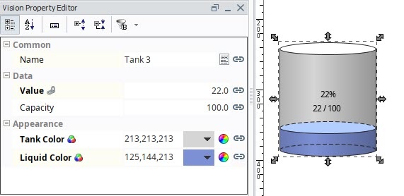
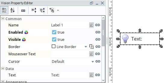
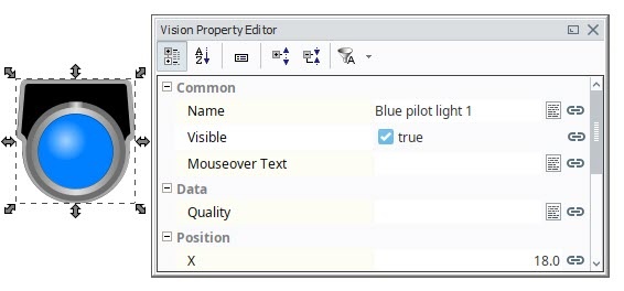
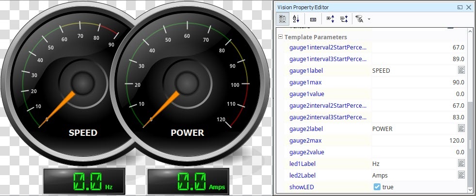
Components are building blocks for your project. The Vision module has a variety of built-in components such as displays, buttons, and charts. Each component has multiple properties that control its appearance, behavior, and data. For example, a Tank has a level, capacity, and a liquid color, while a Label has text, font, and an image. You can enhance components with custom properties to create additional functionality.
Bindings
A binding is a mechanism that allows a property on a component to change based on a a change to a value elsewhere in Ignition. For example, with binding, the liquid level displayed in a tank graphic can be bound to the realtime liquid level in a tank. The value of a tag could be bound to a linear scale, a meter, or a label on your window. The power of bindings comes from the variety of binding types.
Click on the following links for complete information about binding types:
- Properties: Property Binding, Cell Update Binding, Component Styles
- Tags: Tag Binding, Indirect Tag Bindings in Vision, Tag History Binding
- Expressions: Expression Binding
- Databases: DB Browse Binding, SQL Query Binding, Named Query Bindings
- Functions: Function Binding
Graphics
In addition to standard components, the Vision module supports the use of SVG, PNG and JPEG images on Vision windows. You can create your own images and import them into your project or use Ignition's 2D Drawing tools to create graphics.
You can use the built-in SVGs from the Symbol Factory, which contains hundreds of ready-to-use graphics, or use the raster image library with an Image component to get a jump start on your project.
Scalable Vector Graphics
Scalable Vector Graphics (SVG) have several advantages over other graphic types. Because they are vector graphics, they can be scaled without a loss of clarity or resolution. Additionally, you can drill into an SVG to change individual parts of the image. To use an SVG in Ignition, simply drag the file directly onto the window in which you want it to appear.
Templates
Components and images can be combined to create Vision templates. These are re-usable objects that can be configured once and used throughout your project. Templates work under a principal of inheritance. When a change is made to a template, that change is inherited by each instance of that template. Most templates use one or more custom properties (Template Parameters) to tie data from a window to the internals of the template.
The Cloud Templates Browser portal in the Designer gives you access to pre-built templates. Ignition community members can also share their own templates in the Cloud Templates.
Vision Client Disconnections
If a Vision Client loses its connection to the Ignition Gateway, a Connection Lost message will be displayed immediately on your screen:
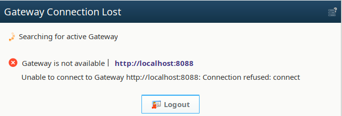
The Vision Client will continuously attempt to reconnect to the Gateway. When the connection between the Vision Client and the Gateway is re-established, your Vision Client will resume its normal operation. If the project associated with the Vision Client is somehow deleted, the Client will fail to reconnect because its source project is missing. A project can be manually deleted or overwritten by a Gateway restore.