Vision Designer Interface
Vision Designer Workspace
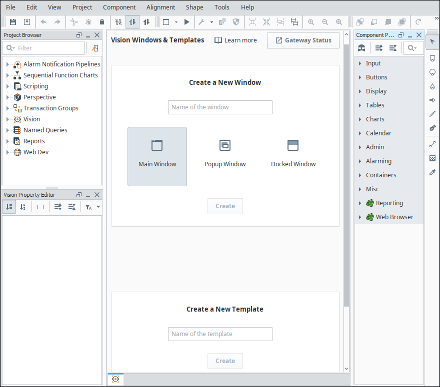
The Vision Designer Interface is where the bulk of the designer's work is done. The Vision Designer Interface provides some built-in functionality to help you get started designing your project whether you are logging into your project for the first time or the 50th time. From the Vision Windows & Templates Welcome tab, you can easily create Main windows, Popup windows, Docked windows and Templates. It even shows you the recently modified windows, so picking up where you left off the last time you logged into your project, is right at your fingertips.
You can also check the Gateway Status from the Designer Interface and see all the Vision Clients that are running along with the Client details and stats.
When looking at a Vision specific element in the Designer, such as a window or template, the Designer is organized with some panels that are specific to the Vision Designer Interface, such as the Property Editor and Component Palette. Other elements of the workspace that are shared between spaces are discussed in the General Designer Interface.
Component Palette
The Vision module comes with a host of useful components out of the box, such as buttons, text areas, dropdowns, charts, many of which are specialized for industrial controls use. The Component Palette is located on the right side of the Designer workspace. The basic workflow is to drag a component from the component palette and drop it into a container on a window. From there, you can use the mouse to drag and resize the component into the correct position. While the component is selected, you can use the Property Editor panel to alter the component's properties, which changes the component's appearance and behavior.
Vision Property Editor
The Vision Property Editor is a dockable panel that appears in the Designer's central workspace, usually in the lower left corner. It displays the properties of the selected component. If more than one component is selected, it will show all properties that the current selection set have in common. Hovering your mouse over a property will display a tooltip that gives a description of the property, as well as its data type and scripting name. Alternately, you can click on the Show/Hide Description Area icon to bring up the description area which displays the same information for the currently selected property.
You can also change how the properties are sorted in the property editor. By default, they are sorted with the Categorized  icon, with similar components grouped under different categorical headers. However, they can also be sorted in alphabetical order by clicking on the Alphabetic
  icon.
icon.
Filters
It is common for components to have many properties, so by default the Property Editor only shows the Basic properties. These are the properties that you'll most commonly want to set or bind for a given component. However, the property filter can be changed to show different sets of properties. The Designer will remember your selection for future sessions.
- Basic: The Name property and any very commonly used properties. Most components only show two to four properties in Basic.
- Standard: Most of the common properties that a designer would want to use. Few or none of the Expert properties are in the Standard list.
- Expert: The properties that are most commonly used with more advanced features of the component. Few or none of the Standard properties are in the Expert list.
- All: All properties

Most users find it best to set the property filter to All, so they can see all of the properties available to them at all times.
Binding Icon
To the right of most properties is the Binding  icon. Click this icon to modify the Property binding that is driving that property. You can only use this button when the window workspace is not in Preview mode. Some properties cannot be bound because their datatype is not supported by the binding system. You can still use scripting to affect these properties.
Status Indication
The name of a property in the Property Editor conveys important information about that property:
- A blue name indicates that the property is a custom property.
- A bold name with a Link
 icon next to the property indicates that the property is bound using a property binding.
 - A bold name with a Color Palette
 icon indicates that the property is being affected by the component styles settings.
 - A red bold name with a Warning
 icon indicates that the property is double-bound. This means that two things, a property binding and the styles settings are both trying to drive the property value. This will result in errors as the two systems fight each other to write to the property.
Dropdown Lists in Properties
Some of the properties you will encounter on components will have a dropdown list instead of a field to type into. The property description will say it is an integer value, and in most of these cases you can still create a binding on that property. These dropdown lists are an enumeration, meaning each element in the dropdown has an integer value. In all cases, the first value in the list is 0, the second is 1, the third is 2, and so on. You can use this knowledge to create a dropdown list on-screen for your operators that matches the list. In this case, you would just bind this property to the Selected Value of the dropdown.
Common Properties
Every component has properties arranged into categories based on what it has available (i.e., Common, Behavior, Data, Appearance, Layout, etc.). Each component has a different list of properties to effect how it behaves, but every component has the Common group of properties located at the top of the list. These Common properties will behave the same for all components. Here's a list for each Common property and when it might be used.
| Function | Description |
|---|---|
| Name | The name of the component. This string is used to identify your components in the Project Browser. This is especially important for Bindings and Scripting. Binding is allowed on this property, but it is recommended to never bind this property. Binding it can break your scripts, bindings, and cause errors. |
| Enabled | This boolean controls whether a component can be interacted with. Most commonly used with data entry components to allow the user to see the value, but not change it. |
| Visible | This boolean controls whether the component is shown on the window. You can bind this property to show/hide the component based on any logic you want (i.e., security, process step, etc.). |
| Border | The border that surrounds the component. There is a dropdown to select from a list of common borders, and a button to the right to manually edit a border from several different options with a second tab that shows Titled Borders. When binding this property, note that this is a complex data type. It is a Java Border data type, not a string or an enumeration. The common ways to make this property dynamic are to bind it with an Expression binding type or to set it through a script, but using the Expression binding is preferred. If you are using an Expression binding, you must use the toBorder() expression function to return the correct data type. If you are using a script, you need to make sure you use the Java Border data type. See the Java documentation for more information on setting a border through scripting. |
| Mouseover Text | The text that is displayed when a user moves the mouse over the component. This string is commonly used to provide your operators more information about an object (i.e., showing the PLC address of an on-screen value, or telling the operator exactly what will happen when a button is pressed). HTML is allowed in this property. |
| Cursor | The mouse pointer image to use when the operator moves the mouse over the component. This int property corresponds to one of the options in the list. Selecting default means the operating system decides what pointer to use:
|
Vision Menubar
There is a menubar at the top of the Designer Workspace that provides functionality when working in the Vision workspace. Each menu dropdown reveals a host of functions related to the menu item. The other menus shared between Vision and Perspective are discussed in the General Designer Interface.

File Menu
See General Designer Interface.
Edit Menu
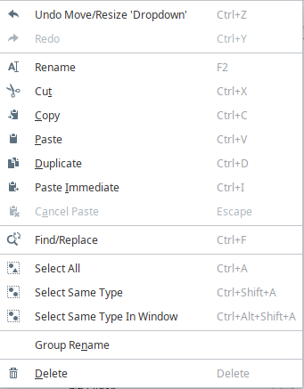
The Edit Menu is similar to other applications edit menus as it provides much of the basic copy/paste functionality. You can also access this menu by right-clicking on an item.
| Function | Description |
|---|---|
| Undo and Redo | Can be used to revert to the previous state, essentially removing the last change, or redoing it again after having been removed. This has a large queue that can be traversed, but does not include every change (i.e., Tag edits cannot be undone). |
| Cut/Copy/Paste/Duplicate | These functions much the same as they do everywhere else. Most things in the Designer can be copied and pasted elsewhere, from individual components on the window to entire folders of windows. The difference is that when using Paste with an object on a window, it will instead create a paste action, and allow you to move the mouse and select where you want to paste it, clicking the mouse to confirm. Cancel Paste will cancel the paste action, while paste immediate will bypass the paste action, and instead immediately paste the object from where it was cut or copied from. |
| Find/Replace | Brings up the Find and Replace interface to allow you to find specific objects within the project. Refer to Find and Replace for more information. |
| Select All | Selects All siblings in the same container as the currently selected component. |
| Select Same Type | Selects all components of the same type in the same container as the currently selected component. |
| Select Same Type in Window | Selects all components of the same type as the currently selected component, regardless of what container they are in. |
| Group Rename | Renames a group of components to a prefix with a number afterwards. For example, if your prefix is Button, it will rename all selected components Button (1), incrementing the number each component. |
| Delete | Deletes the currently selected component. This can also be done using the delete key. |
View Menu
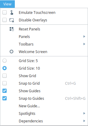
The View Menu allows you to manipulate how various objects look or act in the Designer.
| Function | Description |
|---|---|
| Emulate Touchscreen | Simulates Touchscreen mode in the Designer to be able to test it without having to open a Client. |
| Disable Overlays | Disables the red or gray overlays on components because of a bad Tag or binding, but only in this Designer session. |
| Reset Panels | Resets panels (Project Browser, Tag Browser, etc.) to the default panel configuration. |
| Panels | Allows you to enable or disable certain panels within the Designer. |
| Toolbars | Allows you to enable or disable certain toolbars within the Designer. |
| Welcome Screen | Takes you to the welcome screen in the Designer, or reopen it if it had been closed. |
| Grid Size | Allows you to select a grid size of 5 or 10. |
| Show Grid | Toggles the grid on and off. |
| Snap to Grid | Changes click-and-drag behavior to snap components to grid lines. This works even when Show Grid is off. |
| Show Guides | Shows any guide lines. |
| Snap to Guides | Changes click-and-drag behavior to snap components to any created guidelines. |
| New Guide | Adds a guide line to the current window. |
| Spotlights | Puts a highlighted border around components that have the selected spotlight. Bound objects will get a green highlight, objects with scripting will get a blue highlight, and invisible objects will get a pink highlight. If a component has multiple highlights, and both are enabled, it will alternate the colors throughout the highlight. |
| Dependencies | Shows the binding dependencies (as arrows) based on the selected component or components. Show Supporters will show all components that the currently selected component is bound to, Show Dependents will show all components that are bound to the currently selected component, and Show All will show all of the bindings, regardless of the selected components. |
Project Menu
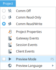
The Project Menu is where many project specific settings can be changed.
| Function | Description |
|---|---|
| Designer Comms | The Comm settings allow you to select the level of communication the Designer can have with the Gateway. By default, this is set to Comm Read-Only, which will make any information coming from the Gateway read only, but this can be changed to Comm Off which will prevent Gateway communication, or Comm Read/Write, which will allow both read and write communications between the Gateway. The default that the Designer opens at can be changed in the Project Properties. See also: Communication Modes |
| Properties | Opens up the Project Properties window, allowing project settings to be changed. See also: Project Properties |
| Event Scripts | Opens up the appropriate event script window, either Client or Gateway. These can also be accessed from the Project Browser. See also: Client Event Scripts and Gateway Event Scripts. |
| Preview Mode | Puts the Designer into Preview Mode, allowing you to interact with it like a Client. See also: Previewing the Project |
| Preview Language | Determines the language that the Designer will revert to when in Preview Mode. See also Localization in Vision |
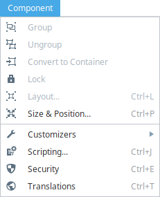
Component Menu
The Component Menu offers many of the same selections for the selected component that right clicking on that component would contain.
| Function | Description |
|---|---|
| Group | Only available when multiple components are selected. Grouping will place the currently selected components into a group. Ungroup will remove the grouping. See also: Working with Components |
| Ungroup | Only available when a group is selected. This option removes the group (and any custom properties that are on the group) and places all items from that group into the object the group was in. |
| Convert to Container | Only available when a group is selected. Converts the selected group to a container. Refer to Container for more information. |
| Lock | Locks or unlocks the selected component's size and position. |
| Layout | Set layout constraints for the selected component. |
| Size and Position | Change the size and position of the currently selected component. |
| Customizers | Allows you to select any of the available customizers for the currently selected component. |
| Scripting | Brings up the scripting window for the currently selected component. |
| Security | Opens up the Security Settings Panel, allowing security to be placed on the selected components. |
| Translations | Brings up the Translatable Terms Panel, showing any translations for the selected component. |
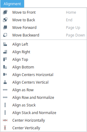
Alignment Menu
The Alignment Menu options allow you to adjust the alignment of components relative to other components.
| Function | Description |
|---|---|
| Move to Front | Move the selected components to the front of the z-order. |
| Move to Back | Move the selected components to the back of the z-order. |
| Move Forward | Move the selected components forward in the z-order relative to any overlapping components. |
| Move Backward | Move the selected components backward in the z-order relative to any overlapping components. |
| Align Left | Align the left edges of a group of components. |
| Align Right | Align the right edges of a group of components. |
| Align Top | Align the top edges of a group of components. |
| Align Bottom | Align the bottom edges of a group of components. |
| Align Centers Horizontal | Aligns all of the selected components horizontally on their centers. |
| Align Centers Vertical | Aligns all of the selected components vertically on their centers. |
| Align Centers | Aligns all of the selected components either vertically or horizontally on their centers. |
| Align as Row | Aligns all of the components on their centers as a row, and will add padding between them that you can select. Normalizing them will change the size of all of the components to the first selected component. |
| Align as Stack | Aligns all of the components on their centers as a stack, and will add padding between them that you can select. Normalizing them will change the size of all of the components to the first selected component. |
| Center Horizontally | Centers the currently selected components horizontally. |
| Center Vertically | Centers the currently selected components vertically. |
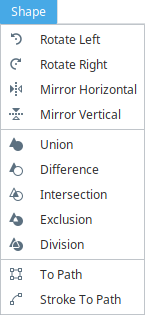
Shape Menu
The Shape Menu allows for manipulation of shape or path objects.
| Function | Description |
|---|---|
| Rotate | Rotates the currently selected shape 90 degrees either right or left. |
| Mirror | Flips the component either vertically or horizontally. |
| Union | Alters the first shape to be the combination of all selected shapes. |
| Difference | Alters the first selected shapes by removing the last selected shape from them. |
| Intersection | Alters the first shape to become a new shape consisting of the area they share. |
| Exclusion | Alters the first shape to become a new shape consisting of the area they do not share. |
| Division | Cuts the first shape into multiple shapes along the borders of other shapes. |
| To Path | Converts a shape to a simple path object. |
| Stroke To Path | Converts the selected shape into a new shape defined by its stroke. |
Tools Menu
The Designer comes with many tools that allow you to manage and test various resources within a project. Each of the tools have their own interface and are accessed within the Tools menu on the menu bar of the Designer. For more information, see Designer Tools.