Working with Vision Components
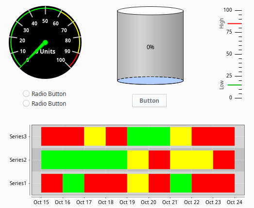
The Vision Module comes with a host of built-in components that you can select from for use in your project. One thing that you'll find when working with components is there are a few different ways to manipulate and layout components on a window when working in the Designer. This page contains a small sampling of the components available in Vision. See the Vision Components Appendix page for a complete list of components.
This section describes how to select, move, resize, duplicate, and group components during the design process.
Selecting Components
There are a number of different ways to select components within a window, each of which has their own advantages.
Mouse Selection
Using the mouse to directly click a component is the most common way. Make sure the Selection  icon on the Drawing Tools menubar is enabled, then click on a component to select it. If the component you want to select is obscured by other components, hold down Alt-click, and the selection will step down through the z-order.
Window Selection
You can also select components using window selection. Click-and-drag within a container to draw a selection rectangle. If you drag the window from left to right, it will select all components that are completely contained within the rectangle. If you drag the window right-to-left, it will select all components that the rectangle touches.
Lastly, you can start dragging a window selection and then hold down the Alt key to use touch selection. This will draw a line as you drag, and any components that the line touches will become selected. As you're using these techniques, components are given a yellow highlight border.
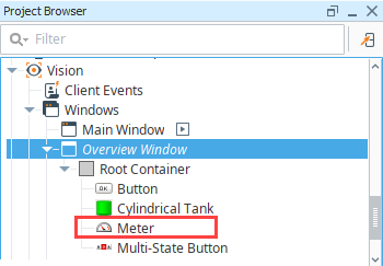
Tree Selection
By selecting nodes in the Project Browser you can manipulate the current selection. This is a handy way to select the current window itself, which is hard to click on since it is behind the Root container. However, you can click to it, using Alt-click to step down through the z-order. It is also the only way to select components that are invisible.
Component Properties
Each component has a unique set of properties that can be set and modified within the Property Editor. A property is a named variable with a distinct type that affects something about the component's behavior or appearance. You can also create your own custom properties on the component, which act like variables that can store any information that you want on the component.
Data Types
There are a wide variety of datatypes across all of the Vision Module's components. Each property has a distinct type, which dictates what values will be allowed. Below are the common data types.
Numeric Types
| Data Type | Description |
|---|---|
| Boolean | A true/false value. Modeled as 0/1 in Python. Technically, 0 is false and anything else is true. |
| Short | A 16-bit signed integer. Can hold values between -32,768 to 32,767, inclusive. |
| Integer/int | A 32-bit signed integer. Can hold values between -2,147,483,648 to 2,147,483,647 inclusive. |
| Long | A 64-bit signed integer. Can hold values between -9,223,372,036,854,775,808 to 9,223,372,036,854,775,807 inclusive. |
| Float | A 32-bit signed floating point number in IEEE 754 format. |
| Double | A 64-bit signed floating point number in IEEE 754 format. |
Non-Numeric Types
| Data Type | Description |
|---|---|
| String | A string of characters. Uses UTF-16 format internally to represent the characters. |
| Color | A color, in the RGBA color space. Colors can easily be made dynamic or animated using Property Bindings or Styles. |
| Date | Represents a point it time with millisecond precision. Internally stored as the number of milliseconds that have passed since the "epoch", Jan 1st 1970, 00:00:00 UTC. |
| Dataset | A complex data structure that closely mimics the structure of a database table. A Dataset is a two-dimensional matrix (also known as a table) of data organized in columns and rows. Each column has a name and a datatype. |
| Font | A typeface. Each typeface has a name, size, and style. |
| Border | A component border is a visual decoration around the component's edges. You can make a border dynamic by using the Style Customizer, the toBorder() expression function, or scripting with the Java border object. |
Dataset Editor
The Dataset Editor  icon appears next to the binding icon for the Data property. Clicking the icon brings up the Dataset Editor window where you can view and make changes to the raw data. Note, any changes will be overwritten the next time your binding polls.

With the Dataset Editor, you can add and delete columns and rows, delete all rows, and copy information to or from the clipboard. When adding columns, you have multiple formats to choose from including string, date, integer, double, float, etc.
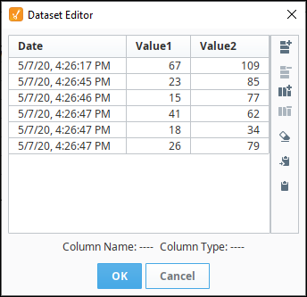
The Dataset Editor icons actions are detailed in the table below.
| Icon | Action |
|---|---|
 | Add row |
 | Delete selected rows |
 | Add a column |
 | Delete selected column |
 | Delete all rows |
 | Add to clipboard |
 | Paste from clipboard |
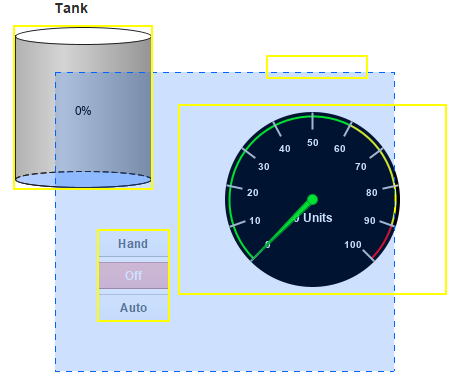
Manipulating Components
Manipulating components can be done with both the mouse and the keyboard. You can move components around, resize them, and rotate them.
Resizing
When you select the component you want to resize, they'll get eight resize-handles displayed around the edge of the selection. These handles look like double-sided arrows around the perimeter. Use the mouse to drag them to change the size of the components in the selection. To maintain the selection's aspect ratio, hold down Ctrl as you resize. To resize around the center of the current selection, hold down Shift. These can be used at the same time.
You can also resize the current selection using the keyboard. To nudge the right or bottom edge of the selection in or out, use Shift combined with the arrow keys, which resizes by the nudge distance, which defaults to one pixel at a time. To nudge the top or left edge of the selection, use Ctrl-Shift combined with arrow keys. To resize faster, hold the Alt key as well, to move the component the alt nudge distance, which defaults to ten pixels at a time.

Moving
To move the component, simply drag it anywhere within the container's bounds. You can also move whatever is currently selected by holding down Alt while dragging, regardless of whether or not the mouse is over the current selection. This is important because it is the primary way to move a container component. (Normally, dragging in a container draws a selection rectangle inside that container).
While a component is selected, you may also use the keyboard's arrow keys to move a component around the nudge distance. Just like resizing with the arrow keys, to move the alt nudge distance, use the Alt key.
Duplicating
Components can be easily duplicated by dragging them as if you were going to move them and holding down the Ctrl key. This will drop a copy of the component at the desired drop location. It is often useful to also hold down Shift key as you do this to ensure exact alignment. You may also use the Ctrl-D shortcut to quickly duplicate a component in place.
Rotating
Shapes can be rotated directly using the selection tool. Other components cannot be rotated in this manner. To rotate a shape, first select it using the selection tool so that you see the resize handles around it. Then simply click on it once again and you'll see the rotation handles appear. Clicking (but not double-clicking) on selected shapes toggles back and forth between the resize handles and the rotation handles.
Once you see the rotation handles, simply start dragging one to rotate the shape or shapes. Holding down the Ctrl key will snap your rotation movements to 15 degree increments. When the rotation handles are present, there is also a small red crosshair handle that starts in the middle of the selection. This is the rotation anchor, meaning it's the point that the selection will rotate around. You can drag it anywhere you'd like to rotate around a point other than the center of the shape.

Size and Position
Components can also be positioned and resized with the Size and Position window. This window allows you to type in an exact pixel size of the component as well as X/Y coordinates that the component will be at (with the upper left point of the component moving to that point). To access the Size and Position window, right-click on the component and select Size and Position.

Component Grouping
Shapes and components can be grouped together so that they act like a single component in the Designer. Grouping components is very similar to putting them in a container. In fact, it is the same thing as cutting and pasting them into a perfectly-sized container and then putting that container into group mode, with one exception. If the group contains only shapes and no other kinds of components, it will be a special shape-group that has the ability to be rotated and has some other shape-like properties.
When components or shapes are in a group, clicking on them in the Designer will select the group instead of the shape. If you double-click on a group, it will become "super-selected", which will allow you to interact with its contents until you select something outside of that group.
Groups can contain other groups, creating a nested structure. Groups themselves are also components, meaning that you can add custom properties to groups, bind them, and so on.
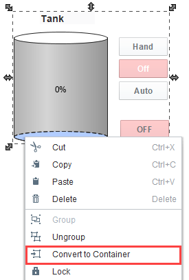
Difference between a Container and a Group
It is helpful to use groups and containers to organize the components on your window. You can select multiple components and right-click to convert them into a group, then right-click again convert that group to a container.
Group Layouts
Layout works differently for groups. The layout setting for components and shapes inside a group is ignored. All members of a group act as if they are in relative layout with no aspect ratio restrictions. This special group-layout mode is also active when resizing a group inside of the Designer, whereas traditional (container) layout doesn't take effect in the Designer.
Component Layout
Layout is the concept that a component's size and position, relative to its parent container's size and position, can be dynamic. This allows the creation of windows that resize gracefully using either Anchored or Relative layouts and can optionally keep the original aspect ratio.
This is important as web-launched deployments of Vision Clients are often displayed on multiple monitors with different resolutions.
This is also relevant for components that have user-adjustable windows like popup windows. Imagine a popup window that is mostly displaying a large table or chart. If you're running on a large monitor, you may want to make the window bigger to see the table or chart easier. Of course, this is only useful if the table or chart actually gets larger with the window.
Changing a component's layout is as simple as right-clicking on the component and opening the layout dialog box. You can also alter the default layout mode that gets assigned to new components. See Designer/Window Editing Properties.
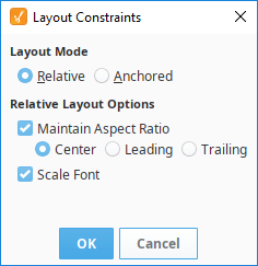
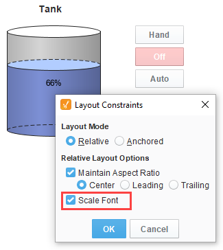
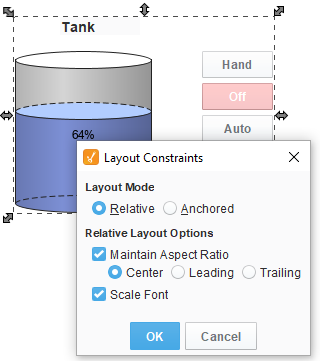
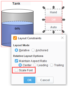
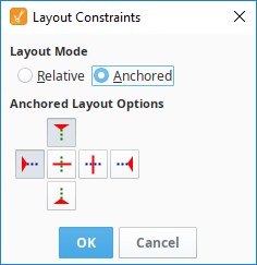
There are two layout modes, and they are set on a per-component basis. Both affect the component's size and position relative to its parent container. The root container's size is dictated by the window size. To edit the layout of a component, right-click on the component and select Layout from the menu. The Layout Constraints window displays showing all the default settings. These default settings can be altered in the Project Properties.
Layout Modes
-
Relative
This mode makes a component's size and location relative to its parent's size and location. When the parent changes size, the component changes accordingly. This creates components that auto-scale. -
Anchored
This mode makes the edge of a component's two axes (horizontal and vertical) anchored to the edge or edges of its parent.
Relative Layout
Relative layout is the default mode. This is a simple and effective layout mode that keeps a component's size and position constant relative to its parent container, even when the parent container grows or shrinks. More precisely, it remembers the component's position and size as a percentage of its parent's bounds at the last time the window was saved. Relative layout also has the option of scaling a component's font appropriately.

Note that Relative layout mode respects aspect ratio. So, if the parent component is distorted, the content will not be. The extra space is distributed evenly on both sides of the content.

Relative Layout Options
-
Maintain Aspect Ratio
If selected, the component's original aspect ratio is preserved. Otherwise, it can stretch tall or wide. -
Center
When maintaining the aspect ratio, centers the component with respect to its parent. -
Leading
When maintaining the aspect ratio, aligns the component with the parent's leading edge. -
Trailing
When maintaining the aspect ratio, aligns the component with the parent's trailing edge. -
Scale Font
If selected, the component's font will scale along with its size as the relative layout adjusts the component. This will override other font size settings. If this setting is applied to a group, then all components in the group will use this setting.
Font Scaling
By default, font scaling is enabled on all components, but it can behave differently on some components so it’s good to test it out before putting it into production. You can change the default Component layout settings in Project Properties under Vision > Design > Relative Layout Options.
Font Scaling on Individual Components
When individual components are dragged into a window, the following default layout settings for each component are applied. All components on the window default to font scaling.
Font Scaling on Groups
When individual components are grouped together, the default layout settings are applied to the new group component, and to each component in the group. All the components in the group default to font scaling.
Font scaling on individual components in a group can be disabled by selecting the group, and double clicking on a single component. You will get a red outline around the group, then you can select the individual component(s), and disable font scaling.
The individual component font scale setting takes precedence within a group.
When you remove the group (right-click and select Ungroup), all the individual components within that group will get reset to the default layout settings including font scaling, even if font scaling was set differently.
Font Scaling on Containers
You can convert a group to a container to change the way scaling works. Ignition remembers the last layout Settings you made to each individual component in that group prior to the conversion to a container (i.e., if any of the components had font scaling disabled, once the group is converted to a container, those same components will still have font scaling disabled).
Anchored Layout
Anchored layout lets you specify various "anchors" for the component. The anchors dictate how far each of the 4 edges of the component stay from their corresponding edges in the parent container.
Anchored Layout Options
-
North/South
If one of these is selected, the distance between that edge of the component and that edge of the container is preserved. If both are selected, the component will stretch its height to maintain both distances. -
West/East
If one of these is selected, the distance between that edge of the component and that edge of the container is preserved. If both are selected, the component will stretch its width to maintain both distances. -
Center Vertically
When selected, both top and bottom buttons will be deselected. This option maintains the height of the component and centers it vertically in the container. -
Center Horizontally
When selected, both left and right buttons will be deselected. This option maintains the width of the component and centers it horizontally in the container.
For example, if you anchor top and left, then your component will stay a constant distance from top and left edges of its parent. Since you didn't specify an anchor for the right or bottom sides, they won't be affected by the layout.

If you anchor bottom and right instead, the components will again stay the same size. Since you didn't specify an anchor for their other edges, but they will stay a constant distance from their parent's right and bottom edges.

Additionally, you can mix and match the various modes for the different components in a given container. To demonstrate, we can apply different anchors to each of the shapes at once and then change the size of the layout.
- Applying the horizontal and vertical centering anchors on the square, centers it in the layout and maintains the original size.
- Applying the south and west anchors on the triangle, holds it to the lower left area of the layout.
- Applying the north, south, west, and east anchors on the circle, causes it to expand as the edges of the layout expand.
