Color Animation in Vision
Using Color on Components
Using color on components is an important part of creating effective HMIs. While static colors can help identify specific features on the screen, dynamic colors can help draw the users attention to certain areas. Making color type properties such as Fill Paint dynamic works a little bit differently than other properties with simple types. There typically aren't Tags of type color, so the way we set up bindings on these types of properties works a little bit differently, and we have a few options available to us.
Using Expression Bindings
You can use the expression language to calculate a color using the color() function. If you have a color that depends on multiple properties, then using an express is recommended to evaluate correctly. This first example returns a static color using the Fill Color property.
// binding on the Fill Color property
color(255,0,0) // static red color
This example takes a Tag value and translates it to a color that ranges from white to blue as the Tag value increases.
// binding on the Fill Color property
color(255,255,255-({tag value}/100*255)) // fades from white to blue when Tag value goes from 0 to 100 %
If you have multiple properties or Tags, you can use the logic Expression Functions to select between a few colors.
if({Tag1}>50,
    if({Tag2},
        3, // if tag1>50 and tag2 is true
        1), // if tag1>50 and tag2 is false
    if({Tag3},
        2, // if tag1<=50 and tag3 is true
        0)) // if tag1<=50 and tag3 is false
This example takes one integer value and selects from several options.
// binding on the fill color property
switch({HOA tag},
    0,1,2, // off, on, hand
    color(255,0,0), color(0,255,0), color(255,255,0), // red, green, yellow
    color(0,0,0)) // black (fallback color)
The Number to Color Translator
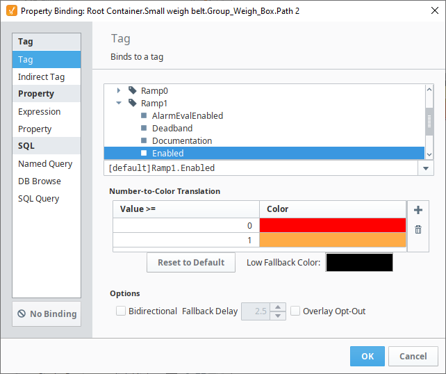
The Number-to-Color Translation, commonly known as Color Mapping is where you map a value to a color within a binding. When selecting a binding type where producing a color won't be possible, the Number-to-Color Translator will appear at the bottom of the binding window. This includes Property Bindings, Tag Bindings, and Indirect Tag Bindings. The way the Number-to-Color Translator works is that for every number range there is a set color. The binding then translates the numeric value into a color based on the mapping table. You can choose a different color for each value, and even make it blink between two different colors. If you need to add or remove values, use the Add New Translation  icon or Delete Selected Translation
  icon on the right side of the Number-to-Color Translation table. There is a Low Fallback Color option so when a value falls below your lowest value, a default color can be set.
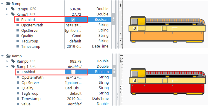
In this example, the fill color two parts of the conveyor symbol has been bound to the Ramp1 tag, enabled value. When the Ramp is enabled (value = 1), the symbol displays parts in the normal, yellow color. When the Ramp is disabled (value = 0), the fill color on those two parts is red, indicating the conveyor belt is not running. For more information on how this was applied to a symbol, see Images and SVGs in Vision.
Style Customizer
Many Vision components support the Style Customizer, which lets you define a set of visual styles that change based on a single Driving Property. Typically, you'll have a property on your component that you want to use as a driving property (like a discrete state), which then drives multiple visual properties, like the font, border, and foreground color, to change to a specific style that was set up per state beforehand. Style Customizer lets you define these relationships all at once, and lets you preview them too! Without styles, you would have to go to every property and bind them all individually.
Style Customizer Window
The Style Customizer window has multiple parts to it.
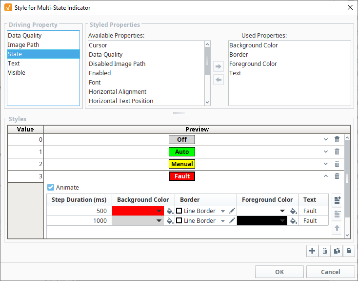
- Driving Property - The value of the selected property will be used to determine the style used. Only certain properties on the component can be used as driving properties, but the most common are discrete state properties. Custom Properties can also be used here.
- Styled Properties - Here you can select which properties will be used in the styles. Any properties that are in the left panel are available to be used in the styles, while properties in the right panel are already being used in the style. Properties can be moved between the panels by selecting it and clicking the appropriate arrow button.
- Styles - The list of styles that will be available for this component. Each style has a Value property on the left. When the value of the Driving Property is greater than or equal to the value of a style, that style will be applied to the component. Each style gives a preview of what it looks like, and can be expanded to by clicking the expand icon
 to edit the properties within that style.
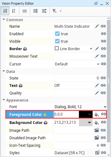
You will notice in the image below that the properties being used in the Styled Properties are the Background Color, Border, Foreground Color, and Text, which corresponds to the properties we have available within each style in the Styles area. Each style can also be animated by clicking the animation checkbox. This allows you to add different steps to the style, where each step of the style can have its own unique style. Each step also gains a Step Duration (ms) property that is used to determine how long the step is active for, as shown in the fourth row. This is typically used to create a flashing effect, where the component will flash between two different colors such as red and gray.
Value Conflict
You can bind a property that is already being used by a style, but a warning icon will appear on the property in the Property Editor. This means there is a conflict between the binding on the property, and the style on the component. As a general practice, only the style or binding should write to the property, not both.
Style Customizer Example
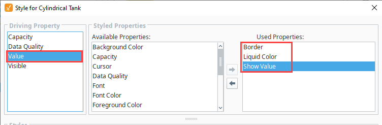
The best example of the Style Customizer in action is the Multi-State Indicator, as this component uses the style customizer to work properly and switch between different states, so it can be used as an example already built in. However, the many other components can use the Style Customizer, so this example sets up styles for a Cylindrical Tank.
-
Add a Cylindrical Tank component to the window, and add a Tag to the Value property. (This example uses a Rampt1 tag).
-
Right click on the Cylibdrical Tank and go to Customizers > Style Customizer.
-
Select a Driving Property. Here, the Value is a good choice as we can change the tank to flash when the contents get too high.
-
In the Styled Properties select the Border, Liquid Color, and Show Value.
-
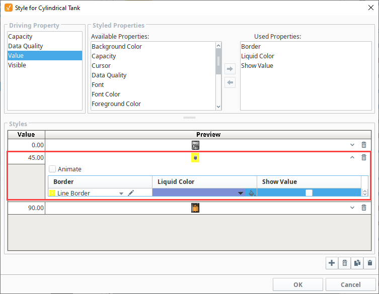
Next, we need to set up the different styles. Click the Add
icon three times to add three styles. -
Leave the first style set to Value 0.00, and don't change any of the other settings.
-
Set the second style to Value 45.
- Click the Expand icon.
- In the Border Chooser, select the Line Border style, set the line width to 5px, and the line color to yellow. This way, it is obvious the tank is filling up.
- Set the Liquid Color to blue or keep the default color.
- Click the Expand
-
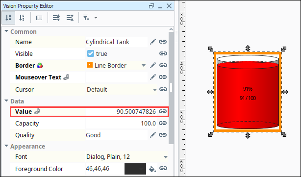
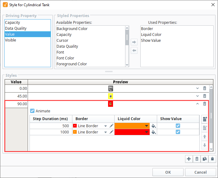
For the third style, we're going to animate it and and create two steps to alert the user that the tank is almost full. Set the third style to Value 90, then click the Expand
icon. Set the following options for the first step:- Animate checkbox - checked
- Step Duration 500 ms.
- Border - Line Border Orange and set the Line Width to 5px, and the line color to Orange.
- Liquid Color - Orange
- Show Value checkbox - checked
-
Click the Add
icon to add another step. Set the following options for the second step:- Step Duration 1000
- Border - Line Border Red and set the Line Width to 5px, and the line color to Red.
- Liquid Color - Red
- Show Value checkbox - checked
-
Click OK to save the style.
-
In the Vision Property Editor, when the Value changes to >/= 90, the Tank component and border will change to reflect the style settings. The tank colors and border will flash between red and orange.