Vision Component Customizers
The Vision module provides a number of customizers to configure components in ways that are more complex or detailed for basic properties.
The two main customizers are the Component Customizer and the Style Customizer. These two customizers are used repeatedly for many different components. For special purpose components like the Easy Chart, Table, Tab Strip, and Multi-State Button, they have their own special customizers for you to create your own custom properties.
Component Customizers
To use a customizer:
- Right-click on the component.
- Choose Customizers.
- Select the desired Customizer.
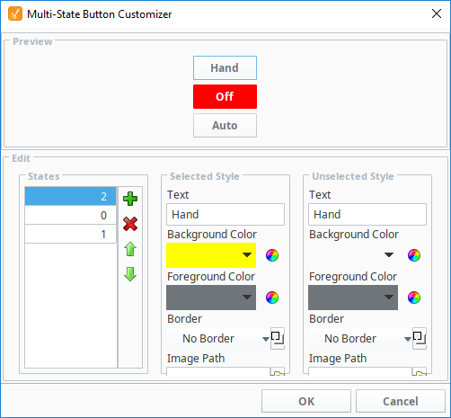
You can also select the component and click the Customizer  icon in the Vision Main Toolbar located on the title bar. The following image is an example of the Customizer for the Multi-State Button component.
Often, a Customizer works as a user-friendly interface to one or more expert properties. For example, the Easy Chart Customizer modifies the contents of the pens, tagPens, calcPens, axes, and subplot dataset properties. This means you can also use property bindings and scripting to modify the values of these expert properties at runtime, giving you the ability to dynamically perform complex manipulations of components.
Custom Properties
In addition to the component's basic property settings, you can also create your own custom properties to enhance and add functionality to a component. You can use the custom properties like any other properties, such as with data binding, scripting, and styles. Custom properties are important for passing parameters from one window to another, especially with a popup window. Properties on the window's Root Container double as a window's parameters. For example, when you click on a Button component to open a popup window, it can pass a set of values into the window. These values are then set to the custom property on the Root Container for use on that window.
To configure a custom property:
-
Right-click on the component.
-
Select Customizers > Custom Properties.
-
Click the plus
 icon to add a row.
 -
Enter the Name (i.e., motorNum) of the custom property and data Type. Click OK.
-
In the Property Editor, scroll to the bottom of the panel to see your custom property in blue.

Custom properties can be any of the basic property types, but can also be a UDT Definition. When specified, the UDT option will create a property shape that matches the shape of the UDT, allowing each member in to UDT to be represented as a separate property in the resulting custom property.
Style Customizer
Many components support the Style Customizer, which allows you to define a set of visual styles that change based on a single property. Typically, you'll have a property (often a custom property) on your component that you want to use as a driving property. The Style Customizer enables you to define many visual relationships at once, and allows you to preview them before implementing. Without the customizer, this would have to be done to each property individually.
Configuring the Style Customizer
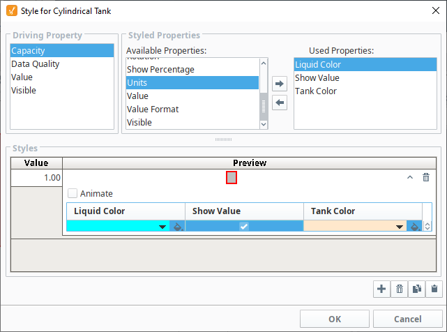
Some components have styles already set up, while others do not. The default styles help users get started, but these properties can be further modified if desired. The following example configures a Cylindrical Tank component that already has a style defined. There are four driving properties on the component where styles can be configured: Capacity, Data Quality, Value, and Visible.
-
Drag in a Cylindrical Tank from the component palette to the window.
-
Right-click on the Cylindrical Tank and select the Style Customizer.
-
Click on Capacity > Liquid Color.
-
Click the Add Property
icon. -
Repeat this step for the Show Value and Tank Color Properties.
-
Click the Add
icon under Styles. -
Click the Expand
 icon to see the color palette for the Liquid Color.
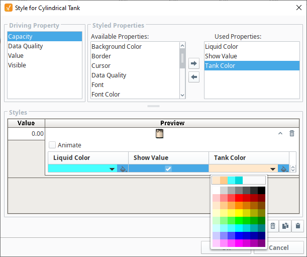
-
Choose a color from the palette.
-
Repeat this step for the Show Value and Tank Color Properties.
-
Click OK to save your updates.
Configuring Custom Properties
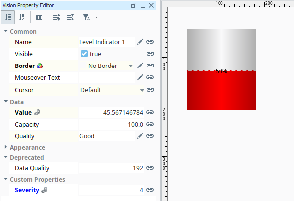
Below is an example of how to use a custom property to configure the appearance of a Level Indicator component by changing the fill color based on the alarm state of the tank's temperature.
-
Add a Level Indicator and open Custom Properties.
-
Click the Add
icon. -
Name the new property Severity and set it to an Integer type. Click OK.

-
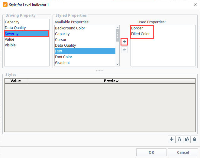
Right-click on the component and choose Style Customizer.
-
Choose your Severity property as the driving property, and the Border and Filled Color properties as the styled properties.
-
Under Styles, click the Add
icon three times. -
Create three styles for the three alarm states you want to show.
-
For the first style, enter a value of -1 (not an alarm) and don't change anything else.
-
For the second, enter a value of 2 (medium alarm). Set the filled color to orange.
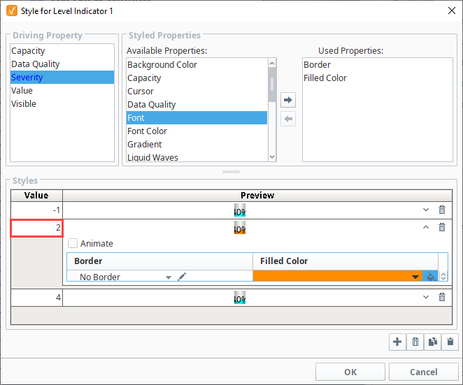
-
For the third style, enter a Value of 4 (high alarm).
- Click the Expand
 icon.
icon. - Select the Animate checkbox.
- Click the Add
 icon.
icon. - Set the StepDuration to 500 for both frames.
- For the first frame set the FilledColor to red.
- For the second frame, set the FilledColor to yellow.
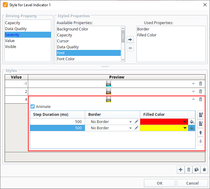
- Click the Expand
-
Click OK. Notice that the styled properties you chose are now bold and have the Styles
 icon next to them. This is to help remind you that those properties are being driven, so if you change their values directly, your changes will be overwritten.
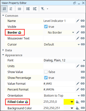
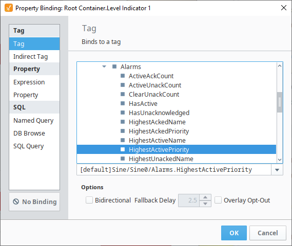
-
In the Property Editor, click on the Binding
 icon for the Severity custom property.
 -
Bind it to the tank temperature tag's Alarms.HighestActivePriority property.
Now, when the alarm state for the tank's temperature changes, the color of the indicator will change based on the settings in the Style Customizer. For instance, the indicator will flash red and yellow if the high alarm is triggered.
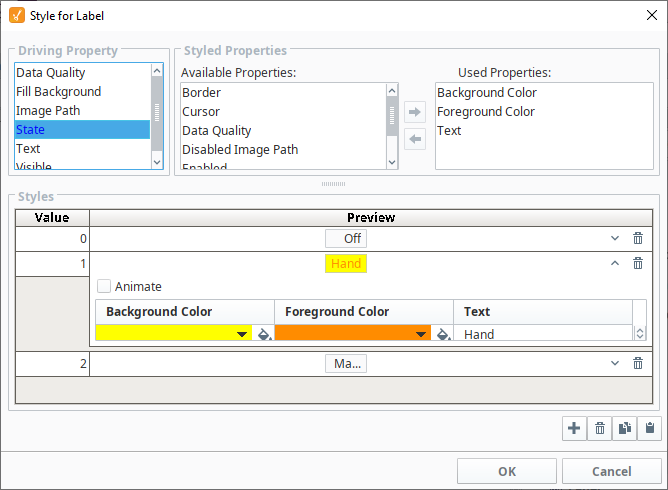
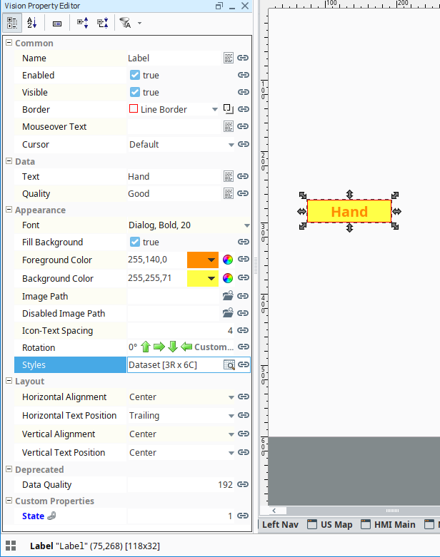
Below is another example to demonstrate the possibilities of customization by using Custom Properties and the Styles feature together to transform the Label component to appear more like the Multi-State Indicator. The Label component initially displays just a string, however you change the foreground color, background color, and border to make it even more functional.
-
Right-click on the Label component and choose Custom Properties.
-
Click the Add
icon. -
Name the new property State and set it to an Integer type. Click OK.

-
Bind that property to a discrete state Tag coming out of a PLC.
-
Next use the State property to drive its Styles configuration to make the component look different and display different text based on the value being 0, 1, or 2, like a Multi-State Indicator does. The Used Properties for this configuration include Background Color, Foreground Color, and Text.
-
Click OK when all style selections are complete to apply them.
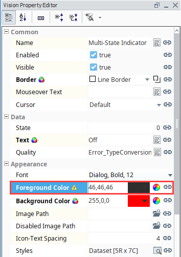
Value Conflict
You can bind a property that is already being used by a style, but a warning icon will appear on the property to indicate there is a conflict between the binding on the property and the style on the component. As a general practice, only the style or binding should write to the property, not both.