Perspective Component Properties
Each Perspective component has a unique set of properties that can be set and modified within the Perspective Property Editor. A component property is simply a named variable with a distinct type that affects something about the component's behavior or appearance, such as size, color, name, visibility. You can also create your own custom properties on a component which act like variables that can store any information that you want on the component. The available properties for each Perspective component are described individually in the Perspective Components section. In the default panel settings, the Property Editor appears on the right side of the Designer screen and contains all the properties that can be configured on a component, including custom properties.
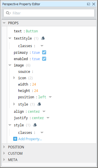
The image below shows the properties that are set on the selected Button component.
Property Categories
Each Perspective component has a list of available properties. Each property is placed into one of several categories, and each property category groups the properties by some commonality. The property categories are described below.
-
Props: Properties that control the component's configuration and provides the runtime data for how the property appears and behaves in a session. See individual Perspective Components for a list of the properties and their descriptions.
-
Position: Properties defined by the component’s parent container control where the component is located inside the container. The available properties listed under this category depend entirely on the container type that the component is placed in. For more information, see the pages for each type of container.
-
Custom: The Custom category was designed as an ideal location to add user created properties.
-
Meta: Properties defined by the Perspective Module itself for common things like the component’s name, and if the component is visible.
-
Params: Only available on Views. This category of properties is used when passing parameters from one view to another view via navigation, or the Perspective - Embedded View component.
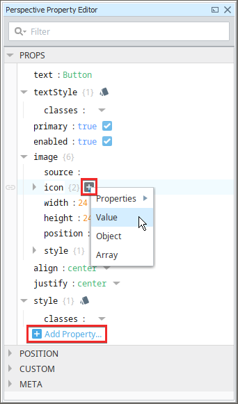
The following image shows an example of the Property Editor for a Button component. Here we see Props is expanded, while the other categories are collapsed.
User Created Properties
User created properties can be added to any property category. New properties can be added by clicking the Add Property  icon.
icon.
It is strongly advised to add new properties to either the Custom or Params categories. Components can contain hidden properties in either the Props, Position, or Meta categories. These hidden properties are typically used on the backend to help the component function. By adding a user create property to Props, Position, or Meta, you could unintentionally create a property that matches the name of a hidden property, resulting in unintended behavior from the component. The Custom and Params categories don't have such properties, so they're a safe location for user created properties.
Alternatively, new elements can be added to objects and arrays by hovering over the object/array in the property editor, and clicking the Add  icon.
icon.
Property Data Types
Before you create a property, you must first understand the different property data types. When you create a new custom property, you must first select the appropriate property data type based on how you want the component to behave or appear. Technically, all values delivered to the frontend are encoded as JSON. Meaning they are either a value (boolean, number, string, or null), an array, or an object (string-keyed map). For convenience, Perspective offers some addition support for certain types, such as dates and datasets. The table below describes each property data type.
| Property Type | Description |
|---|---|
| Value (primitive) | A value is an single variable for the property. It has a 'key" and a "value". "Key" is the name given to the property, and "value" is the actual value of the property. Value types are as follows:
|
| Object | An object is a one or more values stored under one variable name. Objects are indicated by curly braces . In this example, the Object has three sub- properties. |
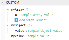
| Array | An array can hold many values under a single name, and you can access the values by referring to an index number. Array is indicated by square brackets [ ]. A good example of an array is the Thermometer component's default setup as shown in the example below. There is an array called "intervals" with three values, 0 through 2. Each of the array items is an object type that has three values: color (string), high (numeric), and low (numeric). 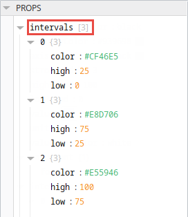 |
| Dataset | The Dataset property type is a special variant of a Value. It can only be used when a binding returns data in a dataset format, or if a script writes a dataset to a property. A Dataset lists the number of rows and columns [rowsxcolumns] and has an Edit Dataset icon that appears after a binding has been created. This icon brings up the Dataset Viewer panel and allows you to make changes to the raw data. Note that any changes will be overwritten the next time your binding polls. Datasets are generally only returned by SQL queries and Tag History bindings, though both have the ability to select from several different return formats. A good example of this is a table bound to a Historical Tag query.  Dataset properties have an dataset viewer and editor in Perspective's Property Editor. Once a property is bound to a dataset, you can access the viewer by clicking on the Dataset Browser  icon. icon.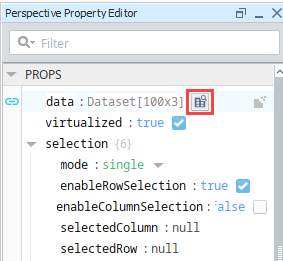 With the Dataset Editor you can add and delete columns and rows, delete all rows, and copy information to or from the clipboard. For Editor icons, see Dataset. |
| Date | Dates are a special variant of a Value. On the frontend they're represented in in a YYYY-MM-dd HH:mm:ss format, but on the backend they're treated as long integers. The date variant is used when a binding returns a date object (such as an expression binding that uses the now expression function). Date properties always feature a calendar icon.  Clicking the icon will cause a popup calendar to appear, making it easy to select a different date. 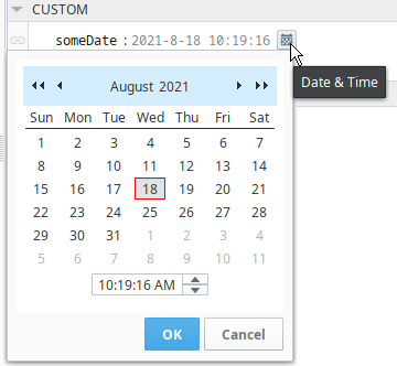 |
| Color | Color properties are another variant on the Value type. Many components provide color properties as a means to select the color of a certain object. On the backend, colors are simply strings, but the designer renders them as colored blocks. Clicking the block will cause an color selector to appear, allowing you to change the color on the property. 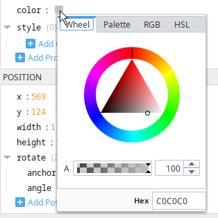 |
Dataset
| Icon | Action |
|---|---|
 | Add row |
 | Delete selected rows |
 | Add a column |
 | Delete selected column |
 | Delete all rows |
 | Add to clipboard |
 | Paste from clipboard |
JavaScript uses double-precision floating-point format numbers as specified in IEEE 754 and can only safely represent numbers between -(2^53 - 1) and 2^53 - 1. This means any value greater than 9,007,199,254,740,991 (or ~9 quadrillion) or less than -9,007,199,254,740,992 will be changed to a value calculated using floating point math up to a max value of 2^63.
This could potentially cause issues with very large numbers, especially when in a dataset property:
- Modifying a value in the Perspective Dataset Double or Long column could lead to an unexpected value.
- If bound to a Dataset tag, the value of the tag could be changed to an unexpected value.
- A Perspective Component rendering a dataset Double or Long could render an unexpected value.
Restricting Property Access
Perspective components have the ability to restrict access to properties from the app/browser. Property access settings do not restrict or inhibit built-in component interactions with bindings and python scripts. Instead they protect against malicious code execution in the browser. Normally a user can potentially execute arbitrary JavaScript code via developer tools (which generally are included with all web browsers) to interact with components and properties in the session. However setting property access level to Private or Protected will prevent such approaches, as browser-side script execution will be unable to access property values on the server side.
To understand what property access in Perspective is, you'll need to understand how the Document Object Model (DOM) works. In short, each active session is represented in a browser (which is the user interface side of the DOM) and on the Gateway (the back-end of the DOM). Interacting with components on the browser-side, such as writing to the text property on the text field, impacts the back-end and allows the gateway to react appropriately (i.e., trigger a property change script).
When a property is set to Public, then arbitrary JavaScript execution can freely write to the back-end, which is likely undesirable in most cases. However, a property set to Protected will disregard any such write requests from the browser, meaning only the back-end is allow to write to the property (i.e, Bindings, component Script Actions, etc). While the browser-side of the DOM is still interactable, the back-end will ignore such value changes.
In this same example, setting a property set to Private will also disregard write attempts, in addition to remaining hidden from any read attempts made by the arbitrary JavaScript.
One caveat to property access is that the names of style classes are always visible and interactable from the browser, so style class names should not included sensitive information.
| Property | Description |
|---|---|
| Public | Unrestricted Access. This is the default setting for all non-system properties. |
| Private | Hidden. The property is not readable from JavaScript, and write requests will be ignored (assuming the script correctly guesses the property path) |
| Protected | Read only. The browser's DOM may be interacted with via JavaScript, but the back-end will ignore any write requests. |
| System | This property's value is updated automatically. Not user-writable, read-only, and cannot be removed. System properties will not accept writes from the browser, and bindings will not be allowed to write to these properties either. |
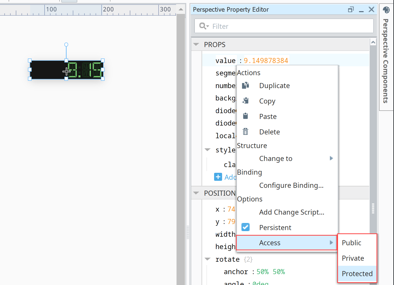
Restricting Access to Component Properties
In the example below, we used an LED Display component to restrict access on the components 'value' property. Restricting Access to Component Properties
-
In the Property Editor, select the property you want to restrict access on.
-
Right-click on the property, select Access and choose the restriction level: Public, Private or Protected.
-
Once the restriction access is configured, the Property Editor will place one of three badges on any non-public property: Private
 , Protected
  , and System
  .
.
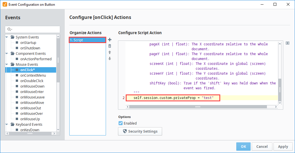
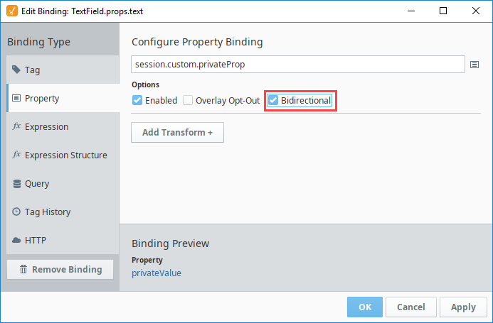
Writing to Private or Protected Session Property
To write to a Private or Protected session prop, you can write to it through a scripting action.
You can also use a property binding to write to a Private or Protected session prop. Remember to enable the bidirectional option.
Persistent Properties
By default, component properties and their values are saved with the project. Meaning that a property in a Perspective Session will initialize with a value matching the last saved value. This is why you can create a label with a static text value, save, and then see the same text value in the session. These properties are considered Persistent.
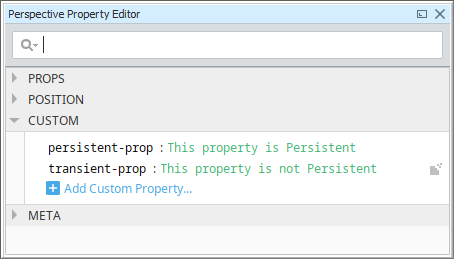
Conversely, properties can be configured to not retain their value in the session, meaning they'll initialize without a value. These properties are not Persistent. These properties are denoted by the Transient  icon to the right of the property's value in the Property Editor.
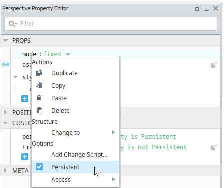
Changing the Persistent state of a property can easily be accomplished by right-clicking on a property in the Property Editor, and toggling the Persistent option.
Persistence and User-Created Properties
User created properties missing the Persistent flag will not be saved in your project. Meaning, properties that are both user-created and not flagged as Persistent will be lost once the view containing the property is closed in the designer (not just the value, but the property itself), regardless of whether or not the project was saved. This is also true for launching a session, as the user created property that is not Persistent will not be present in the session.
The one exception to this rule is if a binding was configured on the property. Binding configurations are always saved along with the component, and will execute in the session. The existence of a binding on a property will result in the property being re-created in the session.
Bindings and Persistence
When configuring a binding on a property, the property will automatically be configured to not persist. The idea being that properties with bindings generally don't need to save their value along with the view: when a view is opened, all bindings will need to evaluate on startup, which means the last saved value on the property is likely to differ from the result of the binding.
Imagine a table component, with a binding on the table's data property. In most cases, you'll likely want the data in the table to be generated in the session from the binding, retrieving the most update-to-date results. In this case, it doesn't make sense to persist the dataset in the table along with the table, as it's just extra data that will quickly be replaced by the binding at runtime.
Bound properties default to a non-persistent configuration, but sometimes this isn't desirable. For example, Embedded View components have an empty state when their "path" property is blank. When a binding is placed on the path property, opening the parent view will result in the Embedded View quickly transitioning between the empty state and the loaded view, which can cause an undesirable "flash" as the binding evaluates. This can be prevented by configuring the property as Persistent, and configuring an initial path for the Embedded View (which can lead to an empty placeholder view), allowing for a controlled transition.
Custom Properties
User-created properties may be added to any property category such as the Props, Position, Custom and Meta Property Categories to enhance functionality. The Custom Category was designed as an ideal location in the Property Editor for users to create their own custom properties. These Custom properties allow components to store additional values which can be accessed by bindings and scripts. They are also important for passing parameters from one view to another.
Creating Custom Properties
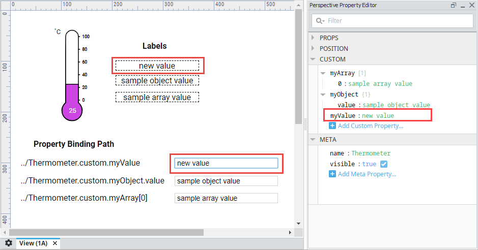
In the following example, we used the Thermometer component to add some custom properties in the Custom category.
-
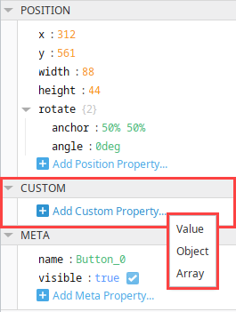
Custom Properties are created by clicking on the "Add Custom Property..." link, or by right clicking on a property in the Property Editor to bring up the Action Menu. There are three property types to choose from: Value, Object, and Array.
-
Several custom properties were created under Custom in the Property Editor showing each of the different property data types (i.e., value, object, and array).
-
In the image below, next to the Thermometer, three Text Fields were added to a view to write to each of the different custom properties in the Thermometer. Each of their binding paths are listed next to the fields which are bound to the same custom property so you can see the difference when the values changes on the labels.
Meta Properties
Meta properties are defined by the Perspective Module itself for common things like the component’s name, and if the component is visible. Every Perspective component features Meta Properties. Each property under this category is listed below.
| Name | Description | Data Type |
|---|---|---|
| name | Name of the component used when navigating tree paths by name. | value: string |
| visible | Whether or not the component should be visible. | value: boolean |
| tooltip | New in 8.1.10 When enabled, the component will display a customizable tooltip. See tooltip. | object |
| contextMenu | New in 8.1.25 When enabled, the component displays a context menu when right-clicked. See contextMenu. | object |
| domId | Hidden by default. When added to the Meta category on a component, allows you to set the DOM "id" of the output element. This property is intended for testing purposes only, such as using a framework like Selenium to test a page. | value: string |
| tabIndex | New in 8.1.39 Hidden by default. When added to the Meta category on a component, it allows you to set an integer value to establish the sequence in which each component will receive focus by tabbing through the contents of a page. | value: integer |
tooltip
| Name | Description | Data Type |
|---|---|---|
| enabled | If true, a tooltip for the component will display on hover or when requested by a script. | value: boolean |
| width | Display width of the tooltip. Expects either numerical value that represents a number of pixels, or a string. Expected strings can be either "auto" (which allows the tooltip to decide its own width), or a number and unit. For example: "60px", or "100pt". Default value is auto. | value: string |
| text | The message to display in the component tooltip. See Multi-Line Tooltips for more information. | value: string |
| style | Standard style object for the tooltip. See Style Reference. | object |
| delay | Time, in milliseconds, to wait before the tooltip is displayed when requested or when the component is hovered over. A value of 0 results in immediate display. | value: numeric |
| sustain | Time, in milliseconds, to display tooltip before removing it. A value of 0 results in the tooltip displaying until the mouse exits the component or removeTooltip() is called on the component. | value: numeric |
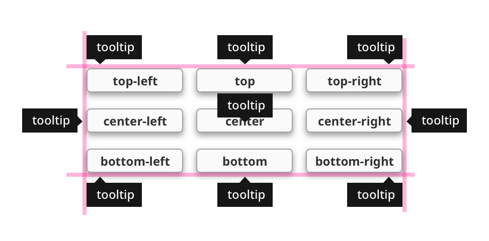
| location | The tooltip display location relative to the component. Valid values: mouse, top/center/bottom, top/center/bottom- right, top/center/bottom - left Tooltip locations are constrained by the available space, and will display with the following priorities:
 If the tooltip is too large to expand away from the component without leaving the viewport, the tooltip will still display at the configured location but may obscure the component. If the tooltip is too large to expand away from the component without leaving the viewport, the tooltip will still display at the configured location but may obscure the component. | value: string |
| tail | Enables a decorative triangle on the tooltip that points to the component. Ignored when location is mouse. | value: boolean |
contextMenu
| Name | Description | Data Type |
|---|---|---|
| enabled | Determines if the context menu for this component is on or off. If true, a context menu will appear when items are added. The context menu is disabled by default. | value: boolean |
| items | Adds items to configure and display in the context menu. See Context Menu Item Types below for more description on the type options. See items. | object |
| style | Standard style object for the context menu. | object |
items
| Name | Description | Data Type |
|---|---|---|
| text | Text to display on the context menu item. | value: string |
| icon | Configured icon to display before item text. Icons can be configured for all item types except separator. | object |
| style | Standard style object for the context menu item. | object |
| type | Selects the type of context menu item to display. Type options include submenu, link, method, message, and separator. | value: string |
Multi-Line Tooltips
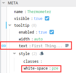
By default, the content in the meta.tooltip.text property is all rendered as a single line, only wrapping when text length exceeds the width. However it is possible to render text that spans multiple lines.

First, set add "white-space : pre" to meta.tooltip.style. Then, make sure the content of the meta.tooltip.text property contains multiple lines. This can be done by configuring an expression binding, and concatenating the items with "\n" characters:
"First Thing" + "\n" + "Another Thing"
Context Menu Item Types
| Item Type | Description |
|---|---|
| submenu | This item type will display child items when clicked or hovered over and when child items exist, a simple arrow > icon will be included after the parent item text. When selected, a children property will appear in the property editor that consists of the same item types and properties. |
| link | This item type will act like a link component, which allows users to specify a link to navigate to when clicked. When selected, a link property will appear containing url and target properties:
|
| method | When clicked, this item type will invoke a custom method defined on the component that the menu is enabled on. Any method defined here will become a custom method of the component the context menu belongs to. You may configure arguments to be passed into this custom method with the params object. When selected, a method property will appear containing name and params properties:
|
| message | When clicked, this item type will send a message with the given message type code, payload, and scope. This is allowed when specifying a configured message handler for a perspective session or perspective component, such as a toggle switch. When selected, a message property will appear containing type, payload, and scope properties:
|
| separator | This item type displays a non-interactable horizontal hard-rule to keep context menu items separate. |
The image below shows an example context menu configured on a Button component. The first item, menu-item, is a link type and includes a configured icon. Menu-item1 is a submenu type with a single child item, child-menu-item. A separator item type divides menu-item1 and menu-item2, which is a method type. This example demonstrates the context menu default style settings and you may notice different item type selections are not distinguishable in their default text display. Context menus can be further stylized in their entirety or within the individual item properties as desired.

Params
Params are a category of properties that are used when passing parameters from one view to another view. The properties inside of the params category define parameters that can be passed in and out of a view. It's through the use of parameters that views interchange information with other entities such as a docked view, embedded view, or a page. To learn more about using parameters to pass properties across views, refer to Property Bindings in Perspective.
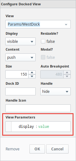
Docked View
When configuring a page, it's possible to pass a value to a docked view. When you click on a docked view, you can specifiy one or more param properties in the View Parameters field of the view that is docked. If you have any param category properties defined on that view, this interface allows you to pass a value when you navigate to the configured page. To learn more, go to the Docked Views page.
Embedded View
The embedded view component allows you to embed one view inside of another. The only way to pass a property across views is by passing a view parameter into an embedded view. Parameters can be defined as input, output, or both input/ouput. Once you have param properties configured on your views, the embedded view component provides you with access to these parameters. You have options on how to pass a property into an embedded view. How to set up passing a parameter depends on how you design your project. You can set up passing a property to an embedded view using a parameter with property bindings, Tag bindings, or even scripts. For more information on embedded views, refer to Pass a Property into an Embedded View Using a View Parameter and View Properties.
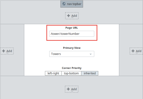
Page
Passing parameters to a Page essentially means passing a URL parameter to a page. Parameters are used to allow a page to be mounted at a dynamic URL, allowing information in the URL to be interpreted as input parameters to the page’s primary view. A primary view can see whatever parameters are passed in, and components inside the view can bind or use the values in some useful way.
The way you add parameters to the Page URL is by mounting the page at a special URL using a parameter replacement syntax like so: <page> /:towerNumber. The dynamic URL mounting uses a colon to signify that a portion of the URL is meant to by dynamic and map to an input parameter on the page’s primary view. To learn more, go to Passing Parameters to Pages) section.
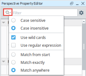
Search Filter
In the Property Editor search bar, you can search for component properties. Start typing in the search bar and the property list updates based on the text you enter. You can also set filter options to make the search case sensitive, or use wildcards, regular expressions, match from start, match exactly, and match anywhere.
Bindings
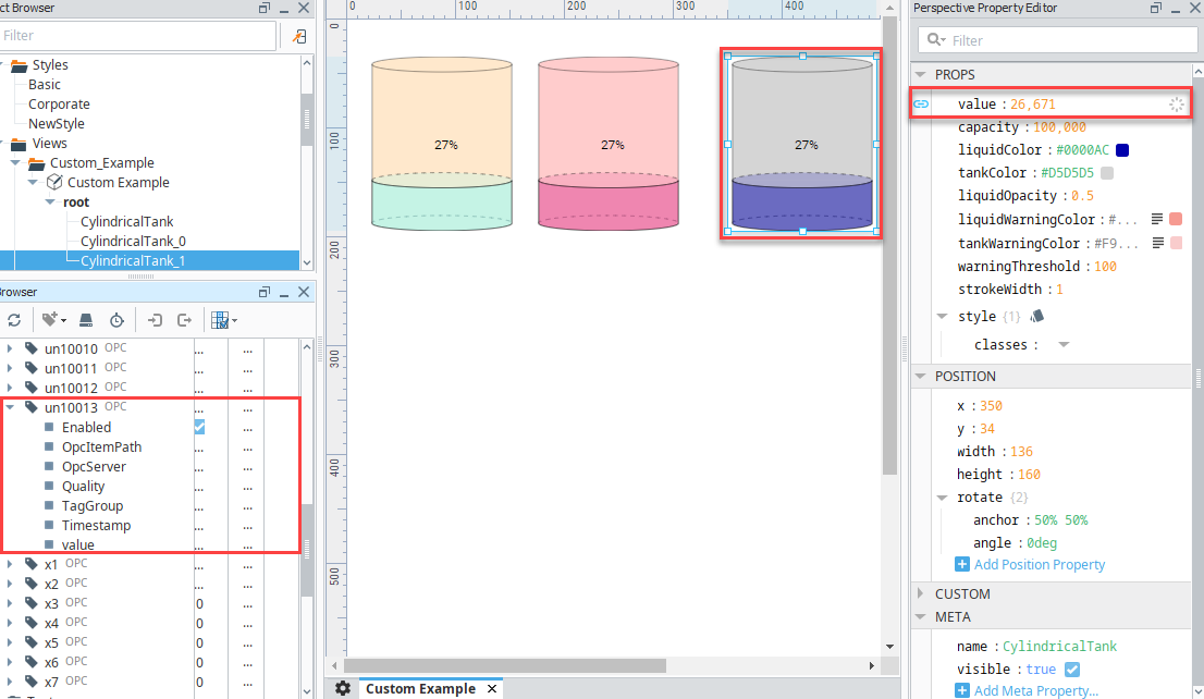
Most properties have binding options. For more information on bindings, see Types of Bindings in Perspective. The image below shows the properties in the Property Editor that are set on a Cylindrical Tank component. There are Binding  icons to the left of each of the properties that appear when you mouse over them. If you have a Cylindrical Tank on your view and click the Binding icon for the value property, it will open the Binding window and you can set what the Cylindrical Tank component is bound to. In this example, the value property of the Tank is bound to the un10013 OPC Tag.
Styles
A full menu of style options is also available for text, background, margin and padding, border, shape and other miscellaneous settings to adjust the appearance of your components. Style classes enable you to set up a particular look and feel (fonts, colors, borders, etc.) once and then apply it to multiple components.
Right-Click Menu
Right-clicking in the Perspective Property Editor brings up a number of items. These items are described below by section.
Actions
The Actions items provides a means to modify properties on a component such as deleting a property, or inserting a new property. Common utilities (i.e., copy, paste, duplicate) are available.
Structure
- Add Before: Allows you to insert a new property into the hierarchy before an existing one. It is only visible when right-clicking on an element in either an Array or Object.
- Add After: Allows you to insert a new property into the hierarchy after an existing one. It is only visible when right-clicking on an element in either an Array or Object.
- Insert: Allows you to insert a new property into the hierarchy. The "Add Before" and "Add After" Structure options in the Perspective Property Editor context menu are two unique items that are only visible when right-clicking on an element in either an Array or Object.
- Value: Allows you to change the type of the selected property to a Value, Array, or Object
Binding
The Binding section of items allows you to configure or manipulate existing bindings on a property. If any of the following are not current available options, they will not be visible selections. For example, if the clipboard does not contain a binding configuration, the menu won't display a Paste Binding option.
- Configure Binding...: Opens the binding configuration window, allowing you to add a binding to the clicked property.
- Copy Binding: Copies the binding configuration from the clicked property.
- Paste Binding: If a binding configuration was previously copied via Copy Binding, this option will paste the binding configuration on the clicked property.
- Disable Binding: Disables the binding on the clicked property.
- Remove Binding: Removes the binding configuration from the clicked property.
Options
- Add Change Script: Enables you to add a script that will be called whenever the value of the property changes. For more information, see Property Change Scripts.
- Persistent: Determines if the property is Persistent or Transient.
- Access: Allows you to restrict property access.