Perspective Design Tips
Designing mobile-responsive applications involves several considerations. Your design should work across a range of devices, from small smartphones to large desktops. While no single strategy fits every project, you can create a layout that adapts to different screen sizes based on your content and use case.
With devices ranging from smartphones to tablets, it's important to understand how your project displays across screen sizes. This page outlines key principles to consider when designing in Perspective. These guidelines can also support your organization’s internal design processes.
Before getting started, you may encounter terms like mobile optimized, responsive design, and user experience during project planning.
- Responsive design uses flexible layouts that adjust to any screen size.
- Mobile optimized means the layout is adapted for smartphones and tablets.
- User experience (UX) affects how users interact with your project, including performance, navigation, and visual clarity.
Start by defining clear goals. Identify the problem you're solving and understand your users' needs. Ask:
- What devices will users access the project on?
- Are they viewing data, entering data, or controlling equipment?
- What do components need to do?
- Should the project work offline?
Capture requirements early and observe workflows where possible. Requirements may evolve during the design process.
Designing for Mobile-Responsive Applications
Perspective supports both desktop and mobile design. Whether users are seated at a desk, walking the floor with a tablet, or responding to alerts remotely, your project should adapt to their environment.
Designing for multiple screen sizes early in the project is more efficient than adding support later. A responsive design adapts to different screen sizes without requiring multiple versions of the same project.
Responsive design is a layout strategy that dynamically adjusts the position and size of components. You can resize your browser window to see how a Perspective project rearranges its layout. On mobile devices, this happens automatically based on available space.
Understanding Views and Containers
Views and containers are the foundation of Perspective projects. They define how components are arranged and how your project behaves across devices.
- A view contains components and represents a logical unit of design.
- A container holds other components and defines a layout strategy.
Each container type responds differently to changes in screen size. Choose the container that best supports your layout goals.
Experiment with different container types to see how they respond when resized.
For more details, see the Perspective Containers section.
Design Principles
The following principles help you build effective designs across screen sizes.
Touch and Ergonomics
Mobile devices rely on touch input, so interactive elements must be easy to tap.
Use these general guidelines:
- Minimum touch target size: 25 px
- Optimal touch target size: 40 px
- Minimum spacing between elements: 10 px
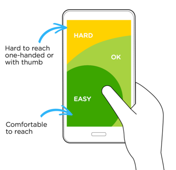
Also consider how users hold their devices. The thumb zone, or the lower center area of the screen, is typically easiest to reach. Place primary actions in this area. Place less-used or destructive actions where accidental taps are less likely.
Test your design on different devices and screen sizes. When possible, involve users in testing to get direct feedback.
Mobile-First Design Approach
Mobile-first design starts with smaller screens and builds upward. This approach helps prioritize essential features and space efficiency.
Benefits of mobile-first design:
- Better performance on smaller devices
- A single, consistent data model across platforms
- Lower long-term maintenance
Fluid Content
Fluid layouts provide a consistent experience across screen sizes. These layouts can be achieved with Perspective containers, which provide a way to organize and position components within a view. Using containers effectively helps avoid clutter on small screens and empty space on larger ones. Perspective containers help manage how components are arranged by:
- Building responsive layouts
- Reusing views across projects
- Adjusting content dynamically based on container size
Design for flexibility. Layouts should adapt without losing clarity or functionality.
Content as UI
Content and design work together to create an intuitive user interface.
To build a content-driven UI:
- Keep it simple
- Use consistent layout and spacing
- Apply common UI elements to build familiarity
- Use visual cues to indicate behavior
Think of content as part of the interface. Users should be able to understand what they see and how to interact with it.
Declutter
Avoid overwhelming users with unnecessary information. Too many elements reduce clarity and increase cognitive load.
Keep the interface focused:
- Display only essential content
- Use minimal UI elements
- Prioritize clarity and usability
A clean interface is easier to navigate, especially on mobile devices.