Styles
Perspective components have Style properties that enable you to customize the look and feel of components on the screen through various properties. These styles are based on Cascading Style Sheets (CSS), a style sheet language used for describing the presentation of a document or webpage. CSS is designed to enable the separation of presentation and content, including layout, colors, and fonts. The Perspective module uses the popular standard HTML5/CSS3 technology for its user interface (UI) layer.
Using CSS, the Perspective Style options for components are both detailed and flexible. Styles are used in multiple places, and components can accept style information from multiple sources. There are many CSS settings available through the user interface, they are described in the Style Reference.
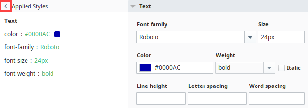
Properties Example
A group of Style settings can be saved together and given a name as a Style Class.
Style Editor
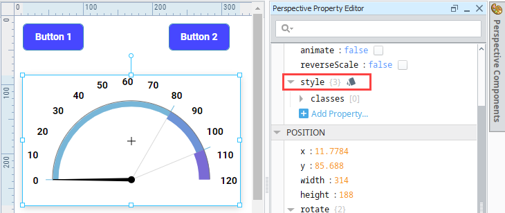
Wherever the style property and the Styles  icon appear in the Property Editor, you can click on the icon to display the style editor.
The following menus are available in the style editor:
- Text
- Background
- Margin and Padding
- Border
- Shape
- Misc
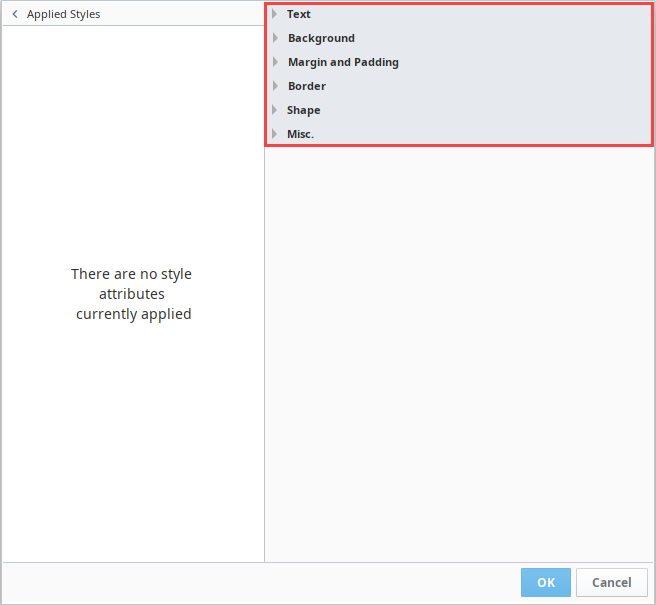
You can quickly make adjustments to the styles by clicking on them in the Applied Styles panel.
When you hover over a style listed in the panel, a Delete  icon is displayed. Click on it to delete the style.

If you made new edits to an existing style attribute, you can hover over the style and an Undo  icon is displayed. Click on it to revert to the previously saved setting.

You can minimize the Applied Styles panel by clicking on the Arrow  icon to the left of the name. Click the arrow again to reopen the panel.
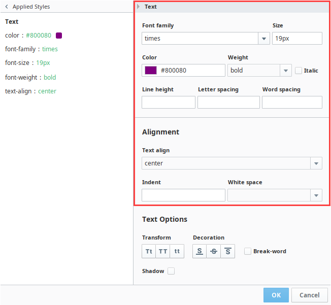
Expanding a category enables you to set the properties associated with it. Here is an example of the Style Editor with the Text menu expanded and a few options selected:
- color: #800080
- font-family: times
- font-size: 19px
- font-weight: bold
- text-align: center
Applying individual style elements to a component will overwrite the settings for the same style elements being applied from a Style Class.
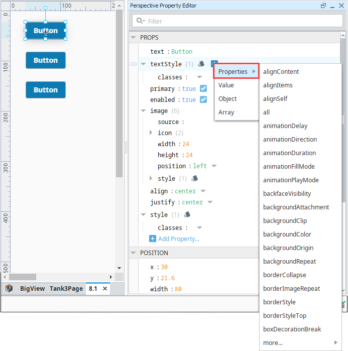
Some components can have multiple individual Style elements, with each one focusing on a different part of the component. When these styles have a conflict, the more specific style wins out, and sets the style for that particular property.
CSS Lengths
Styles, by default, make use of pixels (px) when it comes to length. However all CSS lengths are available and can be used by specifying the unit. For example, a font can be specified in points by appending the unit "pt". For example:
35pt
Creating a Style
-
In a coordinate view, drag a Gauge component and a Label component.
-
Select the Gauge component and click the Styles
icon in the properties for the component.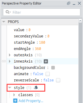
The style editor is displayed. Each of the pull down menus has options. These options are described in the Style Reference.
-
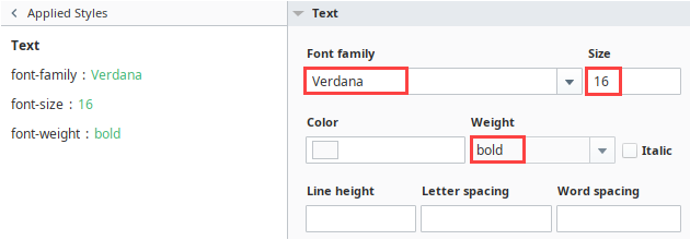
Click on the Text menu then set the following style options:
- Font family: Verdana
- Size: 16
- Weight: bold
As you select Style elements, they appear in Applied Styles column on the left.
-
Click OK.
-
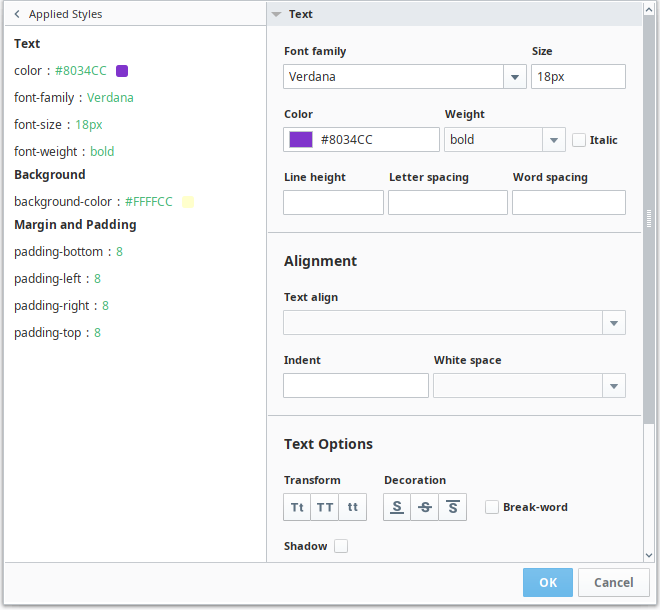
Next select the Label component and click the Styles
icon. -
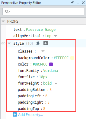
Expand the Text menu and set the following style options:
- Font family: Verdana
- Size: 18px
- Weight: bold
- Color: #8034CC
-
Expand the Background menu and set the following style option:
- Background Color: #FFFFCC
-
Expand the Padding menu and set the padding to 8 for all four sides.
-
Click OK to save the changes. You will notice those properties now appear in the components Style, letting you know that those particular elements have a style applied to them.