Perspective Built-In Themes
Themes
Perspective comes with several themes, providing initial styling to all components. The active theme in a session is determined by a session property. Specifically, session.props.theme found on the home screen of the Perspective workspace. Changing the value of this property in a Perspective Session will change the active theme for the session.
Initial Theme
Ignition installations come with the following themes:
- light
- dark
- light-warm
- light-cool
- dark-warm
- dark-cool
Theme Colors��
The built-in themes make heavy use of CSS variables for colors. For any of the default themes, colors are defined in the variables.css file. Defining your own variable is simple. Add a line with the following to the variables file:
--variable-name: #FF0000;
Be aware that changes made to the built-in theme files will be replaced on Gateway start up (including restarts caused by a Gateway Restoration) and moved to a backup folder on upgrade. As a result, it is highly recommended that you create a custom CSS file that can then be imported into the entry point CSS files.
For more information, see the markdown README file located in the Gateway's installation directory: %installDirectory%\data\modules\com.inductiveautomation.perspective\themes\README.md
Using Theme Colors
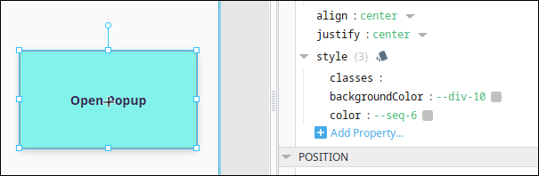
Theme colors can be used on components by simply providing the variable name. For example, we can change the backgroundColor and color of a button component by just stating the variable name for the appropriate styling properties on the component's style object.
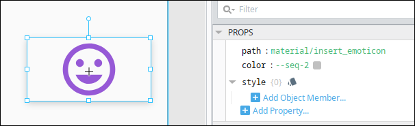
If a component has a color property outside of a style object, such as the Icon component, the same rules apply; simply set the value of the color property to the name of the variable.
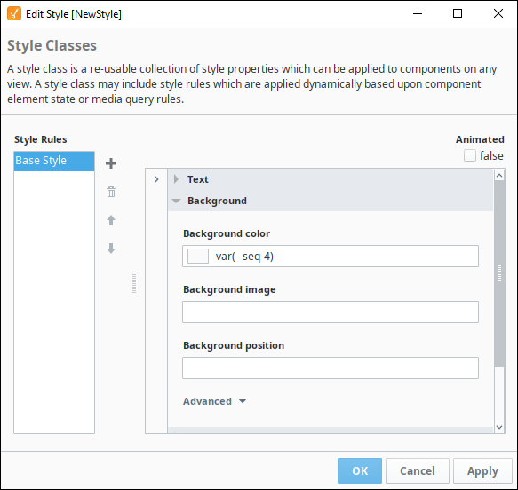
Style Classes
When using a Theme Color in a Style Class, the variable must be wrapped in the var() method, as shown below.
Built-in Theme Colors
The following color swatch represents the built-in color variables for each IA provided theme.
| light | light-cool | light-warm | dark | dark-cool | dark-warm | |
|---|---|---|---|---|---|---|
| --neutral-10 |
|
|
|
|
|
|
| --neutral-20 |
|
|
|
|
|
|
| --neutral-30 |
|
|
|
|
|
|
| --neutral-40 |
|
|
|
|
|
|
| --neutral-50 |
|
|
|
|
|
|
| --neutral-60 |
|
|
|
|
|
|
| --neutral-70 |
|
|
|
|
|
|
| --neutral-80 |
|
|
|
|
|
|
| --neutral-90 |
|
|
|
|
|
|
| --neutral-100 |
|
|
|
|
|
|
| --seq-1 |
|
|
|
|
|
|
| --seq-2 |
|
|
|
|
|
|
| --seq-3 |
|
|
|
|
|
|
| --seq-4 |
|
|
|
|
|
|
| --seq-5 |
|
|
|
|
|
|
| --seq-6 |
|
|
|
|
|
|
| --div-1 |
|
|
|
|
|
|
| --div-2 |
|
|
|
|
|
|
| --div-3 |
|
|
|
|
|
|
| --div-4 |
|
|
|
|
|
|
| --div-5 |
|
|
|
|
|
|
| --div-6 |
|
|
|
|
|
|
| --div-7 |
|
|
|
|
|
|
| --div-8 |
|
|
|
|
|
|
| --div-9 |
|
|
|
|
|
|
| --div-10 |
|
|
|
|
|
|
| --div-11 |
|
|
|
|
|
|
| --div-12 |
|
|
|
|
|
|
| --div-13 |
|
|
|
|
|
|
| --div-14 |
|
|
|
|
|
|
| --div-15 |
|
|
|
|
|
|
| --div-16 |
|
|
|
|
|
|
| --qual-1 |
|
|
|
|
|
|
| --qual-2 |
|
|
|
|
|
|
| --qual-3 |
|
|
|
|
|
|
| --qual-4 |
|
|
|
|
|
|
| --qual-5 |
|
|
|
|
|
|
| --qual-6 |
|
|
|
|
|
|
| --qual-7 |
|
|
|
|
|
|
| --qual-8 |
|
|
|
|
|
|
| --qual-9 |
|
|
|
|
|
|
| --qual-10 |
|
|
|
|
|
|
| --callToAction |
|
|
|
|
|
|
| --callToActionHighlight |
|
|
|
|
|
|
| --callToAction--hover |
|
|
|
|
|
|
| --callToAction--active |
|
|
|
|
|
|
| --callToAction--disabled |
|
|
|
|
|
|
| --error |
|
|
|
|
|
|
| --info |
|
|
|
|
|
|
| --infoSecondary |
|
|
|
|
|
|
| --warning |
|
|
|
|
|
|
| --warningSecondary |
|
|
|
|
|
|
| --success |
|
|
|
|
|
|
| --indicator |
|
|
|
|
|
|
| --indicatorOff |
|
|
|
|
|
|