Creating and Using Custom Perspective Themes
Theme Overview
Themes help customize the look of components in your Perspective Sessions, acting as a foundation from which you can customize components even further using Style Classes. Perspective has some default themes already, which you can learn about on the Perspective Built-In Themes page.
By default, themes are stored as cascading style sheets (CSS) in %installDirectory%\data\modules\com.inductiveautomation.perspective\themes. Default themes use CSS variables for colors, which are defined in the variables.css file of every theme's folder.
In some cases, the default themes may not meet your requirements. For these situations, you can create a custom theme.
Creating a Custom Theme
-
Open a text editor, such as Notepad or Notepad++, as an administrator. Opening the text editor as a standard user may result in your operating system blocking you from saving your file to the themes folder.
-
Save the text file as a .css file in the themes directory, and give it a name. In this example, we are naming the .css file "
myTheme".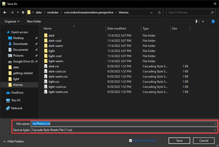
-
After you save the file, add the following line as the first line of the new .css file:
@import "./light/index.css";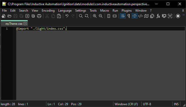
This will import the properties of the
light.cssfile into your new .css file, acting as a base for your custom theme. You can change which .css file you want to reference by changing the folder name to another existing folder (such as@import "./dark/index/css";)noteReferencing and importing settings from existing themes is recommended over directly referencing .css files. Many of the required .css files are nested deep within the various themes folders. Importing will allow you to skip over a few steps, reducing the chance of problems arising.
-
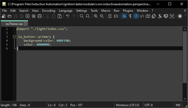
Once you add the initial import line, you can start adding your own changes to your custom theme file. In this example, we are using the default settings imported from the
light.csstheme, with the only changes being the background color and text color for all button components..ia_button--primary {
background-color: #00FF00;
color: #000000;
} note
noteIf you need a reference for all available Perspective component CSS class names, you can reference the various .css files located at
%installDirectory%\data\modules\com.inductiveautomation.perspective\themes\light\common. -
After you make your desired theme changes, save the .css file.
Using Your Custom Theme
To use your custom theme, select it from the Session Properties in the Designer using the theme property. You can select your custom theme from the dropdown menu. Keep in mind that changes made to the theme property will become active only after a Gateway restart.
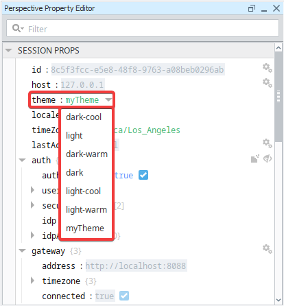
Once you select your custom theme and restart your Gateway, your components will change appearance according to your .css file.

There are some cases in which custom themes aren't enough to get your desired look. You can get around this by using Style Classes to fine-tune your components.