Working with Perspective Components
Components give you flexibility in designing HMI and SCADA that reflect your company's design and your site's layout. Components represent widgets you deal with every day: buttons, text areas, dropdowns, charts, gauges, linear displays, and so on. The Perspective Module comes with a host of built-in components that you can select from for use in your project. There are many ways to manipulate and arrange components when working in the Designer.
This section introduces you to how to work with components so you can learn how to quickly select, move, resize, duplicate, and customize components during the design process. Properties and specifics for individual components are covered in the Appendix.
Component Categories
Components are separated into the following categories in Perspective:
- Chart - Charts allow you to display and show off your data in a graphical way.
- Container - Containers provide a way of laying out and organizing components within a view.
- Display - Display components display static and dynamic information.
- Embedding - Embedding components can be embedded in multiple views of a project.
- Input - Input components enable users to enter data, or select data, and even control a device.
- Navigation - Navigation components provide you with design strategy options to navigate within a Perspective session.
Component Properties
Properties on Perspective components are separated into categories.
- Props - Properties that control the configuration and provide the runtime data for the component. See individual Perspective components for a list of the properties and their descriptions.
- Position - Properties defined by the component’s parent container which control the location of the component. The available properties listed under this category depend entirely the container type that the component is placed in.
- Custom - Custom properties defined by the designer for each component instance.
- Meta - Properties defined by the Perspective Module itself for common things like the component’s name. See Meta Properties on Perspective Components.
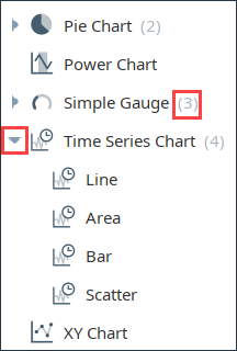
Variants
When a component has variants, a number appears next to its name or thumbnail image. Click the arrow to the left of the component to view a dropdown menu of variants. Refer to Perspective Components for information about individual components.
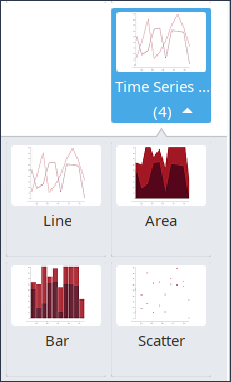
List View vs Tile View
As of release 8.1.2 there are two options for viewing Perspective Components in the Designer. Click on the List View  icon to see components listed just by category and name. Click on the Tile View icon to see the components listed by category and thumbnail icon. The following image shows the Tile View
  of the variants for the Time Series Chart component.
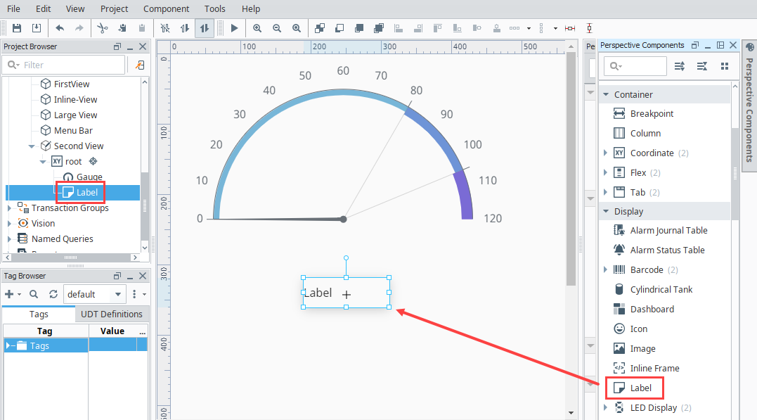
Adding Components
To add a component, open the Perspective Components palette. Click on the component you want (or click on a variant of the component) and drag it onto your view. In this example, we put a Label component under the Gauge component.
Selecting Components
Mouse Selection
Using the mouse is the most common way to select components, where a single click on a component selects it and double clicking Deep Selects it.
You can also select components by clicking and dragging the mouse to draw a selection rectangle. If you drag the window left-to-right, it will select all components that are completely contained within the rectangle. If you drag the window right-to-left, it will select all components that the rectangle touches. Lastly, you can start dragging a window selection and then hold-down the Alt key to use touch selection. This will draw a line as you drag, and any components that the line touches will become selected. As you're using these techniques, components that are about to become selected will be given a yellow highlight border.
Tree Selection
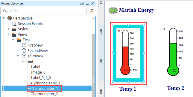
By selecting nodes in the Project Browser tree you can manipulate the current selection. This is a handy way to select the current view, the root for the container, and any components on the view. This is also the only way to select components that are invisible.
Deep Selection
Perspective makes great use of its many containers to help create a layout and design to fit any scenario on any device. To accommodate this, components sometimes need to be nested within a series of containers, which are themselves nested in other types of containers. With this comes a true tree of components, and selecting components nested inside containers works differently than components on the root. Deep Selection allows you to select into a container and select a component within.
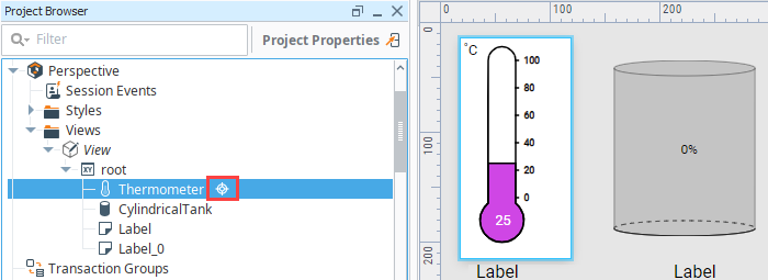
To deep select a component, double-click on it. Three things happen to indicate you have deeply selected into the component and not just selected the component itself:
- The border of the component changes to a thick solid line that can't be manipulated.
- The surrounding area darkens.
- In the Project Browser, a Deep Selection
 icon appears next to the component.
Once inside this new deep selection space, you can then select a component much like before, either by clicking or dragging to select components, or by deep selecting into another container inside the original container.
In addition to double-clicking a component, you can use a single-click while holding the Alt and Shift keys to enable deep selection. For the Button, Label, Checkbox, and Toggle Switch components deep selection also enables inline text editing.
To cancel the deep selection, click anywhere outside of the component.
Select Through
When working with nested containers, Alt + left clicking on a component in a container will select the clicked component, and automatically deeply select the component's parent container. This can save time compared to first deeply selecting the container, and then selecting the component.
Select View
Right-Click Menu
When working with components in the Designer, you can right-click to get quick access to options.
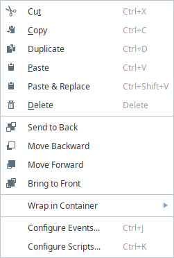
The top portion of the menu is similar to an edit menu in that it provides much of the basic copy/paste functionality
| Function | Icon | Description |
|---|---|---|
| Cut |  | Removes the selected component but keeps a copy on the clipboard. You can also use the Ctrl-X shortcut to quickly cut a component. |
| Copy |  | Copies the selected component to the clipboard. You can also use the Ctrl-C shortcut to quickly copy a component. |
| Paste |  | Pastes the current contents of the clipboard. Does not paste over and replace components. You can also use the Ctrl-V shortcut to paste. |
| Duplicate |  | Duplicates the selected item (essentially a fast copy and paste action). Components can also be duplicated by dragging them and holding down the Ctrl key. You can also use the Ctrl-D shortcut to quickly duplicate a component in place. |
| Delete |  | Deletes the currently selected component. This can also be done using the delete key. |
| Paste & Replace | | Pastes the current contents of the clipboard over the currently selected component and replaces it. You can also use the Ctrl-Shift-V shortcut to paste over. |
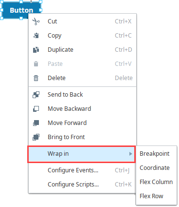
Z-order
The next section of the right-click menu contains options or setting the z-order of components. The z-order is the order in which two-dimensional objects are stacked, for example shapes in a graphic that overlap each other. In Perspective, z-order defines relative order of components when they overlap. There are four z-order icons and actions that will reorder any selected components.
| Function | Icon | Action |
|---|---|---|
| Send to Back |  | Move the selected components to the back of the z-order. |
| Move Backward |  | Move the selected components backward in the z-order relative to any overlapping components. |
| Move Forward |  | Move the selected components forward in the z-order relative to any overlapping components. |
| Bring to Front |  | Move the selected components to the front of the z-order. |
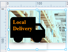
In the following example, we have an image component with a photo of a warehouse, an icon, and a label. We placed an icon (the truck) and a label "Local Delivery" on the view as well, and then set the z-order so the label is on top, the truck icon is in the middle, and the image in the background.
Wrap in Container
Modify Source View
This option only appears in the list after right clicking on an embedded view component or flex repeater component. Selecting this option will take you to the source view's configuration in the designer.
Configure Events
The Configure Events option takes you to the Event Configuration page where you can set up actions for the component based on events such as a mouse click or key press. For complete information, see Component Events and Actions.
Configure Scripts
The last option is Configure Scripts, which takes you to a Script Configuration page where you can set up Custom Methods Custom Methods and Message Handlers on the component.
Manipulating Components
Manipulating components can be done with both the mouse and the keyboard. You can move components around, resize them, and rotate them.
Moving
To move the component, click on it once then drag it anywhere within the container's bounds.
Resizing
When you click on the component you want to resize, you'll see eight handles displayed around the edge of the selection. When you click on a handle, the mouse cursor will change to a two-way arrow. Use the mouse to drag the handle and change the size of the component. You can also select multiple components and resize them together. To resize around the center of the current selection, hold down Shift.
You can also resize the current selection using the keyboard. To nudge the right or bottom edge of the selection in or out, use Shift combined with the arrow keys, which resizes by the nudge distance, which defaults to one pixel at a time. To nudge the top or left edge of the selection, use Ctrl-Shift combined with arrow keys.
Aligning
New alignment tools are available in the Perspective Designer Toolbar. These tools allow easy alignment of selected components within a Coordinate container including align top, bottom, left, right, as a row, and as a stack. Align as row, and align as stack include a normalize version, that adjusts the size of the selected components to match the component that was selected first. Rotated components being aligned will correctly align along the top-most, bottom-most, left-most, right-most point of the rotated component. If a rotated component is being normalized is within the group that is being aligned, normalizing the component will adjust the pre-rotated dimensions.
These tools can only be used with components in a Coordinate container.
| Icon | Function | Description |
|---|---|---|
 | Align Left | Align the left edges of a group of components. |
 | Align Right | Align the right edges of a group of components. |
 | Align Top | Align the top edges of a group of components. |
 | Align Bottom | Align the bottom edges of a group of components. |
 | Align Centers Horizontal | Aligns all of the selected components horizontally on their centers. |
 | Align Centers Vertical | Aligns all of the selected components vertically on their centers. |
 | Align as Row | Aligns all of the components on their centers as a row, and will add padding between them that you can select. |
 | Align as Row and Normalize | Aligns all of the components on their centers as a row, and changes the size of all of the components to the first selected component. If a rotated component is within the group that is being aligned, normalizing the component will adjust the pre-rotated dimensions. |
 | Align as Stack | Aligns all of the components on their centers as a stack, and will add padding between them that you can select. |
| Align as Stack and Normalize | Aligns all of the components on their centers as a stack, and changes the size of all of the components to the first selected component. If a rotated component is within the group that is being aligned, normalizing the component will adjust the pre-rotated dimensions. |
 | Center Horizontally | Centers the currently selected components horizontally. |
 | Center Vertically | Centers the currently selected components vertically. |
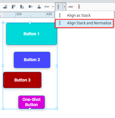
Align and Normalize Example
In the following example, we have a stack of buttons that are various sizes. We want to align them, stack them with equal space in between them, and make them all the same size.
-
Select the buttons, then choose Align as Stack and Normalize.
-
Enter a padding distance in pixels. We use 8px for this example.

-
Click OK. The buttons will be stacked and normalized.

Alignment Guides
When you drag a component near another component in a container, Alignment Guidelines appear to help you better align your elements.
-
A dashed red line will appear to guide alignment to the center of the components or to the right or left edge, depending on where you drag.
-
A solid red line indicates distance, in pixels, between components.
The Designer also has Vertical and Horizontal guide that can be set up to help you align components. For more information, see Vertical and Horizontal Guides.
Alignment Guides Example
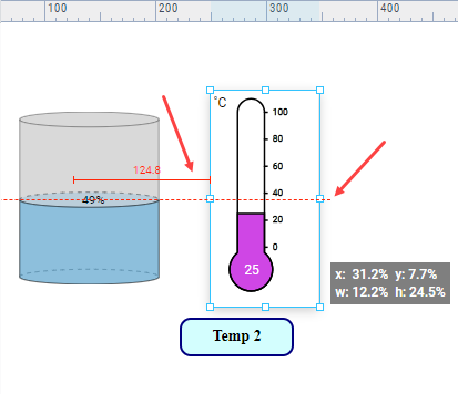
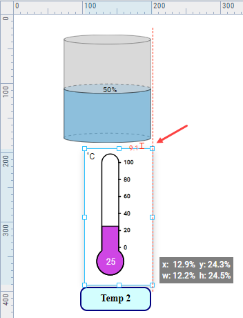
In the following example we've added a Label component beneath a Cylindrical Tank component. I want to align the label so that it is centered with the center line of the tank.
-
Drag the Label component underneath the Cylindrical Tank component. As the Label component approaches another component, you'll see Alignment Guides appear.
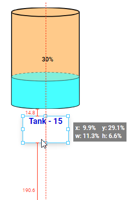
Now the starting edge of the Label is aligned with the center of the Cylindrical Tank. But we want the text to be centered under the tank.
-
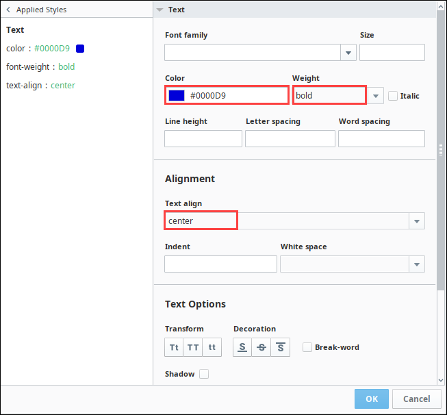
Select the Label component and click the Modify Style
 icon next to the style property.
 -
Expand the Text settings. Set the color to blue, the font weight to bold, and the text align to center.
-
Click OK to save the style settings.
-
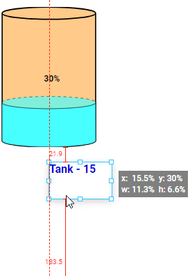
Now the text is centered in the Label component. Drag the Label component underneath the Cylindrical Tank component again. You'll see Alignment Guides appear.
-
Stop dragging when the Label is centered under the Cylindrical Tank.
Rotating
Components place on coordinate containers can be rotated. The Rotate property is located on Position Properties section of the Perspective Property Editor. For a definition of all the position properties see the individual container pages. Rotated components being aligned to other components will correctly align along the top-most, bottom-most, left-most, right-most point of the rotated component.
There are two ways to rotate a component:
- Enter a rotation angle in the props.rotate.angle property.
- Grab the rotation handle on the component and drag it with your mouse until the component is rotates as you'd like.
The rotation anchor sets the point of rotation around which the component will be rotated.
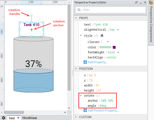
If a component is smaller than 28px by 28px, the rotation handle and anchor + symbol are not displayed. Use the property editor to set rotation and anchor properties in this case.
Rotation Examples
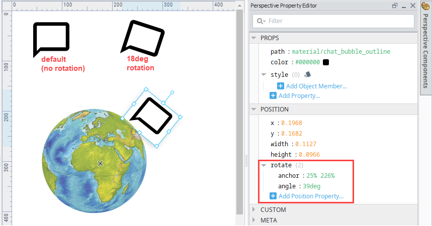
Example 1
The following example shows icon component at default (no rotation), at 18 degrees rotation, and then at 39deg rotation with the rotation anchor (point of rotation) placed over the earth image. In the latter, the icon has a better angle in relation to the earth graphic.
Example 2
If a rotated component is within the group that is being aligned, normalizing the component will adjust the pre-rotated dimensions. The component on the left of the following image are not aligned but were resized at some point. The components on the right show what they look like after align stack and normalize.
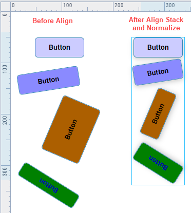
Image Source
Many components in Perspective contain a image.source property, that allows you to show an image on the component. The property expects a URL to the image, which can either be on the internet or something that is stored on the Gateway. For example, here is a Button component with an image:

Web Address
Simply enter the wed-address for the image you wish to display. Both raster images and SVGs can be displayed via this method.
Image Management
Images stored in Image Management are available at http://{your gateway's IP address}:{your gateway's port}/system/images/{path to your image}.
http://gatewayIpAddress:8088/system/images/Builtin/icons/24/lightbulb_on.png
For additional information on using images in Perspective, see Images and Icons in Perspective.
Bypassing Browser Cache
Some Perspective components serve as wrappers for instances of a Chromium browser, which comes with powerful features like being able to make HTTP GET requests to any domain on the internet. Since this occurs inside of your web browser, it's important to pay attention to the browser cache and how it might affect interactions with other webservers.
For example the Inline Frame component will render the result returned from HTTP GET requests inside of an instance of Chromium embedded in your View. If you wanted to use an iFrame to render a PDF file you had hosted on a remote webserver, you would plug the URL to the PDF into the iFrame src property and the iFrame would render the file.
However, if you later realize you uploaded the wrong version of the file to the webserver, you may notice that uploading a new version with the same file name will not change the rendered file in your iFrame component. This is a result of the HTTP Cache in action. You can fix this issue by clearing the cache or renaming the file and updating the src property in the Designer to point to the new URL. In cases where neither of these fixes are an option, you can alternatively bypass the cached resource and pull in the new file using an Expression binding on the src property. This is accomplished in the following expression:
'http://YOURURL?timestamp=$' + floor(toMillis(now())*0.00001)
Make sure to replace YOURURL with the relevant webserver address. This example will update once every 100,000 milliseconds. Adjust the 0.00001 value in the expression to an update rate that works for you.