Perspective Designer Interface
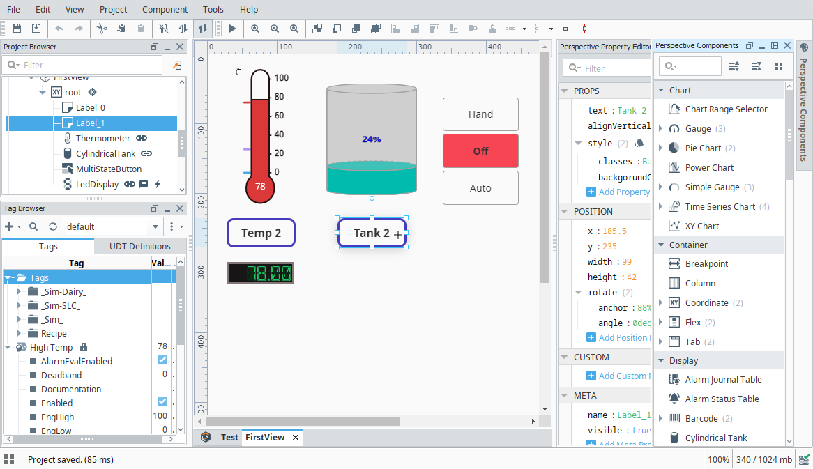
The Perspective Designer Interface includes a number of panels and menus containing functionality that allow you to design and build your project. The Perspective Designer Interface has several basic panels that are used for specific objects such as the Project Browser and Tag Browser. The Project Browser panel allows you to view the different Designer Spaces and their component hierarchies at a glance as you design and build your project, while the Tag Browser panel allows you to browse tags in the Designer and OPC server as well as create new tags. Some of the menus, like the File Menu and Help Menu, are shared throughout the Designer, and some are specific to certain objects that will only be displayed when an object of that type is selected.
There are many dockable and draggable panels that surround the workspace, as well as the familiar menu bars and toolbars. The default panels include: Component Palette, Property Editor, Project Browser, and Tag Browser. The dockable panels can be rearranged as you wish and will snap into place as you move them around the screen. Each workspace remembers its layout, which is the docking arrangement of the panels around it.
If you closed a panel and want to get it back, re-enable it from the View > Panels submenu. To reset the user interface back to its default arrangement, go to View > Reset Panels or click the Panel Chooser  icon in the lower left corner of the window and select Reset Panels.
Perspective Menubar
There is a menubar at the top of the Designer that provides functionality that you can interact with when working in the Perspective workspace. Each menu has a host of functions as it relates to that menu. The other menus that are shared between Vision and Perspective are discussed in the General Designer Interface.
File Menu
See General Designer Interface.
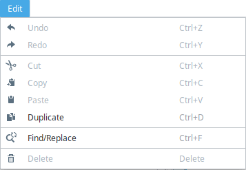
Edit Menu
The Edit Menu is similar to other applications edit menus in that it provides much of the basic copy/paste functionality. You can also right-click on an item in the browser to access this menu.
| Function | Description |
|---|---|
| Undo and Redo | Can be used to revert to the previous state, essentially removing the last change, or redoing it again after having been removed. This has a large queue that can be traversed, but does not include every change (i.e., Tag edits cannot be undone). |
| Cut/Copy/Paste/Duplicate | These functions perform similarly to most software applications.
|
| Find/Replace | Brings up the Find and Replace interface to allow you to find specific objects within the project. See Find and Replace for more information. |
| Delete | Deletes the currently selected component. This can also be done using the delete key. |
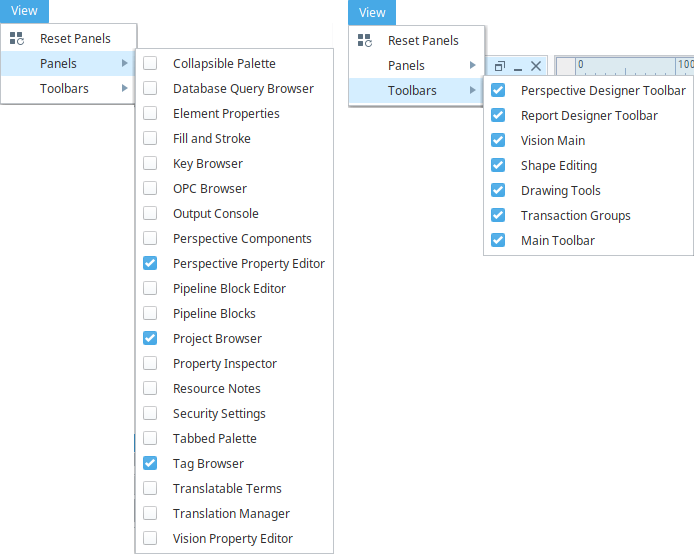
View Menu
The View Menu enables you to control the display of panels and toolbars in the Designer.
| Function | Description |
|---|---|
| Reset Panels | Resets the Panels in the Designer so that they are in the default configuration. |
| Panels | A list of all the available Panels for the Designer in Perspective. Select the checkbox next to the Panel name to display that panel. Panel options include the Perspective Property Editor, Project Browser, Tag Browser, and Perspective Components, among others. |
| Toolbars | A list of all the available Toolbars for the Designer in Perspective. Select the checkbox next to the Toolbar name to display that toolbar. Toolbar options include the Perspective Designer Toolbar, Drawing Tools, Shape Editing, and Main Toolbar, among others. |
Project Menu
See General Designer Interface.
Component Menu
The Component Menu provides links to the Event Configuration and Script Configuration screens where you can add events, actions, and message handlers to individual components.

| Function | Description |
|---|---|
| Configure Events... | Displays the Event Configuration screen. For more information, see Perspective Events and Actions. |
| Configure Scripts... | Displays the Script Configuration screen. For more information, see Component Message Handlers. |
Tools Menu
Perspective's workspace makes use of the general Tools Menu options. However, the Launch Project item holds several unique sub options.
| Function | Description |
|---|---|
| Launch Session | Launches the current project, using the system's default web browser. |
| External Debugger | Opens Dev Tools, via the designer's JxBrowser, inspecting whichever view was currently being viewed in the designer. |
| Copy Debug URL | Copies the URL used by the External Debugger. This can be useful in cases where Dev Tools is having trouble starting via the External Debugger option. Note: As of version 8.1.37, the option to copy the debug URL has been removed. |
Help Menu
See General Designer Interface.
Perspective Toolbar
The Perspective Toolbar contains shortcuts to options from the menubar as well as options to set the z-order for components.

| Icon | Function/Description |
|---|---|
 | Save all outstanding project changes in Ignition Gateway. |
 | Merges any new changes on the Gateway into the open project. |
 | Undo the last action. |
 | Redo the last undo action. |
 | Cuts the current selection into the clipboard. |
 | Copies the current selection into the clipboard. |
 | Pastes the current selection into the clipboard. |
 | Gateway communication such as queries and tag subscriptions disabled. |
 | Read-only communication operations such as SELECT queries and tag values allowed. |
 | Full read-write Gateway communication allowed |
  | Toggle the active view between Preview mode and Design mode. Design mode is the default mode where you can manipulate components and adjust their properties. In Preview mode, you are interacting with a "live" version of the view. Property bindings and event handlers will run just like in the Session. |
 | Zoom into the currently open window. |
 | Zoom out of the currently open window. |
 | Zoom reset to 100%. |
 | New in 8.1.10 Toggles the component selection tool, allowing the mouse to select and interact with components. Disabled when a container other than a coordinate container is deeply selected. |
 | New in 8.1.10 Toggles the Pipe Draw Tool, allowing the mouse to draw pipe connections. Disabled when a container other than a coordinate container is deeply selected. |
 | New in 8.1.10 Toggles the Pipe Move Tool, allowing the mouse to move existing pipes. Disabled when a container other than a coordinate container is deeply selected. |
 | Move the selected components to the back of the z-order. |
 | Move the selected components backward in the z-order relative to the overlapping components. |
 | Move the selected components forward in the z-order relative to the overlapping components. |
 | Move the selected components to the front of the z-order. |
The remainder of the icons on the Perspective toolbar are for aligning components. See aligning for more information.
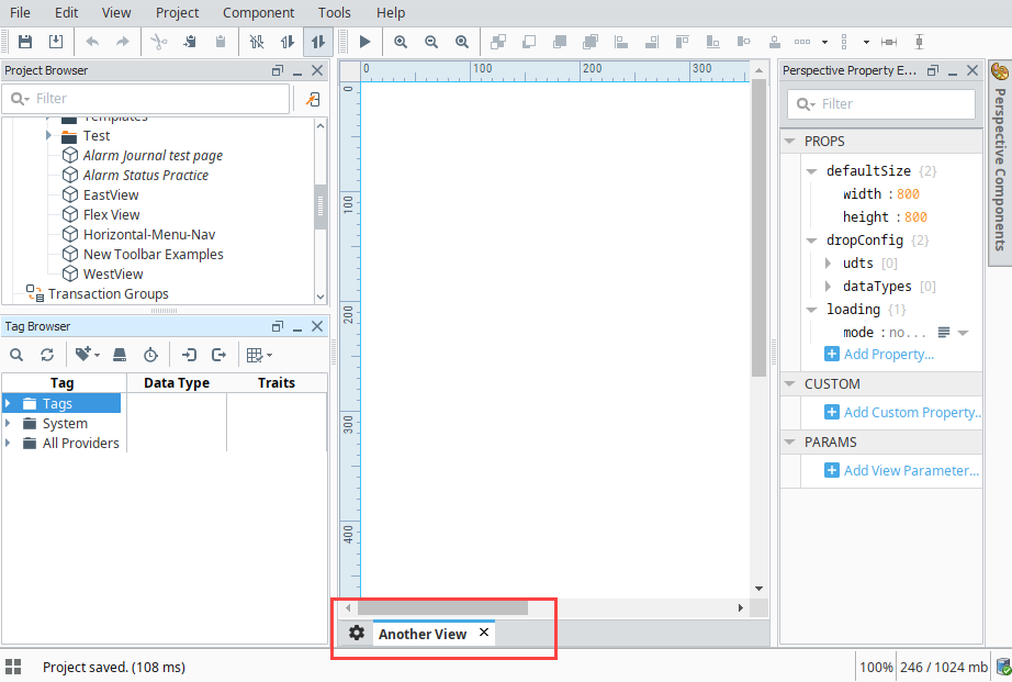
Resource Tabs
The Resource Tabs allow you to change which resource is being edited in the workspace, as well as navigate to the Settings  area of the Perspective Workspace.
Right-Click Menu
The right-click menu provides multiple ways to close one or more views.
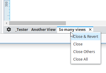
| Option | Description |
|---|---|
| Close & Revert | Closes the selected view, and reverts any changes that have been made, but not yet saved. This option should only be used when you wish to lose any changes made to the view. |
| Close | Closes the selected view, and commits changes (meaning changes will be retained in the designer session). |
| Close Others | Closes all views except for the view selected. Changes made to the views are committed. |
| Close All | Closes all views. Changes made to the views are committed. |
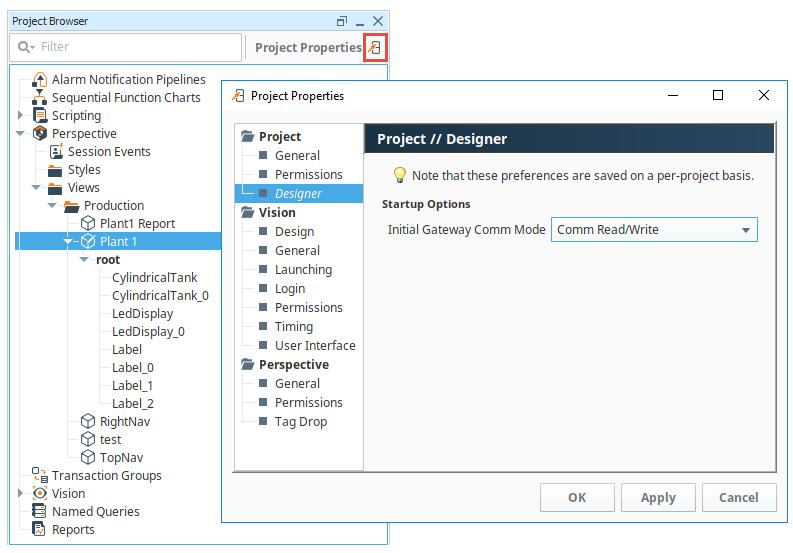
Project Browser
The Project Browser panel allows you to view the different Designer Spaces and their component hierarchies. You can expand folders and navigate down through each folder to see elements of a project such as windows, views, containers, and components. The Project Browser shows the entire tree structure from the project level folder down to the component level. You can view or change many of the project properties settings by clicking the Project Properties  icon. The Project Browser is also discussed on the General Designer Interface page.
Badge Icons
Perspective has host of useful icons in the Project Browser that can show extra configurations on a component, such as scripting, security, deep selection, message handler, etc. These icons, as shown in the image below, are extremely useful when trying to navigate through a view to find components with extra configurations. Here is a list of the Perspective Badge icons.
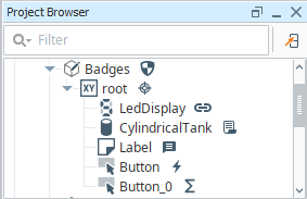
| Badge Icon | Name | Description |
|---|---|---|
 | Binding | Indicates the component has a binding. Appears next to the name of the component. |
 | Custom Method | Indicates the component has a custom method. Appears next to the name of the component. |
 | Deep Select | Shows a selected component within a selected container. Indicates you have deeply selected into the component and not just selected the component itself. Appears next to the name of the selected component. |
 | Event Action | Indicates that the component has its own event actions which are related directly to the functionality of the component. Appears next to the name of the component. |
 | Message Handler | Shows that the component contains a user-created script that listens for a particular message. Appears next to the name of the component. |
 | Script | Identifies that the component has a property change script. Appears next to the name of the component. |
 | Security | Indicates that the component has security permissions applied to the view. Appears next to the name of the component. |
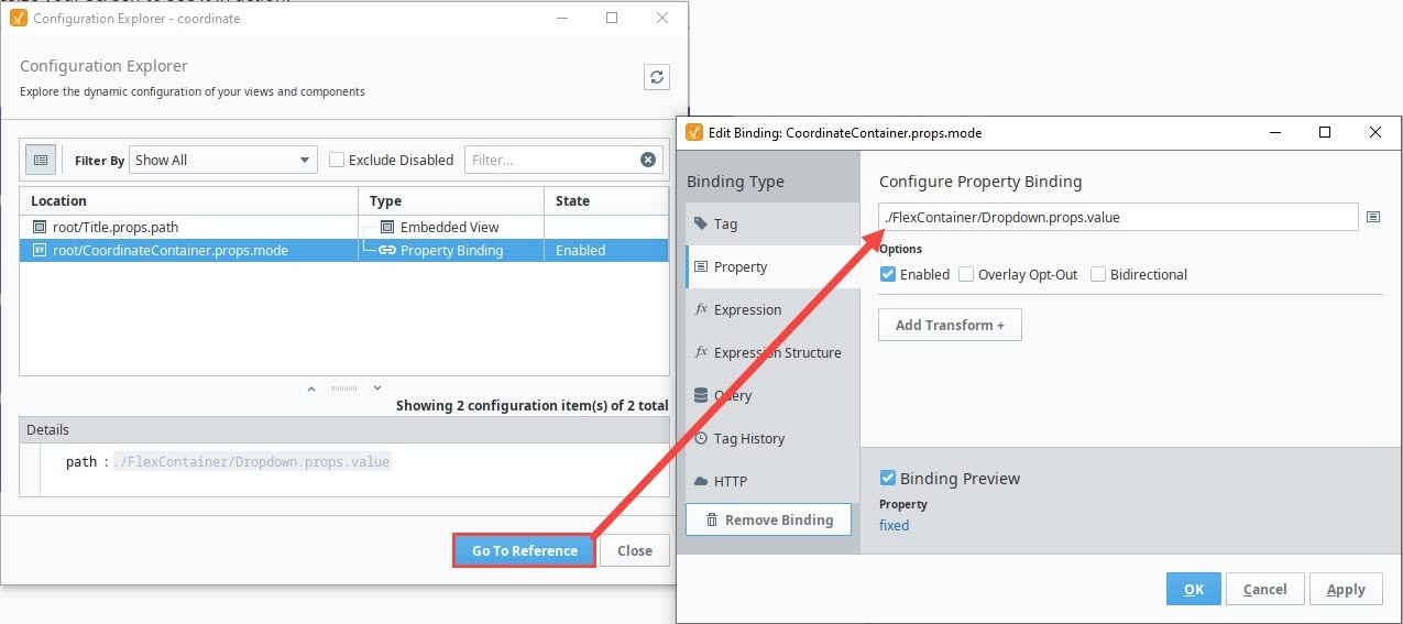
Configuration Explorer
The Configuration Explorer allows you to view the dynamic configuration of all of your views and components. Right-click on a view or component in the Project Browser and select Configuration Explorer to examine the following configurations:
- Bindings and Transforms
- Custom Methods
- Embedded Views
- Events and Actions
- Extension Functions
- Message Handlers
- Property Change Scripts
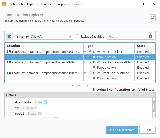
Select a configuration and click Go To Reference to highlight the relevant view or component in the Project Browser and, if applicable, open an Edit window to view details about the selected configuration.
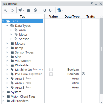
Tag Browser
The Tag Browser allows you browse tags in the Designer and OPC servers. In addition, tags can be created, edited, exported and imported directly from the Tag Browser. For more information on tags, the different tag types, and how they work, see Tag Browser.
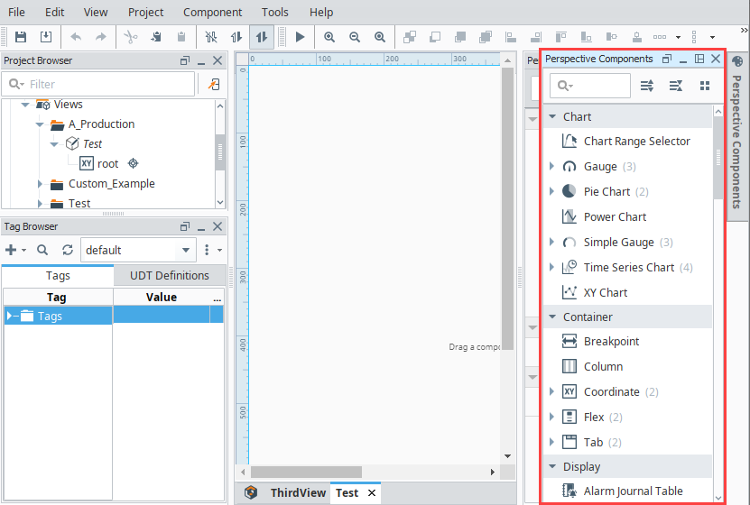
Perspective Component Palette
The Perspective module contains numerous components, such as buttons, labels, and charts. Perspective utilizes modern web technologies so many of the built-in components may look reminiscent of components you may have seen on your favorite websites. Components are created by dragging the component from the Component Palette and dropping it onto a view. A complete list of components is found on the Perspective Components page.
The Component Palette is located in the upper right side of the Perspective Designer Interface. If the component palette is not visible, click Perspective Components to open. This panel defaults to auto-hide itself. Components are grouped into different categories based on functionality. Each category can be individually expanded to show all components in that category, or collapsed to hide the components in that category.
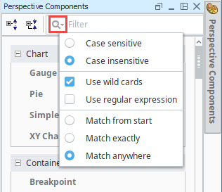
In the Component Palette search bar, you can search for components. Start typing in the search bar and the component list will update based on the text you entered. You can also set filter options by clicking on the Search  icon to expose the filter selection to make the search case sensitive, or use wildcards, regular expressions, match from start, match exactly, and match anywhere.
Perspective Property Editor
As with other areas of Ignition, the Perspective module has a dedicated Property Editor panel that allows for fine-tuning of individual objects. The Property Editor is contextual, meaning that the properties available are dependent on which object or component is selected.
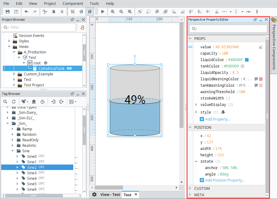
The Property Editor contains a search field, allowing you to filter properties based on the text typed into the field. The image below shows the properties that are set on a Cylindrical Tank component. There are Binding icons to the left of each of the properties that appear when you mouse over them. If you have a Cylindrical Tank on your view and click the Binding  icon for the Value property, it will open the Binding window and you can set what the Cylindrical Tank component is bound to. In following example, the Value property of the Tank is bound to a Sine2 OPC tag.
In the Property Editor you can also set Position properties and add Custom properties to components, as well as create Params for passing values from one view to another. To learn more about each of the categories in the Property Editor, refer to the Perspective Component Properties page.
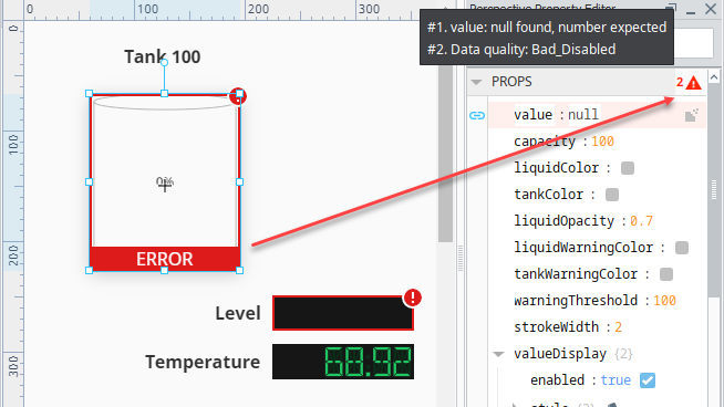
The Property Editor will allows show warnings if there an an issue with the selected component. This is commonly used to show when the quality on a property is non-good, or if there is some other configuration issue with a property. Clicking the red triangle in the upper right corner of the property category will display additional information.
Page Configuration
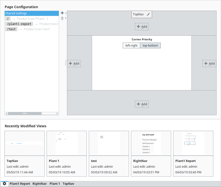
Pages are how you navigate within a Perspective project. Each page represents a collection of views that are displayed in a single space. Just like a single tab of a web browser, this represents a single page (at a time). Before you begin to configure a page, it's important to understand the page layout. It has several specific regions and each behave differently: Top Dock, Bottom Dock, Left Dock, Right Dock, and a Primary View. The type of content you create and the design strategy you use for your views will determine where you place them on the page layout. For example, you may want a staff schedule to be available on every page, but not displayed all the time on the page. What you could do is configure the view on a docked window, thus making it available on demand when someone wants to see it by clicking on a tab in a session to view it, and clicking the tab again to hide it. Pages in Perspective describes in detail about page layout, page configuration, configuring docked views, and more.
Open the Page Configuration window by clicking on the Settings icon in the lower left corner. This is where you'll configure your pages in Perspective.
Initially, Shared Settings allow you to apply configuration changes to all pages (such as adding an omnipresent docked view), as well as specify the Corner Priority.
To the right of the Page Configuration column, the following buttons are present:
- Add: Creates a new Page Configuration.
- Trash: Removes the selected Page Configuration.
Recently Modified Views
You'll also notice in the Page Configuration image below, there is a Recent Modified Views list. These are your most recent modified views along with a timestamp denoting when the last edit to the view was made and who made the modifications. If the project does not contain any views, the listing will be empty.
Keyboard Shortcuts
There are a lot of ways to speed up development once you are familiar with how Ignition works. There are many keyboard shortcuts in Perspective Designer that are listed throughout the Designer interface alongside menu options. To learn about keyboard shortcuts, go to the Windows, Linux, and Mac Keyboard Shortcuts page.
Vertical and Horizontal Guides
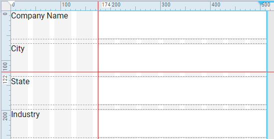
In the Designer workspace, you can set vertical and horizontal guides to help you align components. To set a vertical guide, slide your cursor along the top horizontal ruler and click it where you want it. The number of pixels will be displayed in the top ruler and a red vertical line will appear the length of your workspace. To remove the guide, click on the guide and drag it to the left into the vertical ruler and it will disappear.
To set a horizontal guide, slide your cursor in the vertical ruler and click it where you want it. The number of pixels will be displayed in the left ruler and a red horizontal line will appear on the width of your workspace. To remove the guide, click on the guide and drag it to the top into the horizontal ruler and it will disappear.
You can add multiple vertical and horizontal guides.
The Perspective Designer toolbar also has options for aligning components.