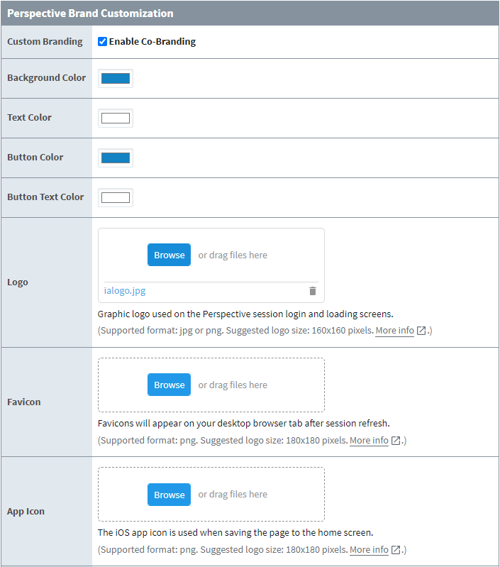
Perspective Co-Branding
| Property | Description |
|---|---|
| Custom Branding | Choose to toggle custom branding on or off. Default is off. |
| Background Color | Choose what the background color will be. |
| Text Color | Choose what the text color will be. |
| Button Color | Choose what color buttons will appear as. |
| Button Text Color | Choose what color button text will appear as. |
| Logo | Graphic logo used on the Perspective Session login and loading screen. Supports .jpg or .png formats. Suggested logo size is 160x160 pixels. |
| Favicon | Favicons will appear on your desktop browser tab after Session refresh. Supports .png format. Suggested logo size is 180x180 pixels. |
| App Icon | The iOS app icon is used when saving the page to the home screen. Supports .png format. Suggested logo size is 180x180 pixels. Note that the icon used on Android devices when creating a project shortcut is set by "Launch Icon" project property. |
| Preview | Shows a preview of the login and loading screens with custom branding applied. |
Perspective Co-Branding is currently only available for Standard and Cloud Edition.
App Bar Customization
In addition to the login, loading, and terminal screens, you can also personalize the bottom-docked App Bar by:
- Choosing to toggle the App Bar off or on.
- Changing the icon for the About button.
- Changing the view that displays the about modal.
- Changing the title of the about modal.
The table below lists the customizable elements of the App Bar, as well as with what they look like by default. For more information about individual Session properties that affect the App Bar, click here.
| Name | Default |
|---|---|
| Show | FALSE |
| About Icon |  |
| About View | 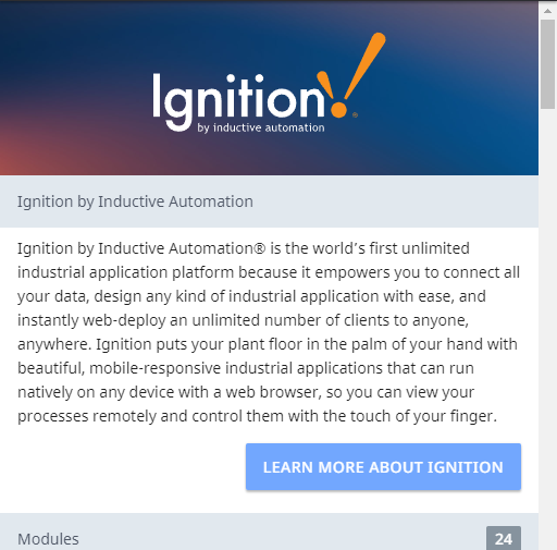 |
| About Title |  |
Best Practices (Favicons and App Icons)
There are some considerations to take when selecting or designing a logo to use as a favicon or app icon. While some of these considerations are not mandatory, they may give some insight into optimal logo design.
Here are a few tips that applies to both favicons and app icons:
- Use a higher resolution of the final icon you have selected, if possible.
- Since your image resolution may be downscaled, using a higher resolution picture will help retain image quality.
- If bandwidth or some other bottlenecking factor is an issue, using smaller favicons may help reduce data load.
Favicons
Favicons are generally used in browser tab icons, desktop icons, and Android icons. The bullet(s) below contain tips on designing favicons:
- (Chrome on Android specific) If your favicon is too small, then the favicon will not be used when saving to the home screen.
- For typical uses in desktop environments, either 16x16px or 32x32px are recommended.
- Modern browsers downsize images, so larger images will also work.
- For multi-platform environments, either 180x180px or 192x192px are recommended.
- Many Android devices will not use favicons smaller than a certain size.
App Icons
App icons are used by Apple devices and may follow some different rules than favicons. For Apple's official documentation detailing best practices and creating an app icon for iOS and other Apple devices, click here.
One caveat to keep in mind is that while the favicon and logo fields will accept and render icons with transparent designs without issue, attempting to use an icon with transparency as an app icon will result in the icon appearing all black.
Best Practices (Design)
Listed below are a few basic tips when designing your Perspective login, loading, and terminal screens. These tips are not mandatory, as styles, personalization, and customization preferences differ from person to person and organization to organization. Additionally, these tips may extend to apply during general Perspective Session design.
- Use text colors that can be easily seen against their backgrounds.
- Keeping designs simple will help minimize cognitive load.
- Use logos and icons that are easily identifiable.
Examples
Example 1 (Login and Terminal Screens)
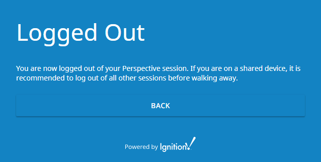
The settings below will modify the look of the Perspective login, loading, and terminal screens:
| Property | Value |
|---|---|
| Custom Branding | TRUE |
| Background Color | #1383C3 |
| Text Color | #FFFFFF |
| Button Color | #1383C3 |
| Button Text Color | #FFFFFF |
| Logo | Inductive Automation Logo |
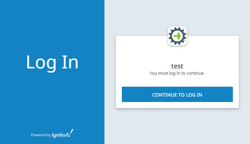
The following is the rendered output:
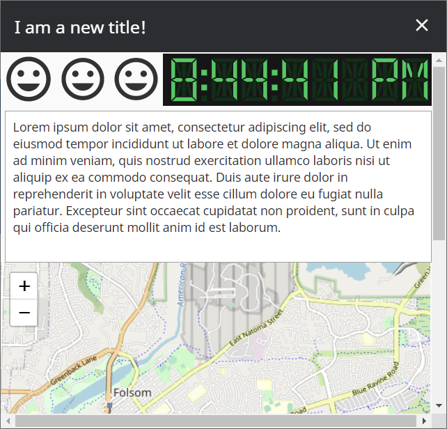
Example 2 (App Bar)
The settings below will modify the look of the Perspective Session's App Bar:
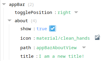
| Property | Value |
|---|---|
| show | TRUE |
| icon | material/clean_hands |
| path | appBarAboutView |
| title | I am a new title! |
The following is the rendered output affected by the icon property:
The following is the rendered output affected by the path and title properties: