Perspective Project Properties
There are a number of properties you can set for your Perspective projects within the Designer. For example, there are properties for setting security levels, configuring how the sessions receive updates, and more.
To access the Project properties, in the Designer, click on Project tab on the menu bar. Then select Project Properties.
-882b2c7c98bd73adce4c4ab274e08549.png)
Project properties span several functional areas each containing settings applicable to that area. Scroll down to the Perspective section.
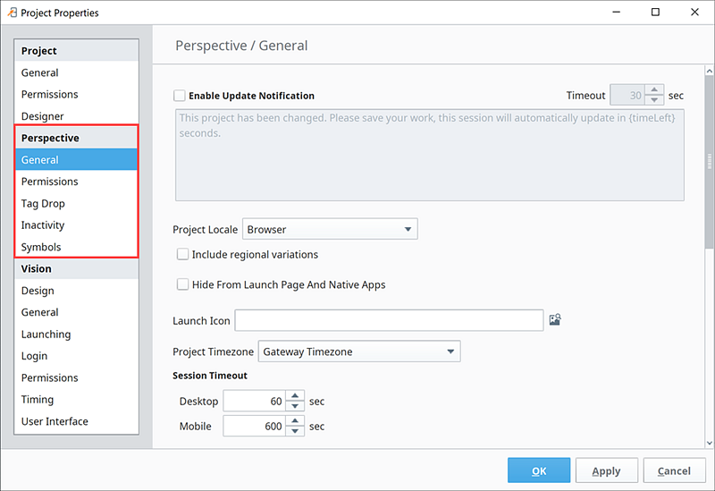
Perspective General Properties
These general properties apply to the Perspective Sessions.
General
| Property | Description |
|---|---|
| Enable Update Notification | Enables notifications for sessions when the project is changed. When notification is enabled, this is the message that will be displayed. The token {timeLeft} will be replaced with the seconds remaining until update. If false, update will be immediate. |
| Project Locale | Select a project locale. |
| Include regional variations | Enables regional variations for the locale. |
| Hide from Launch Page and Native Apps | When selected, the project to be hidden from the Session Launcher and mobile app project listing. |
| Launch Icon | The image specified here is used to represent the project on the launch page and the Ignition Perspective mobile app. This needs to be a path to an image that has been uploaded to the Gateway. Use the browse button to choose or upload a new image. |
| Project Timezone | Timezone for this project. Dropdown list includes the Gateway timezone, Session timezone, or specific timezones around the globe. |
| Identity Provider | Identity Provider (IdP) for this project if a Perspective Project had an IdP set for it prior to the release 8.0.6. Note: For new installations after 8.0.6, the Identity Provider property is now located in Project Properties > Project General > Security Settings The property will also move to the new location under Project Properties > Project General > Security Settings if you change set this property to none. |
| Session Timeout Desktop | The time, in seconds, for that the Gateway will wait for desktop devices to respond. |
| Session Timeout Mobile | The time, in seconds, for that the Gateway will wait for mobile devices to respond. |
| Session Closed Message | Message to be displayed if system.perspective.closeSession is invoked. |
| Page Closed Message | Message to be displayed if system.perspective.closePage is invoked. |
| Logged Out Message | New in 8.1.8 Determines the message displayed when a user logs out of a session. Only applies when the project requires authentication. |
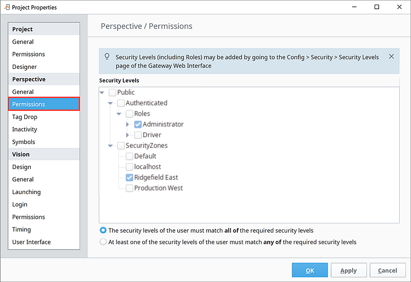
Perspective Permissions Properties
The Perspective Permissions properties restrict project access to specific security levels and security zones.
Permissions
| Property | Description |
|---|---|
| (Security Levels Tree) | Interactive tree that shows the current authenticated roles and security zones. |
| (First radio button) | If selected, then the security levels of the user must match all of the required security levels. |
| (Second radio button) | If selected, then at least one of the security levels of the user must match any of the required security levels. |
In the following example, a user must have the Administrator security level and Ridgefield East security zone to be able to access this project.
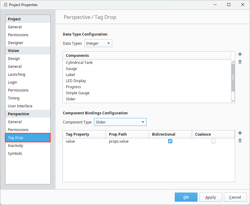
Perspective Tag Drop Properties
Tag Drop properties provide a way to link certain data types of Tags to commonly used components when dragging-and-dropping a Tag onto a view. This is done in Project Properties under Tag Drop in three steps: select the data type, select the component to create, and select the bindings that are created on that component.
- Data Type Configuration: This setting determines which components show up in the popup list when dragging a Tag into a view. You can switch between the different tag data types to see what sorts of components are allowed to be dropped for each of those types. Add or remove new entries in the list using the Add
 icon and Delete
  icon. You can then double-click on the new blank cell and select a component from a dropdown.
 - Component Bindings Configuration: This setting determines which bindings are created when a component is dropped into a view. Select a component, then set up or modify the bindings for the selected component (which is typically just the Tag value bound to the value/text prop on a component). Add or remove new binding entries using the Add icon and Delete icon. Double-click the Tag Property and Prop Path cells to fill in properties.
- The Tag Drop interface includes Bidirectional and Coalesce settings when adding components where these settings can be applied.
The Component Binding Configuration table values are tied to the component currently selected in the Component Type dropdown, they are not related to what is selected in the Data Type Configuration table above.
Dropping tags onto existing components can now create bindings on those components if the data type of the tag matches a Tag Drop configuration in the project. Tag Drop configuration is what determines if a binding is configured or not.
Tag Drop
| Property | Description |
|---|---|
| DataType Configuration | This section is to set up a list of components to show for each data type that can be dragged onto the view. |
| Data Types | A dropdown list of the available data types in Ignition. Choose a datatype to see a list of components associated with it. |
| Components | A list of components associated with selected data type. |
| Component Bindings Configuration | This section is to set up bindings when a tag is dropped. |
| Component Type | A dropdown list of the available components in Perspective. |
| Tag Property | The name of a tag's property to be used in a binding. value is most commonly used. |
| Prop Path | The property path on the component where the binding will be created. props.value or props.text are most commonly used. |
| Bidirectional | A check box to indicate if the binding should be bidirectional. The Bidirectional property is set by default when adding Input Components. |
| Coalesce | A check box that when checked ensures target property changes of child properties are combined into a single write back to the source. This setting applies to Bidirectional bindings only. |
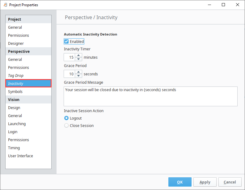
Perspective Inactivity Properties
Perspective has Inactivity Timeout settings in Project Properties. You can set an Inactivity timer that either closes the Perspective session or logs the user out if no activity is detected after a specified number of minutes. Activity is considered opening a new tab, clicking, typing. If Perspective is running on a mobile device, activity is considered a swipe or tap. The Gateway is the "time keeper" for inactivity timer.
This inactivity feature pertains to perspective sessions only. When the Inactive Session Action occurs (regardless of whether "Logout" or "Close Session" is selected), the user will still be logged into the Identity Provider.
When enabling this inactivity feature, it is highly recommended that you also enable the "Always ask the IdP to re-authenticate users by default" setting under Project Properties, as this will require that any user attempting to log into a Perspective session will have to provide their credentials first.
Inactivity
The following are the properties for the Inactivity Timeout:
| Property | Description |
|---|---|
| Enabled | Whether the automatic inactivity detection option is enabled. |
| Inactivity Timer | Time (in minutes) in which a session can be inactive before the user is logged out or the session is closed. The maximum value is 2,147,483,647. |
| Grace Period | Grace period (in seconds) after the Inactivity Timer time has passed but before the user will be logged out or the session closed. |
| Grace Period Message | Message to be displayed before a session becomes inactive. Use the placeholder {seconds} to indicate remaining time. (Optional.) |
| Inactive Session Action | Action that occurs when the session becomes inactive. Options are:
|
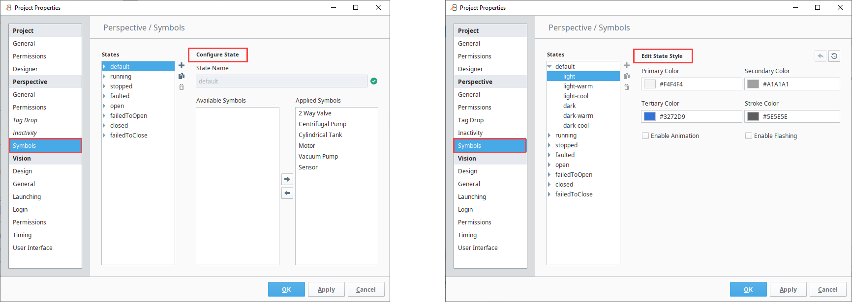
Perspective Symbols Properties
- Add
 icon: Creates a new state with full customization access. Color and function settings pre-populate with the built-in default state built-in settings, but will have no preset applied symbols.
 - Duplicate
 icon: Creates a new state based on a selected pre-existing state. Duplicated state names will automatically populate based on the original state name. Duplicated states have full customization access regardless of the state they were created from.
 - Delete State
 icon: Deletes selected custom states. A popup message will require you to confirm your selection before deleting. Built-in states can be edited, but not deleted.
When editing a built-in or custom state themes, you can use the Undo  icon to replace changes with the last saved settings or the Reset Theme
  icon to return all settings back to their original configuration when the state was first created.
Symbols
The following table lists the properties for the Symbols States:
Configure State (Only State Name Selected)
| Property | Description |
|---|---|
| State Name | The name of the state containing the light/dark visual state styles. Built-in state names cannot be changed. |
| Available Symbols | Lists the symbols that are available to use the selected state, but do not have it as a currently applied option. |
| Applied Symbols | Lists the symbols that will show this state as an option to apply when configuring the symbol. Add or remove applied symbols by selecting a symbol and using the Add or Remove Applied Symbol  arrows. arrows. |
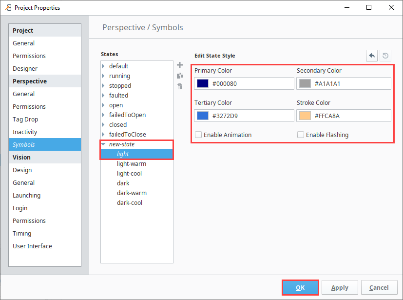
Edit State Style (State Name > Visual State Selected)
| Property | Description |
|---|---|
| Primary Color | Sets the symbol fill color. |
| Secondary Color | Sets the alternate symbol fill color. This color is used when Enabled Flashing is checked. |
| Tertiary Color | Sets the vessel fill color. |
| Stroke Color | Sets the symbol outline color. |
| Enable Animation | Enables symbol animation properties. |
| Enable Flashing | Enables symbol fill color to alternate between the set Primary and Secondary Colors. |
Create and Apply a Custom State
-
Open Project Properties.
-
Select Symbols.
-
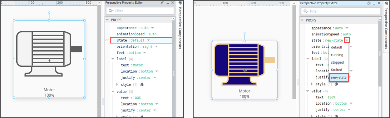
Click the Add
icon. Rename your new state if desired. In this example, it will be left as new-state.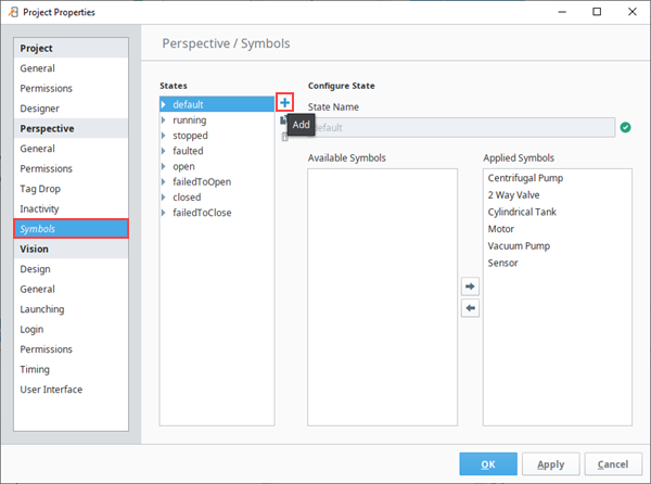
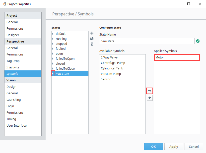
-
Use the Add Applied Symbol
 arrow to select and apply your new state to desired symbols. This example will make this state applicable to the Motor symbol.
 -
Use the state dropdown to select the visual themes you want to edit. This example will edit the light visual state.
-
Set your desired color, animation, and flashing configurations under Edit State Style.
-
Click OK.
-
Access a view and place a Motor symbol.
-
Select the Motor and change the state field from default to the custom state, in this case new-state. The new state configurations are immediately applied and displayed in the view.