Images and Icons in Perspective
Perspective supports the import and display of PNG, JPG, JPEG, GIF, and SVG images. Images can be loaded into Perspective using the Image Management tool, dragged and dropped directly into a view, or derived from an external web address. All images are displayed using the Image component.
Similarly, icons can be added to view using the Icon component, or the icon property within other select components. Icon paths are selected from a pre-configured library within the Designer, which can be further customized with additional icons as desired.
Use the Image Management Tool
The following example walks through bringing an image from the Image Management tool using an Image component. Note that referencing images from the Image Management tool requires adding "/system/images" to the beginning of the path.
-
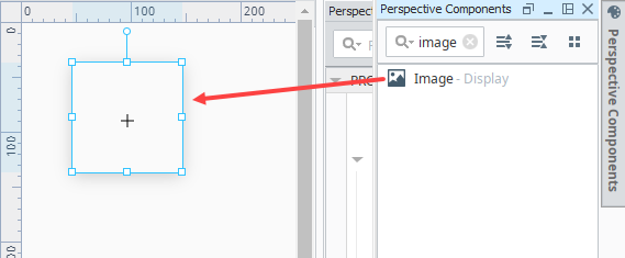
Drag an Image component onto the view.
-
At the top of the Designer in the Menu Bar, select Tools > Image Management.
-
Navigate through the different folders for an image file you want.
-
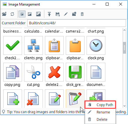
Right-click on the image and select Copy Path.
-
In the Property Editor, paste the image path into the
sourceproperty for the Image component, making sure to add "/system/images" to the beginning of the path.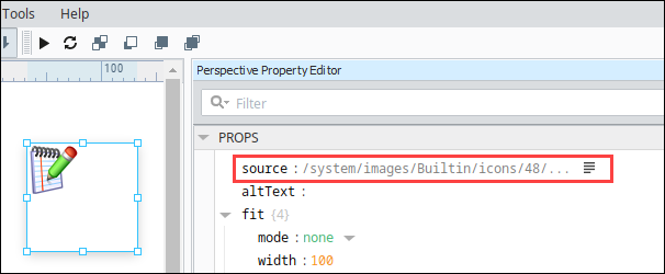
The image now appears inside the Image component.
Drag and Drop an Image onto a View
When using the drag and drop method to add an image, you will have the option to upload it into the Image Management tool to be then referenced, or to embed it directly into the view. In this example, we'll pull in a JPG photo of a sunset to use as a background on a home page. Images saved in the Image Management tool can be referenced and used repeatedly as described in the Using the Image Management Tool section above.
-
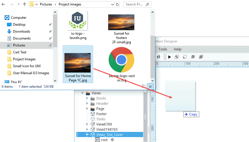
Open a view in the Designer.
-
Locate an image on your computer of an acceptable file type and drag it onto the view.
noteThe image in this example has been resized in a graphics editing program to be the size we want.
-
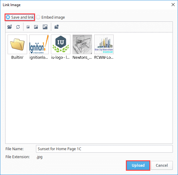
A Link Image popup will appear for you to select whether you want to save the image as a link (in the Image Management tool) or embed the image. For this example, we will save the image as a link, making sure the Save and link option is selected and then clicking Upload. Refer to the Embedding Images steps below for selecting Embed image.
-
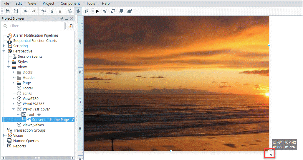
The image will now appear in the view in an Image component, but the component shape still needs to be adjusted to fit the image size. Drag one of the corner nodes to match the image component border with the full image.
-
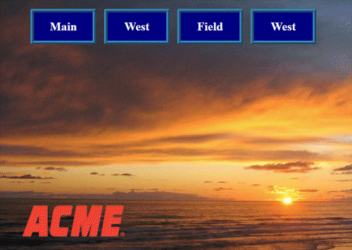
Add any further components and graphics to your view as desired and save your project. For this example, we added a company logo SVG file and navigation buttons.
Embedding Images
Embedded images can degrade performance, but allow you to view and modify image elements directly in the Property Editor.
-
Locate the image on your computer and drag it onto the view.
-
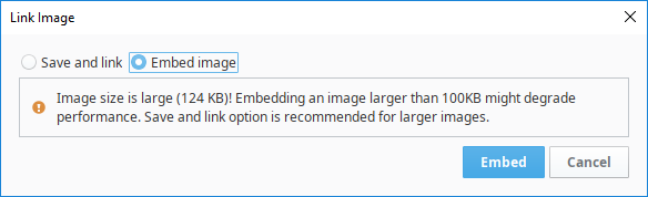
Click the Embed image radio button.
Large Image FileIf the image is larger than 100KB, you will see a warning message in the confirmation popup recommending the Save and link option instead.
-
Click Embed to embed the image.
-
Adjust the corner nodes of the Image component border to match the image size.
Use an External Web Address
Images can also be added to the Image component by pasting a copied image address from a web browser into the source property.
-
Right-click an image and select Copy image path.
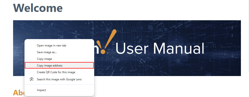
-
In the Designer, drag an Image component onto a view.
-
Paste the image address into the
sourcefield in the Property Editor.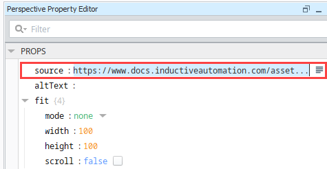
-
Adjust the corner nodes to display the full image or select a desired fit from the
modedropdown.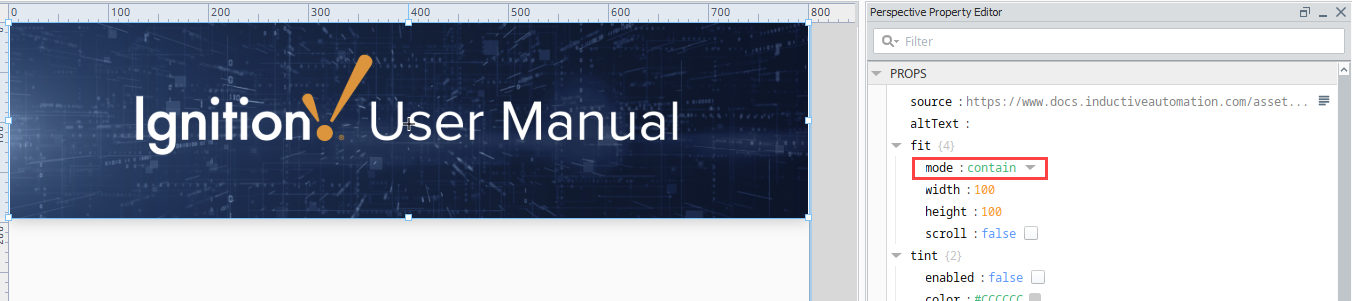
Use Icons
Icons in Perspective include a collection of specifically curated Scalable Vector Graphic (SVG) images. The bulk of the icons included with Perspective are derived from the materials icon library, which is fully detailed on Google Fonts - Material Symbols & Icons, but an ignition and sample-component folders are also available by default. Icons are referenced using icon paths within Perspective. For example, the path material/location_on will reference the location_on material design icon. This starting collection of icons can be expanded with custom icon repositories.
Icons can be displayed using the following icons:
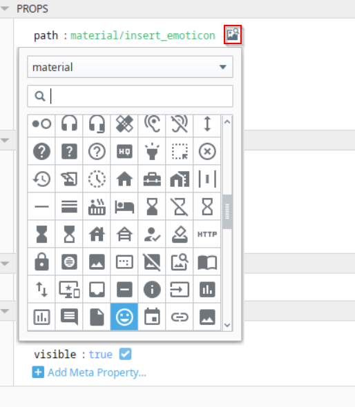
All icon properties (via the Icon component or other applicable components) include an interface for selecting both built-in and custom icons from configured libraries. On the right-hand side of the icon path, the Browse  icon can be used to search for available icons. The icons will be arranged into headings based on the originating icon files on the Gateway.
Add a Custom Icon Repository
Although the built-in icon repository is a great source for icons, you can set up a custom library of icons to be accessible by Ignition. All icon repositories are stored as SVG files within the Gateway's installation directory. A typical path to an icon file will look like:
- Windows
- MacOS
- Linux
C:\Program Files\Inductive Automation\Ignition\data\modules\com.inductiveautomation.perspective\icons\<repository name>.svg
/usr/local/ignition/data/modules/com.inductiveautomation.perspective/icons/<repository name>.svg
/usr/local/bin/ignition/data/modules/com.inductiveautomation.perspective/icons/<repository name>.svg
You can create custom libraries by adding your own SVG file at this path. The properties inside the file are defined using XML, which should follow the pattern provided below. Note that each icon is enclosed with an SVG tag that defines values for the id attribute, which is used to specify the name of each icon, and the viewbox attribute, which must have large enough dimensions to fully enclose the graphic.
<?xml version="1.0" encoding="utf-8"?>

<svg xmlns="http://www.w3.org/2000/svg" xmlns:xlink="http://www.w3.org/1999/xlink">
    <!--Red Circle-->
    <svg viewBox="0 0 24 24" id="red-circle">
        <circle cx="12" cy="12" r="6" stroke="black" stroke-width="1" fill="red" />
    </svg>

    <!--Blue Circle-->
    <svg viewBox="0 0 24 24" id="blue-circle">
        <circle cx="12" cy="12" r="6" stroke="black" stroke-width="1" fill="blue" />
    </svg>
</svg>
A Designer restart is required once an icon file has been added to pull in the new icons for development.
Custom Icon Repository Example
In this example, we'll make a custom repository file with icons. The name of the file is example.svg. We'll then use the icons in this file and other repositories to create a Horizontal Menu component for Proposal, Project Documents, and Appendix headings.

-
First we created the repository file in XML.
<?xml version="1.0" encoding="utf-8"?>
<svg xmlns="http://www.w3.org/2000/svg" xmlns:xlink="http://www.w3.org/1999/xlink">

    <!--a red circle-->
    <svg viewBox="0 0 24 24" id="red-circle">
        <circle cx="12" cy="12" r="6" stroke="black" stroke-width="1" fill="red" />
    </svg>

    <!--a blue circle-->
    <svg viewBox="0 0 24 24" id="blue-circle">
        <circle cx="12" cy="12" r="6" stroke="black" stroke-width="1" fill="blue" />
    </svg>

    <!--a triangle-->
    <svg viewBox="0 0 24 24" id="triangle">
        <path d="M12 0 L3 22 L21 22 Z" />
    </svg>

    <!--roman numeral one icon-->
    <svg viewBox="0 0 24 24">
        <g id="one">
            <rect
            id="rect3723" width="15.09025" height="3.0526078" x="4.4548745" y="2.4385488" />
            <rect
            id="rect3723-3" width="15.09025" height="3.0526078" x="4.4548745" y="19.510113"/>
            <rect
            id="rect3755" width="3.4557824" height="16.990929" x="10.272108" y="3.5045362" />
        </g>
    </svg>
    <!--roman numeral two icon-->
    <svg viewBox="0 0 24 24">
        <g id="two">
            <rect
            id="rect3723" width="15.09025" height="3.0526078" x="4.4548745" y="2.4385488" />
            <rect
            id="rect3723-3" width="15.09025" height="3.0526078" x="4.4548745" y="19.510113" />
            <rect
            id="rect3755" width="3.4557824" height="16.990929"  x="6.8435426" y="3.5045362" />
            <rect
            id="rect3755-9" width="3.4557824" height="16.990929" x="13.700686" y="3.5045002"/>
        </g>
    </svg>
</svg> -
Save the file in the Ignition directory:
C:Program Files\Inductive Automation\Ignition \data\modules\com.inductiveautomation.perspective\icons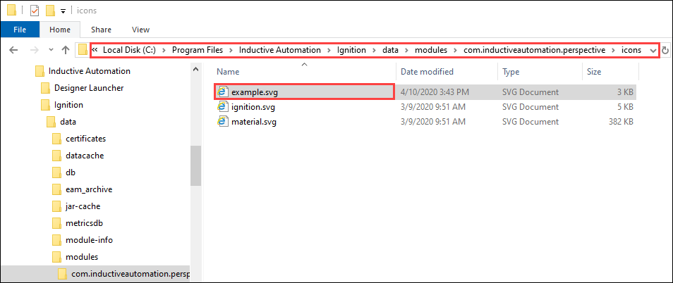
-
Restart the Designer to implement the changes.
-
Drag a Horizontal Menu component onto a view and edit the properties as shown below to display two of the
examplerepository icons and onematerialsrepository icon.Property Value props.items.0.enabled TRUE props.items.0.icon.path example/one props.items.0.icon.color #4747FF props.items.0.label Proposal props.items.0.style.color #4747FF props.items.0.style.fontFamily Verdana props.items.1.enabled TRUE props.items.1.icon example/two props.items.1.color #008000 props.items.1.label Project Documents props.items.1.style.color #008000 props.items.1.style.fontFamily Verdana props.items.2.enabled TRUE props.items.2.icon.path material/folder_special props.items.2.icon.color #AC00AC props.items.2.label Appendix props.items.2.style.color #AC00AC props.items.2.style.fontFamily Verdana props.style.borderBottomStyle double props.style.borderLeftStyle none props.style.borderRightStyle none props.style.borderTopStyle double props.style.borderTopWidth 4 props.style.borderBottomWidth 4 -
Enable the Designer Preview
 mode to see the Horizontal Menu appearance.
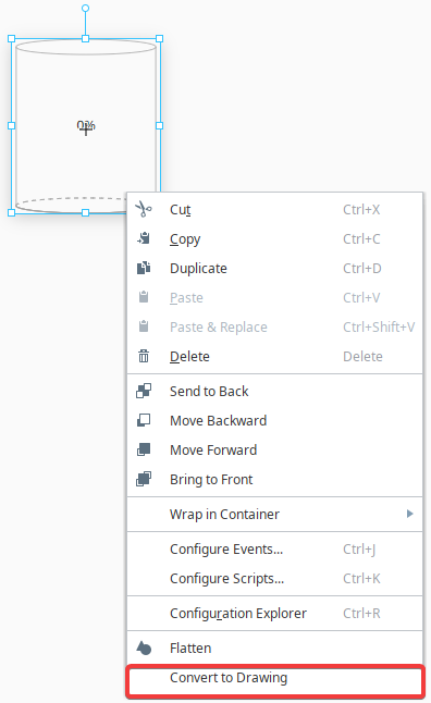
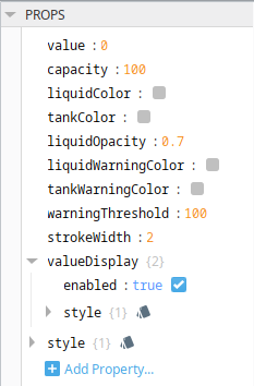
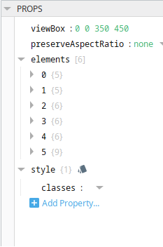
Convert SVG-based Components to Drawings
| Component Example | Properties | Property Editor Image |
|---|---|---|
| Cylindrical Tank as a Component |
|  |
| Cylindrical Tank as a Drawing |
|  |