Perspective - Map
Component Palette Icon:
Description
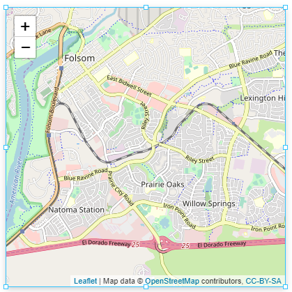
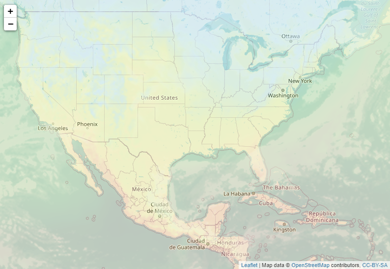
The Map component provides a mobile-friendly interactive map. Settings can be customized to control the initial view, zoom, mouse interaction, and keyboard interaction.
The Map component is based on the Leaflet open-source JavaScript library for interactive maps. For more information on Leaflet, see https://leafletjs.com/reference-1.6.0.html.
User Interaction
Zoom
Depending on the property settings, users can zoom the Map component in several ways:
- Shift and drag the mouse to a rectangular shape.
- Double-click to zoom in and Shift + double-click to zoom out.
- Roll the scroll wheel up to zoom in and down to zoom out.
- Press the + (Plus) key to zoom in and the - (Minus) key to zoom out.
Pan
Depending on the property settings, users can pan across the Map component in multiple ways:
- Use the keyboard arrow keys to pan left, right, up, down.
- Use the mouse to click and drag the map.
Popups
Depending on property settings, users may see the following popup actions.
- Popups close when they click on the map.
- Popups close when they use the ESC key.
- Popups open as they scroll past certain areas of the map.
Properties
Most properties have binding options. For more information on Bindings, see Types of Bindings in Perspective. This section only documents the Props category of properties. The other categories are described on the Perspective Component Properties page.
| Name | Description | Property Type |
|---|---|---|
| init | Map initial state when loaded. Options include:
| object |
| location | Map location.
| object |
| zoom | Zoom properties for the map. See zoom properties. | object |
| customControls | New in 8.1.6 Custom map controls displaying views that are shown in the corner of the map. See customControls properties. | object |
| attribution | Enables an attribution control on the map. Default is true. | array |
| closePopupsOnClick | When set to true, popups will close when a user clicks anywhere else on the map. Default is true. | value: boolean |
| trackResize | Enables the map to automatically handle browser window resizing. Default is false. | value: boolean |
| keyboardNav | Enables navigation of the map with keyboard arrow keys and with the + (Plus) and - (Minus) keys. The + key zooms in; the - key zooms out. Default is true. | value: boolean |
| keyboardPanDelta | The number of pixels to pan when a keyboard arrow key is pressed. Default is 80. | value: numeric |
| dragging | Enables the map to be dragged with a mouse/touch. Default is true. | value: boolean |
| maxBounds | When this option is set, the map restricts the view to the given geographical bounds, bouncing the user back if the user tries to pan outside the view.
| object |
| fadeAnimation | Enables the fade animation. Default is true. | value: boolean |
| layers | Settings for the map UI, vector, and raster layers that can be displayed on top of the map.
| |
| style | Sets a style for this component. Full menu of style options is available for text, background, margin and padding, border, shape and miscellaneous. You can also specify a style class. | object |
zoom Child Properties
| Name | Description | Property Type |
|---|---|---|
| controls | Whether zoom controls are added to the map. Default is true. | value: boolean |
| delta | Controls how much the map's zoom level will change after a zoomIn(), zoomOut(), pressing + or - on the keyboard, or using the zoom controls. Values smaller than 1 allow for greater granularity. Be aware that some combinations of fractional delta and snap values (e.g. delta less than or equal to 0.5 and snap set to 1) may cause unresponsive zoom controls due to rounding. | value: numeric |
| onBoxZoom | Enables the map to be zoomed to a rectangular area defined by pressing the Shift key while dragging the mouse. Default is true. | value: boolean |
| onDoubleClick | Enables the map to be zoomed in by double-clicking on it and zoomed out by pressing the Shift key while double-clicking. Default is true. | value: boolean |
| onScrollWheel | Enables the map to be zoomed in and out using the mouse scroll wheel. Default is true. | value: boolean |
| snap | Forces the map's zoom level to be a multiple of this value, particularly applicable after fitBounds() or a pinch-zoom. Be aware that some combinations of fractional delta and snap values (e.g. delta less than or equal to 0.5 and snap set to 1) may cause unresponsive zoom controls due to rounding. | value: numeric |
| max | Maximum zoom level of the map. Default is null. | value: numeric |
| min | Minimum zoom level of the map. Default is null. | value: numeric |
| animation | Animation settings for the map.
| object |
customControls Child Properties
| Property | Description | Property Type |
|---|---|---|
| path | Path to the view that will be used as the display for the control. New in 8.1.29 If a path is present in the path property field, an Open View  icon will appear and will navigate directly to the view when clicked. icon will appear and will navigate directly to the view when clicked. | value: string |
| params | Parameters to be passed to the view within the control. Names in this object must match input parameters defined on the view. | object |
| position | Corner of the map where the control will be anchored. Options are: bottom-right, top-right, or bottom left. | value: string |
| enabled | Whether or not the custom control is enabled. | value: boolean |
layers Child Properties
raster Properties
| Name | Description | Property Type |
|---|---|---|
| tile | Settings enable you to load and display tile layers on the map. The tile provider can be customized to change the appearance of the map. See https://leaflet-extras.github.io/leaflet-providers/preview/ for some possibilities.
| object |
| image | Settings for images displayed over specific bounds of the map.
| array |
tile.options Properties
| Name | Description | Property Type |
|---|---|---|
| attribution | This tile layer's attribution. | value: string |
| opacity | Opacity of tiles. | value: numeric |
| zIndex | The z-index of tiles in the grid. | value: numeric |
| tileSize | Width and height of tiles in the grid.
| object |
| update | Tile update options.
| object |
| zoom | Zoom options.
| object |
| subdomains | Subdomains of the tile service. Passed in the form of an array of strings (where each string is a subdomain name). For example, ['a','b','c'].
| array |
vector Properties
polygon
An array of polygon layers.
| Name | Description | Property Type |
|---|---|---|
| polygons | An array of polygons each consisting of an array of points that create a single polygon.
Changed in 8.1.15 In 8.1.15 the default shape of polygons changed to the following: | array |
| smoothFactor | How much to simplify each vector on each zoom level. Higher the number means better performance and smoother look, and the lower the number means more accurate representation. | value: numeric |
| noClip | Disables polyline clipping. | value: boolean |
| event | Event settings for the individual polygon layer.
| object |
| stroke | Stroke settings for the individual polygon layer.
| object |
| fill | Fill settings for the individual polygon layer.
| object |
polyline
An array of polyline layers.
| Name | Description | Property Type |
|---|---|---|
| polylines | An array of polylines each consisting of an array of points that create a single polyline.
Changed in 8.1.15 In 8.1.15 the default shape of polylines changed to the following: | array |
| smoothFactor | How much to simplify each polyline on the zoom level. | value: numeric |
| noClip | Disables polyline clipping. | value: boolean |
| event | Event settings for the individual polygon layer.
| object |
| stroke | Stroke settings for the individual polygon layer.
| object |
| fill | Fill settings for the individual polygon layer.
| object |
rectangle
An array of rectangle layers.
| Name | Description | Property Type |
|---|---|---|
| rectangles | An array of rectangle bounds each consisting of two corners that create a single rectangle.
| object |
| smoothFactor | How much to simplify each rectangle on the zoom level. | value: numeric |
| noClip | Disables rectangle clipping. | value: boolean |
| event | Event settings for the individual rectangle layer.
| object |
| stroke | Stroke settings.
| object |
| fill | Fill settings for the individual rectangle layer.
| object |
circle
An array of circle layers.
| Name | Description | Property Type |
|---|---|---|
| circles | An array of circles each consisting of center point corners that creates a single circle.
| object |
| radius | Radius of the circle marker, in pixels. | value: numeric |
| event | Event settings for the individual circle layer.
| object |
| stroke | Stroke settings for individual circle layer.
| object |
| fill | Fill settings for the individual circle layer.
| object |
ui Properties
marker
Map marker layers.
| Name | Description | Property Type |
|---|---|---|
| name | A unique name that is used to distinguish this marker from another. | value: string |
| enabled | New in 8.1.16 Determines if the marker is shown on the map. Default value is true. | value: boolean |
| lat | Latitudinal coordinate. | value: numeric |
| lng | Longitudinal coordinate. | value: numeric |
| opacity | Marker opacity. | value: numeric |
| icon | Marker icon configuration.
| object |
| tooltip | This marker's tooltip configuration, if tooltip is enabled. | object |
| popup | Popup configuration for this marker. |
popup
Array of popup layer configurations for this map.
| Name | Description | Property Type |
|---|---|---|
| enabled | New in 8.1.16 Determines if the popup is shown on the map. Default value is false. | value: boolean |
| lat | Latitudinal coordinate. | value: numeric |
| lng | Longitudinal coordinate. | value: numeric |
| content |
| object |
| width | Width of the popup. Min and Max values allowed. | value: numeric |
| height | Max popup height in pixels. | value: numeric |
| pan | Popup pan configuration.
|
view
Array of view layer configurations for this map.
| Name | Description | Property Type |
|---|---|---|
| path | Path to the view | value: string |
| params | Params to pass to the view | object |
| lat | Latitudinal coordinate. | value: numeric |
| lng | Longitudinal coordinate. | value: numeric |
| transparentBackground | If enabled, disables the default background color. Default is false. | value: boolean |
| shadow | If enabled, apply a box shadow around the view. Default is true. | value: boolean |
other.geoJSON Properties
GeoJSON objects to include as a feature layer. Each element should be a geoJSON FeatureCollection. This property is intended to be modified by an HTTP binding to a URL containing the desired geoJSON data, and a map transform to process the results.
For more information on the geoJSON format, see http://geojson.org/.
It is not the intent that geoJSON shapes are manually added to the component. In addition, you can use the following site to create a basic geoJSON layer: https://geojson.io/.
See Perspective Map - Adding geoJSON Shapes for more information.
| Property | Description | Property Type |
|---|---|---|
| styleOptions | Style options for a FeatureCollection layer. Additional styleOptions objects can be added to individual features within the FeatureCollection.
| object |
Map Parameters
Because this component uses the Leaflet library, there are several common objects you'll want to be aware of when using the callable methods on this component. Each of these "objects" is just a Python dictionary with specific keys. Documentation for these objects is provided for convenience.
LatLng
An object representing a point at a certain latitude and longitude. For the purposes of interacting with the map component, this object is typically a Python dictionary.
# Example
{"lat":50, "lng":30}
| Option | Type | Default | Description |
|---|---|---|---|
| lat | Numeric | None | Numerical value representing a latitude value. |
| lng | Numeric | None | Numerical value representing a longitude value. |
PanOptions
A Python dictionary containing keys that can modify the panning behavior on the Map component. The contents of this dictionary are listed below, but the original explanation can be found in Leaflet's documentation.
| Option | Type | Default | Description |
|---|---|---|---|
| animate | Boolean | false | If true, panning will always be animated if possible. If false, it will not animate panning, either resetting the map view if panning more than a screen away, or just setting a new offset for the map pane (except for panBy which always does the latter). |
| duration | Numeric | 0.25 | Duration of animated panning, in seconds. |
| easeLinearity | Numeric | 0.25 | The curvature factor of panning animation easing (third parameter of the Cubic Bezier curve). 1.0 means linear animation, and the smaller this number, the more bowed the curve. |
| noMoveStart | Boolean | false | If true, panning won't fire movestart event on start (used internally for panning inertia). |
ZoomOptions
A Python dictionary containing keys that can modify the zooming behavior on the Map. The contents of this dictionary are listed below, but the original explanation can be found in Leaflet's documentation.
| Option | Type | Default | Description |
|---|---|---|---|
| animate | Boolean | false | If true, panning will always be animated if possible. If false, it will not animate panning, either resetting the map view if panning more than a screen away, or just setting a new offset for the map pane (except for panBy which always does the latter). |
FitBounds
A Python dictionary containing keys that can modify the zooming behavior on the Map. The contents of this dictionary are listed below, but the original explanation can be found in Leaflet's documentation.
| Option | Type | Default | Description |
|---|---|---|---|
| paddingTopLeft | Point | [0,0] | Sets the amount of padding in the top left corner of a map container that shouldn't be accounted for when setting the view to fit bounds. Useful if you have some control overlays on the map like a sidebar and you don't want them to obscure objects you're zooming to. |
| paddingBottomRight | Point | [0,0] | Similar to paddingTopLeft, except for the bottom right corner of the map. |
| padding | Point | [0,0] | A setting that allows both the top left and bottom right padding to use the same value. |
| maxZoom | Numeric | null | The maximum possible zoom to use. |
Scripting
See the Perspective - Map Scripting page for the full list of scripting functions available for this component.
Example
Additional Layers
You can add any number of layers to the Perspective Map component by adding tiles under layers.raster.tile.
You will need to obtain an API key to use most map providers. Many API keys are available for free or with a subscription to a service such as Google Maps Platform. The example below makes use of the Open Weather Map API.
https://tile.openweathermap.org/map/{layer}/{z}/{x}/{y}.png?appid={API key}
For this example, we only need to update two parameters in the endpoint URL:
| Parameter | Description |
|---|---|
{layer} | The name of the layer to display, such as clouds_new or temp_new. |
{API key} | Your unique API key. |
layers.raster.tile.0
Default map tile
| Property | Value |
|---|---|
| url | https://{s}.tile.openstreetmap.org/{z}/{x}/{y}.png |
| options |
|
layers.raster.tile.1
Clouds map tile
| Property | Value |
|---|---|
| url | https://tile.openweathermap.org/map/clouds_new/{z}/{x}/{y}.png?appid=YOUR_API_KEY |
| options |
|
layers.raster.tile.2
Temperature map tile
| Property | Value |
|---|---|
| url | https://tile.openweathermap.org/map/temp_new/{z}/{x}/{y}.png?appid=YOUR_API_KEY |
| options |
|