Perspective - Google Map
Component Palette Icon:
Description
The Google Map component provides a new interactive map option to the Map component. The Google Map component is based on the LeafletJS plugin to use Google maps basemaps and allows scriptable interactions and various layer configurations including traffic, polygons, markers, and overlays.
A Google Map API Key is required to be entered in the new googleMapsApiKey session prop to provide a functional map without a Development Mode watermark. This API key will be exposed on the web application, so it is recommended to add restrictions following Google's API Security Best Practices.
Properties
Most Properties have binding options. For more information on Bindings, see Types of Bindings in Perspective. This section only documents the Props Category of properties. The other Categories are described on the Perspective Component Properties page.
| Name | Description | Property Type |
|---|---|---|
| init | The map's initial state on load.
| object |
| backgroundColor | Color used for the background of the map when the tiles have not yet loaded as the user pans. | value: string |
| clickableIcons | Allow map icons to be clickable. These icons are also known as points of interest (POI) and represent areas like parks, schools, and shops . Default is true. | value: boolean |
| cursor | Cursor related configuration.
| object |
| controlSize | Size in pixels of the controls appearing on the map. | value: numeric |
| disableDefaultUI | Enables/Disables all default UI buttons. May be overridden individually. Does not disable the keyboard controls, which are separately controlled by the keyboardShortcuts property. Does not disable gesture controls, which are separately controlled by the gestureHandling property. | value: boolean |
| fullscreen | Fullscreen related configuration.
| object |
| gestureHandling | Controls how the map handles gestures. Options include cooperative, greedy, auto, and none. Default is set to auto. | value: string |
| heading | The heading for aerial imagery in degrees measured clockwise from cardinal direction North. | value: numeric |
| isFractionalZoomEnabled | Whether the map should allow fractional zoom levels. | value: boolean |
| keyboardShortcuts | Allows the map to be controlled by the keyboard when set to true. | value: boolean |
| layers | Map layers configuration. See the Layers section below for more detail on the available map layers. | object |
| mapID | The Map ID of the map. | value: string |
| mapType | MapType related configuration.
| object |
| restriction | Defines a boundary that restricts the area of the map accessible to users. When set, a user can only pan and zoom while the camera view stays inside the limits of the boundary.
| object |
| rotate | Rotate related configuration.
| object |
| scale | Scale related configuration.
| object |
| tilt | Controls the automatic switching behavior for the angle of incidence of the map. The only allowed values are 0 and 45. | value: numeric |
| zoom | Zoom related configuration.
| object |
| style | Sets a style for this component. Full menu of style options is available for text, background, margin and padding, border, shape and miscellaneous. You can also specify a style class. | object |
Layers Properties
overlayView
Renders instances of Perspective views within the active project.
| Name | Description | Property Type |
|---|---|---|
| name | A unique name which is used to distinguish this element from others. This name is provided to any applicable interaction event handlers, such as click handlers. | value: string |
| enabled | Enable/disable rendering of the OverlayView layer. | value: boolean |
| mapPaneName | Map pane in which to render the OverlayView. Options include floatPane, mapPane, markerLayer, overlayLayer, overlayMouseTarget. | value: string |
| bounds | Sets the bounds of the overlay. Either of bounds or position are required.
| object |
| position | OverlayView position. Either of bounds or positions are required. | object |
| views | OverlayView instance configuration.
| object |
| transparentBackground | If enabled, disables the default background color. | value: boolean |
| shadow | If enabled, apply a box shadow around the view. | value: boolean |
| zIndex | The z-index of the layer. | value: numeric |
| properties | Properties of this element. These are provided to any applicable interaction event handlers, such as click handlers. | object |
| style | Sets a style for this overlayView layer. Full menu of style options is available for text, background, margin and padding, border, shape and miscellaneous. You can also specify a style class. | object |
groundOverlay
Binds and scales an image to fit projected ground coordinates.
| Name | Description | Property Type |
|---|---|---|
| name | A unique name which is used to distinguish this element from others. This name is provided to any applicable interaction event handlers, such as click handlers. | value: string |
| enabled | Enable/disable rendering of GroundOverlay layer. | value: boolean |
| overlays | Overlay related configuration.
| object |
| clickable | If true, the ground overlay can receive mouse events. | value: boolean |
| opacity | The opacity of the overlay, expressed as a number between 0 and 1. Optional. | value: numeric |
| properties | Properties of this element. These are provided to any applicable interaction event handlers, such as click handlers. | object |
marker
A marker identifies a location on a map. By default, a marker uses a standard image. Markers can display custom images.
| Name | Description | Property Type |
|---|---|---|
| name | A unique name which is used to distinguish this element from others. This name is provided to any applicable interaction event handlers, such as click handlers. | value: string |
| enabled | Enable/disable rendering of the marker layer. | value: boolean |
| visible | If true, the marker is visible. | value: boolean |
| markers | Marker related configuration.
| object |
| clusterMarkers | Enables marker clustering. | value: boolean |
| animation | Starts an animation. Any ongoing animation will be cancelled. Passing in null will cause any animation to stop. Default options include none, bounce, and drop. | value: string |
| clickable | If true, the marker receives mouse and touch events. | value: boolean |
| crossOnDrag | If false, disables cross that appears beneath the marker when dragging. | value: boolean |
| cursor | Mouse cursor to show on hover. | value: string |
| draggable | If true, the marker can be dragged. | value: boolean |
| icon | Marker icon configuration.
| object |
| label | Adds a label to the marker. | value: string |
| opacity | The marker's opacity between 0.0 and 1.0. | value: numeric |
| optimized | Optimization enhances performance by rendering many markers as a single static element. This is useful in cases where a large number of markers is required. | value: boolean |
| popup | If enabled, popup configuration for this marker. Popups do not apply to clusters.
| object |
| tooltip | If enabled, tooltips can be configured for this marker. Tooltips do not apply to clusters.
| object |
| shape | Image map region definition used for drag/click.
| object |
| title | Rollover text. | value: string |
| zIndex | The z-index of the layer. | value: numeric |
| properties | Properties of this element. These are provided to any applicable interaction event handlers, such as click handlers. | object |
circle
An array of circle layers.
| Name | Description | Property Type |
|---|---|---|
| name | A unique name which is used to distinguish this element from others. This name is provided to any applicable interaction event handlers, such as click handlers. | value: string |
| enabled | Enable/disable rendering of the circle layer. | value: boolean |
| visible | If true, the circle is visible. | value: boolean |
| circles | Sets the center of the circle.
| object |
| radius | Sets the radius of this circle in meters. | value: numeric |
| clickable | Indicates whether this circle handles mouse events. | value: boolean |
| draggable | If set to true, the user can drag this circle over the map. | value: boolean |
| editable | If set to true, the user can edit this circle by dragging the control points shown at the center and around the circumference of the circle. | value: boolean |
| fill | Circle fill configuration. Default properties include enabled, color, and opacity. | object |
| stroke | Stroke configuration. Default properties include enabled, color, opacity, position, and weight. | object |
| zIndex | The z-index compared to other polys. | value: string |
| properties | Properties of this element. These are provided to any applicable interaction event handlers, such as click handlers. | object |
polygon
Allows the map to draw arbitrary shapes at specified coordinates. An array of polygon layers.
| Name | Description | Property Type |
|---|---|---|
| name | A unique name which is used to distinguish this element from others. This name is provided to any applicable interaction event handlers, such as click handlers. | value: string |
| enabled | Enable/disable rendering of the polygon layer. | value: boolean |
| visible | If true, the polygon is visible. | value: boolean |
| polygons |
| object |
| clickable | Indicates whether this polygon handles mouse events. | value: boolean |
| draggable | If set to true, the user can drag this polygon over the map. | value: boolean |
| editable | If set to true, the user can edit this polygon by dragging the control points shown at the center and around the circumference of the circle. | value: boolean |
| fill | Polygon fill configuration. Default properties include enabled, color, and opacity. | object |
| geodesic | When true, edges of the polygon are interpreted as geodesic and will follow the curvature of the Earth. When false, edges of the polygon are rendered as straight lines in screen space. Note that the shape of a geodesic polygon may appear to change when dragged, as the dimensions are maintained relative to the surface of the Earth. | value: boolean |
| stroke | Stroke configuration. Default properties include enabled, color, opacity, position, and weight. | object |
| zIndex | The z-index compared to other polys. | value: string |
| properties | Properties of this element. These are provided to any applicable interaction event handlers, such as click handlers. | object |
polyline
An array of polyline layers.
| Name | Description | Property Type |
|---|---|---|
| name | A unique name which is used to distinguish this element from others. This name is provided to any applicable interaction event handlers, such as click handlers. | value: string |
| enabled | Enable/disable rendering of the polyline layer. | value: boolean |
| visible | If true, the polyline is visible. | value: boolean |
| polylines |
| object |
| clickable | Indicates whether this polyline handles mouse events. | value: boolean |
| draggable | If set to true, the user can drag this polyline over the map. | value: boolean |
| editable | If set to true, the user can edit this polyline by dragging the control points shown. | value: boolean |
| geodesic | When true, edges of the polygon are interpreted as geodesic and will follow the curvature of the Earth. When false, edges of the polygone are rendered as straight lines in screen space. Note that the shape of a geodesic polygon may appear to change when dragged, as the dimensions are maintained relative to the surface of the Earth. | value: boolean |
| stroke | Stroke configuration. Default properties include enabled, color, opacity, position, and weight. | object |
| zIndex | The zIndex compared to other polys. | value: string |
| properties | Properties of this element. These are provided to any applicable interaction event handlers, such as click handlers. | object |
polyline.polylines.icon Properties
| Name | Description | Property Type |
|---|---|---|
| path | The symbol's path, which is a built-in symbol path, or a custom path expressed using SVG path notation. | value: string |
| anchor | The position of the symbol relative to the polyline. The coordinates of the symbol's path are translated left and up by the anchor's x and y coordinates respectively. | object |
| fill | Icon fill configuration. Default properties include enabled, color, and opacity. | object |
| rotation | The angle by which to rotate the symbol, expressed clockwise in degrees. A symbol in an IconSequence where fixedRotation is false is rotated relative to the angle of the edge on which it lies. | value: numeric |
| scale | The amount by which the symbol is scaled in size. Defaults to the stroke weight of the polyline. After scaling, the symbol must lie inside a square 22 pixels in size centered at the symbol's anchor. | value: string |
| stroke | Icon stroke configuration. Default properties include enabled, color, opacity, position, and weight. | object |
rectangle
An array of rectangle layers.
| Name | Description | Property Type |
|---|---|---|
| name | A unique name which is used to distinguish this element from others. This name is provided to any applicable interaction event handlers, such as click handlers. | value: string |
| enabled | Enable/disable rendering of the rectangle layer. | value: boolean |
| visible | If true, the rectangle is visible. | value: boolean |
| rectangles | Sets rectangle configuration.
| object |
| clickable | Indicates whether this rectangle handles mouse events. | value: boolean |
| draggable | If set to true, the user can drag this rectangle over the map. | value: boolean |
| editable | If set to true, the user can edit this rectangle by dragging the control points shown. | value: boolean |
| fill | Rectangle fill configuration. Default properties include enabled, color, and opacity. | object |
| stroke | Stroke configuration. Default properties include enabled, color, opacity, position, and weight. | object |
| zIndex | The z-index compared to other polys. | value: string |
| properties | Properties of this element. These are provided to any applicable interaction event handlers, such as click handlers. | object |
bicycling
Shows bicycle route information.
| Name | Description | Property Type |
|---|---|---|
| name | A unique name which is used to distinguish this element from others. This name is provided to any applicable interaction event handlers, such as click handlers. | value: string |
| enabled | If true, displays bike lanes and paths and demotes large roads. | value: boolean |
| properties | Properties of this element. These are provided to any applicable interaction event handlers, such as click handlers. | object |
traffic
Shows traffic information.
| Name | Description | Property Type |
|---|---|---|
| name | A unique name which is used to distinguish this element from others. This name is provided to any applicable interaction event handlers, such as click handlers. | value: string |
| enabled | If true, displays current road traffic. | value: boolean |
| autoRefresh | Whether the traffic layer refreshes with updated information automatically. | value: boolean |
| properties | Properties of this element. These are provided to any applicable interaction event handlers, such as click handlers. | object |
transit
Shows transit information.
| Name | Description | Property Type |
|---|---|---|
| name | A unique name which is used to distinguish this element from others. This name is provided to any applicable interaction event handlers, such as click handlers. | value: string |
| enabled | If true, enables layer that displays transit lines. | value: boolean |
| properties | Properties of this element. These are provided to any applicable interaction event handlers, such as click handlers. | object |
kml
Keyhole Markup Language (KML) configuration to specify a set of geographic visualizations.
| Name | Description | Property Type |
|---|---|---|
| name | A unique name which is used to distinguish this element from others. This name is provided to any applicable interaction event handlers, such as click handlers. | value: string |
| enabled | Enable/disable rendering of a KML layer. | value: boolean |
| url | The URL of the KML document to display | object |
| clickable | If true, the layer receives mouse events | value: boolean |
| preserveViewport | If this option is set to true or if the map's center and zoom were never set, the input map is centered and zoomed to the bounding box of the contents of the layer. | value: boolean |
| screenOverlays | Whether to render the screen overlays. | value: boolean |
| suppressInfoWindows | Suppress the rendering of info windows when layer features are clicked. Default is null. | value: string |
| zIndex | The z-index of the layer. Default is null. | value: numeric |
| properties | Properties of this element. These are provided to any applicable interaction event handlers, such as click handlers. | object |
Scripting
See the Perspective - Google Map Scripting page for the full list of scripting functions available for this component.
Example
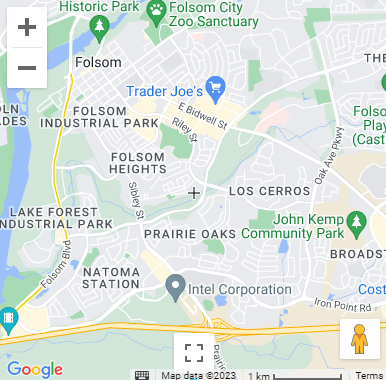
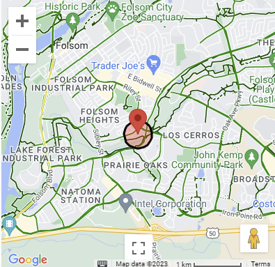
The example below incorporates multiple layers to display bike paths and mark a location at the center of an editable circle using layers.
Properties
-
layers.marker.0: Default marker icon
Property Value markers.0.position.lat 38.660867 markers.0.position.lng -121.159728 markers.0.icon.type default -
layers.circle.0: Red circle layer centered at the marker icon location
Property Value circles.0.center.lat 38.660867 circles.0.center.lng -121.159728 circles.0.fill #FF0000 radius 300 -
layers.bicycling: Visible bicycle routes
Property Value enabled true