Perspective - Markdown
Component Palette Icon:
Description
The Markdown component allows users to format any type of text so it is publishable as plain text without looking like it's been marked up with tags or formatting instructions. The Markdown component provides is a lightweight formatting language which is easy to write and easy to read. Markdown's formatting syntax only addresses issues that can be conveyed in plain text. For any marked up content that is not covered by Markdown's syntax, you can use HTML. You can even change the color of text in the component with HTML tags using the source prop in the Property Editor as shown in Example 2.
To learn more about how to use Markdown component for publishing plain text, refer to the following articles: Markdown Basics and Markdown Node Types.
If you would like to manually add line breaks, the most direct approach would be to disable the escapeHTML property, and add your own paragraph and line break elements. Once disabled, you can add line breaks as seen below:
Value of source | Result |
|---|---|
| Because there isn't a line break between "four" and "five", they're on the same line. 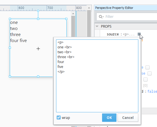 |
Properties
Most Properties have binding options. For more information on Bindings, see Types of Bindings in Perspective. This section only documents the Props Category of properties. The other Categories are described on the Perspective Component Properties page.
| Name | Description | Property Type |
|---|---|---|
| source | Text annotated with markdown syntax to display. | value: string |
| sectionSpacing | Number of pixels of vertical space between each section or header. | value: numeric |
| style | Sets a style for this component. Full menu of style options is available for text, background, margin and padding, border, shape and miscellaneous. You can also specify a style class. | object |
| markdown | Lightweight formatting language that is easy to write and easy to read.
| object |
Component Events
The Perspective Event Types Reference page describes all the possible component event types for Perspective components. Not all component events support each Perspective component. The Component Events and Actions page shows how to configure events and actions on a Perspective component. Component scripting is handled separately and can be accessed from the Component menubar or by right clicking on the component.
Examples
Example 1
| Property | Value |
|---|---|
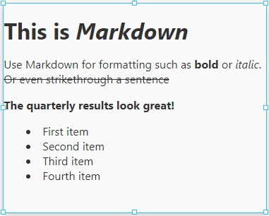
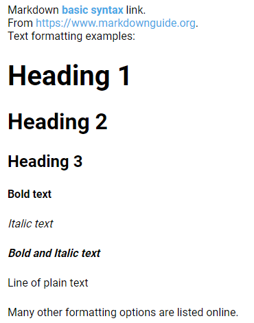
| props.source | MARKDOWN source:Markdown [basic syntax](https://www.markdownguide.org/basic-syntax) link.From https://www.markdownguide.org.Text formatting examples: |
Example 2
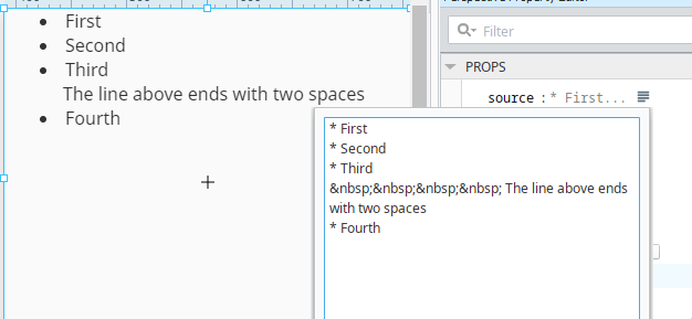
You can add additional lines within a list by ending the previous line with two spaces. In the example below, the text on the third line is actually "Third ". You can then force spaces via HTML using .
* First
* Second
* Third
    The line above ends with two spaces
* Fourth
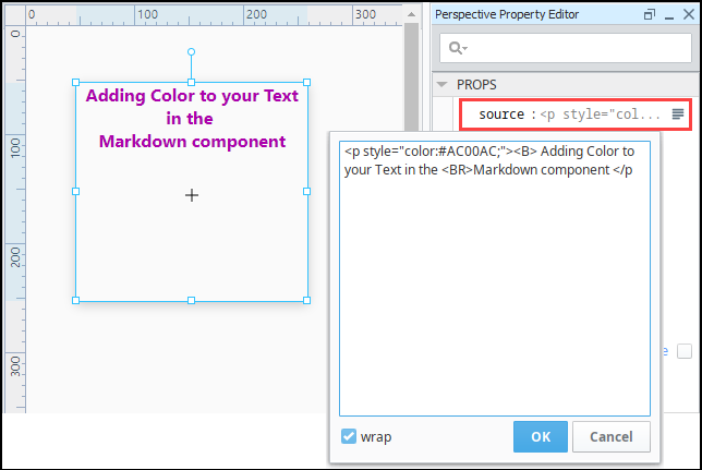
Example 3
The following code was used in the example below and pasted into the source property of the Markdown component.
<p style="color:#AC00AC;"><B> Adding Color to your Text in the <BR>Markdown component </p