Perspective - Dashboard
Component Palette Icon:
Description
The Dashboard component exposes layout capabilities to end users in a Perspective session so they have the ability to customize their dashboard layout for their individual needs. Widgets are configured in the Designer by designers and made available to Perspective session users. The Dashboard component uses a grid system based off of CSS grid specifications to position and place widgets.The Property Editor of the Dashboard component is where the designer controls the general layout of the grid by specifying the responsive mode: fixed or stretch, if the dashboard is editable, and if each widget is configurable and available in a Perspective session.
End users can choose from a list of pre-configured widgets to configure their dashboards in a Perspective session. They can add, remove, resize, move around, and configure widgets, including the ability to interact with widgets in a session such as entering text in a text field, displaying/hiding components in a widget, and even use parameters to pass a property to a specified view.
To learn more, refer to Configuring a Dashboard.
Properties
Most Properties have binding options. For more information on Bindings, see Types of Bindings in Perspective. This section only documents the Props Category of properties. The other Categories are described on the Perspective Component Properties page.
| Name | Description | Property Type |
|---|---|---|
| pack | New in 8.1.4 Enables widget packing algorithm. When disabled, widgets can be placed anywhere on the Dashboard and the component will not try to rearrange them in an optimal layout. | boolean |
| grid | The grid layout mode defines the responsive behavior of the grid and its cells: fixed and stretch. Both fixed and stretch values are strings.
| object |
| isEditing | Controls the runtime edit mode of the dashboard component. Stays in sync with the edit/play toggle control located at the bottom of the component. | boolean |
| editingToggle | Whether to display the dashboard editing toggle option. When disabled, hides the built in edit/play toggle control located at the bottom of the component. Disable this if you’d like to implement your own toggle that updates the isEditing prop in a controlled fashion. Default is true. | boolean |
| fixed | Visible when the grid mode is fixed. The following properties are all numeric values.
| object |
| stretch | Visible when the grid mode is stretch. The following properties are all numeric values.
| object |
| widgets | An array of configuration objects for widgets currently in use the dashboard display. Click here to see widgets properties. | array |
| availableWidgets | An array of widgets as configuration objects that are available to the user. When a widget is added to the dashboard via the add widget modal, this configuration object is copied to the widgets in use array, and act as the widgets defaults. Click here to see availableWidgets properties. | array |
widgets Properties
| Name | Description | Property Type |
|---|---|---|
| name | The unique widget name. | value: string |
| viewPath | The current configuration view path of the widget. | value: string |
| viewParams | Parameters for the view. If passing parameters into the embedded view, the names here must match the parameters on that view. New in 8.1.4 A dropdown list of parameters is available when the user clicks the Add Object Member  icon. This makes it easy to add parameters from the rendered view. icon. This makes it easy to add parameters from the rendered view.  | object |
| isConfigurable | Whether this widget is configurable during runtime. If enabled, dashboard is in edit mode, the toggle becomes available when the widget is selected which is used to configure the widgets view. When toggled on, the configuring view parameter will be true. | value: boolean |
| header | Configuration object for the widget header.
| object |
| body | Configuration object for the widget body.
| object |
| minSize | Specifies the widgets minimum allowable size when determining widget layout. Users may not resize widgets below these dimensions. The following property values are numeric.
| object |
| position | The widget position in the dashboard. Whenever a widget is added, resized, or moved the widget position object is automatically updated. The following property values are numeric.
| object |
| style | Style to be applied the widget. A full menu of style options is available. You can also specify a style class. | object |
availableWidgets Properties
| Name | Description | Property Type |
|---|---|---|
| viewPath | The current configuration view path of the widget. | string |
| viewParams | Parameters being passed to the view at the specified path. New in 8.1.4 As of 8.1.4 a dropdown list of parameters is available when the user clicks the Add Object Member icon. This makes it easy to add parameters from the rendered view. | object |
| isConfigurable | Whether this widget is configurable during runtime. If enabled and the dashboard is in edit mode, the toggle becomes available when the widget is selected which is used to configure the widgets view. When toggled on, the configuring view parameter will be 'true.' | value: boolean |
| defaultSize | Specifies the widgets default size adding a widget with no size specified. The following property values are numeric.
| object |
| minSize | Specifies the widgets minimum size used when determining widget layout. The following property values are numeric.
| object |
| category | A category in which to group this widget when displayed in the add widgets modal. | value: string |
| name | A unique name to provide this widget. This is used in the add widget modal. If no name is specified, its value will be blank. This is a required property. | value: string |
| header | Widget header configuration.
| object |
| body | Widget body configuration.
| object |
| style | Style to be applied the widget. A full menu of style options is available. You can also specify a style class. | object |
Component Events
The Perspective Event Types Reference page describes all the possible component event types for Perspective components. Not all component events support each Perspective component. The Component Events and Actions page shows how to configure events and actions on a Perspective component. Component scripting is handled separately and can be accessed from the Component menubar or by right clicking on the component.
Examples
In addition to the demonstration below, learn more about the Dashboard component on the Configuring a Dashboard page.
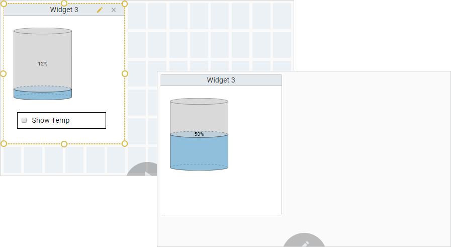
This image shows the dashboard in a Perspective Session with one widget.
| Property | Value |
|---|---|
| props.grid | stretch |
| props.isEditing | true |
| props.editingToggle | true |
| props.stretch.rowCount | 6 |
| props.stretch.columnCount | 14 |
| props.widgets.0.name | Widget 3 |
| props.widgets.0.viewPath | Widget 3 |
| props.widgets.0.isConfigurable | true |
| props.widgets.0.header.enabled | true |
| props.widgets.0.header.title | Widget 3 |
| props.availableWidgets.2.viewPath | Widget 3 |
| props.availableWidgets.2.isConfigurable | true |
| props.availableWidgets.2.name | Widget |
| props.availableWidgets.2.header.enabled | true |
| props.availableWidgets.2.header.title | Widget 3 |
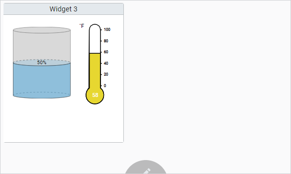
This same example also allows the user to interact with the widget in Edit mode when the isConfigurable property is set to true. The view uses a configuring parameter to go into configuring mode allowing users to configure the widget. It allows the user to show/hide the Thermometer showing the temperature of the Tank by simply checking/unchecking the ShowTemp checkbox.
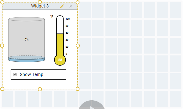
By unchecking Show Temp, the Thermometer component is removed from the widget on the dashboard in a Perspective Session.