Perspective - Equipment Schedule
Component Palette Icon:
Description
New in 8.1.12
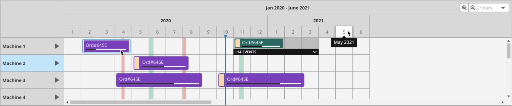
The Equipment Schedule component is a mix between the Status Chart, Gantt Chart, and Calendar components. It conveys equipment scheduling information in a concise and easily digestible format.
Interface Elements
| Icon | Element | Description |
|---|---|---|
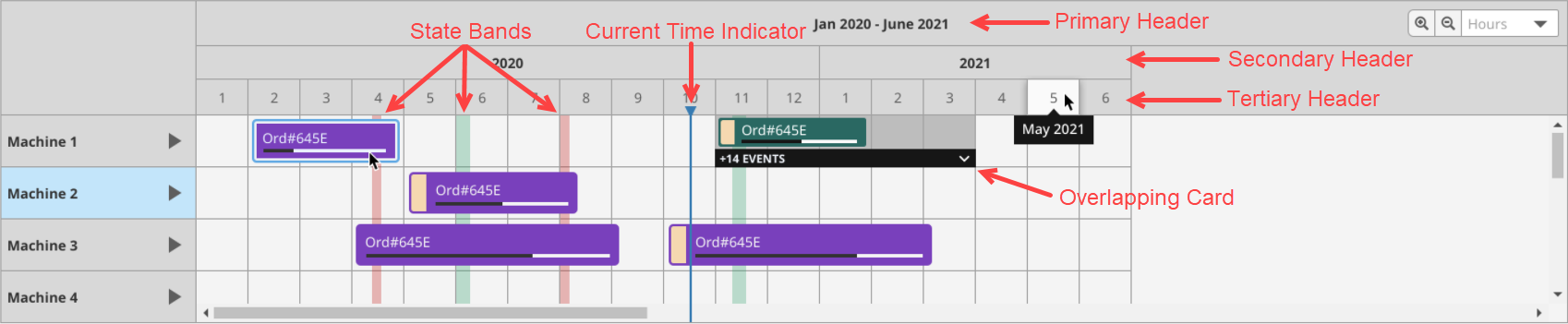
 | Current Time Indicator | Marker that indicates the current time, according to the session's timestamp. Style can be configured via currentTimeIndicator. |
 | State Bands | Bands indicating downtime and break events. Styles can be configured via downtimeEventStyle and breakEventStyle. |
 | Standard Card | A card on the equipment schedule corresponds to a scheduled event. During a Perspective Session, cards can be moved and resized by clicking and dragging. |
 | Overlapping Card | When more than one event is scheduled during the same time period for one item, an overlapping card will represent all events scheduled during that time period. Users can click the black drop down bar to select and edit individual events within the overlapping card. |
 | Zoom level | Sets the zoom level for the chart. Levels can be selected from the drop down menu or by clicking the magnifying glasses to zoom in or out. Valid values include month, day, 12-hr, 8-hr, 6-hr, 3-hr,15-min, hours, and minutes. |
 | Add New Event | Clicking within any empty square on the equipment schedule will allow the user to add a new event onto the chart. Note that Component Events must be configured and the addEnabled property must be true. |
| Primary Header | Header that represents the full range of time displayed on the chart. Styles can be configured via headerStyles.primaryHeaderStyle. | |
| Secondary Header | Header that represents subsets of time displayed in the Primary Header. Styles can be configured via headerStyles.secondaryHeaderStyle. | |
| Tertiary Header | Header that represents subsets of time displayed in the Secondary Header. Styles can be configured via headerStyles.tertiaryHeaderStyle. |
Properties
| Name | Description | Data Type |
|---|---|---|
| addEnabled | If enabled, users can add events to an item's schedule. Note that Component Events must be configured to implement the desired functionality when the events are fired. | boolean |
| resizeEnabled | If enabled, users can resize events. Note that Component Events must be configured to implement the desired functionality when the events are fired. | boolean |
| moveEnabled | If enabled, users can move events. Note that Component Events must be configured to implement the desired functionality when the events are fired. | boolean |
| deleteEnabled | If enabled, users can delete events. Note that Component Events must be configured to implement the desired functionality when the events are fired. | boolean |
| items | The cells, or equipment items, with schedules displayed on the chart. Each row on the equipment schedule corresponds to one item.
| array |
| dateRange |
| object |
| defaultZoom | Default zoom level for the chart. Valid values include month, day, 12-hr, 8-hr, 6-hr, 3-hr, 15-min, hours, and minutes. Note: The 15-min option is only available in version 8.1.17 and later. | value: string |
| rowHeight | Sets the height for all rows on the equipment schedule. | value: numeric |
| scheduledEvents | The scheduled events for all configured items.
| object |
| downtimeEvents | Downtime events correlated to a specific item. | array |
| breakEvents | Scheduled breaks, which will appear as downtime for all items. | array |
| selectedEvent |
| object |
| progressBar |
| object |
| currentTimeIndicator |
| object |
| headerStyles |
| object |
| rowStyle | Sets a style for all rows. Full menu of style options is available for text, background, margin and padding, border, shape and miscellaneous. You can also specify a style class. | object |
| selectedEventStyle | Sets a style for the selected event. Full menu of style options is available for text, background, margin and padding, border, shape and miscellaneous. You can also specify a style class. | object |
| scheduledEventStyle | Sets a style for scheduled events. Full menu of style options is available for text, background, margin and padding, border, shape and miscellaneous. You can also specify a style class. | object |
| downtimeEventStyle | Sets a style for downtime events. Full menu of style options is available for text, background, margin and padding, border, shape and miscellaneous. You can also specify a style class. | object |
| breakEventStyle | Sets a style for break events. Full menu of style options is available for text, background, margin and padding, border, shape and miscellaneous. You can also specify a style class. | object |
| bodyStyle | Sets a style for the body. Full menu of style options is available for text, background, margin and padding, border, shape and miscellaneous. You can also specify a style class. | object |
| style | Sets a style for the component. Full menu of style options is available for text, background, margin and padding, border, shape and miscellaneous. You can also specify a style class. | object |
Scripting
See the Perspective - Equipment Schedule Scripting page for the full list of scripting functions available for this component.