Perspective - Alarm Status Table
Component Palette Icon:
Description
The Alarm Status Table allows you to view currently active alarm events in the system, providing an easy way to inspect the alarm details, shelve alarms, and acknowledge them.
Acknowledgement is handled by selecting (checking) alarms and pressing the Acknowledge button.
Shelving is supported by pressing the Shelve button when an alarm is selected and choosing a time duration.
You can change the columns that are displayed and the column width in Preview Mode and in a Perspective Session. Right-click on the table header to show/hide columns. Click and drag the margins of the columns to resize their width. You can also sort table columns in ascending or descending order by simply clicking the up or down arrows next to each column header. Sorting on alarm State and Priority in the Alarm Status Table sorts in descending order. All the other columns the sort order is alphanumerical.
User Interface
| Interation | Description |
|---|---|
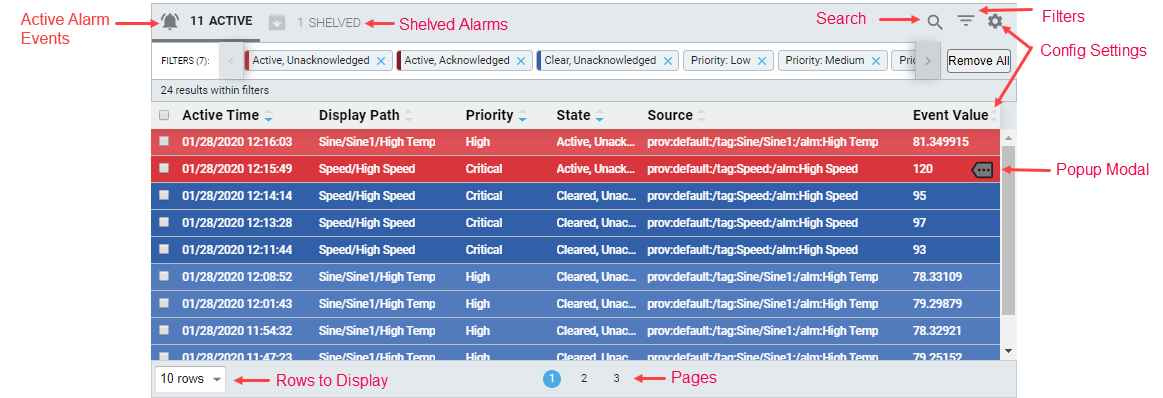
| Active Alarm Events | Shows the number of active alarms in the system. When viewing the shelved alarms view, clicking on the bell icon will switch the component back to the realtime view. |
| Config Settings | Clicking the  icon or right clicking on a column heading will open the Configuration menu, which determines which columns show appear on the component. icon or right clicking on a column heading will open the Configuration menu, which determines which columns show appear on the component. |
| Filters | Clicking the  icon opens the Filters menu, allowing you to select event states and priorities to filter on. icon opens the Filters menu, allowing you to select event states and priorities to filter on. |
| Pages | A listing of pages. Long lists of alarm events are spread across multiple pages to improve performance. Clicking on a number will switch which page is shown. |
| Popup Modal | Hovering over a row in the table will cause the Popup Modal  icon to appear. Clicking this icon shows more information about the alarm. icon to appear. Clicking this icon shows more information about the alarm. |
| Rows to Display | Determines how many rows are shown per page. |
| Search | Clicking the  icon cause a search bar to appear, allowing the user to type in search terms. icon cause a search bar to appear, allowing the user to type in search terms. |
| Shelved Alarms | Shows the number of shelved alarms. When viewing the realtime view, clicking on the Shelved Alarms display will switch to the shelved alarms view. While the table is showing shelved alarms, shelved alarms can be selected from the table and unshelved. 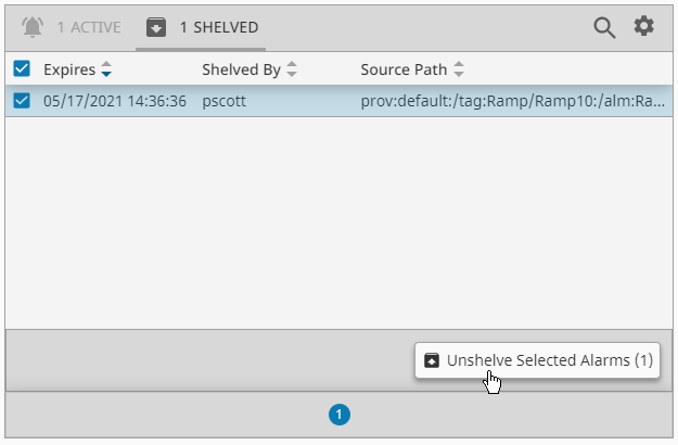 |
In addition, selecting a row within the table shows some additional interaction options.
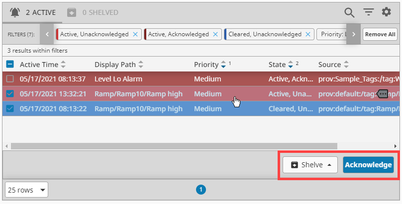
The Shelve button allows you to shelve the selected alarms.
The Acknowledge button allows you to mark the selected alarms as "acknowledged".
Properties
Most Properties have binding options. For more information on Bindings, see Types of Bindings in Perspective. This section only documents the Props Category of properties. The other Categories are described on the Perspective Component Properties page.
| Name | Description | Property Type |
|---|---|---|
| refreshRate | New in 8.1.0 The rate at which the table will poll for updates in milliseconds. | value: numeric |
| enableHeader | Enable table header. Default is true. | value: boolean |
| enableDetails | Enable active events table details action. Default is true. | value: boolean |
| enableAcknowledge | Enable acknowledge action. Default is true. | value: boolean |
| enableShelve | Enable shelve action. Default is true. | value: boolean |
| enableUnshelve | Enable unshelve action. Default is true. | value: boolean |
| toolbar | Settings for the toolbar. Click to see toolbar properties. | object |
| shelvingTimes | Available alarming shelving times in seconds. Shelving times are customizable by editing values for this property in the Property Editor. | array |
| responsive | Responsive layout configuration. Rows are converted to cards. While in responsive layout, disables or removes certain table features that are no longer applicable.
| object |
| filters | This is where you configure filtering properties for displaying alarm data in the Alarm Status Table. Click to see the filter properties. | object |
| selection | New in 8.1.4 Currently selected alarms and alarm selection configuration.
| object |
| rowStyles | Styles to apply to rows given their alarm state and designated priority. Click to see the rowStyles properties. | object |
| activeSortOrder | The default weighted order in which columns and their contents are sorted relative to other columns and their contents. Used when the component loads. Active event columns need to have sort configured in order for this to work. | array |
| shelvedSortOrder | The default weighted order in which columns and their contents are sorted relative to other columns and their contents. Used when the component loads. Shelved event columns need to have sort configured in order for this to work. | array |
| dragOrderable | New in 8.1.14 When enabled, users may drag column headers to reorder columns in the table. | value: boolean |
| columns | Used only for determining what columns to show on load. Click to see columns properties | object |
| columnsAssociated | New in 8.1.14 A list of columns used to retrieve and display alarm associated data. Click to see columnAssociated properties | object |
| pager | Settings for the pager. Click to see pager properties | object |
| style | Sets a style that applies to the component. The Style menu contains all the tools for modifying text, background, margins, and borders. You can also specify a style class. | object |
toolbar Properties
| Name | Description | Property Type |
|---|---|---|
| enabled | Enables the visibility of the table toolbar. Default is true. | value: boolean |
| enableActiveTab | Enables the visibility of the Active Events tab. | value: boolean |
| enableShelvedTab | Enables the visibility of the Shelved Events tab. | value: boolean |
| enableFilter | Enables the visibility of the text filter toggle. Default is true. | value: boolean |
| toggleableFilter | New in 8.1.18 If false, the text filter will not require user interaction to open, and instead will remain open. Default is true. | value: boolean |
| enableFilterResults | Enables the visibility of the filters results count message. Default is true. | value: boolean |
| enablePreFilters | Enables the visibility of the pre-filter toggle. Default is true. | value: boolean |
| enableConfiguration | Enables the visibility of the configuration toggle. Default is true. | value: boolean |
filter Properties
active
Settings for active alarms.
| Name | Description | Property Type |
|---|---|---|
| text | The alarm events filter text. | value: string |
| states | Pre-filters for filter active alarm events. All of the following properties are boolean values.
| object |
| priorities | Alarm event priority pre-filters. All of the following properties are boolean values.
| object |
| conditions | Gateway side alarm query conditions. All of the following properties are string values.
| object |
| results | Alarm event filtering results configuration and data.
| object |
shelved
Temporarily silence an alarm for a fixed period of time while the alarm event issue is worked on.
| Name | Description | Property Type |
|---|---|---|
| text | The alarm events filter text. | value: string |
| results | Shelved alarm filtering results configuration and data.
| object |
rowStyles Properties
| Name | Description | Property Type |
|---|---|---|
| activeUnacked | Style settings for rows with activeUnacked alarms. | object |
| activeAcked | Style settings for rows with activeAcked alarms. | object |
| clearUnacked | Style settings for rows with clearUnacked alarms. | object |
| clearAcked | Style settings for rows with clearAcked alarms. | object |
| dateFormat | A date format string to be applied against dates. | value: string |
rowStyles Child Properties
Each rowStyles property except dateFormat has the following child properties. For each, a full menu of style options is available for text, background, margin and padding, border, shape and miscellaneous. You can also specify a style class
| Name | Description | Property Type |
|---|---|---|
| base | Base style settings for alarms. | object |
| priorities | Style settings for the alarm row based on priority.
| object |
columns Properties
active
Active alarm event columns to display on load
| Name | Description | Property Type |
|---|---|---|
| activeTime | Settings for the activeTime column. | object |
| displayPath | Settings for the displayPath column. | object |
| priority | Settings for the priority column. | object |
| state | Settings for the state column. | object |
| source | Settings for the source column. | object |
| label | Settings for the label column. | object |
| name | Settings for the name column. | object |
| eventId | Settings for the eventId column. | object |
| eventValue | Settings for the eventValue column. | object |
| notes | Settings for the notes column. | object |
| isActive | Settings for the isActive column. | object |
| isAcked | Settings for the isAcked column. | object |
| isClear | Settings for the isClear column. | object |
| ackTime | Settings for the ackTime column. | object |
| ackUser | Settings for the ackUser column. | object |
| ackNotes | Settings for the ackNotes column. | object |
| ackPipeline | Settings for the ackPipeline column. | object |
| activePipeline | Settings for the activePipeline column. | object |
| clearTime | Settings for the clearTime column. | object |
| clearPipeline | Settings for the clearPipeline column. | object |
| deadband | Settings for the deadband column. | object |
shelved
| Name | Description | Property Type |
|---|---|---|
| expires | Settings for the expires column. | object |
| shelvedBy | Settings for the shelvedBy column. | object |
| sourcePath | Settings for the sourcePath expires column. | object |
column active and shelved Child Properties
Each column type property has the following child properties.
| Name | Description | Property Type |
|---|---|---|
| enabled | Whether the column is enabled. Default is true. | value: boolean |
| width | The column's width, which when not strict represents a proportion of the available space, i.e., flex grow. If strictWidth is enabled, the column will be fixed and static. | value: numeric |
| strictWidth | If enabled, the width of the column (set with the width property) becomes static. Default is false. | value: boolean |
| sort | Default sort order of the column. Options are none, ascending, or descending. | value: string |
columnsAssociated active Properties
Active alarm event associated data columns to display on load.
| Name | Description | Property Type |
|---|---|---|
| field | Maps to the associated data value represented by the column. | value: string |
| enabled | Whether the column is enabled. Default is true. | value: boolean |
| width | The column's width, which when not strict represents a proportion of the available space, i.e., flex grow. If strictWidth is enabled, the column will be fixed and static. | value: numeric |
| strictWidth | If enabled, the width of the column (set with the width property) becomes static. Default is false. | value: boolean |
| sort | Default sort order of the column. Options are none, ascending, or descending. | value: string |
| order | Order to display this column in the table. | value: numeric |
pager Properties
| Name | Description | Property Type |
|---|---|---|
| enabled | Enables the pager to be displayed. Default is true. | value: boolean |
| hide | Visually hides the pager from view. Useful when pager is manipulated in a controlled fashion via the activePage property. Default is false. | value: boolean |
| options | Rows to show per pager option. | array |
| initialOption | The initial option to use when the table first loads. It must exist as an available option. | value: numeric |
| activePage | Represents the current active page and corresponds to the value of the page jump input field. | value: numeric |
| shelvedPage | Represents the current shelved page and corresponds to the value of the page jump input field. | value: numeric |
Scripting
See the Perspective - Alarm Status Table Scripting page for the full list of scripting functions available for this component.
Examples
Example 1
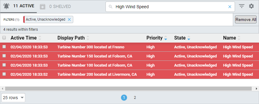
In a Perspective Session, click on the Filter button to filter on alarm states and/or use the Search Bar to target more specific alarm events. Select from the Configuration Settings to change the column headers to display the alarm event data you're interested in.
This example uses the Search Bar to find any text with 'High Wind Speed' in the Active, Unacknowledge alarm state.
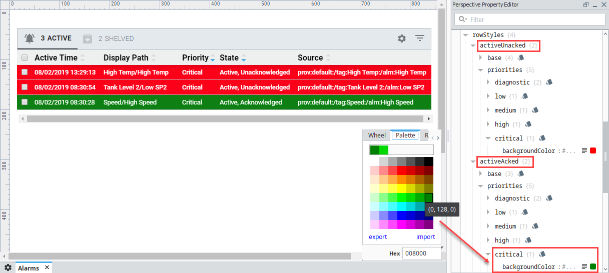
Example 2 - Alarm Status Table Row Styles
In the Designer, you can change row styles to be different colors for the different priorities for each alarm state. In this example, the rowStyle for the Critical priority for the activeAcked alarm state was changed to green.