Perspective - Tree

Component Palette Icon:
Description
The Tree component displays a tree hierarchy based on an array of objects. Icons can be chosen for the nodes of the tree, and different icons can be used when an node is expanded or collapsed.
Properties
Most Properties have binding options. For more information on Bindings, see Types of Bindings in Perspective. This section only documents the Props Category of properties. The other Categories are described on the Perspective Component Properties page.
| Name | Description | Property Type |
|---|---|---|
| items | An array of objects, each of which represents a node on the tree.
| array |
| interactable | If set to false, the tree is displayed but the user can't interact with it in the runtime. Default is true. | value: boolean |
| selection | Holds the item index path of the current selection. | value: string |
| selectionData | Array of objects containing the data and index path for all currently selected nodes.
| array |
| appearance | Settings for the appearance of the tree. Click here to see the appearance properties. | object |
| style | Sets a style for this component. Full menu of style options is available for text, background, margin and padding, border, shape and miscellaneous. You can also specify a style class. | object |
appearance Properties
| Name | Description | Property Type |
|---|---|---|
| textOverflow | Setting indicating whether overflowing text should cause the entire tree to scroll horizontally or whether the text should be truncated with an ellipsis. Default is scroll. | value: string dropdown |
| expandIcons | Settings for the expand icons . Options as follows:
| object |
| defaultNodeIcons | Settings for the node icons. Options as follows:
| object |
| selectedStyle | Sets a style for when nodes are selected. Full menu of style options is available for text, background, margin and padding, border, shape and miscellaneous. You can also specify a style class. | object |
| unselectedStyle | Sets a style for when nodes are unselected. Full menu of style options is available for text, background, margin and padding, border, shape and miscellaneous. You can also specify a style class. | object |
| rowHeight | Height, in pixels, of each row/node of the tree. Default is 24. | value: numeric |
Scripting
See the Perspective - Tree Scripting page for the full list of scripting functions available for this component.
Example
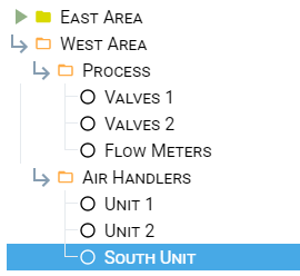
| Property | Value |
|---|---|
| appearance.defaultNodeIcons.collapsed.path | material/Play_arrow |
| appearance.defaultNodeIcons.collapsed.color | #D9D900 |
| appearance.defaultNodeIcons.expanded.path | material/subdirectory_arrow_right |
| appearance.defaultNodeIcons.expanded.color | #FFAC47 |
| appearance.defaultNodeIcons.empty.path | material/panorama_fish_eye |
| appearance.defaultNodeIcons.empty.color | #000000 |