Perspective - Alarm Journal Table
Component Palette Icon:
Description
The Perspective Alarm Journal Table displays the history of the alarm system. It can be configured to show active, cleared, and acknowledged events.
Before the Alarm Journal Table can retrieve alarm data, an Alarm Journal must first be configured.
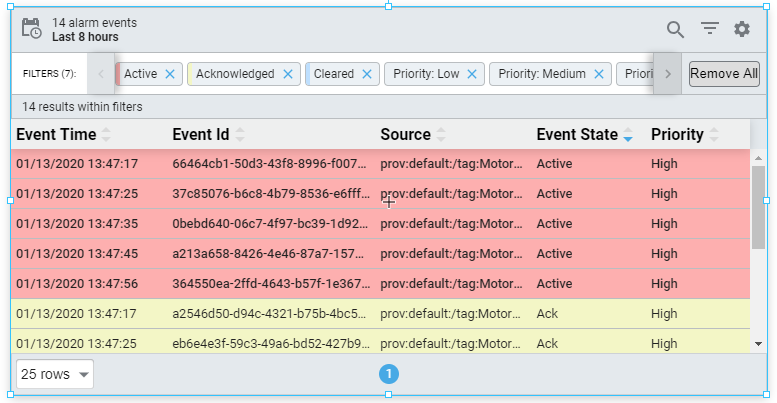
The Perspective Alarm Journal Table has a number of configuration options that can be used to filter on realtime and historical alarm data, and change how the component displays those alarms. When you first drag the Alarm Journal Table into the Designer, by default, the table will show you the last 8 hours of alarm journal data. You can interface with the journal table in the Designer, in Preview Mode of the Designer, and in a Perspective Session.
The Alarm Journal Table provides a host of filtering properties that allow you to filter on various parts of alarms and view the details. All the alarm states are visible by clicking the Filter button on the table. There is also a search bar where you can enter text to further refine your filter criteria so you have less alarm events to scroll through. The Alarm Journal Table can filter for alarm events in either Realtime or Historical using the Date Range feature.
You can change the columns that are displayed, the order of the columns, and/or the column width in Preview Mode and in a Perspective Session. Right-click on the table header to show/hide columns. Click and drag the margins of the columns to resize their width. You can also sort table columns in ascending or descending order by simply clicking the up or down arrows next to each column header.
User Interface
The following table describes the user interface available for the Alarm Journal Table.
| Interaction | Description |
|---|---|
| Config Settings | Clicking the  icon or right clicking on a column heading will open the Configuration menu, which determines which columns show appear on the component. icon or right clicking on a column heading will open the Configuration menu, which determines which columns show appear on the component. |
| Date Range | Clicking on the  icon will open the Date Range window, allowing the user to determine a range of time to filter on. Alarm events with an Event Time that matches the selected range will appear on the table. icon will open the Date Range window, allowing the user to determine a range of time to filter on. Alarm events with an Event Time that matches the selected range will appear on the table. |
| Filters | Clicking the  icon opens the Filters menu, allowing you to select event states and priorities to filter on. icon opens the Filters menu, allowing you to select event states and priorities to filter on. |
| Pages | A listing of pages. Long lists of alarm events are spread across multiple pages to improve performance. Clicking on a number will switch which page is shown. |
| Popup Modal | Hovering over a row in the table will cause the Popup Modal icon to appear. Clicking this icon shows more information about the alarm. |
| Rows to Display | Determines how many rows are shown per page. |
| Search | Clicking the  icon will cause a search bar to appear, allowing the user to type in search terms. icon will cause a search bar to appear, allowing the user to type in search terms. |
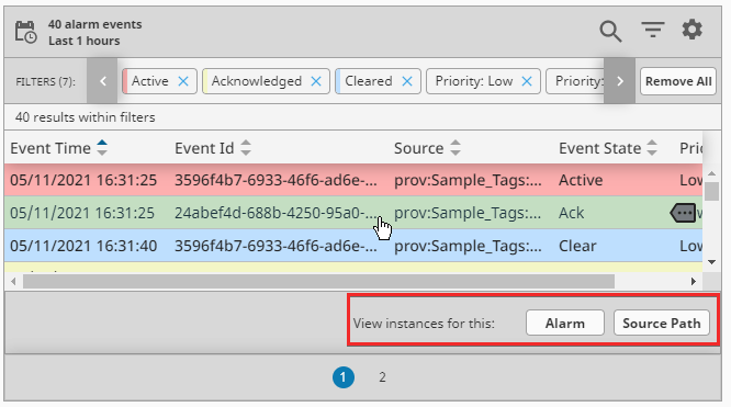
Additional interface options become available when selecting a row within the table, which allow the table to search for similar events.
- Alarm: Shows all events for a single alarm instance, meaning the active event, the clearing event, and the acknowledging event (if present).
- Source Path: Shows all events that match the same source path as the selected event, respecting the selected date range.
Properties
Most Properties have binding options. For more information on Bindings, see Types of Bindings in Perspective. This section only documents the Props Category of properties. The other Categories are described on the Perspective Component Properties page.
| Name | Description | Property Type |
|---|---|---|
| name | The name of the alarm journal to query. Default is "Journal". Note: In Gateway Network configurations, set this to an empty string OR use the name of the Remote Alarm Journal. On Edge Gateways, set this to an empty string value to have the component use the Edge Alarm Journal. | value: string |
| refreshRate | New in 8.1.0 The rate at which the table will poll for updates in milliseconds. | value: numeric |
| enableHeader | Enables the table header. Default is true. | value: boolean |
| enableDetails | Enables the details action. Default is true. | value: boolean |
| toolbar | Settings for the toolbar. Click to see the toolbar properties | object |
| dateFormat | A date format string to be applied against dates. Options are none, date in the format "10/15/2018", time in format "3:59:00 PM", or date time in format "10/15/208 15:59:00". | value: string |
| responsive | Responsive layout configuration. Rows are converted to cards. While in responsive layout, disables or removes certain table features that are no longer applicable. Click to see the responsive properties | object |
| dateRange | Settings for date range state. Click to see the dateRange properties | object |
| filter | Filter settings. Click to see the filter properties | object |
| rowStyles | Styles to apply to rows given their alarm event and designated priority. Click to see rowStyles properties | object |
| dragOrderable | New in 8.1.14 When enabled, users may drag column headers to reorder columns in the table. | value: boolean |
| columns | Used for determining what column properties to display on the Alarm Journal Table. Click to see columns properties | object |
| columnsAssociated | New in 8.1.14 A list of columns used to retrieve and display alarm associated data. Click to see columnsAssociated properties. | object |
| sortOrder | The default weighted order in which columns and their contents are sorted relative to other columns and their contents. Only works if used when the component loads. Columns need to have sort configured in order for this to work. | array |
| pager | Settings for the pager. Click to see pager properties. | object |
| style | Sets a style that applies to the component. The Style menu contains all the tools for modifying text, background, margins, and borders. You can also specify a style class. | object |
toolbar Properties
| Name | Description | Property Type |
|---|---|---|
| enabled | Enables the visibility of the table toolbar. Default is true. | value: boolean |
| enableDateRange | Enables the visibility of the date range toggle. Default is true. | value: boolean |
| enableFilter | Enables the visibility of the text filter toggle. Default is true. | value: boolean |
| toggleableFilter | New in 8.1.18 If false, the text filter will not require user interaction to open, and instead will remain open. Default is true. | value: boolean |
| enableFilterResults | Enables the visibility of the filters results count message. Default is true. | value: boolean |
| enablePreFilters | Enables the visibility of the prefilter toggle. Default is true. | value: boolean |
| enableConfiguration | Enables the visibility of the configuration toggle. Default is true. | value: boolean |
responsive Properties
| Name | Description | Property Type |
|---|---|---|
| enabled | Enables responsive layout. Default is false. | value: boolean |
| breakpoint | Width in pixels that triggers change in responsive layout. | value: numeric |
dateRange Properties
| Name | Description | Property Type |
|---|---|---|
| mode | The current date range mode: realtime or historical. | value: string |
| realtime | When mode is set to realtime, this property will appear with the following sub properties available:
| object |
| historical | When mode is set to historical, this property will appear with the following sub properties available:
| object |
filter Properties
| Name | Description | Property Type |
|---|---|---|
| text | The alarm events filter text. | value: string |
| events | Alarm event types. All of the following properties are boolean values.
| object |
| priorities | Alarm event priority pre-filters. All of the following properties are boolean values.
| object |
| conditions | Gateway side alarm query conditions. All of the following properties are string values.
| object |
| results | Alarm event filtering results configuration and data.
| object |
rowStyles Properties
| Name | Description | Property Type |
|---|---|---|
| active | Style settings for rows with active alarms. | object |
| acked | Style settings for rows with acked alarms. | object |
| cleared | Style settings for rows with cleared alarms. | object |
| system | Style settings for rows with system alarms. | object |
rowStyles Child Properties
Each rowStyles property has the following child properties. For each, a full menu of style options is available for text, background, margin and padding, border, shape and miscellaneous. You can also specify a style class
| Name | Description | Property Type |
|---|---|---|
| base | Base style settings for alarms. | object |
| priorities | Style settings for the alarm row based on priority.
| object |
columns Properties
| Name | Description | Property Type |
|---|---|---|
| eventTime | Settings for the eventTime column. | object |
| eventId | Settings for the eventId column. | object |
| name | Settings for the name column. | object |
| source | Settings for the source column. | object |
| eventState | Settings for the eventState column. | object |
| priority | Settings for the priority column. | object |
| state | Settings for the state column. | object |
| displayPath | Settings for the displayPath column. | object |
| label | Settings for the label column. | object |
| eventValue | Settings for the eventValue column. | object |
| isSystemEvent | Settings for the isSystemEvent column. | object |
| ackUser | Settings for the ackUser column. | object |
| ackNotes | Settings for the ackNotes column. | object |
column Child Properties
Each column type property has the following child properties.
| Name | Description | Property Type |
|---|---|---|
| enabled | Whether the column is enabled. Default is true. | value: boolean |
| width | The column's width, which when not strict represents a proportion of the available space, i.e., flex grow. If strictWidth is enabled, the column will be fixed and static. | value: numeric |
| strictWidth | If enabled, the width of the column (set with the width property) becomes static. Default is false. | value: boolean |
| sort | Default sort order of the column. Options are none, ascending, or descending. | value: string |
columnsAssociated Properties
| Name | Description | Property Type |
|---|---|---|
| field | Maps to the associated data value represented by the column. | value: string |
| enabled | Whether the column is enabled. Default is true. | value: boolean |
| width | The column's width, which when not strict represents a proportion of the available space, i.e., flex grow. If strictWidth is enabled, the column will be fixed and static. | value: numeric |
| strictWidth | If enabled, the width of the column (set with the width property) becomes static. Default is false. | value: boolean |
| sort | Default sort order of the column. Options are none, ascending, or descending. | value: string |
| order | Order to display this column in the table. | value: numeric |
pager Properties
| Name | Description | Property Type |
|---|---|---|
| enabled | Enables the pager to be displayed. Default is true. | value: boolean |
| hide | Visually hides the pager from view. Useful when pager is manipulated in a controlled fashion via the activePage property. Default is false. | value: boolean |
| options | Rows to show per pager option. | array |
| initialOption | The initial option to use when the table first loads. It must exist as an available option. | value: numeric |
| activePage | Represents the current active page and corresponds to the value of the page jump input field. | value: numeric |
Scripting
See the Perspective - Alarm Journal Table Scripting page for the full list of scripting functions available for this component.