Style Classes
A Style Class is a group of Style settings that are saved together. Style Classes can be applied to multiple components to provide consistency in design. A Style Class enables you to define style elements in one place, and then quickly apply that style to different components. Style Classes are stored in the Styles folder in the Project Browser.
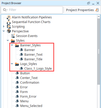
Within the Styles folder, Style Classes can be placed into folders in order to keep them organized. In the following example, we created separate folders for banner styles and logo styles in the Designer. As projects grow and increase in complexity, use folders to more easily manage your Style Classes.
The prefix ia_ is reserved for the base, predefined styling that is built into Perspective, and should not be used when naming user-created Style Classes. Using the ia_ prefix for user-created Style Classes may result in unintended behavior.
Creating a Style Class
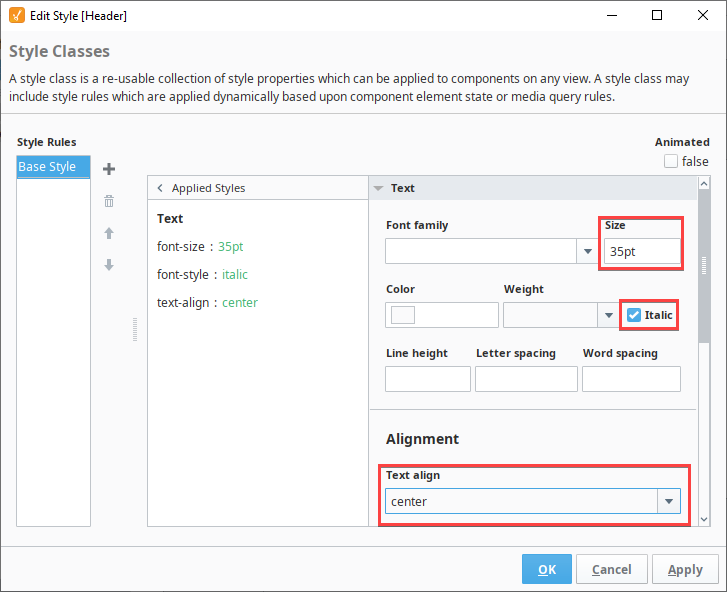
In this example we'll create a 35 point Italic font, and center the text.
-
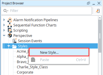
To create a Style Class, right-click on the Styles folder and select New Style.
-
Enter a name for the new Style Class. Style Class names must be unique to the project. You will see a green check icon if the name you enter is acceptable. In this example we'll name ours "Header".

-
Click Create Style Class.
-
On the Edit Style screen, use the style editor to define the style. In this case we'll configure values for the following properties under Text:
- Size: 35pt
- Italic: enabled
- Text align: center
-
Click OK to save the Style Class.
-
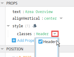
Once a Style Class has been created, it can then be applied to a component. In the component's Style property, there will be a classes property with a dropdown list of all available Style Classes that can be applied to the component.
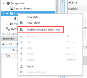
Enabling the Advanced Stylesheet
Users with extensive background working with CSS are now able to fine tune styling by modifying the Advanced Stylesheet resource. The stylesheet is an advanced feature and is not placed by default. To enable the Advanced Stylesheet, right-click on the Styles folder and select Enable Advanced Stylesheet.
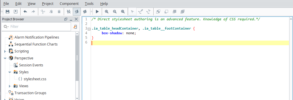
The stylesheet.css resource will now be available under Styles. The stylesheet allows users to insert CSS as in any normal CSS file. Note the editor does not support auto-complete CSS syntax.
Common examples of how this resource can be used include overriding or extending Perspective Style Classes or CSS classes used within a component's structure. CSS classes are not exposed in a component's Property Editor, where as Style Classes are exposed. Perspective uses the prefix .psc- for Style Classes before they are injected onto the page, so if you are trying to target a Style Class, you’ll need to add this prefix to the name of your style declaration. Then add the Style Class name (without the prefix) to your Property Editor style field. Use the prefix .ia to edit CSS classes as shown. No further steps are required to activate edits to CSS classes.
The rules defined in this resource are inserted into the Perspective project between the Theme files of the Gateway and the Style Classes of the project. This means the resource is scoped to a project, unlike Theming files being Gateway-scoped.
To disable this advanced feature, follow the Delete a Style Class process below.
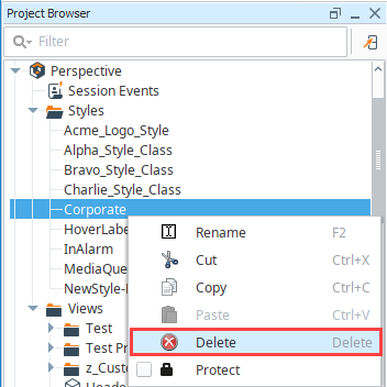
Delete a Style Class
To delete a Style Class, right-click on the Style Class name in the Project Browser, then select Delete. When a Style Class is deleted, it is no longer applied to any components it was previously applied to. The component returns to the default style settings with the exception of any inline styles. Inline styles will remain applied to the component.
Rename a Style Class
To rename a Style Class, right-click on the Style Class name in the Project Browser, then select Rename.
Once a Style Class is renamed, any component that was using the Style Class will lose reference to the newly named style class, meaning you'll need to reapply the newly named style class.
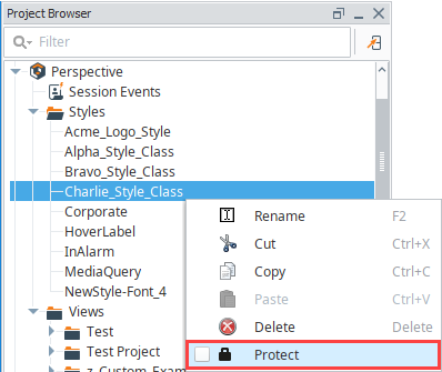
Protect a Style Class
You can lock a Style Class from inside Designer by opening the Project Browser, right-clicking on the Style Class, and selecting the Protect option to protect it. Once it's protected, it cannot be changed except by someone that has the permission to unprotect it and modify it. For more information on protecting project resources see Project Security in the Designer.
Multiple Style Classes
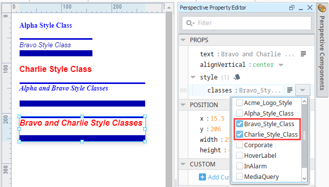
Perspective allows you to select more than one Style Class for a component. Multiple Style Classes are applied to a component in alphabetical order. Style Classes further along in the alphabet will override earlier Style Classes.
In the example below, Bravo Style Class is blue, bold, italic, and 13px text with some borders. Charlie Style Class is red, bold, and 16px text.
When both styles are applied together, the color and text size in Charlie Style Class override Bravo. However, the italics and borders from Bravo remain because Charlie does not have those properties set.
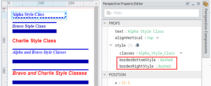
You can also apply inline styles to components that have a Style Class. The inline style properties override any properties in the Style Class. For example, if the Style Class has a properties of 22pt bold text with a color of blue, but there is an inline style property of 18pt bold text with a color of orange, the component will receive the inline style properties. In this example, we applied the Alpha style to a label and the applied inline styles of a bottom and right border.
Animated Style Classes
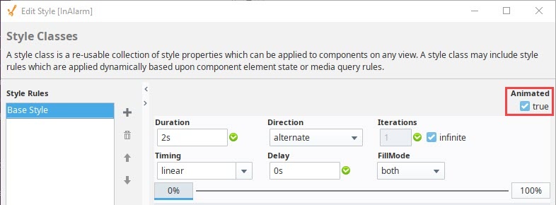
An animated style class transitions through two or more style configurations over some period of time. For example, using an animated Style Class can be powerful way to visually show data changes (such as an alarm state) on a component over time. When the Animated option is set to true on the Edit Style screen, several settings appear for customizing the animation.
Animated Settings
The following properties appear when the Animated checkbox is set to True.
| Name | Description |
|---|---|
| Duration | Number of seconds for each animation stop. |
| Direction | Options are normal, reverse, alternate, and alternate reverse. |
| Iterations | Number of times you want the animation to run. Enter an integer, or check the infinite box to have the animation run continually. |
| Timing | Options are linear, ease, easeIn, easeOut, stepStart, stepEnd, and exaggerate. |
| Delay | Delay, in number of seconds. |
| FillMode | Options are none, forwards, backwards, or both. |
| 0% to 100% | Animation stops. All of the animation and style settings can be set for each stop. Additional stops can be added by right-clicking on the bar in between 0% and 100%. |
| Style Settings | Sets the styles for an animation stop. Full menu of style options is available for text, background, margin and padding, border, shape and miscellaneous. |
| Applied Styles | Displays the style names and settings as you add them to a component. |
Bindings on Style Classes
In Perspective, you can dynamically change the Style Class on a component. Styles and Style Classes can have binding options. For example, a component could use a Style Class when a Tag has one value, and not use the class when the Tag has a different value.
Element States on Style Classes
Element States are used on Style Classes to change the style configuration on a component based on the state of the component. It is an additional styling configuration you can make on a Style Class. For example, you could have the border on a component change when it is disabled. Or you could have the background change when the user hovers the mouse over the component. See the table below for element states that are available. These states are based in CSS pseudo classes.
| Name | Description |
|---|---|
| Element State | State of the component. See the Element State table for state options. |
| Animated | If checked, the Element State can be animated. The animate options are as follows: See Animated. |
Element State
| State | Description |
|---|---|
| active | The component is being activated by the user. For example, clicking on it with a mouse. |
| checked | The component is checked or toggled to an "on" state. Applies to checkboxes, radio buttons, etc. |
| default-choice | The component is the default selection in a group of related options. |
| disabled | The component is disabled and it cannot be selected, clicked on, typed into, or accept focus. |
| empty | Represents any element that has no children. Children can be either element nodes or text (including whitespace). |
| enabled | The component is enabled and can be selected, clicked on, typed into, or accept focus. |
| first-child | Changes the style for the first element among a group of sibling elements. |
| fullscreen | Automatically adjust the size, style, or layout of content when elements switch back and forth between full-screen and traditional presentations. |
| focus | The component receives focus. It is generally triggered when the user clicks or taps on an element or selects it with the keyboard's tab key. |
| hover | User hovers mouse over the component. |
| in-range | Element whose current value is within the range limits specified by the min and max attributes. |
| invalid | The component has an invalid input or selection based on the input type or validation rules. |
| last-child | The component is the last element among a group of sibling elements. |
| link | The component acts as a hyperlink, navigating the user to a different location when activated. |
| only-child | The component is the only child of its parent |
| out-of-range | The component's current value is outside the range limits specified by the min and max attributes |
| read-only | The component is read-only. |
| read-write | The component is available for read and write. |
| required | The component must be filled before submitting a form. |
| valid | The component has a valid input or selection based on the input type or validation rules. |
| visited | The component links that the user has already visited. |
Animated
| Name | Description |
|---|---|
| Duration | Number of seconds for each animation stop. |
| Direction | Options are normal, reverse, alternate, and alternate reverse. |
| Iterations | Number of times you want the animation to run. Enter an integer, or check the infinite box to have the animation run continually. |
| Timing | Options are linear, ease, easeIn, easeOut, stepStart, stepEnd, and exaggerate. |
| Delay | Delay, in number of seconds. |
| FillMode | Options are none, forwards, backwards, or both. |
| Style Settings | Sets a style animation stop. Full menu of style options is available for text, background, margin and padding, border, shape and miscellaneous. |
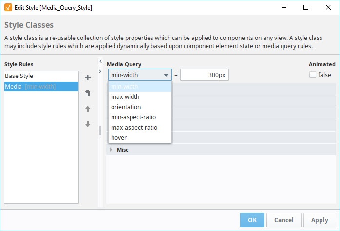
Media Query on Style Classes
A Media Query can be applied to a Style Class in order to change the style of your Perspective components based on the device your session is running on. That is, you can change the style of your Perspective components based on the device your session is running on.
Media queries don't change anything about your layout, rather they react to those changes in the device and then choose from the various style rules you defined.
For example, you could make changes to your styles based on the width of the session. Media queries in Style Classes are a direct import of CSS rules. Depending on the particular media query, the selector will apply at less than or equal to, or vice versa.
Media Query Settings
| Name | Description |
|---|---|
| min-width | Sets the minimum width in pixels. If the viewport is larger than the specified width (in pixels), this rule will be applied. If the viewport is smaller than the minimum width, this rule has no effect. For example, a setting of min-width 361 means this rule is active if the screen is at least 361 pixels wide. |
| max-width | Sets the maximum width in pixels . If the viewport is smaller than the maximum width, it will automatically change the height of the element. If the viewport is larger than the maximum width, rule has no effect. For example, a setting of max-width 360 means this rule is active if the screen is at most 360 pixels wide or smaller. |
| orientation | This rule will apply based on whether the browser window is in landscape mode (that is, its width is greater than its height) or portrait mode (its height is greater than its width). Options are portrait or landscape. |
| min-aspect-ratio | Sets a minimum width-to-height aspect ratio. Enter value as a ratio or width-to-height, for example 8/5. |
| max-aspect-ratio | Sets a maximum width-to-height aspect ratio. Enter value as a ratio or width-to-height, for example 8/5. |
| hover | Applies the style settings when the device supports hovering. Options are hover or none. |
| Style Settings | The style settings to apply during the media query. Full menu of style options is available for text, background, margin and padding, border, shape and miscellaneous. |