Perspective - Thermometer

Component Palette Icon:
Description
The Thermometer component displays a temperature value depicted as a level in a mercury thermometer. Temperature intervals can be defined with their own colors so that the mercury color changes based on the temperature range. Full menu of style options is available for text, background, margin and padding, border, shape and miscellaneous. You can also specify a style class.
Properties
Most Properties have binding options. For more information on Bindings, see Types of Bindings in Perspective. This section only documents the Props Category of properties. The other Categories are described on the Perspective Component Properties page.
| Name | Description | Property Type |
|---|---|---|
| thermometerColor | Color of the outline of the thermometer. Default is black. | color |
| mercuryColor | Color of the mercury. See Color Selector. | color |
| axisLabelColor | The color of the thermometer's y-axis label. Default is black. See Color Selector. | color |
| strokeWidth | Width of the lines used to draw the thermometer in pixels. | value: numeric |
| highBound | The high boundary value for the whole thermometer. | value: numeric |
| lowBound | The lower boundary value for the whole thermometer. | value: numeric |
| value | The value to display in the thermometer. The mercury level and value label will change to reflect this. | value: numeric |
| unit | A string to describe the units for the current value label. Options are "F" for Fahrenheit or "C" for Celsius. | value: string dropdown |
| valueFontcolor | The color of the current value. See Color Selector. | color |
| valueFont | The font to use for the current value label.
| object |
| intervals | Defines the upper and lower temperature range for each interval.
| object |
| style | Sets a style for this component. Full menu of style options is available for text, background, margin and padding, border, shape and miscellaneous. You can also specify a style class. | object |
Component Events
The Perspective Event Types Reference page describes all the possible component event types for Perspective components. Not all component events support each Perspective component. The Component Events and Actions page shows how to configure events and actions on a Perspective component. Component scripting is handled separately and can be accessed from the Component menubar or by right clicking on the component.
Example
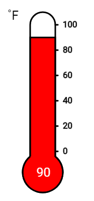
| Property | Value |
|---|---|
| props.unit | F |
| props.mercuryColor | #8AFF8A |
| props.intervals.1.high | 45 |
| props.intervals.0.color | #0000FF |
| props.intervals.1.color | #CCCCFF |
| props.intervals.2.color | #FF0000 |
| props.intervals.2.low | 85 |
| props.value | 90 |