Perspective - Container Palette
Container Components
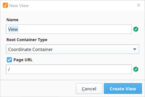
Container components provide a way of laying out and organizing Perspective components within a view. The different container types support different layout strategies. As the root level of a view, containers are essential to creating responsive applications with the ability to display information across a wide variety of screen sizes and orientations. The container type is selected when creating a view under the Root Container Type field. Once the view is created, the root container type cannot be changed.
The following is a complete list of container components, and a link pointing to a page with the component's description, properties, and an example of how to configure it.
The Coordinate container is the default container type when creating a new view in a project. A different container type can be selected using the dropdown arrow to display the full list of container component options.
The following is a complete list of container components, and a link pointing to a page containing the component's description, properties, and an example of how to configure it.