Perspective - Flex Container
Component Palette Icon:
Description
The Flex container provides an efficient way to lay out, align, and distribute space among components in the container particularly when their size is unknown or dynamic. The Flex Container can alter a component's width and height to best fill the available space to accommodate all types of devices and screen sizes. It expands components to fill available free space, or shrinks them to prevent overflow.
The container works off of two axes: main axis and cross axis. Components will fill out the container along the main axis. Additional alignment and justification of the components are determined by the alignItems, alignContent, and justify properties.
The Flex container is based off the CSS flexbox.
Properties
Most Properties have binding options. For more information on Bindings, see Types of Bindings in Perspective. This section only documents the Props Category of properties. The other Categories are described on the Perspective Component Properties page.
| Property | Description | Property Type |
|---|---|---|
| direction | Direction of the child layout. Options are row, row-reverse, column, column-reverse. | value: string |
| wrap | Whether the container should allow children to wrap to the next line if space has run out. Options are nowrap, wrap, wrap-reverse. | value: string |
| justify | Adjusts placement of children along the main axis when there is extra space, which may be used to fill areas before, after, or in-between: flex-start, flex-end, center, space-between, space-around, space-evenly. | value: string |
| alignItems | Adjusts placement of children along the cross axis when there is extra space: flex-start, flex-end, center, baseline, stretch. | value: string |
| alignContent | Adjusts alignment of wrapped content when there is free space in the cross axis: flex-start, flex-end, center, space-between, space-around, stretch. | value: string |
| style | Use Style to customize the visual style of the component. The Style menu contains all the tools for modifying text, background, margins, and borders. You can also specify a style class. | object |
Child Component Position Properties
When a component is placed inside of a flex container, it will inherit the position properties listed below.
| Property | Description | Property Type |
|---|---|---|
| grow | Ability to grow in the direction dimension as needed, relative to siblings. If space is available and grow is not zero, it may stretch, depending on sibling rules. This value is relative to other components, meaning that two components with the same grow value will grow at the same rate. | value: numeric |
| shrink | Ability to shrink in direction dimension as needed, relative to siblings. If space is available and grow is not zero, it may stretch, depending on sibling rules. This value is relative to other components, meaning that two components with the same shrink value will shrink at the same rate. | value: numeric |
| basis | Space filled by component by default, before grow, shrink, and sibling considerations are evaluated. This is the component's base width when the direction property is set to row, and it is the component's base height when the direction property is set to column. | value: numeric |
| display | Determines if the component will be displayed in the container or not. Components that are not displayed won't just be invisible, but will actually be removed from the Flex container, readjusting all other components to fit. | value: boolean |
User Interface
See the Flex Container User Interface page for more information on additional functionality available when the Flex container is deep selected.
Growing and Shrinking
The Flex container's grow and shrink properties allow a great deal of control over how different components expand and shrink. To demonstrate, here are three components nested inside a Flex container, with a direction of row:

All three components have the same basis, so at this session width, they all have the same size. However, the blue component has a much larger grow value than the other two components. So, when we increase the length of the Flex container along its direction property:

The blue component does most of the stretching. Specifically, since the sum of all grow properties is 1 + 1 + 5 = 7, and the blue component has a grow property of 5, for every 7 pixels the Flex container grows, the blue component will grow by 5 pixels. Now let's try shrinking the container, noting that the red component has a shrink value of 5:

As you can see, a larger shrink value will make the container shrink more. For every 7 pixels the Flex container loses, the red component will lose 5 pixels.
Static Widths
Now let's try the same example again, but with some different grow and shrink values:

We've given the red and green components identical values, so they should stretch and shrink at the same rate. Meanwhile, the blue component's grow and shrink values are both 0, so when we make the Flex container wider, it stays the same size:

Even Scaling
Now let's say we start off with a blue component twice the basis of the others:

In order to maintain this ratio as the width of the container increases, it must have a grow value twice that of the others:

Scripting
See the Perspective - Flex Container Scripting page for the full list of scripting functions available for this component.
Example
In the following example, we have three components inside a Flex container: Button, Thermometer, and LED Display. The position properties for the Button and LED Display are set so that their size will not change if the Flex container is resized. However, the Thermometer will shrink or grow depending on the Flex container size.
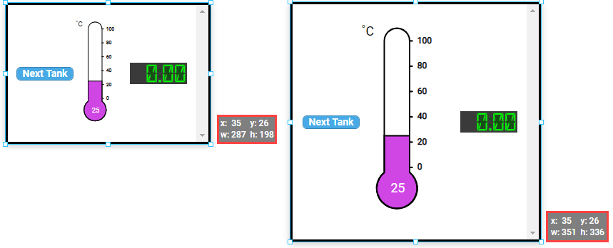
The following properties are set for the Flex Container:
| Property | Value |
|---|---|
| props.direction | row |
| props.wrap | nowrap |
| props.justify | space-between |
| props.alignItems | center |
| props.alignContent | flex-start |
The following properties are set for the Button component within the container:
| Property | Value |
|---|---|
| props.text | Next Tank |
| position.grow | 0 |
| position.shrink | 0 |
| position.basis | 80px |
The following properties are set for the Thermometer component within the container:
| Property | Value |
|---|---|
| props.direction | row |
| position.grow | 1 |
| position.shrink | 1 |
| position.basis | 50% |
The following properties are set for the LED Display component within the container:
| Property | Value |
|---|---|
| position.grow | 0 |
| position.shrink | 0 |
| position.basis | 80px |