Perspective - Video Player
Component Palette Icon:
Description
The Video Player component enables you to embed video or a live feed in Perspective views. In a view, the component displays either a live feed from an IP camera or a web hosted video file that is accessible from your gateway. The component is wrapped in a skin that gives you control over the style of the video controls and a uniform experience across browsers. Video controls can also be hidden (available on hover) to allow for a simple, clean video display.
The component requires a URL to a video or live feed. This also includes files placed on a WebDev mounted folder or file resource, which can be used to serve video files.
Designer Playback
The Designer contains an instance of JxBrowser to display your views as you build them. There are a few codecs that JxBrowser does not support. Because of this, you may find that some videos do not play or display correctly while in the Designer. This is only a limitation of the codecs available to the Designer. The video will work as expected in a client session assuming it supports the required codec.
This component plays embedded media files, which is not supported by the Safari 14 web browser. As a result, Sessions running in Safari 14 will not be able to utilize video playback on this component.
Mobile Platform Restrictions
Due to security restrictions on some mobile platforms (and in certain use cases), there are some special behaviors to be aware of when using this component.
iOS
All iOS devices require user interaction (touch, click, etc) to play the video. For this reason, the controls.play parameter will not play or pause the video. That must be done by the user clicking the play button. Because of this restriction, this platform also will only use the native look of the player (as determined by the web browser), rather than the custom look that is provided by the Perspective module.
iOS and Android Tablet:
On these platforms, security restrictions surround the use of the controls.autoplay property. Video content can only be automatically played if there is no audio. Because of this restriction, the controls.mute property must also be set to true.
Fullscreen Mode (all desktop and mobile platforms):
When in fullscreen mode, the native look of the player (determined by the web browser) is used as opposed to the custom look provided by the Perspective module. Because of this, the controls.play parameter will not play or pause the video. That must be done via user action (click, touch, etc).
User Interaction
The Video Player component properties have impact on the way a user can interact with it in the runtime.
| Interaction | Description |
|---|---|
| Viewing on a Mobile Device with Android | On Android, you’ll get the same experience as the desktop display with one exception; when going into fullscreen mode, you’ll be presented with the native video control for a cleaner fullscreen experience on that platform. |
| Viewing on a Mobile Device with iOS | On iOS, you’ll get the native video control for standard and fullscreen mode. |
User Interface
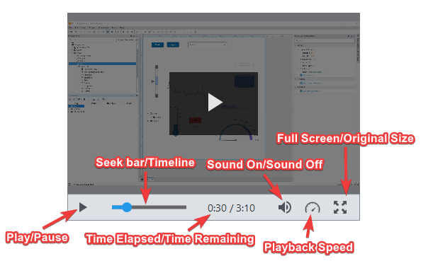
Controls
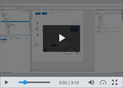
The following controls are available to the user in a session.
| Icon | Definition | Description |
|---|---|---|
 | Play | Starts the video play. |
 | Pause | Pauses the video play. |
 | Playback Speed | Sets the speed of the playback. Options are .25, .5, Normal, 1.25, 1.5, 2, 5, and 10 (for example, .5 is half speed, 2 is double speed, etc.). |
 | Seek bar/Timeline | Interactable slider representation of the time elapsed and time remaining. |
 | Sound On | Sound is turned on for the video. Clicking on this icon brings up a sliding bar with which you can adjust the volume. |
 | Sound Off | Sound is turned off for the video. |
 | Time elapsed/Time remaining | Displays the time elapsed in the video and the time remaining. |
 | Full Screen | Expands the video to full screen. |
 | Original size | Returns the video to original screen size. You can also press the Esc key to return to original size. |
Properties
Most Properties have binding options. For more information on Bindings, see Types of Bindings in Perspective. This section only documents the Props Category of properties. The other Categories are described on the Perspective Component Properties page.
| Name | Description | Property Type |
|---|---|---|
| source | The path to the source of the video or live feed. | value: string |
| liveFeed | Used to toggle the component to display a live feed. If set to true, the poster, autohideControls, controls, and status properties will be hidden as they pertain only to a video file. | value: boolean |
| poster | The path to an image that will display as the background image of the video file when the video has not yet loaded. (Hidden if props.liveFeed is set to true.) | value: string |
| autohideControls | Used to toggle the visible state of the control bar when displaying a video file. If set to true, the control bar will be displayed only when the mouse is hovered over the video. (Hidden if props.liveFeed is set to true.) | value: boolean |
| controls | Properties that are used to provide settings and interaction points with a video file. (Hidden if props.liveFeed is set to true.).
| object |
| status | This property holds several sub-properties that are used to provide status updates while the video file goes through the playback process. These sub-properties should not be set as they are constantly overwritten during the playback process. (Hidden if props.liveFeed is set to true.)
| object |
| controlStyle | Sets a style for the controls on this component: the control bar, all controls, error messaging, context menus, and control popups. Full menu of style options is available for text, background, margin and padding, border, shape and miscellaneous. Classes are predefined styles in a project. | object |
| style | Full menu of style options is available for text, background, margin and padding, border, shape and miscellaneous. You can also specify a style class. | object |
Component Events
The Perspective Event Types Reference page describes all the possible component event types for Perspective components. Not all component events support each Perspective component. The Component Events and Actions page shows how to configure events and actions on a Perspective component. Component scripting is handled separately and can be accessed from the Component menubar or by right clicking on the component.