Perspective - Accordion
Component Palette Icon:
Description
The Accordion component allows the embedding of expandable/collapsible views which can be toggled with a click or a tap of their headers. The headers may contain text or a view.
Properties
Most Properties have binding options. For more information on Bindings, see Types of Bindings in Perspective. This section only documents the Props Category of properties. The other Categories are described on the Perspective Component Properties page.
| Name | Description | Property Type |
|---|---|---|
| expansionMode | Determines how many items can be expanded at a given time. Options are 'single' and 'multiple'. When using 'single' any item that's currently expanded will collapse if another one is clicked. When using 'multiple', items that are expanded will remained open until they are collapsed. | value: string |
| items | An array of items in the accordion. Each item has a separate header and body configurations.
| array |
| style | Sets a style for this component. Full menu of style options is available for text, background, margin and padding, border, shape and miscellaneous. You can also specify a style class. | object |
| unusedSpaceStyle | Sets a style for the empty area at the bottom of the accordion. Full menu of style options is available for text, background, margin and padding, border, shape and miscellaneous. You can also specify a style class. | object |
header Properties
| Name | Description | Property Type |
|---|---|---|
| toggle | An object containing configuration options for the toggle icon.
| object |
| content | An object containing configuration options for the content.
| object |
| height | The height of the header. | value: string |
| reverse | Reverses the order of the toggle and header content, (i.e., from left side to the right side). | value: boolean |
| style | Sets a style for the header. Full menu of style options is available for text, background, margin and padding, border, shape and miscellaneous. You can also specify a style class. | object |
body Properties
| Name | Description | Property Type |
|---|---|---|
| viewPath | Path of the view to display. New in 8.1.29 If a path is present in the viewPath property, an Open View  icon will appear that will navigate directly to the view when clicked. icon will appear that will navigate directly to the view when clicked. | value: string |
| viewParams | Parameters for the view. If passing parameters into the embedded view, the names here must match the parameters on that view. New in 8.1.4 As of 8.1.4 a dropdown list of parameters is available when the user clicks the Add Object Member  icon. This makes it easy to add parameters from the rendered view. icon. This makes it easy to add parameters from the rendered view. | object |
| useDefaultViewWidth | Use of view's default width instead of adjusting based on the content's width. | value: boolean |
| useDefaultViewHeight | Use of view's default height instead of adjusting based on the content's height. | value: boolean |
| height | The height of the body. | value: string |
| style | Sets a style for the body. Full menu of style options is available for text, background, margin and padding, border, shape and miscellaneous. You can also specify a style class. | object |
Scripting
See the Perspective - Accordion Scripting page for the full list of scripting functions available for this component.
Example
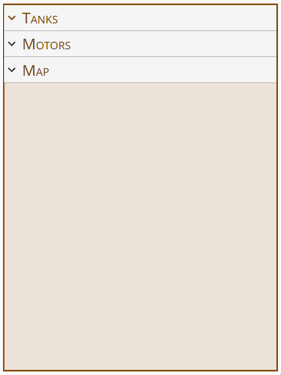
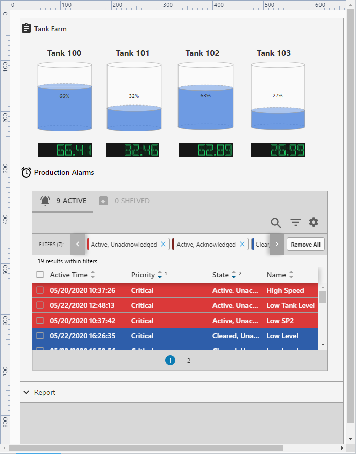
This Accordion example has three multiple embedded expandable and collapsible views. Each view can be expanded or collapsed by clicking on their headers. The Tank Farm and the Production Alarms views are both expanded while the Report view is collapsed.
The three views used in the accordion example are working views and the component was configured to use these existing views. Configuring the accordion component is just a matter of how you want to present the information on the component, and then to configure its properties.
Preview Mode
Property Settings
| Property | Value |
|---|---|
| expansionMode | multiple |
| props.items.0.header.toggle.expandedIcon.path | material/assignment |
| props.items.0.header.toggle.collapsedIcon.path | material/expand_more |
| props.items.0.header.content.type | text |
| props.items.0.header.content.text | Tank Farm |
| props.items.0.body.viewPath | Tank Farm |
| props.items.0.body.style.marginTop | 3px |
| props.items.0.body.style.margin | 10px |
| props.items.1.header.toggle.expandedIcon.path | material/alarm |
| props.items.1.header.toggle.collapsedIcon.path | material/expand_more |
| props.items.1.header.content.type | text |
| props.items.1.header.content.text | Production Alarms |
| props.items.1.body.viewPath | Production Alarms |
| props.items.1.body.style.marginTop | 3px |
| props.items.1.body.style.margin | 10px |
| props.items.2.header.toggle.expandedIcon.path | material/info |
| props.items.2.header.toggle.collapsedIcon.path | material/expand_more |
| props.items.2.header.content.type | text |
| props.items.2.header.content.text | Report |
| props.items.2.body.viewPath | Report4 |
| props.items.2.body.style.marginTop | 3px |
| props.items.2.body.style.margin | 10px |