Perspective - Carousel
Component Palette Icon:
Description
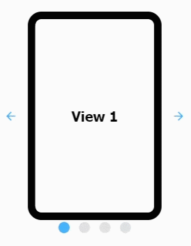
The Carousel component allows you to display a selection of rotating views at a defined rate with a link to the view on a page in your project. The Carousel component can automatically cycle through the views or a user can click through the views on demand, either way, still providing a link to the view on a page.
This version updates how the component handles drag transition ("swiping" across embedded views). Only common rotational angles are supported (90, 180, 270, 360) for drag transitions. If the Carousel's rotation doesn't match one of those angles, then drag transition is disabled.
Here are a few best practices when working with the Carousel component.
- Components such as the Video Player and Map are performance intensive components and should not be embedded in the Carousel since they can hurt session performance.
- Avoid embedding views containing carousels in a carousel. This can become confusing for users.
- Avoid embedding views that contain iFrame components. It's easy for content embedded in an iFrame to steal focus from other components. Also, depending on the content in the iFrame, it may impact performance.
Properties
Most Properties have binding options. For more information on Bindings, see Types of Bindings in Perspective. This section only documents the Props Category of properties. The other Categories are described on the Perspective Component Properties page.
| Name | Description | Property Type |
|---|---|---|
| views | Visible area of a page. Can have multiple views in the carousel component.
| value: array |
| activePane | Active pane being displayed. | value: numeric |
| lazyLoad | Load views on demand or progressively. | value: boolean |
| autoplay | Settings controlling the rotation of views in the carousel.
| object |
| behavior | Behavior and interaction related carousel options.
| object |
| appearance | Appearance related carousel options. Click here to see the appearance properties | object |
| style | Sets a style for this component. Full menu of style options is available for text, background, margin and padding, border, shape and miscellaneous. You can also specify a style class. | object |
 icon will appear that will navigate directly to the view when clicked.
  icon. This makes it easy to add parameters from the rendered view.
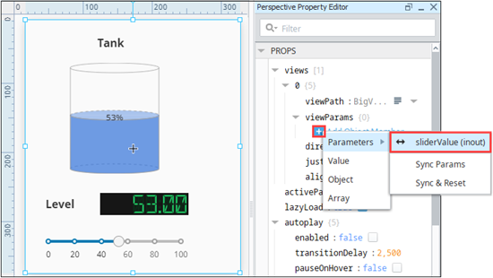
appearance Properties
| Name | Description | Property Type |
|---|---|---|
| dots | Carousel dots configuration.
| object |
| arrows | Carousel arrows configuration.
| object |
| useDefaultViewWidth | Enables the use of the view's default width instead of dynamically adjusting based on the available width. | value: boolean |
| useDefaultViewHeight | Enables the use of the view's default height instead of dynamically adjusting based on the available height. | value: boolean |
| slidesToShow | Number of views to show on each carousel page. | value: numeric |
| slidePadding | Applies padding between slides. | value: numeric |
| reverse | Reverses the slide order. Meaning, the first view rendered on the component will be the last element in the views array property. | value: boolean |
Component Events
The Perspective Event Types Reference page describes all the possible component event types for Perspective components. Not all component events support each Perspective component. The Component Events and Actions page shows how to configure events and actions on a Perspective component. Component scripting is handled separately and can be accessed from the Component menubar or by right clicking on the component.
Examples
See the Carousel Component Examples page for more examples of using the Carousel component.