Perspective - Flex Repeater
Component Palette Icon:
Description
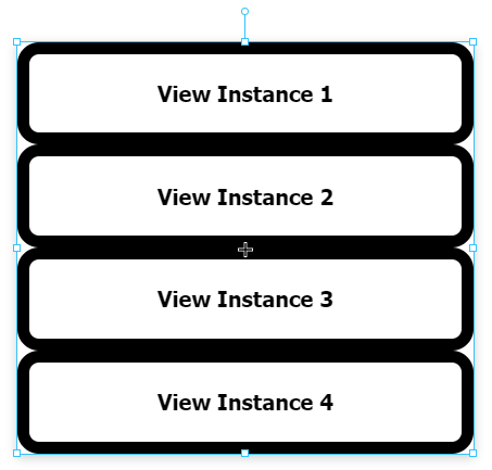
The Flex Repeater component lets you easily create multiple instances of views for display in another view.
When first dropped on a view, the Flex Repeater looks like any other empty container. Set the path to the component that you want to create multiple instances of, and then under instances add an object for each instance that you want to create. The object will usually contain one or more parameters, including the instance's own index, that will be passed into that particular instance. As a side note, overwriting the index parameter is not recommended.
The flex repeater is functionally very similar to the Flex Container component. Both components are based off of the CSS flexbox, and both abide by similar rules in regards to how child objects are positions. However the Flex Repeater differs from the contain in two notable ways:
- The Flex Repeater can only have embedded views as direct children, where as the Flex Container can have any type of component.
- The Flex Repeater can create instances of views from the runtime, by adding additional elements to the instances array. The flex container does not have anything resembling this functionality.
Properties
Most Properties have binding options. For more information on Bindings, see Types of Bindings in Perspective. This section only documents the Props Category of properties. The other Categories are described on the Perspective Component Properties page.
| Name | Description | Property Type |
|---|---|---|
| path | Path to the desired view to display. New in 8.1.29 If a path is present in the path property field, an Open View  icon will appear that will navigate directly to the view when clicked. icon will appear that will navigate directly to the view when clicked. | value: string |
| instances | Number of instances of the view that you want to display in the container. Each instance can contain an instanceStyle and instancePosition property. Changing these properties will override any styles and position settings applied by elementStyle and elementPosition.This is where a value property can be added that matches up with a parameter in the view to pass in a value.
New in 8.1.4 As of 8.1.4 a dropdown list of parameters is available when the view being displayed has view parameters. This makes it easy to add, delete, or synchronize parameters from that view. | array |
| direction | Direction of layout of repeated views. Options are row, row-reverse, column and column-reverse. | value: string |
| wrap | Whether the container should allow instances to wrap to the next line if space has run out. Options are nowrap, wrap, wrap-reverse. | value: string |
| justify | Adjusts placement of instances along the main axis when there is extra space, which may be used to fill areas before, after, or in-between: flex-start, flex-end, center, space-between, space-around, space-evenly. | value: string |
| alignItems | Adjusts placement of instances along the cross axis when there is extra space: flex-start, flex-end, center, baseline, stretch. | value: string |
| alignContent | Adjusts alignment of wrapped content when there is free space in the cross axis: flex-start, flex-end, center, space-between, space-around, stretch. | value: string |
| useDefaultViewWidth | Use view's default width instead of adjusting based on the content's width. | value: boolean |
| useDefaultViewHeight | Use view's default height instead of adjusting based on the content's height. | value: boolean |
| elementStyle | Sets a style for this element. Full menu of style options is available for text, background, margin and padding, border, shape and miscellaneous. You can also specify a style class. | object |
| elementPosition | Sets a position for this element. Element position properties that apply to all instances, unless overridden by instancePosition
| object |
| loading | New in 8.1.5 View loading settings.
| object |
| style | Sets a style for the Flex Repeater. Full menu of style options is available for text, background, margin and padding, border, shape and miscellaneous. You can also specify a style class.
| object |
User Interface
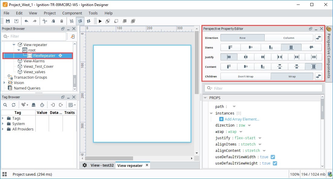
When a Flex Repeater is deep selected, there is an interface at the top of the Perspective Property Editor that enables you to set the container's properties. Functionality is similar to that of the Flex Container component. See Perspective - Flex Container.
Component Events
The Perspective Event Types Reference page describes all the possible component event types for Perspective components. Not all component events support each Perspective component. The Component Events and Actions page shows how to configure events and actions on a Perspective component. Component scripting is handled separately and can be accessed from the Component menubar or by right clicking on the component.
Example

-
In order to use the Flex Repeater, you need a view that will be shown inside the repeater. To do this, we made a new View with a Coordinate layout called "RepeatedView".
- In the Project Browser, select the new View
- In the Property Editor. Under PARAMS, select Add View Parameter, select a property type of Value.
- Rename the parameter from "key" to "labelText".
- Select the root container for the view, and set the mode property to "percent".
-
Add a Label component to the view, and configure a property binding on its text property to the labelText parameter we just created. We set the component's alignVertical property to "center", and we stretched the label to fill the entire view. We also configured some styling on the Label:
Style Category Value borderStyle solid fontSize 30px textAlign center -
Now we can configure our Flex Repeater. Drag a Flex Repeater component onto the view, then set the following properties:
Style Category Value path RepeatedView direction Column useDefaultViewWidth false useDefaultViewHeight false -
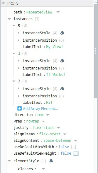
Finally, create three object members in the instances array. Add a labelText property to each object of type value, and replace the value strings to the desired strings to show. Here's how the property editor looks for our Flex Repeater:
-
You should now see the Flex repeater populated as shown in the image above.