Self-Hiding Navigation Drawer
Navigation Drawer
A navigation drawer is a special type of docked menu, usually appearing on the left side of a session. What makes a navigation drawer special is its responsive design. On smaller devices, this docked menu can hide itself and pop out when the user needs it. These drawers have become ubiquitous in User Interface (UI) design, particularly in apps.
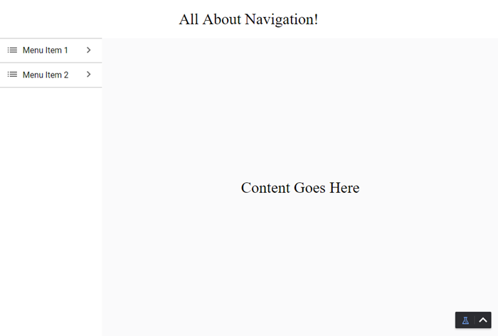
Here's what one might look like on a computer monitor, Menu Item 1 and 2 tabs are visible on the left-hand side of the screen:
Here's what one might look like on a mobile device:

Only the title and main content for the screen are visible. A menu icon is available in the top left-hand corner to expand menu options as desired.
As the screen becomes smaller, the menu is hidden and an icon appears in the top left to allow us to toggle its visibility. This particular navigation drawer will probably need about 200 pixels horizontally, which on a desktop is fine, but on a mobile device takes up too much of the screen.
This guide assumes a bit of knowledge about how views and components work. Please see those sections of this manual for more information as needed.
Configuring a Navigation Drawer
The following example walks through how to configure this self-hiding navigation drawer. There is no mention of setting up the Menu Tree or any content pages, it is strictly a guide to show you the layout type.
Navigation View
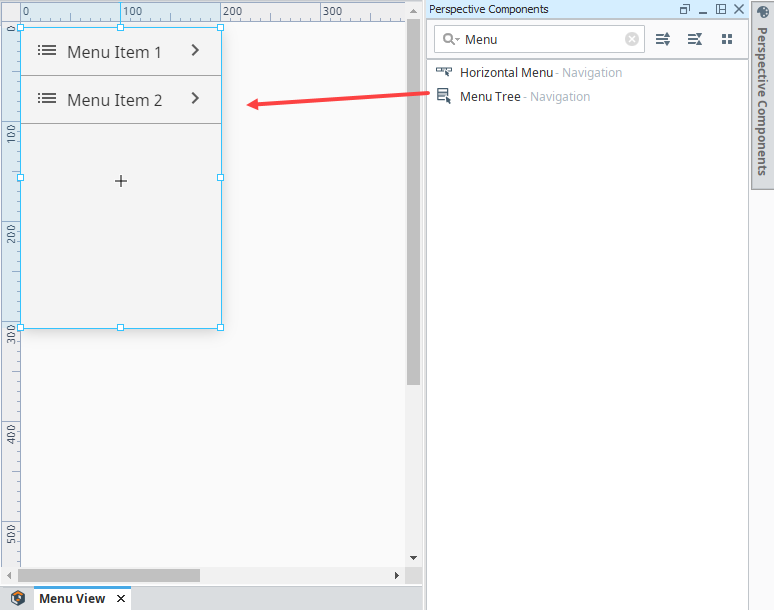
- In the Project Browser, right click on Views and click New View.
- Name the view Menu View and set the Root Container Type to Coordinate.
- Click Create View.
- Set the width of the view to 200 pixels.
- Drag a MenuTree component onto the Menu View. Configure the component as you would if you were using a standard docked view.
You can set the root of the Menu View to use the Percent Mode. This way it is easy to make the Menu Tree fill all the space.
Header Views
Next, we will create our header views. The two views will be set up in a breakpoint container, which will swap between a small header with an icon, and a big header without one.
- Create a small header view for our mobile UI.
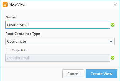
- In the Project Browser, right click on Views and click New View.
- Name the new view HeaderSmall, and set the Root container Type to Coordinate.
- Click Create View.
- Set the height of the view to 75 pixels.
- Drag an Icon component onto the upper left side of the view, then click on the component to select it.
- In the Property Editor, set the path property to material/menu. You can of course use whatever icon you'd like; a list of all the icons in the material folder can be found here.
- Add a title for the header. We used a Label component with the text "All About Navigation!"

- Create a large header view for our desktop UI
- Create another view called HeaderLarge, again with a layout of Coordinate.
- Set the height to 75 pixels.
- Don't add the icon to this one, but add the same Label as above.
- Finally, create a Breakpoint view to toggle between them.
- Create a view called HeaderMain with a layout of Breakpoint.
- Set the height to 75 pixels.
- In the Property Editor, click on Large (under Children).
- Drag an Embedded View component on the HeaderMaster view.
- Under PROPS, click on the Expand
 icon next to the path property then select HeaderLarge.
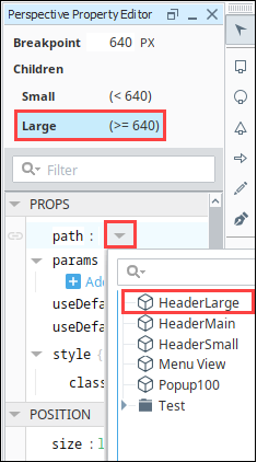
- Now we'll do the same for the small child of this Breakpoint container. In the Property Editor, click on Small (under Children).
- Drag an Embedded View component on the HeaderMain view.
- In the Property Editor, click on the Expand icon next to the path property then select HeaderSmall.
Page Setup
Now that we have our header and menu views, we need to set up our pages to display the views properly.
- Click on the Perspective
 icon in the bottom left of the Designer to access the Page Configuration menu. Select Shared settings. We're going to add our two docked views here, so they show up on every page.
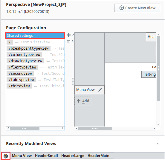
- On the top dock, click the Add
 icon. Select the HeaderMain view and click OK.
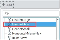
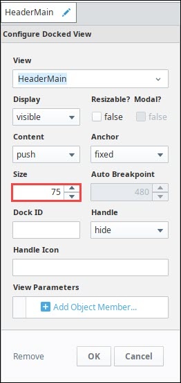
- Click the Edit
 icon next to the HeaderMain docked view.
 - In the Configure Docked View menu, set the size to 75.
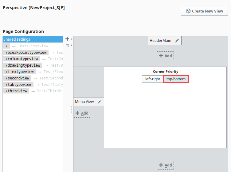
- On the left dock, click the Add icon. Add the Menu View and set the following:
- Size: 200
- Display: Auto (This enables us to configure a breakpoint below)
- Autobreakpoint: 640 (This is the same width that the breakpoint container on the HeaderMaster view is using)
- Dock Id: menu (This will be used in our dock action on the menu icon to toggle the menu.)
-43f10cb5b92bc63519bac144e9a1427c.png)
- In the center of the Page Configuration menu, set the Corner Priority to top-bottom. The other option won't look quite right.
Configure Menu Icon
Now we need to configure the menu icon we created on HeaderSmall to pull up Menu View.
- Open the HeaderSmall View.
- Right-click on the Icon component, and select Configure Events....
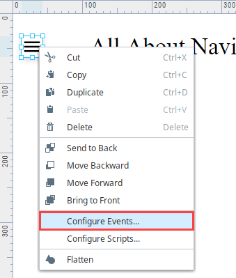
- Under Mouse Events, select onClick.
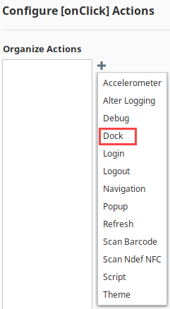
- Next click the Add icon to add an action. Select the Dock action.
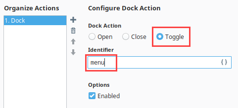
- This action needs the identifier we created. Set the Dock Action to Toggle, and the Identifier to menu. Click OK.
Now you can test it out, it's easiest to open a browser on your desktop and change the size to toggle between the different views. Using this strategy, you can configure a navigation drawer in combination with any basic navigation component or method.