Report Charts
Report Charts
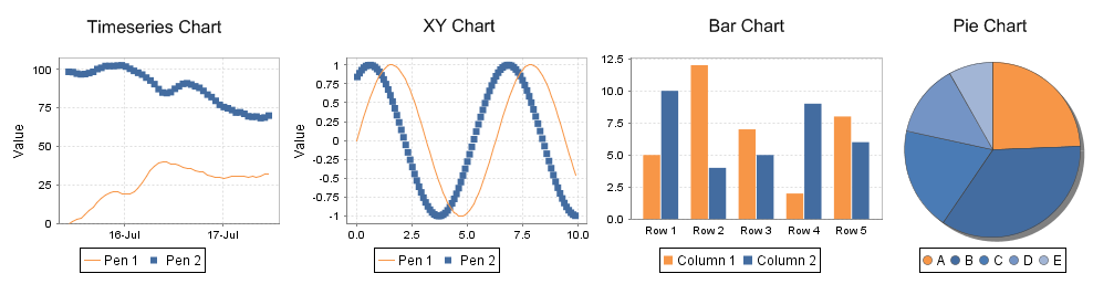
Report charts allow you to display your data in a graphical way, just like the charts in the rest of Ignition. Charts can be driven by any data source in a report, or even embedded into table rows using nested data sets. There are four types of charts to choose from when deciding how you want to show data:
- Timeseries Chart: a simple chart that plots values against a timestamp X axis. Great for showing historical trending.
- XY Chart: similar to the Timeseries chart, this chart plots lines on X-Y axes, but is configured to show numeric categores on the X axis.
- Bar Chart: a bar chart that uses text categories on the X axis. Can be configured as a Pareto chart.
- Pie Chart: a basic pie chart that uses text categories. Percentages are automatically calculated.
The Data Key Property
Similar to Tables in reporting, all charts must first be assigned a Data Key. This assignment configures the chart to look at specific keys in a data source, and prevents any name collisions with other data keys: if multiple data sources in your report return a column named "id", the chart wouldn't know which column you were referring to without this initial assignment.
Assignment can be achieved by drag-and-dropping a key into the Data Key property, or by clicking the Key Search ![]() button.
button.

Once assigned, you can the start adding pens or bars to your chart.
Timeseries Chart
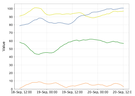
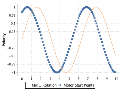
The Timeseries Chart ![]() is a type of XY chart whose domain or X-Axis represents time series data and range can be one or more pens. The Timeseries Chart is a great way to display data visually from Tag History, or similar time related data sources.
is a type of XY chart whose domain or X-Axis represents time series data and range can be one or more pens. The Timeseries Chart is a great way to display data visually from Tag History, or similar time related data sources.
Usage
To use the chart, drag the component from the Report Palette to your report. Type or drag a data key from the Key Browser into the Data Key field of the Chart Options tab in the Property Inspector. Select a time series domain (for example a t_stamp column of your query). The Y axis (value) can be modified in the Chart Options tab, but the X axis (time range) is based on the data in the Data Key that powers the chart dataset.
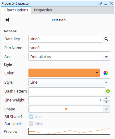
To add pens to your query, click the Add ![]() icon on the Chart Options tab next to the Pens table in the Property Inspector. You can select a pen row and click the Edit
icon on the Chart Options tab next to the Pens table in the Property Inspector. You can select a pen row and click the Edit ![]() icon on the right side, or double-click the Range Key or Preview fields to navigate to the Edit Pen area. Double-clicking on the Pen Name field allows for renaming the pen only. Click the Back to chart options
icon on the right side, or double-click the Range Key or Preview fields to navigate to the Edit Pen area. Double-clicking on the Pen Name field allows for renaming the pen only. Click the Back to chart options ![]() icon to return to the Chart Options tab.
icon to return to the Chart Options tab.
Chart Options area
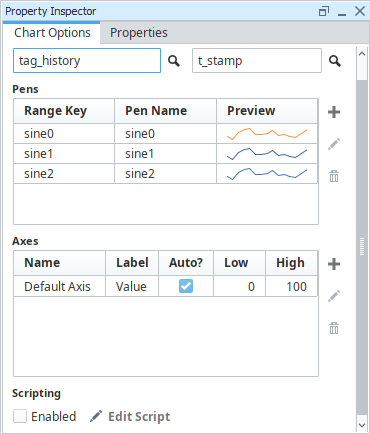
Pen Configuration area
XY Chart
The XY Chart ![]() generates an X vs Y plot of your data. XY Charts can have multiple pens and axes per data source, and each is configurable in the Chart Options tab for the component.
generates an X vs Y plot of your data. XY Charts can have multiple pens and axes per data source, and each is configurable in the Chart Options tab for the component.
Usage
To use the chart, drag the component from the Report Palette to your report. Type or drag a data key from the Key Browser into the Data Key field of the Chart Options tab. Select Domain Key to use for the X axis.
To add pens to your query, click the Add ![]() icon on the Chart Options tab next to the Pens table in the Property Inspector. You can either double click, or select a pen and click the Edit
icon on the Chart Options tab next to the Pens table in the Property Inspector. You can either double click, or select a pen and click the Edit ![]() icon on the right, to navigate to the Pen Configuration area. Click the Back to chart options
icon on the right, to navigate to the Pen Configuration area. Click the Back to chart options ![]() icon to return to the Chart Options tab. The setup and Configuration of this chart and its pens works similarly to the Timeseries Chart, with the exception that you may want to use a different datatype from a date datatype for the domain because the XY Chart's domain axis is represented by a numerical value rather than a timestamp.
icon to return to the Chart Options tab. The setup and Configuration of this chart and its pens works similarly to the Timeseries Chart, with the exception that you may want to use a different datatype from a date datatype for the domain because the XY Chart's domain axis is represented by a numerical value rather than a timestamp.
Bar Chart
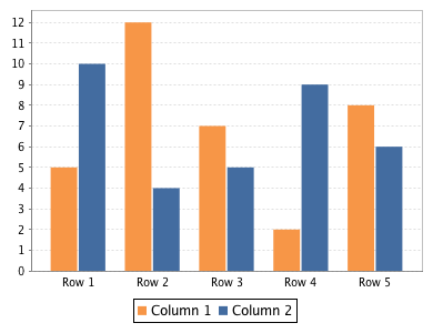
The Bar Chart ![]() component can be used to add bar charts to a report. It uses text categories on the X axis, and can also be configured as a Pareto chart.
component can be used to add bar charts to a report. It uses text categories on the X axis, and can also be configured as a Pareto chart.
Usage
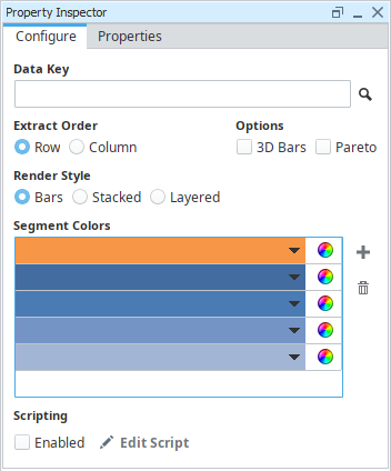
To create a Bar Chart, simply drag the component from the Report Palette and drop it onto your report. Bar Charts are have a number of customization options to adjust colors and rendering styles. When configuring a Bar Chart, take special consideration with the Extract Order property as it will impact how the data is grouped for the numerical bar values to be plotted. A Bar Chart example can be found in the Report Workflow Tutorial.
Pie Chart
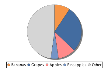
The Pie Chart ![]() adds a Pie Chart based on a simple two column data structure.
adds a Pie Chart based on a simple two column data structure.
Usage
To create a new Pie Chart, drag the pie chart palette item from the Report Design Palette onto your Report Page or Parent Shape. A pie chart has a simple configuration consisting of label values (generally Strings) and numeric quantity values. Color segments can be added or removed by clicking the Add ![]() or Remove
or Remove ![]() icons on the Configure tab.
icons on the Configure tab.
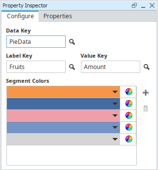
The Pie Chart in the images above was created using a simple data source which had just two columns, the first which represented our Label, and the second being a column of values.
Fruits, Amount
"Bananas", 52
"Grapes", 154
"Apples", 58
"Pineapples", 25
"Other", 265
Chart Scripting
The look and feel of the Timeseries, XY, and Bar charts may be modified through scripting. Scripting may be accessed on these charts by selecting them, and then clicking the Edit Script icon in the Property Inspector. Note that the Enabled property must be checked for the script to become active.
![]()
Clicking on Edit Script will provide access to configureChart, which allows you to make modifications to the chart right before the report is rendered. The charts are simply JFreeCharts, so reading through the JFreeChart API would be useful here.