Charts Inside of Tables
Adding Charts Inside of Tables
Adding charts inside of tables provides a lot of flexibility designing reports as well as organizing and displaying data in a report. The most common way of adding charts inside tables is using an unstructured row and placing the chart inside the row. Unstructured rows are highly customizable allowing you to place charts anywhere within the row of the table.
There are two common locations to place a chart inside a table:
- Using a Header followed by a chart component.
- Using a Details Row followed by a chart component.
It is very common to add a chart in an unstructured Header row because then the chart will be at the top of the first page of a report. An unstructured Details row typically works best when used in conjunction with Grouping Data Inside of Tables or Nested Queries so that each row has a chart with data from that group or query.
Adding a Chart Inside a Header Row
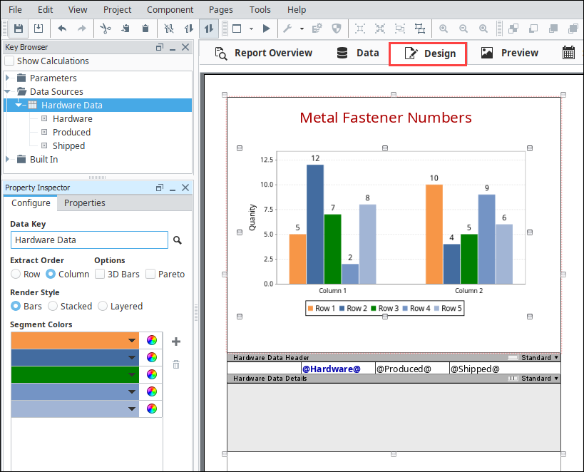
This example shows several pieces of hardware including how many pieces were produced, and how many pieces were shipped. A Bar Chart was added after the Header row in the table.
-
In the Data panel, create a Static CSV data source (i.e., Hardware Data). The dataset is shown below.
Hardware DatasetHardware, Produced, Shipped
Nails, 95, 85
Screws, 80, 60
Bolts, 50, 47 -
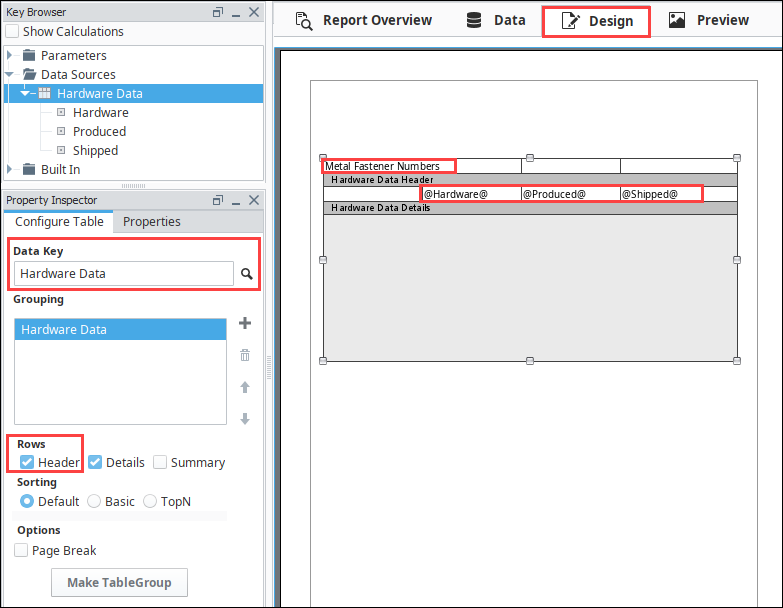
In the Design panel, drag a Table component on to your report. Drag your Datasource (i.e., Hardware Data) from the Key Browser to the Data Key field, and click the Header box in the Configure Tab.
-
Next, drag each Data Key (i.e., Hardware, Produced, and Shipped) to a column in your table in Data Details row.
-
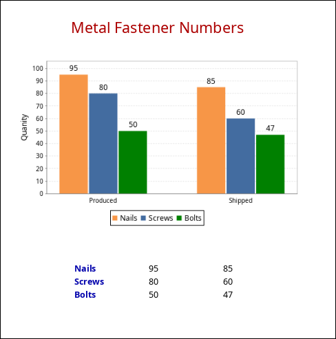
Enter the Header name (i.e., Metal Fastener Numbers Report) in the left column of the Data Header row.
-
Select the Header row and click on the Row Structure icon
 to make the row unstructured
  so you can add a chart.note
You can toggle between a structured and unstructured row by simply clicking the Structure Row icon.
-
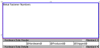
With the Header row selected, drag the row down the page to make room for the chart: click and drag on the dark gray bar titled "Hardware Data Header".
-
Drag in a Bar Chart from the Report Design Component Palette into the unstructured Header row and expand it. While dragging the chart into the header, you'll notice a blue outline around the Header as you hold the mouse button down while the cursor is in front of the header. This signifies that the chart will be placed directly into the header row, as opposed to in front of the table.
-
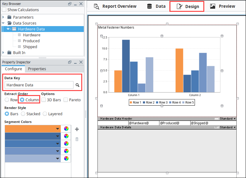
With the chart selected, drag a Datasource (i.e., Hardware Data) to the Data Key of the Configure Tab. Set the Extract Order as 'Column.'
Extract OrderFor a Bar Chart, Extract Order is the order in which the data is extracted from the data key, by Row or Column. By default, Row is selected. Use Row when columns in the data key define the series of data. Use Columns when rows in the data key define the series of data; each column is a new value for the same series.
-
Now, let's put your creativity to work and make your report stand out by changing properties. This example changed the following properties:
- In the Configure Tab - change the third bar color to green.
- Select Metal Fastener Numbers Report header - change the Font Size to 24 pixels, the Text Color to red, and the Horizontal Alignment to Center in the Properties tab.
- Select the Bar Chart - enter a name for the Axis Label (i.e., Quantity), and set the Bar Labels to 'true' in the Properties Tab.
- Select each Data Details cell (i.e., Hardware, Produced, and Shipped), change the Font Size to 14 pixels, and the Hardware Text to blue in the Properties tab.
The Design panel will update the displayed sample data after changing the properties above.
-
Go to the Preview panel to view your report.
Adding a Chart Inside a Details Row
Adding a chart inside a Details row duplicates the chart for the number of Detail rows you have in your table, and displays the respective data for each row in the chart. Note that the number of rows in the nested table will be determined by the parent table's query, and empty rows will be returned if there is no corresponding query data.
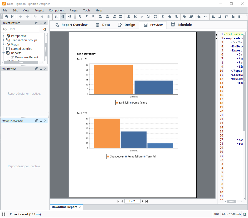
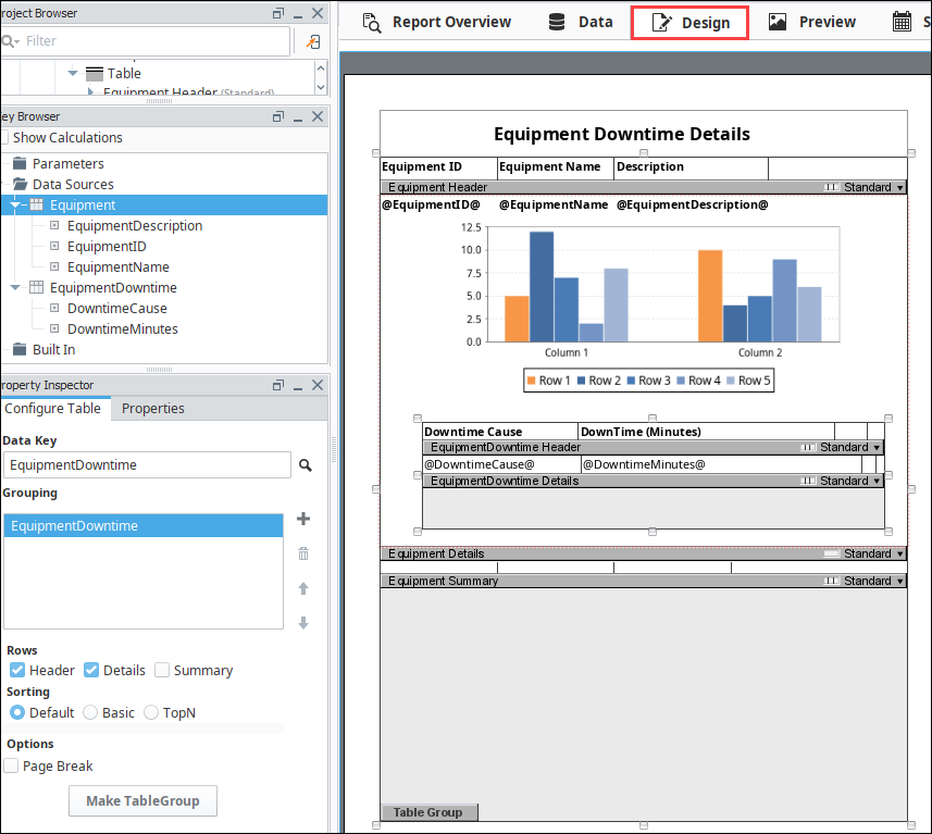
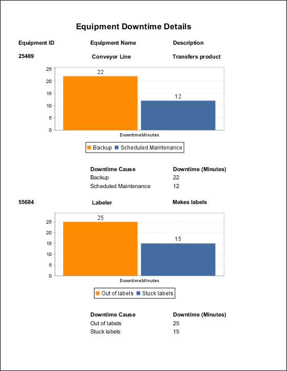
This example shows the Equipment Downtime Details for each piece of equipment: Cause and Downtime in Minutes. It also adds a Bar Chart after the Details row using an unstructured row, and a nested query so that each row has a chart with data from the query. Go to the Nested Queries page and complete the Equipment Downtime example at the bottom if you want to use the same datasets for this example.
-
Once you have your Data set up from the above example, click on the Design tab and add a table component to your report.
-
With the table created, add a Header row to the table. Drag all of your Equipment details into the table, and add header titles for each column.
-
Select the Details row, make the row unstructured
, and drag the row down the page to make room for a chart. -
Drag a chart from the Report Design Component Palette into the unstructured row and expand it.
-
With the chart selected, drag a Datasource (i.e., EquipDowntime) from the Key Browser to the Data Key field in the Configure Tab.
-
If you are using a Bar Chart, set the Extract Order to Column.
-
Go to the Preview panel to view the report. If you want to make any changes to the chart like changing Segment Colors, adding Bar Labels, or adding a page break, etc., go back to the Design panel to modify any of the chart properties. When you're finished, return to the Preview panel. You'll notice that for each piece of equipment there is a chart and data. You can make each piece of equipment have its own page by setting the Page Break option on the Table under the Configure Table tab.
Using a Chart in a Table with Nested Queries
When working with data from nested queries, representing the sub-query data on a chart in a table row is fairly similar to using two unrelated data sources.
In this example, we used content from two different tables, as shown below.
The Tables
Equipment
This table contains identifiers and descriptions for multiple pieces of equipment. A query named "equipment_list" is used by the report to retrieve this information.
| equipment_id | equipment_description | equipment_name |
|---|---|---|
| 1 | North Tank | Tank 101 |
| 2 | South Tank | Tank 202 |
Equipment_Downtime
This table identifies different downtime events, and the id for the equipment that went down. A query named "downtime_list" is used by the report to retrieve this information.
| downtime_id | equipment_id | downtime_cause | downtime_minutes |
|---|---|---|---|
| 1 | 1 | Tank full | 30 |
| 2 | 1 | Pump failure | 14 |
| 3 | 2 | Changeover | 60 |
| 4 | 2 | Pump failure | 34 |
| 5 | 2 | Tank full | 10 |
Queries
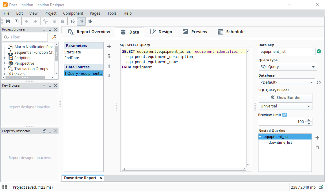
The query for the 'equipment' data source (an "SQL Query" type query) looks like the following:
SELECT equipment.equipment_id as 'equipment identifier',
  equipment.equipment_description,
  equipment.equipment_name
FROM equipment
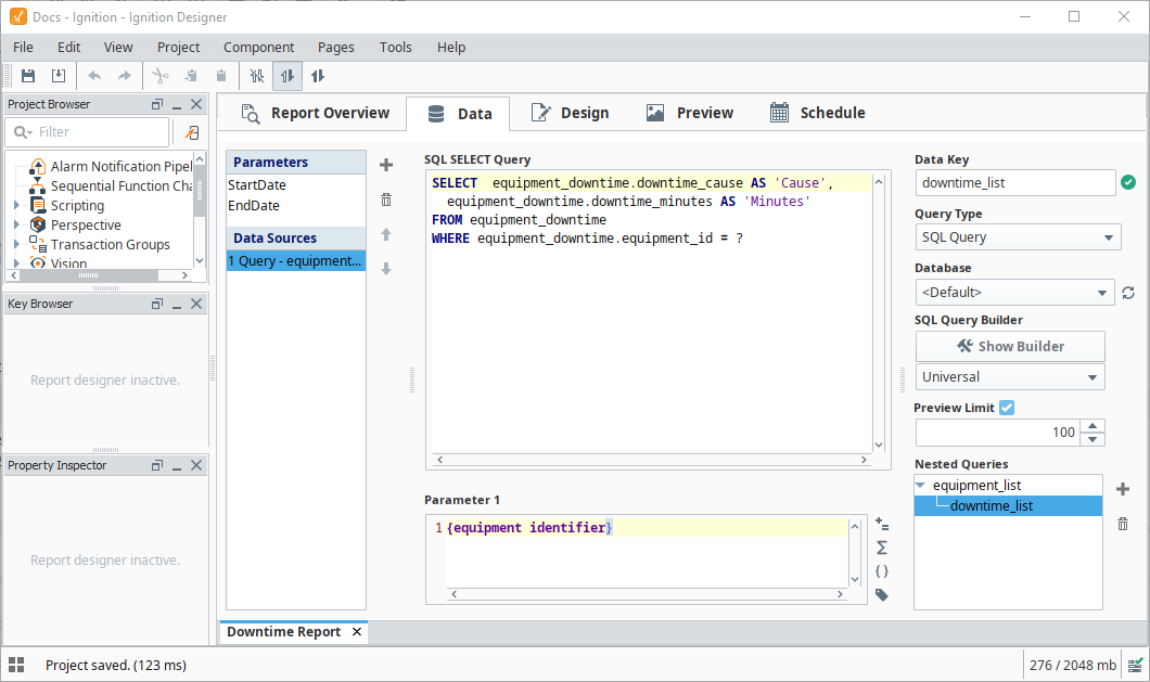
The query for the "equipment_downtime" table (also an "SQL Query" type query) looks like the following:
SELECT  equipment_downtime.downtime_cause AS 'Cause',
  equipment_downtime.downtime_minutes AS 'Minutes'
FROM equipment_downtime
WHERE equipment_downtime.equipment_id = ?
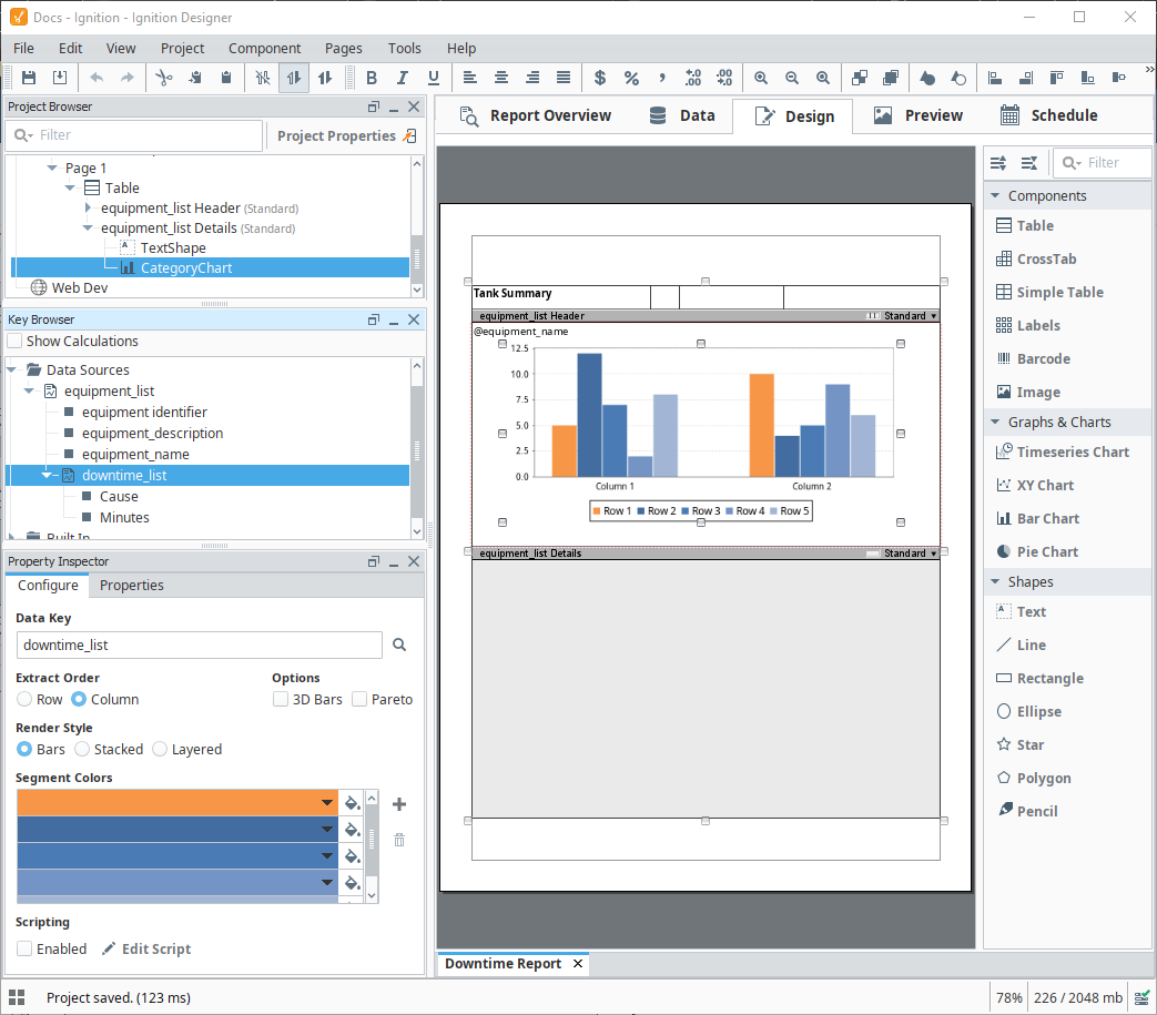
Configuring the Chart
In this section, we are going to have a Category Chart component show the results of our downtime_list query. Because we're using a table, and a nested query, each row on the table will represent a different piece of equipment from our equipment table.
For this to work, the table component must be assigned the results of the parent query (which would be equipment_list in this case), and then assign downtime_list to our chart.
-
Create a new table component, and assign "equipment_list" as the Data Key for the table.
-
Make the Details row unstructured.
-
Add the equipment_name key to the details row, so we know which piece of equipment is represented by the row.
-
Add a Category Chart component to the details row of the table.
-
Set the Data Key on the chart to "downtime_list."
-
Set the Extract Order of the chart to "Column."
-
Switch to the Preview panel, you should see each both pieces of equipment, represented as different charts, each showing their totaled downtime reasons.