Report Design Tools
Object layout is an important aspect in creating professional reports. The Reporting Module provides a host of intuitive tools and functions to help you design and edit reports. Ignition Reporting uses a WYSIWYG (what you see is what you get) approach.
Report Menus
The Ignition Designer menubar provides quick access to many common Reporting Design functions. The Component and Pages menu items are added to the menubar when the Report Design Panel is open. Many of the menus, such as File, Edit, and Tools are similar to other areas of the Designer. Reporting-specific Toolbar and Menu functions are described below.
Component Menu
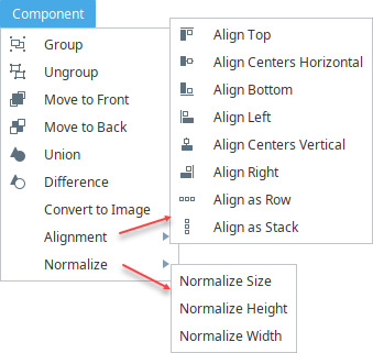
The Component menu allows you to modify the layout of objects in a report. To perform any of the Component menu functions, you must first select an object or multiple objects before you're able to perform the function.
| Menu Item | Function |
|---|---|
| Group/Ungroup | Grouping allows you to merge selected shapes and makes them behave as one with respect to: selection, moving, and resizing. To "drill down" to individual objects, superselect the grouped object. Ungroup separates grouped shapes. |
| Move to Front/Move to Back | All shapes have an order on the page that determines what is drawn on top when two shapes overlap. These options allow you to move a selected shape either forward or backward. This is also known as the Z Order. |
| Union/Difference Paths | Takes multiple overlapping shapes (such as a rectangle and an oval) and combines them into a single shape using the combined paths. A powerful tool to construct complex shapes. |
| Convert to Image | Converts the selected component to an image. |
| Align Selected Items - Make Row Top/Center/Bottom | Quickly align several shapes in a row, either by their top, center, or bottom border. This is particularly useful when shapes are of different heights. |
| Align Selected Items - Make Column Left/Center/Right | Same as above, but for columns, aligning their sides or center. |
| Align as a Row/Stack (column) | Equalizes the distance between shapes horizontally or vertically. |
| Normalize | Make several shapes the same width, height or both. |
Pages Menu

The Pages menu allows you to add or remove pages in the report. Adding and removing pages in the Design Panel is easy. Under the Page menu, click on either Add Page to add a page after the currently selected page, or Add Page Previous to add a page before the currently selected page. To remove a page, open the page you want to remove and select Remove Page.
| Menu Item | Function |
|---|---|
| Add Page | Adds a page to the current open document, after the currently selected page. |
| Add Page Previous | Adds a page to the current open document, before the currently selected page. |
| Remove Page | Removes the currently selected/visible page in the current open document. |
| Zoom In | Increase the size of the report in view. |
| Zoom Out | Decrease the size of the report in view. |
| Zoom | Enter the percentage to zoom to. |
| Zoom to Fit | Have the report fill the available space. |
Report Design Toolbar
The Toolbar provides a variety of functions to assist in editing while designing a report. Here is a complete list of editing functions and their descriptions in the table below.
| Toolbar Item | Function |
|---|---|
 | Toggles bold of the selected text. |
 | Toggles Italic the selected text. |
 | Toggles underline of the selected text. |
 | Aligns the selected text left. |
 | Centers selected text. |
 | Aligns the selected text right. |
 | Justifies the selected text. |
 | Adds a $ to the data key. |
 | Adds a % to the data key. |
 | Forces a decimal place on an integer value in a text shape. |
 | Add the number of allowed decimal digits. |
 | Subtract the number of allowed decimal digits. |
 | Increase the size of the report in view. |
 | Decrease the size of the report in view. |
 | Have the report fill the available space. |
 | Move the selected components to the back of the Z-order. |
 | Move the selected components to the front of the Z-order. |
 | Union: alters the first selected shape to become the union of all selected shapes. |
 | Difference: alters the first selected shape such that the other shapes are subtracted from it. |
 | Align the left edge of a group of components. |
 | Align the right edge of a group of components. |
 | Align the top edge of a group of components. |
 | Align the bottom edge of a group of components. |
 | Align two or more components centerpoints' horizontally. |
 | Align two or more components centerpoints' vertically. |
 | Align three or more components in a row. |
 | Align three or more components in a stack. |
 | Combine the selected components in a group. |
 | Break apart the selected group into its child components. |
Shape Tools
You may have seen some of these same shapes tools when designing your Vision windows or Perspective views. The shapes you see in the Report Design Palette are shape tools: Line, Rectangle, Ellipse, Star, Polygon, and Pencil. Shape tools allow you to create various shapes as well as edit them to create other shapes. They behave a little differently from the typical drag and drop function that you perform on a Vision window. They are not dragged from the design palette on to your report, instead you select a shape tool on the design palette to make the tool active and begin to draw your shape on to your report. You create its size, height, and shape. You'll also notice the Property Inspector will change to reflect that specific tool's properties once the tool is active. Just like components, once a shape is created, you can change its fill color, stroke color, stroke style, and more. Each shape has its own properties. To learn more about shapes, refer to the section on Report Design.
Text Shape
The Text Shape is worth mentioning here because it is a fundamental component used to create text within a report. The Text Shape is used for report titles, customized page headers and footers, and of course, any additional text you want to add to your report. Simply drag a Text component on to report and begin typing. You can move the Text component around, expand it, or shrink it by using the handles when the component is selected. You can even change the font type, size, and color. The Text Shape also has a lot of properties associated with it, including Data Key Format Properties for Date and Number formats by choosing a format from the list of available templates.
Headers and Footers
Creating headers and footers is just like creating any other set of objects in your report. There is no explicit header or footer functions, or specific area on the report where they belong. Typically, headers and footers are placed at the top and bottom of the first page respectively, using the Text component or the Built-In Keys.
When designing your report, the key is sizing and positioning of components within your page around your header and footers. If you have a lot of data in your data table, your report will automatically create additional pages. Each new page that the table creates will have the same header and footers.
You can use the Text component to customize your header and footers or you can use the Built-In Keys from the Key Browser. The Built-in Keys allow you to drag and drop keys to your header and footer areas such as Path, Timestamp, Date, Page number, and more. So place your header and footers where you want them on the first page, and the Report Designer will automatically place them on all additional pages.