Report - Text Shape
The Text shape component creates a text area for static or data key bound content. It is used for report titles, customized page headers and footers, and of course, any additional text you want to add to a report. Select the Text Shape on the Report Component Palette to make it active, draw a rectangle in your Report Designer, and begin entering text. After it is created, you can move the Text component around, expand it, or shrink it by using the handles when the component is selected. The Text Shape component has two tabs; the Edit Text and Properties tabs.
The Edit Text tab has a set of functions on the right side of the tab to quickly edit the text, like changing the font type, size, style, and color. These same properties may also be modified from the Properties tab. Properties that are modified will usually affect all text in that object regardless of specific text selection. The Properties tab has a lot of properties associated with Text Shape component, including Data Key Format Properties for Date and Number formats by simply choosing a format from the list of available templates.

Report Designb Component Icon
Properties
Property Inspector - Edit Text Tab

| Property | Description |
|---|---|
 | Insert data key |
 | Select font and size |
 | Bold |
 | Italic |
 | Underline |
 | Superscript |
 | Subscript |
 | Choose font color |
Property Inspector - Properties Tab
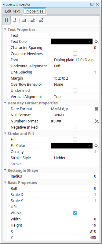
| Property | Description |
|---|---|
| Text | Text to display in the shape. |
| Text Color | Color of the text. |
| Character Spacing | Amount of extra spacing to add between characters. Negative spacing makes characters closer together. |
| Coalesce Newlines | If true, consecutive line breaks will be merged into one. |
| Font | Font to use for the text. |
| Horizontal Alignment | Horizontal alignment for text. |
| Line Spacing | Spacing between lines of text. 1 is single spacing, 2 is double spacing, etc. |
| Margin | Margin between text and bounds of shape in pixels. Format is top; left; bottom; right. |
| Overflow Behavior | How text that overflows the bounds of the shape should be handled.
Changed in 8.1.19 The Grow row option has been removed, and the default value is now None. |
| Underlined | If true, use underlined text. |
| Vertical Alignment | Vertical alignment for text. |
| Date Format | Format to use for dates in this shape. |
| Null Format | Format to use for null values in this shape. |
| Number Format | Format to use for numbers in this shape. |
| Negative in Red | If true, show negative numbers in red. |
| Fill | If true, the shape will fill its space with color. |
| Fill Color | If Fill is selected, the color that will fill the shape. |
| Opacity | How opaque the Fill color is, between 0 and 1. |
| Stroke Style | What style of stroke or border to use: Hidden; Shape Outline; Border; Double. To learn more about stroke styles, refer to Stroke and Fill Properties. |
| Stroke | Details for the chosen stroke. Each Stroke has its own properties depending on the Stroke Style chosen. |
| Radius | Amount to radius the corners of this shape if using a Stroke. |
| Roll | Number of degrees this shape is rotated clockwise. |
| Scale X | Amount to scale the width of this shape. 1 is scale to 100%. |
| Scale Y | Amount to scale the height of this shape. 1 is scale to 100%. |
| URL | New in 8.1.19 A link to attach to this reporting component. Will be a clickable hyperlink if the report is exported as a PDF. You can use the values below to link to internal pages.
|
| Visible | If true, the shape will be visible. |
| Width | Width of this shape in pixels. |
| Height | Height of this shape in pixels. |
| X | Horizontal distance in pixels between the left edge of this shape and the left edge of the page. |
| Y | Vertical distance in pixels between the upper edge of this shape and the top edge of the page. |
Using HTML in the Edit Text Tab
Text Shapes can render HTML tags if the value of the Text property is referencing a report parameter that contains HTML. For example, if a parameter contained the following value, then you can assign an HTML parameter to the Text property of a Text shape.
-
Create a parameter.
"<html>some <br>text</html>"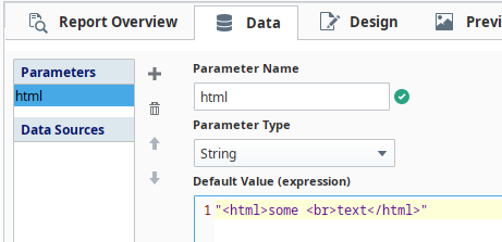
-
Then, in the Edit Text tab on the Text shape, enter @html@.

-
Access the Preview tab to see how the key renders.

Additionally, you can query HTML from a database in the Data Sources field to render HTML tags. Similar to the process described above, you'll need to enter the data key of your query into the Edit Text tab, and then confirm your rendered HTML with the Preview tab.
Supported Tags
Below is a list of all supported tags. The use of any non-supported tags will be ignored by the Report module. You don't need to include the closing formatting tag if the rest of the string should use the formatting.
| Formatting Option | Tag | Example |
|---|---|---|
| Line Break | <br> | <html>Hello <br>World</html> |
| Bold | <b> | <html>Hello <b>World</b></html> |
| Italic | <i> | <html>Hello <i>World</i></html> |
| Emphasis | <em>Displayed as italics. | <html>Hello <em>World</em></html> |
| Underline | <u> | <html>Hello <u>World</u></html> |
| Font Size | <font size='x'>The possible values for x and related size modifier are listed below. | <html>Hello <font size=2>World</font size></html> |
| Font Color | <font color='x'> Where x is a named color, such as 'red' or a hex code ('#0000FF') | <html>Hello <font color='red'>World</font color></html> <html>Hello <font color='#0000FF'>World</font color></html> |
| Superscript | <sup> | <html>Hello <sup>World</sup></html> |
| Subscript | <sub> | <html>Hello <sub>World</sup></html> |
| Alignment | <left>, <center>, <right> | <html>Hello <center>World</center></html> |
Font Size
| Value | Size Modifier |
|---|---|
| 1 | .5 |
| 2 | .75 |
| 3 | 1.0 |
| 4 | 1.2 |
| 5 | 1.4 |
| 6 | 1.6 |
| 7 | 2.0 |
Example
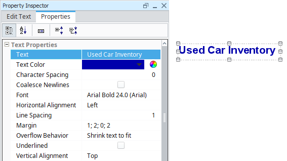
This example shows the property values used to create a heading for the Used Car Inventory report below.
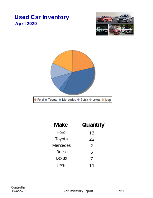
Used Car Inventory Settings
| Property | Value |
|---|---|
| Text | Used Car Inventory |
| Text Color | FFFFFF, Bold |
| Font Size | 24 pixels |
April 2020 settings
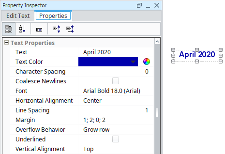
| Property | Value |
|---|---|
| Text | April 2020 |
| Text Color | FFFFFF |
| Font Size | 18 pixels |