Report Component - Pie Chart
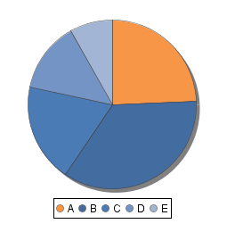
The Pie Chart takes a Data Source with two keys: a Label (typically a string) and a Value (typical a numerical value).
Report Design Component Palette Icon:
Properties
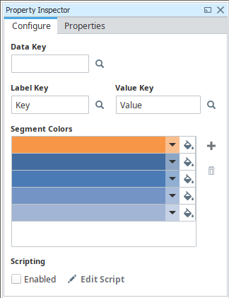
Property Inspector - Configure Tab
| Property | Description |
|---|---|
| Data Key | Unique identifier or placeholder to the data source that will populate the chart. |
| Label Key | Key that will list the names of each segment in the legend on the chart. |
| Value Key | The key that will populate the chart with data. |
| Segment Colors | A unique color in the RGBA color space for each segment (wedge). Will repeat the colors if there are not enough to cover all of the different segments, so it is important to list a lot of colors here. |
Add Segment  | Adds a color wedge to the chart. |
Remove Segment  | Deletes a color wedge from the chart. |
| Scripting Enabled | New in 8.1.28 Enables the script for this component to run. |
Edit Script  | New in 8.1.28 Allows the chart to be modified before the report is rendered. |
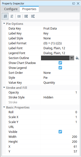
Property Inspector - Properties Tab
| Property | Description |
|---|---|
| Data Key | Data key of the dataset that drives this pie chart. |
| Label Key | Column name inside the dataset represented by the Data Key which holds the pie wedge's label. |
| Label Style | Style for labels on the pie chart. Options are None (0), Simple (1), and Outset (2). |
| Label Format | Format of labels, if enabled. Use 0 = wedge name, 1 = value, 2 = percentage. |
| Label Font | Font used for this chart's labels. |
| Legend Font | Font used for this chart's legend. |
| Section Outline | Color to use for outline dividing sections. See Color Selector. |
| Show Chart Shadow | New in 8.1.28 If true, display background shadow on the Pie Chart. |
| Show Legend | If true, show the chart's legend. |
| Sort Order | Order to sort chart categories. This will determine colors used and order of the legend. |
| Style | Style for this pie chart. Options are Pie, 3D Pie, and Ring. |
| Value Key | Column name inside the dataset represented by the Data Key which holds the pie wedge's value. |
| Opacity | How opaque the fill color is, between 0 and 1. |
| Stroke Style | What style of stroke or border to use: Hidden, Shape Outline, Border, or Double. To learn more about stroke styles, refer to Stroke and Fill Properties. |
| Stroke | Details for the chosen stroke. Each Stroke has its own properties depending on the Stroke Style chosen. |
| Roll | Number of degrees this shape is rotated clockwise. |
| Scale X | Amount to scale the width of this shape. 1 is scale to 100%. |
| Scale Y | Amount to scale the height of this shape. 1 is scale to 100%. |
| URL | New in 8.1.19 A link to attach to this reporting component. Will be a clickable hyperlink if the report is exported as a PDF. You can use the values below to link to internal pages.
|
| Visible | If true, the shape will be visible. |
| Width | Width of this shape in pixels. |
| Height | Height of this shape in pixels. |
| X | Horizontal distance in pixels between the left edge of this shape and the left edge of the page. |
| Y | Vertical distance in pixels between the top edge of this shape and the top edge of the page. |
Example
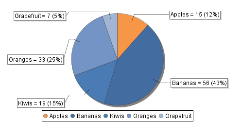
Pie Chart Sample CSV Data
Fruit, Quantity
Apples, 15
Bananas, 56
Kiwis,19
Oranges, 33
Grapefruit, 7
| Property | Value |
|---|---|
| Label Style | Outset |
| Value Key | Quantity |