Vision - Easy Chart

Component Palette Icon:
Description
This component is used to make runtime-configurable time-series charts. It is configured by defining a set of pens and axes. Pens can be many different styles, such as line, area, bar, and shape. This chart automatically creates controls for picking the time range and for hiding or displaying pens.
Features
- Easy configuration
- User-selectable set of pens
- Automatic time-selection controls
- SQL Query and/or SQLTags Historian data sources
- Automatic SPC and calculated pen support
- Zoom, Pan, X-Trace modes
- Any number of Y-axes and subplots
- Realtime or Historical
Pens
There are three kinds of pens in the Easy Chart:
- Tag Historian Pens. These pens pull their data from the Historian system.
- Database Pens. These pens will automatically create SQL SELECT queries to pull data from a database table. Typically, this is a table that is the target of a Historical Transaction Group.
- Calculated Pens: These pens display a calculated dataset based off another pen, such as a moving average or Statistical Process Control (SPC) function such as the Upper Control Limit (UCL).
Interface Elements
| Element | Description |
|---|---|
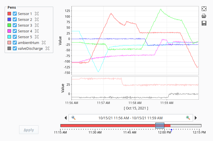
| Pens | After dragging a tag onto the Easy Chart, a Pen corresponding to the tag's value will appear in the Pens panel. Pens can be selected and deselected using the checkboxes. Clicking the X next to a pen will remove it from the Easy Chart. |
| Date Range | In Historical mode, the user is shown a Vision - Date Range component to pick the range of data to fetch and display. The initial values of this component are set through properties on the chart. In historical mode, the chart does not poll. In Realtime mode, the user is instead given the ability to select an amount of time before the current timestamp:  The chart will poll at a rate according to the Poll Rate parameter. In Manual mode, no user input controls are displayed. The chart will use the values of its Start Date and End Date parameters to govern what data is displayed. The chart will poll at a rate according to the Poll Rate parameter. |
Maximize  | Clicking this button will maximize the chart to fill the area of the component. |
Print  | Clicking this button will print the chart. |
Save to Excel  | Clicking this button will save the chart data as an Excel spreadsheet. |
You can bring up a context menu for this component when right-clicking on it either in the Designer's Preview Mode or in a Vision Client. See the Charting - Right Click Menu page for more details.
Properties
| Name | Description | Property Type | Scripting | Category | ||||||||
|---|---|---|---|---|---|---|---|---|---|---|---|---|
| 3D X Offset | The offset to use in the x direction for the '3D Line' pen style. | int | .xOffset3D | Pen Style Options | ||||||||
| 3D Y Offset | The offset to use in the y direction for the '3D Line' pen style. | int | .yOffset3D | Pen Style Options | ||||||||
| Allow Color Changes | If true, pen colors can be set to different values. | boolean | .allowColorChanges | Behavior | ||||||||
| Allow Tag History Interpolation | If enabled and the query mode is not raw, the data will be interpolated for time spans with no data available. | boolean | tagHistoryAllowInterpolation | Tag History | ||||||||
| Auto Apply | If true, user changes to pen visibility will occur immediately. | boolean | .autoApply | Behavior | ||||||||
| Auto Axis Positioning | If true, axes alternate automatically between left and right, rather than being placed explicitly. | boolean | .autoPositionAxes | Behavior | ||||||||
| Auto Color List | The list of colors to use if auto pen coloring is enabled. | Color[] | .autoColorList | Behavior | ||||||||
| Auto Pen Coloring | If true, pens are assigned different colors automatically. | boolean | .autoColorPens | Behavior | ||||||||
| Axes | This Dataset defines all axes that can be used by the pens. | Dataset | .axes | Chart Configuration | ||||||||
| Axis Font | The font for axis labels. | Font | .axisLabelFont | Appearance | ||||||||
| Background Color | The background color of the component. See Color Selector. | Color | .background | Appearance | ||||||||
| Bar Margin | The margin to use for the 'Bar' pen style. | double | .barMargin | Pen Style Options | ||||||||
| Border | The border surrounding this component. Options are: No border, Etched (Lowered), Etched (Raised), Bevel (Lowered), Bevel (Raised), Bevel (Double), Field Border, and Line Border. Note: The border is unaffected by rotation. Changed in 8.1.21 As of 8.1.21, the "Button Border" and "Other Border" options are removed. | Border | .border | Appearance | ||||||||
| Box Fill | For historical-mode date range. The fill color for the selection box. Can be chosen from color wheel, chosen from color palette, or entered as RGB or HSL value. See Color Selector. | Color | .boxFill | Historical Range | ||||||||
| Button Size | The size of the utility button icons. | int | .utilityButtonSize | Utility Buttons | ||||||||
| Bypass Tag History Cache | If true, tag history queries will not use the client history cache. | boolean | .tagHistoryBypassCache | Tag History | ||||||||
| Calculated Pens | This Dataset defines the calculated pens for the chart. | Dataset | .calcPens | Chart Configuration | ||||||||
| Chart Border | The border for the chart itself. | Border | .chartBorder | Appearance | ||||||||
| Chart Mode | Affects the mode that the chart operates in; Manual Mode, Historical Mode, Realtime Mode.
| int | .chartMode | Behavior | ||||||||
| Chart Title | Sets an optional title to be displayed above the chart. | String | .title | Appearance | ||||||||
| Cursor | The mouse cursor to use when hovering over this component. Options are: Default, Crosshair, Text, Wait, Hand, Move, SW Resize, or SE Resize. | int | .cursorCode | Common | ||||||||
| DB Pens | This Dataset defines all of the database pens for the chart. | Dataset | .pens | Chart Configuration | ||||||||
| Date Editor Background | The background color for the date editor. See Color Selector. | Color | .editorBackgroundColor | Appearance | ||||||||
| Date Editor Foreground | The foreground color for the date editor. See Color Selector. | Color | .editorForegroundColor | Appearance | ||||||||
| Date Range | Affects the position of the date range control. | int | .dateRangeLocation | Layout | ||||||||
| Date Range Border | The border for the date range control, if visible. | Border | .dateRangeBorder | Appearance | ||||||||
| Date Style | The style to display dates in. For international support. | int | .dateStyle | Historical Range | ||||||||
| Digital Gap | The size of the gap to use between digital pens. | double | .digitalGap | Pen Style Options | ||||||||
| Empty Group Name | The group name to use for pens that are not in a pen group. | String | .emptyGroupName | Behavior | ||||||||
| End Date | For manual-mode. The end date to use for selecting pen data | Date | .endDate | Data | ||||||||
| Font | Font of text on this component. | Font | .font | Appearance | ||||||||
| Foreground Color | The foreground color of the component. See Color Selector. | Color | .foreground | Appearance | ||||||||
| Gap Threshold | The relative threshold to use for determining continuity breaks for the 'Discontinuous Line' pen style. | double | .gapThreshold | Pen Style Options | ||||||||
| Gridline Color | The color of the gridlines. See Color Selector. | Color | .gridlineColor | Appearance | ||||||||
| Gridline Dash Pattern | Enter a string of comma-delimited numbers which indicate the stroke pattern for a dashed line. For instance, "3,5" means three pixels on, five pixels off. | String | .gridlineDashPattern | Appearance | ||||||||
| Gridline Width | The width (thickness) of the gridlines. | float | .gridlineWidth | Appearance | ||||||||
| Group Pens | If true, pens will be grouped by their group name. | boolean | .penGrouping | Behavior | ||||||||
| High Density Color | For historical-mode date range. The color used to indicate high data density. See Color Selector. | Color | .highDensityColor | Historical Range | ||||||||
| Horiz Gap | The horizontal spacing to use for the pen checkboxes. | int | .hGap | Layout | ||||||||
| Ignore Bad Quality Data | If true, causes the system to ignore any bad quality data. | boolean | tagHistoryIgnoreBadData | Tag History | ||||||||
| Invert Time Axis | If true, the time axis values will increase from the right to left or from top to bottom depending on the Plot Orientation. | boolean | .invertTimeAxis | Layout | ||||||||
| Legend | Where the legend should appear, if any. | int | .legend | Layout | ||||||||
| Max Selection | For historical-mode date range. The maximum size of the selected date range. | String | .maxSelectionSize | Historical Range | ||||||||
| Maximize Plot | If true, displays maximized plot. | boolean | .currentlyMaximized | Layout | ||||||||
| Mouseover Text | The text that is displayed in the tooltip which pops up on mouseover of this component. | String | .toolTipText | Common | ||||||||
| Name | The name of this component. | String | .name | Common | ||||||||
| Outer Range End | For historical-mode date range. The end date for the outer range. Used in cases when an explicit point in time should be used to define the outer range of the chart. Competes with Startup Range. | Date | .outerRangeEnd | Historical Range | ||||||||
| Outer Range Start | For historical-mode date range. The start date for the outer range. Used in cases when an explicit point in time should be used to define the outer range of the chart. Competes with Startup Range. | Date | .outerRangeStart | Historical Range | ||||||||
| Pen Control Border | The border for the pen control panel, if visible. | Border | .penBorder | Appearance | ||||||||
| Pen Control Mode | The style in which the pen control panel alters the chart configuration. In heavyweight mode, unchecked pens are not queried, so checking and unchecking pens refreshes the chart. In lightweight mode, all pens are constantly queried, so checking and unchecking pens is quick. | int | .penControlMode | Behavior | ||||||||
| Pen Control? | Controls whether or not end-users can turn on and off pens. | boolean | .allowPenManipulation | Behavior | ||||||||
| Plot Background | The background color for all plots, unless they override it. See Color Selector. | Color | .plotBackground | Appearance | ||||||||
| Plot Orientation | The plot orientation for all plots. | int | .plotOrientation | Layout | ||||||||
| Plot Outline | The color to use for the plot outline. See Color Selector. | Color | .plotOutlineColor | Appearance | ||||||||
| Poll Rate | The rate (in milliseconds) at which this chart's queries poll. Historical charts don't use this property. | int | .pollRate | Behavior | ||||||||
| Properties Loading | The number of properties currently being loaded. (Read only. Usable in bindings and scripting.) | int | .propertiesLoading | Uncategorized | ||||||||
| Realtime Text | For realtime-mode date range. The text to display on the realtime date control. | String | .rtLabel | Realtime Range | ||||||||
| Selected X Value | The selected domain axis value for X-Trace and Mark modes. (Read only. Usable in bindings and scripting.) | String | .selectedXValue | Uncategorized | ||||||||
| Selection Highlight | For historical-mode date range. The focus highlight color for the selection box. See Color Selector. | Color | .selectionHighlight | Historical Range | ||||||||
| Show Density | For historical-mode date range. If true, a data density histogram will be shown in the date range. Note: This feature relies on being able to validate the data against tag group execution. This chart will be unable to display density information for tags that were stored by an Internal Historian Provider, as well as cases where tag group validation is disabled (such as by disabling Enable Stale Data Detection) | boolean | .showHistogram | Historical Range | ||||||||
| Show Loading | If true, an animated indicator will be shown when data is loading. | boolean | .showLoading | Behavior | ||||||||
| Show Maximize Button? | If true, a small maximize button will be displayed next to the chart. | boolean | .showMaximize | Utility Buttons | ||||||||
| Show Popup? | If true, a popup menu will be shown on right-click that allows the user to change mode, print, save, etc. | boolean | .showPopup | Behavior | ||||||||
| Show Print Button? | If true, a small print button will be displayed next to the chart.. | boolean | .showPrint | Utility Buttons | ||||||||
| Show Save Button? | If true, a small save button will be displayed next to the chart. | boolean | .showSave | Utility Buttons | ||||||||
| Show Tooltips? | If true, tooltips showing point values will be displayed on the chart. | boolean | .tooltips | Behavior | ||||||||
| Show Warnings | If true, warnings generated during chart configuration will be printed to the console. | boolean | .showWarnings | Behavior | ||||||||
| Sort Pens | If true, pens visibility checkboxes will be sorted. | boolean | .alphabetizePens | Layout | ||||||||
| Start Date | For manual-mode. The start date to use for selecting pen data. | Date | .startDate | Data | ||||||||
| Startup Range | For historical-mode date range, this will be the starting range of time available for selection. Useful in cases where the chart should range a period of time on window open (i.e., show the last 8 hours). Competes with the Outer Range Start and Outer Range End properties. | String | .startupRange | Historical Range | ||||||||
| Startup Selection | For historical-mode date range, this value will be used for the starting selection range. | String | .startupSelection | Historical Range | ||||||||
| Subplot Gap | The gap between subplots. | double | .subplotGap | Layout | ||||||||
| Subplots | This Dataset defines all subplots' relative size and color. | Dataset | .subplots | Chart Configuration | ||||||||
| Tag History Resolution | When Tag History Resolution Mode is set to "Fixed", this setting is used to specify the number of data points that should be returned by tag history queries. When a Tag History Provider has pre-processed partitions enabled, this setting can be used in conjunction with the chart's range to specify if the tag history data should use pre-processed partitions or not. For example, if the chart is displaying a range of 60 minutes, and resolution is set to 6, the resulting window size would be 10 minutes each. Since this is greater than the default Pre-processed Window Size of 60 seconds, the pre-processed table is queried. If the resulting window size is less than the Pre-processed Window Size, the raw data table will be queried. Setting this to -1 is equivalent to using the Raw Resolution Mode. Setting this to 0 is equivalent to using the Natural Resolution Mode. | int | .tagHistoryResolution | Tag History | ||||||||
| Tag History Resolution Mode | The mode used for the number of requested points. Fixed will use the Tag History Resolution Size, Natural will return a value per tag group execution, Chart Width will be based on the actual width of the chart component, and Raw will be the raw data. | int | tagHistoryResolutionMode | Tag History | ||||||||
| Tag Pens | This Dataset defines all of the Tag History pens for the chart. | Dataset | .tagPens | Chart Configuration | ||||||||
| Tick Density | For historical-mode date range. This is multiplied by the width to determine the current ideal tick unit. | float | .tickDensity | Historical Range | ||||||||
| Tick Font | The font for tick labels. | Font | .axisTickLabelFont | Appearance | ||||||||
| Time Style | The style to display times of day. For international support. | int | .timeStyle | Historical Range | ||||||||
| Title Font | The font for the optional chart title. | Font | .titleFont | Appearance | ||||||||
| Today Color | For historical-mode date range. The color of the "Today Arrow" indicator. See Color Selector. | Color | .todayIndicatorColor | Historical Range | ||||||||
| Total Datapoints | The number of datapoints being displayed by the graph. (Read only. Usable in bindings and scripting.) | int | .datapoints | Uncategorized | ||||||||
| Track Margin | For historical-mode date range. The amount of room on either side of the slider track. May need adjusting of default font is changed. | int | .trackMargin | Historical Range | ||||||||
| Unit | For realtime-mode date range. The selected unit of the realtime date control. | int | .unit | Realtime Range | ||||||||
| Unit Count | For realtime-mode date range. The number of units back to display. | int | .unitCount | Realtime Range | ||||||||
| Validate Scan Class Executions | Causes the tag history query to verify the scan class execution records, generating bad data for the time periods where the scanclasses did not execute. | boolean | tagHistoryValidateScanclass | Tag History | ||||||||
| Vert Gap | The vertical spacing to use for the pen checkboxes. | int | .vGap | Layout | ||||||||
| Visible | If disabled, the component will be hidden. | boolean | .visible | Common | ||||||||
| Where Clause | A snippet of where clause that will be applied to all database pens, like "TankNum = 2". | String | .globalWhereClause | Data | ||||||||
| X Axis AutoRange? | If true, the X axis will automatically fit the range of available data, if false, it will display a fixed range based on the start date and end date. | boolean | .xAxisAutoRange | Behavior | ||||||||
| X Axis Label | The label shown on the X Axis (time axis). | String | .xAxisLabel | Appearance | ||||||||
| X Axis Margin | A margin for the upper and lower ends of the x axis, expressed as a percentage of the total range. | double | .xAxisMargin | Behavior | ||||||||
| X Axis Visible | Should the x-axis be displayed? | boolean | .xAxisVisible | Appearance | ||||||||
| X-Trace Large Number Format | The large decimal format for the x-trace value in the Easy Chart. | String | .xTraceLargeNumberFormat | Appearance | ||||||||
| X-Trace Number Format Threshold | If the magnitude of the to-be-formatted value is below this threshold, then the X-Trace Small Number Format will be used. | double | .xTraceNumberFormatThreshold | Appearance | ||||||||
| X-Trace Small Number Format | The small decimal format for the x-trace value in the Easy Chart. | String | .xTraceSmallNumberFormat | Appearance | ||||||||
| X-Trace Track Mouse | If set enabled, and the chart is set to X-Trace mode, the X-Trace will auto track the mouse position while the cursor is over the component. This is particularly useful when displaying the Easy Chart on a touchscreen. Changed in 8.1.15 .xTraceTrackMouse and .XTraceTrackMouse can be used interchangeably to read/write to the property. | boolean | .XTraceTrackMouse | Appearance |
Scripting
See the Vision - Easy Chart Scripting Functions page for the full list of scripting functions available for this component.
Event Handlers
Event handlers allow you to run a script based off specific triggers. See the full list of available event handlers on the Component Events page
Customizers
Refer to the Vision - Easy Chart Customizer and the Using the Vision Easy Chart sections of the manual for examples and tutorials on how to use the Easy Chart Customizer. With the customizer, you can set up: