Vision - Bar Chart

Component Palette Icon:
Description
The Bar Chart represents numeric values in an underlying dataset. It is often configured to display as a category chart. A category chart is a chart whose X-values are categories (strings, names, groupings, etc) rather than numeric values (numbers, dates).
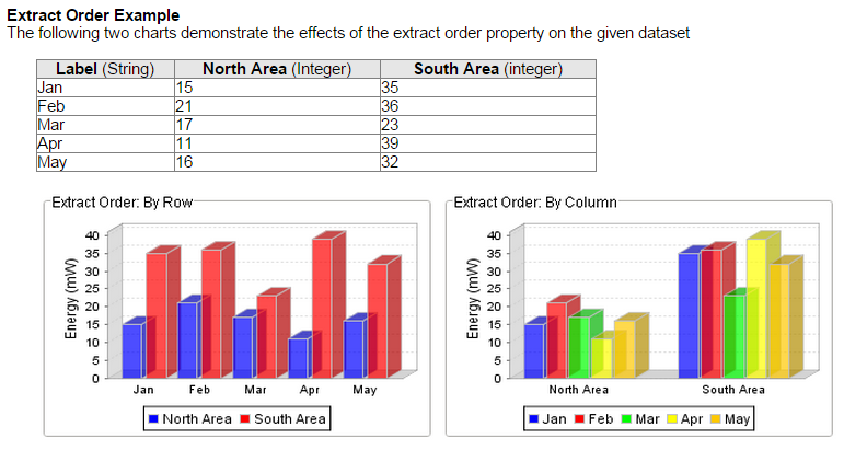
Like most chart components (other than the Easy Chart), the Data property drives the chart. The first column in the Data dataset defines the names of the categories. The rest of the columns define the values for each of the series (if there is more than one series per category), and thus should be numeric.
If the columns define the categories and rows define the series for your data, then set the Extract Order to "By Column".
You can bring up a context menu for this component when right-clicking on it either in the Designer's Preview Mode or in a Vision Client. See the Charting - Right Click Menu page for more details.
Properties
| Name | Description | Property Type | Scripting | Category |
|---|---|---|---|---|
| Bar Label Color | The color for the bar labels. Can be chosen from color wheel, chosen from color palette, or entered as RGB or HSL value. See Color Selector. | Color | .barLabelColor | Axes |
| Bar Label Font | The font for the bar labels. | Font | .barLabelFont | Axes |
| Bar Label Offset | The offset between the bar and the bar label. | double | .barLabelOffset | Axes |
| Border | The border surrounding this component. Options are No border, Etched (Lowered), Etched (Raised), Bevel (Lowered), Bevel (Raised), Bevel (Double), and Field Border. Note: The border is unaffected by rotation. Changed in 8.1.21 As of 8.1.21, the "Button Border" and "Other Border" options are removed. | Border | .border | Common |
| Category Axis Label | The label for the category axis. | String | .categoryLabel | Axes |
| Category Axis Label Angle | The angle for the value axis' labels. | int | .catAxisLabelPosition | Axes |
| Category Axis Label Color | The color for the category axis label. See Color Selector. | Color | .catAxisLabelColor | Axes |
| Category Axis Label Font | The font for the category axis label. | Font | .catAxisLabelFont | Axes |
| Category Axis Lower Margin | The lower margin, as a percentage, of the category axis. | double | .catAxisLowerMargin | Axes |
| Category Axis Tick Color | The color for the category axis' ticks. See Color Selector. | Color | .catAxisTickColor | Axes |
| Category Axis Tick Font | The font for the category axis' ticks. | Font | .catAxisTickFont | Axes |
| Category Axis Upper Margin | The upper margin, as a percentage, of the category axis. | double | .catAxisUpperMargin | Axes |
| Category Margin | The margin between categories as a fraction of the total space. | double | .categoryMargin | Appearance |
| Chart Title | An optional title that will appear at the top of the chart. | String | .title | Appearance |
| Chart Type | Controls how the bar chart is displayed. | int | .rendererType | Appearance |
| Cursor | The mouse cursor to use when hovering over this component. Options are: Default, Crosshair, Text, Wait, Hand, Move, SW Resize, or SE Resize. | int | .cursorCode | Common |
| Data | The data driving the chart. | Dataset | .data | Data |
| Extract Order | Controls whether the first row defines the categories or the series. | int | .extractOrder | Data |
| Foreground Transparency | The transparency of the bars (useful for 3D bars). Valid values are between 0 (0% opacity) and 1 (100% opacity). | float | .foregroundAlpha | Appearance |
| Gradient bars? | If true, bars will be painted with a gradient 'shine'. | boolean | .gradient | Appearance |
| Item Margin | The margin between bars in a category as a fraction. | double | .itemMargin | Appearance |
| Labels? | Always display labels? | boolean | .labels | Appearance |
| Legend Font | The font for the legend items. | Font | .legendFont | Axes |
| Legend? | If true, show a legend for the chart. | boolean | .legend | Appearance |
| Mouseover Text | The text that is displayed in the tooltip which pops up on mouseover of this component. | String | .toolTipText | Common |
| Name | The name of this component. | String | .name | Common |
| Plot Background | The background color for the plot. | Color | .plotBackground | Appearance |
| Quality | The data quality code for any Tag bindings on this component. | QualityCode | .quality | Data |
| Series Colors | The sequence of colors used for series in the bar chart. See Color Selector. | Color[] | .seriesColors | Appearance |
| Shadows? | If true, bars will have a drop-shadow beneath them. | boolean | .shadows | Appearance |
| Title Font | The font for the chart's title. | Font | .titleFont | Axes |
| Tooltips? | If true, show tooltips. | boolean | .tooltips | Behavior |
| Value Axis Auto-Range | If true, the value axis range will be determined automatically. If false, the specified upper and lower bounds will be used. | boolean | .valAxisAutoRange | Axes |
| Value Axis Label | The label for the value axis | String | .valueLabel | Axes |
| Value Axis Label Color | The color for the value axis label. See Color Selector. | Color | .valAxisLabelColor | Axes |
| Value Axis Label Font | The font for the value axis label. | Font | .valAxisLabelFont | Axes |
| Value Axis Lower Bound | The lower bound of the value axis. Used only when auto-range is false. | double | .valAxisLowerBound | Axes |
| Value Axis Tick Color | The color for the value axis' ticks. See Color Selector. | Color | .valAxisTickColor | Axes |
| Value Axis Tick Font | The font for the value axis' ticks. | Font | .valAxisTickFont | Axes |
| Value Axis Upper Bound | The upper bound of the value axis. Used only when auto-range is false. | double | .valAxisUpperBound | Axes |
| Value Axis Upper Margin | The upper margin, as a percentage, of the value axis. Only used when auto-range is true. | double | .valAxisUpperMargin | Axes |
| Vertical | Sets the orientation of the chart to vertical (true) or horizontal(false) | boolean | .vertical | Appearance |
| Visible | If disabled, the component will be hidden. | boolean | .visible | Common |
Scripting
See the Vision - Bar Chart Scripting Functions page for the full list of scripting functions available for this component.
Event Handlers
Event handlers allow you to run a script based off specific triggers. See the full list of available event handlers on the Component Events page
Customizers
Examples