Vision - Chart
Component Palette Icon:
Description
The Chart component (also called the Classic Chart when contrasted with the Easy Chart) provides a flexible way to display either timeseries or X-Y charts that are powered by any number of datasets. Typically, these datasets are bound to SQL Query Bindings in Vision.
Features
- SQL Query and/or SQLTags Historian data sources
- Zoom, Pan, X-Trace modes
- Any number of Y-axes and subplots
- Realtime or Historical
- Many different rendering styles
Configuration
The basic idea behind configuring the classic chart is simple: add datasets, and fill them in with data in a format that the chart understands. You add datasets to the chart using the chart's customizer. You then use standard property bindings to put data into these charts. Commonly you'll use SQL Query Bindings in Vision. Since these datasets are just normal dynamic properties, you can also access them via scripting.
The Customizer also lets you add additional X and Y axes. There are various types of axes, and they each have a large number of properties. Lastly, you can configure additional properties for each dataset, such as which axes it maps to, its visual style, subplot, etc.
Datasets
Each dataset should define one or more "series" (a.k.a "pens"). The format for these datasets is quite simple. Each series in a dataset shares common X-values, defined by the first column. Each additional column are the Y-values for a series.
Chart Type: XY vs Category
The classic chart is typically in XY Plot mode. This means that the X-axis is either date or numeric, and the Y-axes are numeric. If your X-axis is categorical (names, not numbers), you can switch the Chart Type property to Category Chart in the Property Editor. Don't be surprised when you get a few errors - you'll need to go and switch your X-axis to be a Category Axis, and fill your dataset in with valid category data, that is, String-based X-values. This is most often used with the Bar Renderer (see the Vision - Chart Customizer).
You can bring up a context menu for this component when right-clicking on it either in the Designer's Preview Mode or in a Vision Client. See the Charting - Right Click Menu page for more details.
Properties
| Name | Description | Property Type | Scripting | Category |
|---|---|---|---|---|
| Background Color | The background color of the component. Can be chosen from color wheel, chosen from color palette, or entered as RGB or HSL value. See Color Selector. | Color | .background | Appearance |
| Border | The border surrounding this component. Options are: No border, Etched (Lowered), Etched (Raised), Bevel (Lowered), Bevel (Raised), Bevel (Double), Field Border, and Line Border. Note: The border is unaffected by rotation. Changed in 8.1.21 As of 8.1.21, the "Button Border" and "Other Border" options are removed. | Border | .border | Common |
| Chart Orientation | The orientation of the domain axis of the chart. | int | .orientation | Appearance |
| Chart Title | An optional title that will appear at the top of the chart. | String | .title | Appearance |
| Chart Type | Choose the type for this chart: XY (Numeric X-axis) or Category (String X-axis). | int | .chartType | Behavior |
| Cursor | The mouse cursor to use when hovering over this component. Options are: Default, Crosshair, Text, Wait, Hand, Move, SW Resize, or SE Resize. | int | .cursorCode | Common |
| Extract Order | Extract order for how category datasets should be interpreted. | int | .extractOrder | Behavior |
| Font | Font of text on this component. | Font | .font | Appearance |
| Foreground Color | The foreground color of the component. | Color | .foreground | Appearance |
| Mouseover Text | The text that is displayed in the tooltip which pops up on mouseover of this component. | String | .toolTipText | Common |
| Name | The name of this component. | String | .name | Common |
| Plot Background | The background color for all plots, unless they override it. | Color | .plotBackground | Appearance |
| Properties Loading | The number of properties currently being loaded. (Read only. Usable in bindings and scripting.) | int | .propertiesLoading | Uncategorized |
| Quality | The data quality code for any Tag bindings on this component. | QualityCode | .quality | Data |
| Selected Datapoint | The currently selected datapoint. (Read only. Usable in bindings and scripting.) | String | .selectedData | Uncategorized |
| Selected X Value | The selected domain axis value for X-Trace and Mark modes. (Read only. Usable in bindings and scripting.) | String | .selectedXValue | Uncategorized |
| Selection Enabled? | If true, the user will be able to select datapoints on the chart. The selected datapoint will be highlighted, and the selectedData property will reflect it. | boolean | .selectionEnabled | Behavior |
| Selection Highlight Color | The color of the selection highlight. | Color | .selectionHighlightColor | Appearance |
| Selection Highlight Width | The line width of the selection highlight. | float | .selectionHighlightWidth | Appearance |
| Show Legend? | If true, a legend will be shown for the series displayed in the chart. | boolean | .legend | Appearance |
| Show Popup? | If true, a popup menu will be shown on right-click that allows the user to change mode, print, save, etc. | boolean | .showPopup | Behavior |
| Show Tooltips? | If true, tooltips showing point values will be displayed. | boolean | .tooltips | Behavior |
| Subplot Mode | The axis that subplots share if more than one subplot. | int | .subplotMode | Behavior |
| Visible | If disabled, the component will be hidden. | boolean | .visible | Common |
Deprecated Properties
| Property | Description | Property Type | Scripting | Category |
|---|---|---|---|---|
| Data Quality | The data quality code for any Tag bindings on this component. | int | .dataQuality | Deprecated |
Scripting
See the Vision - Chart Scripting Functions page for the full list of scripting functions available for this component.
Event Handlers
Event handlers allow you to run a script based off specific triggers. See the full list of available event handlers on the Component Events page
Customizers
The Chart component uses its own customizer called the Vision - Chart Customizer. You can add datasets and additional XY axes to a chart using the tabs in the chart customizer. You can configure additional properties for each dataset, like what axes it maps to as well as select from a host of visual styles. It also has six axis types to choose from, each with an extensive list of properties.
The customizer already has some default styles in place to help you get started, but you can modify these default settings to your own style. Refer to the Vision - Chart Customizer section for property descriptions and examples of chart axis types.
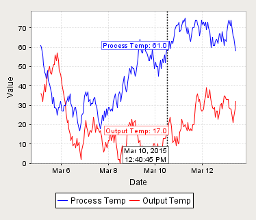
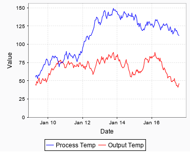
Example