Vision - Status Chart
Component Palette Icon:
Description
The Status Chart component allows you to visualize the status of one or more discrete datapoints over a time range. The X-axis is always a timeseries axis, and the Y-axis is a category axis, with one entry per data series. The chart is populated with a single dataset, the first column of which must be a datetime column.
Wide vs Tall Datasets
In Wide format, all of the columns but the first must be numeric. These "series" columns' headers will be used as the names on the y-axis. In Tall format, there should be exactly 3 columns. The first is the timestamp, the second is the series name, and the third is the value. For example:
Wide Format
| t_stamp | Valve1 | Valve2 |
|---|---|---|
| 2010-01-13 8:00:00 | 0 | 2 |
| 2010-01-13 8:02:00 | 0 | 2 |
| 2010-01-13 8:04:00 | 1 | 2 |
| 2010-01-13 8:06:00 | 1 | 1 |
| 2010-01-13 8:08:00 | 0 | 1 |
Tall Format
| t_stamp | Name | Value |
|---|---|---|
| 2010-01-13 8:00:00 | Valve1 | 0 |
| 2010-01-13 8:00:00 | Valve2 | 2 |
| 2010-01-13 8:02:00 | Valve1 | 0 |
| 2010-01-13 8:02:00 | Valve2 | 2 |
| 2010-01-13 8:04:00 | Valve1 | 1 |
| 2010-01-13 8:04:00 | Valve2 | 2 |
| 2010-01-13 8:06:00 | Valve1 | 1 |
| 2010-01-13 8:06:00 | Valve2 | 1 |
| 2010-01-13 8:08:00 | Valve1 | 0 |
| 2010-01-13 8:08:00 | Valve2 | 1 |
Color Mapping
Apart from getting the data into the series chart, the only other commonly configured option is the mapping of discrete values to colors. This is done in the Status Chart Customizer. Each named series can have its own mapping of colors, if desired. These mappings are stored in the expert-level dataset property Series Properties Data so they can be altered at runtime.
You can bring up a context menu for this component when right-clicking on it either in the Designer's Preview Mode or in a Vision Client. See the Charting - Right Click Menu page for more details.
Properties
| Name | Description | Property Type | Scripting | Category |
|---|---|---|---|---|
| Background Color | The background color of the component. Can be chosen from color wheel, chosen from color palette, or entered as RGB or HSL value. See Color Selector. | Color | .background | Appearance |
| Border | The border surrounding this component. Options are No border, Etched (Lowered), Etched (Raised), Bevel (Lowered), Bevel (Raised), Bevel (Double), and Field Border. Note: The border is unaffected by rotation. Changed in 8.1.21 As of 8.1.21, the "Button Border" and "Other Border" options are removed. | Border | .border | Common |
| Chart Title | Title of this chart. | String | .chartTitle | Appearance |
| Cursor | The mouse cursor to use when hovering over this component. Options are: Default, Crosshair, Text, Wait, Hand, Move, SW Resize, or SE Resize. | int | .cursorCode | Common |
| Data Format | Format of the incoming data. In "wide" format, the first column of the dataset needs to be a timestamp, and every subsequent column represents one series in the chart. In "tall" format, the first column is a timestamp, the second column is a series name. | int | .dataFormat | Data |
| Date Style | The style to display dates in. For international support. | int | .dateStyle | Appearance |
| Domain Axis Color | Color used on the domain axis. See Color Selector. | Color | .domainAxisColor | Domain Axis |
| Domain Axis Font | Font used on the domain axis. | Font | .domainAxisFont | Domain Axis |
| Domain Axis Label | Label on the domain axis. | String | .domainAxisLabel | Domain Axis |
| Domain Axis Location | Location of the domain axis. | int | .domainAxisLocation | Domain Axis |
| Legend | Maps chart colors to descriptions. | dataset | .legend | Appearance |
| Mouseover Text | The text that is displayed in the tooltip which pops up on mouseover of this component. | String | .toolTipText | Common |
| Name | The name of this component. | String | .name | Common |
| Properties Loading | The number of properties currently being loaded. (Read only. Usable in bindings and scripting.) | int | .propertiesLoading | Uncategorized |
| Quality | The data quality code for any Tag bindings on this component. | QualityCode | .quality | Data |
| Range Axis Color | Color used on the range axis. See Color Selector. | Color | .rangeAxisColor | Range Axis |
| Range Axis Font | Font used on the range axis. | Font | .rangeAxisFont | Range Axis |
| Range Axis Label | Label on the range axis. | String | .rangeAxisLabel | Range Axis |
| Range Axis Location | Location of the range axis. | int | .rangeAxisLocation | Range Axis |
| Range Axis Lower Margin | Lower margin of the range axis. | double | .rangeAxisLowerMargin | Range Axis |
| Range Axis Upper Margin | Upper margin of the range axis. | double | .rangeAxisUpperMargin | Range Axis |
| Series Data | Data about each series. Data can be in either "wide" or "tall" format. | Dataset | .data | Data |
| Series Properties Data | Properties for each series. | Dataset | .properties | Data |
| Series Spacing | Affects the amount of spacing between series. Can be between 0.0 and 1.0. The series present on this chart are given equal space to display themselves. Series spacing is the percentage of that space that they use to do so. | double | .seriesSpacing | Appearance |
| Show Domain Axis | Sets whether or not the domain axis is visible. | boolean | .domainAxisVisible | Domain Axis |
| Show Range Axis | Sets whether or not the range axis is visible. | boolean | .rangeAxisVisible | Range Axis |
| Time Style | The style to display times of day. For international support. | int | .timeStyle | Appearance |
| Title Color | Color of the chart title. See Color Selector. | Color | .titleColor | Appearance |
| Title Font | Font on the chart title. | Font | .titleFont | Appearance |
| Visible | If disabled, the component will be hidden. | boolean | .visible | Common |
Scripting
See the Vision - Status Chart Scripting Functions page for the full list of scripting functions available for this component.
Event Handlers
Event handlers allow you to run a script based off specific triggers. See the full list of available event handlers on the Component Events page
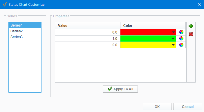
Customizers
The Status Chart component has its own customizer, used to set a number-to-color mapping for each series in the Series Data property.
Status Chart Customizer - Property Description
| Property | Description |
|---|---|
| Series | Selectable list of all objects in the Series Data property.
|
| Properties Table | The number-to-color mapping for the selected Series. |
| Value | A numeric value to match against. |
| Color | The color to display for the given value. |
| Apply To All | Set all of the Series mappings to the currently selected mapping. |
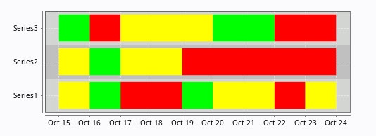
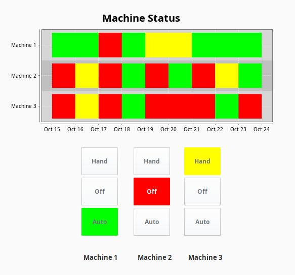
Examples
This example uses the Status Chart to display the state of each of the three machines over consecutive days using the Muli-State button. Tag History was turned on to record history HOA values. The Series Data property's dataset populates the Status Chart using a Tag History Binding. You can view the raw data by clicking on the Dataset Viewer  icon to the right of the Series Data property. Each color represents a state for the machine and can be set in the Series Properties Data property. This example also has the raw data in the code block in case you want to try it for yourself.
Series Data - Dataset Viewer
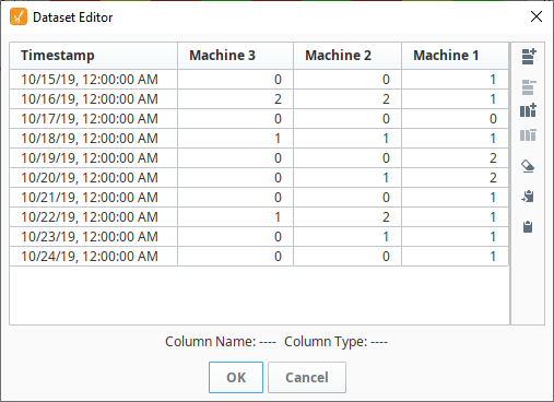
"#NAMES"
"Timestamp","Machine 3","Machine 2","Machine 1"
"#TYPES"
"date","I","I","I"
"#ROWS","10"
"2008-10-15 00:00:00.000","0","0","1"
"2008-10-16 00:00:00.000","2","2","1"
"2008-10-17 00:00:00.000","0","0","0"
"2008-10-18 00:00:00.000","1","1","1"
"2008-10-19 00:00:00.000","0","0","2"
"2008-10-20 00:00:00.000","0","1","2"
"2008-10-21 00:00:00.000","0","0","1"
"2008-10-22 00:00:00.000","1","2","1"
"2008-10-23 00:00:00.000","0","1","1"
"2008-10-24 00:00:00.000","0","0","1"
Series Properties Data - Dataset Viewer
Each machine has three states, and each of the three states (i.e., HOA) have different colors assigned representing a different state.
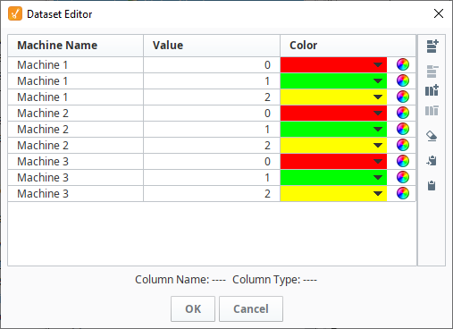
"#NAMES"
"SeriesName","Value","Color"
"#TYPES"
"str","I","clr"
"#ROWS","9"
"Series1","0","color(255,0,0,255)"
"Series1","1","color(0,255,0,255)"
"Series1","2","color(255,255,0,255)"
"Series2","0","color(255,0,0,255)"
"Series2","1","color(0,255,0,255)"
"Series2","2","color(255,255,0,255)"
"Series3","0","color(255,0,0,255)"
"Series3","1","color(0,255,0,255)"
"Series3","2","color(255,255,0,255)"