Perspective - Chart Range Selector
Component Palette Icon:
The Chart Range Selector component is a small recreation of a chart that operators can use to select a time range based on seeing the existing data. This component complements the Time Series Chart component, and should always be used with a chart. Its features include:
- Zoom and pan in/out via mouse wheel interaction.
- Click-and-drag brush range selection and panning.
- Start and End property values that are updated as the brush range changes. These properties can govern the start/end points of data queries to return a dataset.
- Time range showing the overall range of the data being displayed by the brush. (The range updates as the brush is updated.)
- Simple display customization for the axes, baselines, markers, and the overall chart data appearance.
- Label properties have their own dedicated styling properties, such as color and size.
User Interaction
| Interaction | Description |
|---|---|
| Zoom | The user can zoom in and out on the Chart Range Selector, but can not zoom out past its standard level of zoom. |
| Pan | The user can pan across the Chart Range Selector. |
| Refresh | The Chart Range Selector will not refresh its time range if it is zoomed in. |
| Pinch Zoom | On a mobile device, the user can now pinch-zoom the Chart Range Selector. Zooms must originate from within the boundaries of the displaying chart data. |
| Brushes | On a mobile device, the user can draw brushes in the Chart Range Selector via a single touch point (multiple touch points will allow zooming to occur). Brushes can be moved in the Chart Range Selector via a single touch point. |
Properties
Most Properties have binding options. For more information on Bindings, see Types of Bindings in Perspective. This section only documents the Props Category of properties. The other Categories are described on the Perspective Component Properties page.
| Name | Description | Property Type |
|---|---|---|
| enablePanZoom | Allow the chart to be panned and zoomed. The chart cannot be zoomed out past its base range. | value: boolean |
| data | Objects that are the data source for the chart (required). Data can be an object containing a time entry and value entries (all must be numbers) (required). Each value entry must be labeled with the column name to which it corresponds. Data can also be an array containing value entries (all must be numbers). Each value entry consists of a timestamp (which must be the first value) and one or more values that were captured at that time. Finally, data can also be in the form of a dataset, for example, the data property can be bound to a Tag History binding to display either realtime data, or historical data (via start and end dates). | object or array |
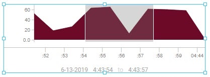
| selectedRange | The start and end points of the selected range (required). This property is updated as you interact with the brush.
| object |
| brushRange | An object used to control the display of the date/time range values at the bottom of the component. | object |
| timeAxis | This property provides settings for the X Axis. This property uses the same configuration as the timeAxis property of the Time Series Component.
| object |
| yAxis | An object used to control the display of the Y Axis. This component was built with the assumption that this axis may be secondary information, so it can be de-emphasized, if desired.
| object |
| areaStyles | An object providing default style to the chart trends as a whole.
| object |
| style | Full menu of style options is available for text, background, margin and padding, border, shape and miscellaneous. You can also specify a style class. | object |
timeAxis.tick
| Name | Description | Property Type |
|---|---|---|
| color | The color of the ticks. Can be chosen from color wheel, chosen from color palette, or entered as RGB or HSL value. See Color Selector. | value: string |
| label | The configuration of the label drawn on the tick.
| object |
| style | Custom CSS styles to apply to the ticks. Any style that applies to an SVG line element can be used. See also style options. | object |
yAxis.tick
| Name | Description | Property Type |
|---|---|---|
| color | The color of the ticks. Can be chosen from color wheel, chosen from color palette, or entered as RGB or HSL value. See Color Selector. | value: string |
| count | New in 8.1.11 Number of ticks to display on the Y axis. Default value is Auto. When the tick count is Auto, Y axis ticks will be added/removed based on the height of the chart, and the tick spacing is adjusted around whole numbers. | value: numeric or string |
| label | The settings for the label on the tick.
| object |
| style | Custom CSS styles to apply to the ticks. Any style that applies to an SVG text element can be used. See also style options. | object |
Component Events
The Perspective Event Types Reference page describes all the possible component event types for Perspective components. Not all component events support each Perspective component. The Component Events and Actions page shows how to configure events and actions on a Perspective component. Component scripting is handled separately and can be accessed from the Component menubar or by right clicking on the component.
Examples
Example 1 - Using a Format Property in a prop.timeAxis.tick.label
The new format property represents the preferred date/time format for the timeAxis property. You can enter any preferred date/time format as defined by https://momentjs.com/docs/#/parsing/string-format/. Below is a listing of suggested formats and how they can be used.
"Millisecond [638]": "SSS",
"Second [:35]": ":ss",
"Hour Minute [8:15]": "h:mm",
"Hour with Meridiem [8 AM]": "h A",
"Day of Week, Month, and Hour [Monday 2nd, 08 AM]": "dddd Do, hh A",
"Abbreviated Day of Week and Month [Mon 2nd]": "ddd Do",
"Abbreviated Month and Day of Month [Jan 2nd]": "MMM Do",
"Full Month [January]": "MMMM",
"Abbreviated Month and Year [Jan 20]": "MMM YY",
"Full Year [2020]": "YYYY",
"[3-2-2020 8:15:35]": "M-D-YYYY h:mm:ss",
"[2020-3-2 8:15:35]": "YYYY-M-D h:mm:ss",
"Unix Millisecond Timestamp [1563464737269]": "x",
"Unix Timestamp [1563464737]": "X"
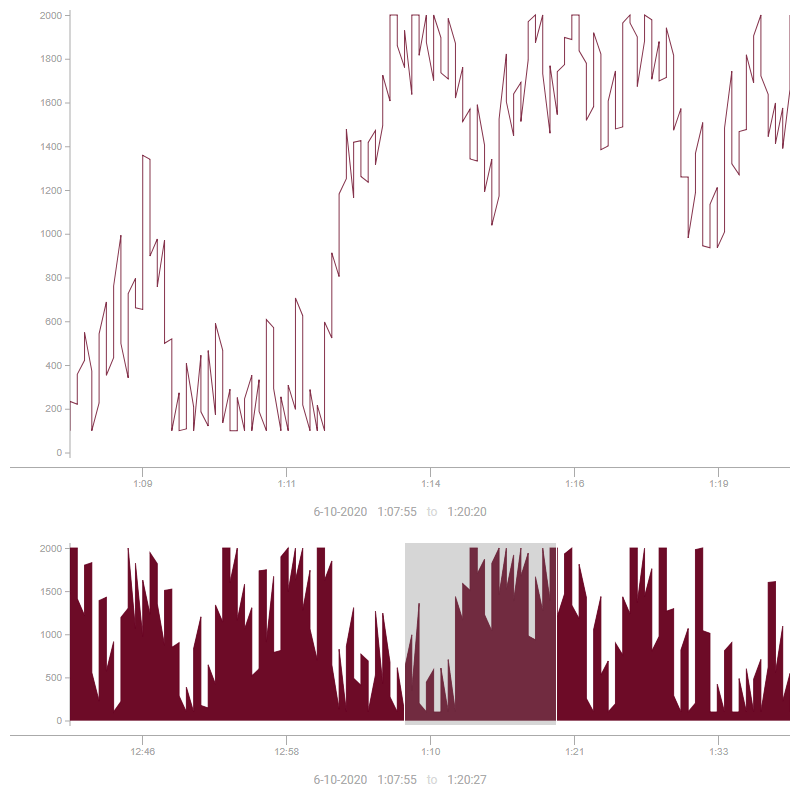
Example 2 - Using the Chart Range Selector
To begin using the Chart Range Selector, a Time Series Chart with trend data will be needed. This example shows how to configure the Chart Range Selector.
-
Begin by configuring tag history on a Tag of your choice.
-
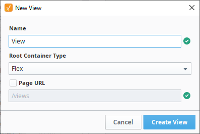
From the Perspective section of the Project Browser on your Designer, right click on the Views folder and select New View... to create a new view.
-
This will bring up the New View window. Give your view a name and select the Flex Root Container Type. The Page URL setting will remain unchecked for this example.
-
From the PerspectiveComponent Palette, drag and drop a Time Series Chart onto your newly created view. In the Position category of the Property Editor, set the position.grow property to '1'.
-
Drag and drop a Chart Range Selector component onto your view. Go to the Postion category and set the Chart Range Selector's position.grow property to '1' .
-
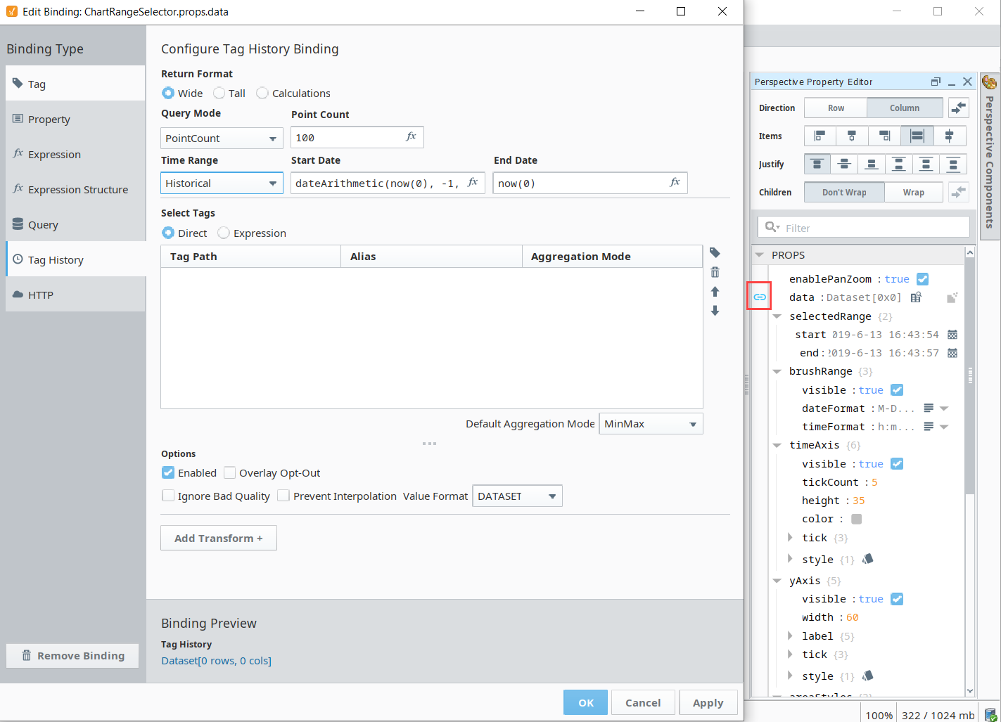
With the Chart Range Selector selected, go to the data property, click on the binding icon
 to bring up the Binding Editor window and select the Tag History binding type as shown in the image below.
 -
Set the Time Range to Historical. We'll configure the binding to span the last one hour of historical data by making the following changes:
- Start Date:
dateArithmetic(now(0), -1, 'hour') - End Date:
now(0)
- Start Date:
-
Under the Select Tags section, click on the Tag
 icon and use the Tag browser to drill down to the Tag you created in Step 1
 -
Click OK.
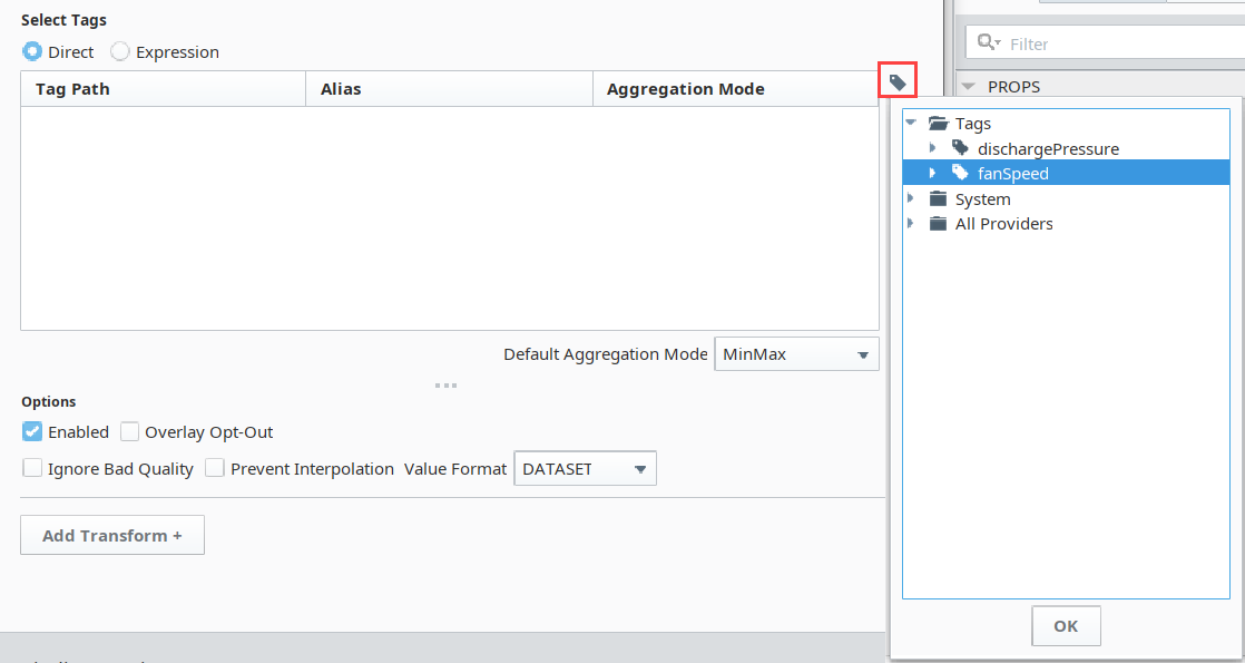
-
Click OK on the Binding Editor window to accept the binding changes. You should now have a Chart Range Selector displaying the last 1 hour of historical data for your Tag created in Step 1.
-
Now select your Time Series Chart and from the Perspective Property Editor, and click on the binding
icon for the series[0].data property to open the Binding Editor window. -
Select the Tag History binding type as shown in the following image.
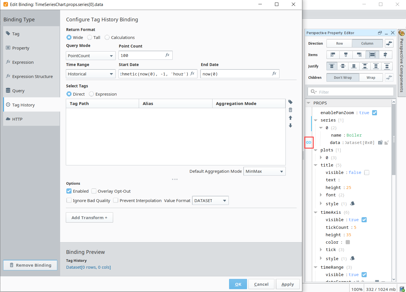
-
Set the Time Range to Historical.
-
The Start Date needs to have a property binding configured pointing to the Chart Range Selector's props.selectedRange.start property as in the image below.
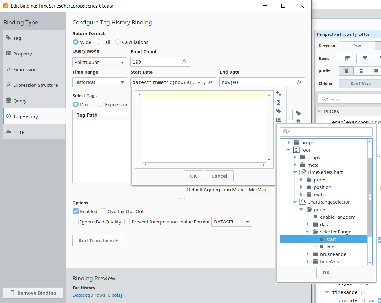
-
Similarly, the End Date needs to have a property binding configured pointing to the Chart Range Selector's props.selectedRange.end.
-
For the Tag History Binding configuration, click on the Tag
icon on the right of the Select Tags table and drill down to the Tag from Step 1, then click OK.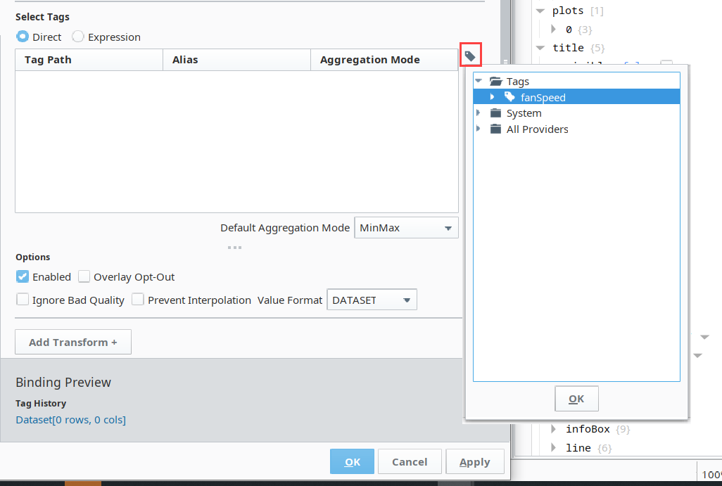
-
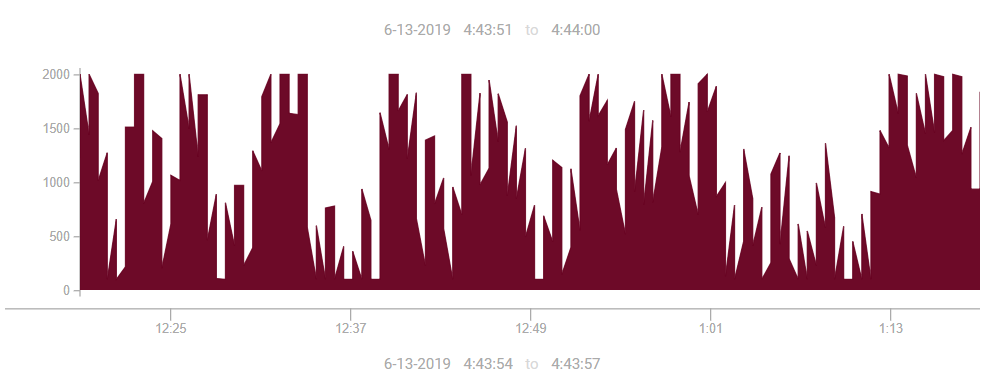
After clicking OK and accepting the binding configurations on the Time Series Chart, you will be able to use your Chart Range Selector to select what data you want on your Time Series Chart to display. Simply drag and re-size the Chart Range Selector's brush section as shown below.