Perspective - Pie Chart
Component Palette Icon:
A Pie Chart displays a list of named items, each of which has a value that is part of a total. The total is the sum of the value of each item. The key to the Pie Chart component is the data property, which contains the items that will be displayed as pie wedges. It is fully customizable in its appearance, from colors, line widths, text styles, and more.
The Pie Chart component had two pre-configured variants:
- Flat Chart - Default component described above.
- Three-Dimensional Chart - Component pre-set with three-dimensional pie wedges.
Properties
| Name | Description | Property Type |
|---|---|---|
| data | Data source for the chart. Each object within an array defines the name and value for a single pie section. | array |
| colors | Colors that correspond to each pie section, respective of order in data. Can be chosen from color wheel, chosen from color palette, or entered as RGB or HSL value. See Color Selector. | array |
| title | Name to display for this chart. | value: string |
| tileColor | Color of the title. Can be chosen from color wheel, chosen from color palette, or entered as RGB or HSL value. See Color Selector. | color |
| valueFormat | Label and legend value format configuration.
| array |
| showLabels | Whether to show labels for each section of this chart. Default is true (show). | value: boolean |
| labels | Settings for the labels.
| object |
| tooltipFormat | New in 8.1.5 This value determines the format of the tooltips. Click to see tooltipFormat Placeholder Objects and Formatting Options. | Value is string. |
| showLegend | Whether to show a legend for this chart. Default is true (show). Value is boolean. | |
| legend | New in 8.1.2 Settings for legend.
| object |
| legendLabelColor | Color of the legend labels. | color |
| cutoutRadius | Percent of total radius to cut out of center of chart. If greater than zero, the chart becomes ring-style instead of pie. | value: numeric |
| selection | New in 8.1.10 An object that contains selection related properties.
| object |
| selectOutline | Outline for each section of the pie.
| object |
| enableTransitions | Whether the chart has visual transition effects for changes in chart data. | value: boolean |
| threeDimensional | Whether the chart has depth effect to look three-dimensional. | value: boolean |
| style | Use styles to customize the visual style of the component. Full menu of style options is available for text, background, margin and padding, border, shape and miscellaneous. You can also specify a style class. | object |
tooltipFormat Placeholder Objects
The value of this property expects a string, and recognizes certain placeholders objects. The objects are fully detailed in amChart's documentation, and we listed some commonly used objects below. Note that each object should be wrapped in a set of braces ({ and } characters).
| Object | Description | Example |
|---|---|---|
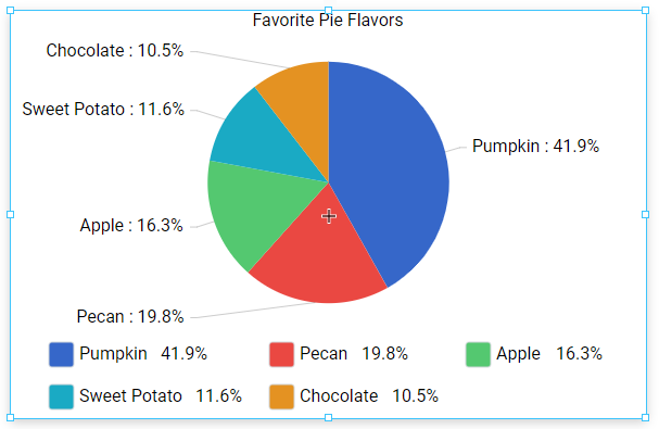
| Category | References the value of the wedge's category (the string value for the wedge), allowing the tooltip to display a string value for the wedge. The value of category is based off the string value for the wedge. Thus, in the Pie Chart Example on this page, category would return the value of the "flavor" property. | {category} |
| Value | Returns the value of the wedge. In addition to just the value of the wedge, additional modifiers can be added to obtain pre-calculated derivative values, such as the sum or largest value. A full list of modifiers can be found in the amCharts documentation. | {value}{value.sum}{value.high} |
tooltipFormat Formatting Options
In addition to placeholder objects, the tooltip can also be formatted in the following ways. All formatting is placed between a set of brackets ( "[" and "]" characters) as a single block. One or more formatting options can be place into a single block. When specifying multiple options, each should be delimited by a single space. Example: [bold red]
| Option | Description | Example Format | Example Output |
|---|---|---|---|
| Bold | Applies bold formatting to the characters in the block. | Hello [bold]World | Hello World |
| Colors | Allows you to specify the color of the text. Colors can be specified as RGB color codes, or named colors. | Hello [red]WorldOR Hello [#ff0000]World | Hello |
| In-line CSS | Allows you to directly apply CSS attributes. | Hello [font-style: italic]World | Hello World |
| Closing Bracket [/] | Terminates the formatting string. Note that this is optional. Style formatting will automatically be terminated by either the next opening style block ( "[" character) or the end of the string, whichever comes first. | [bold]Hello [/]World! | Hello World! |
| Formatting Functions | In addition to the above, several functions are available to further format the placeholder objects. A full list of functions can be found in the amChart documentation. | {value.formatNumber('###.00')} | 100.00 |
Component Events
The Perspective Event Types Reference page describes all the possible component event types for Perspective components. Not all component events support each Perspective component. The Component Events and Actions page shows how to configure events and actions on a Perspective component. Component scripting is handled separately and can be accessed from the Component menubar or by right clicking on the component.
Example
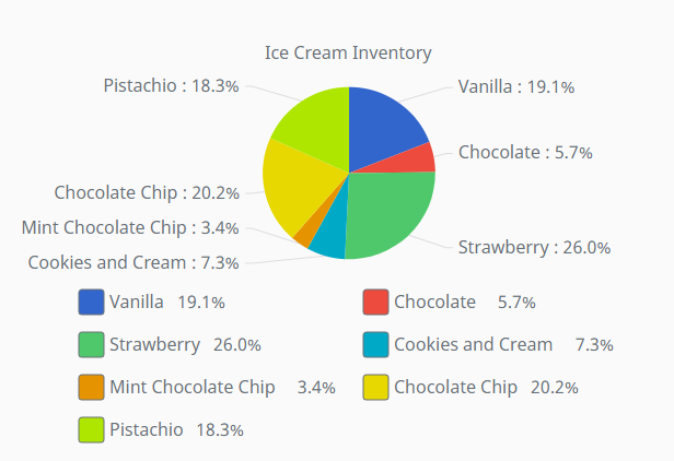
The Pie Chart component can be used for things like inventory tracking. Below is an example that uses a Pie Chart to display the inventory of a local ice cream shop.
-
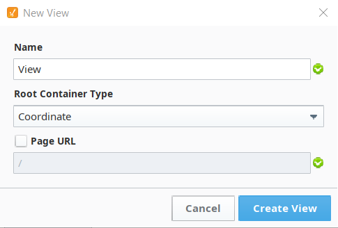
From the Perspective section of the Project Browser in your Designer, right-click on the Views folder and select New View... to create a new view.
-
This will bring up the New View window. Give your view a name and select the Coordinate Root Container type. The Page URL setting will remain unchecked for this example.
-
Drag and drop a Pie Chart from the Perspective Component Palette onto your newly created view.
-
Set the Pie Chart's title property to Ice Cream Inventory.
-
Copy the array below and paste it on the Pie Chart's data property.
[
  {
    "flavor": "Vanilla",
    "count": "50"
  },
  {
    "flavor": "Chocolate",
    "count": "15"
  },
  {
    "flavor": "Strawberry",
    "count": "68"
  },
  {
    "flavor": "Cookies and Cream",
    "count": "19"
  },
  {
    "flavor": "Mint Chocolate Chip",
    "count": "9"
  },
  {
    "flavor": "Chocolate Chip",
    "count": "53"
  },
  {
    "flavor": "Pistachio",
    "count": "48"
  }
]
The array above is a an array of objects. Each object is a dictionary containing key/value pairs where the keys of each dictionary represent ice cream flavors and ice cream inventory counts with their respective values for each. Value types can vary as you can pass both "50" and 50 as counts and the Pie Chart will still be able to render the data correctly. The Pie Chart can have various forms of data sources. The data source array can be built via scripting following the above format or it can be built using a query binding on the Pie Chart's data property. The query used must return two columns in any order where each column represents a string and a numeric value to be rendered by the chart.
- Once you have done this, your Pie Chart should accurately represent of the inventory data for the ice cream shop.