Version: 8.1

Perspective - XY Chart

" "

Component Palette Icon

" "

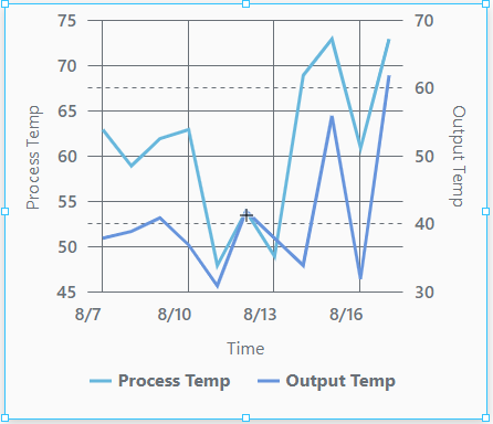
The XY Chart displays data trends. It provides a flexible way to display either timeseries or X-Y data by entering data in the dataSources property. It is fully customizable in its appearance, from labels, colors, line widths, legend, scroll bars, and text styles.

Properties

Most Properties have binding options. For more information on Bindings, see Types of Bindings in Perspective. This section only documents the Props Category of properties. The other Categories are described on the Perspective Component Properties page.

NameDescriptionProperty Type
dataSourcesObjects that are the data source for the chart. When configured to show a date or time on the x-axis, the chart expects that each entry in a data source is already sorted in ascending timestamp order. It is highly advised that you sort the contents of any given data source.array
titleChart title configuration.value:string
subtitleChart subtitle configuration.
legendSettings for the chart legend.object
cursorSettings for the chart cursor.object
enableTransitionsWhether the transition animations are enabled for this chart. Default is false (disabled).boolean
scrollBarsConfiguration for the scroll bars on the chart.object
selection
New in 8.1.10
An object that contains selection related properties. Data points in a series can only be selected if series.#.render is set to either column, candlestick, or line with bullets enabled.
object
backgroundConfiguration for the background of the chart.object
xAxesConfiguration properties for the X Axes of the chart.array
yAxesConfiguration properties for the Y Axes of the chart.array
seriesAn array of series configurations to apply to this chart.array
styleSets a style for this chart. Full menu of style options is available for text, background, margin and padding, border, shape and miscellaneous. You can also specify a style class.object

title Properties

title

NameDescriptionProperty Type
textThe chart title text.value: string
appearanceAppearance related title options.

title.appearance

NameDescriptionProperty Type
colorColor for the title.value: string
fontFont settings.object
paddingPadding space around the title. Values can be set for the top, bottom, left, and right.object

title.appearance.font

NameDescriptionProperty Type
sizeSpecifies the size of the font in pixels (px) or points (pt). If you enter just a number, Perspective assumes the value is in pixels.value: numeric
weightSets how thick or thin characters in the text are displayed.value: numeric

subtitle Properties

subtitle

NameDescriptionProperty Type
textThe chart subtitle text.value: string
appearanceAppearance related subtitle settings.object

subtitle.appearance

NameDescriptionProperty Type
colorColor for the title.value: string
fontFont settings.object
paddingPadding space around the subtitle. Values can be set for the top, bottom, left, and right.object

subtitle.appearance.font

NameDescriptionProperty Type
sizeSpecifies the size of the font in pixels (px) or points (pt). If you enter just a number, Perspective assumes the value is in pixels.value: numeric
weightSets how thick or thin characters in the text are displayed.value: numeric

legend Properties

legend

NameDescriptionProperty Type
enabledWhether the legend is enabled for this chart. Default is true (enabled).value: boolean
positionWhere the legend is located in relation to the chart (left, right, top, bottom, or absolute). Default is bottom.value: string dropdown
absoluteSettings used to position the legend when the position property is set to absolute.Values can entered for x and y.object
markersSettings for the markers.object
labelsSettings for the labels on the legend.object

legend.markers

NameDescriptionProperty Type
enabledEnables all series markers used in the legend.value: boolean
widthThe width of each marker, in pixels.value: numeric
heightThe height of each marker, in pixels.value: numeric
mirrorLookOfSeriesMarkers will be drawn to mirror the look of the series elements. Important: Customizing markers beyond width and height requires that this value is set to false.value: boolean
strokeSettings for the marker line stroke.object
cornerRadiusCorner radius applied to the rectangle marker. Values can be set for the topLeft, topRight, bottomLeft, and bottomRight.value: string dropdown
iconSettings for the icon on the legend.object

legend.markers.stroke

NameDescriptionProperty Type
colorMarker line stroke color.value: string
widthMarker line stroke width.value: numeric
opacityMarker line stroke opacity. 0 is fully transparent, 1 is fully opaque.value: numeric

legend.markers.icon

NameDescriptionProperty Type
pathShorthand path to the icon source, in this format: library/iconName. The materials icon library is a the primary source for icons in Ignition, see https://fonts.google.com/icons?selected=Material+Icons.value: string
colorColor of the icon.value: string
verticalCenterThe vertical anchor point for the icon. Options are none, top, middle, bottomvalue: string dropdown
horizontalCenterThe horizontal anchor point for the icon. Options are none, left, middle, rightvalue: string dropdown
widthWidth of the icon.value: numeric
heightHeight of the icon.value: numeric

legend.labels

NameDescriptionProperty Type
textA template string which is applied to all the labels. Default is [bold]{name}[/].value: string
fontFont settings for the labels.object

legend.labels.font

NameDescriptionProperty Type
weightThe weight of the font.value: numeric
colorThe color of the font.value: string
sizeThe font size.value: numeric

cursor Properties

cursor

NameDescriptionProperty Type
enabledEnables all chart cursors that are set to show.value: boolean
seriesBinds the chart cursor to a specified series' data source.value: string
lineXThe chart cursor configuration for the line that intersects the X axis.object
lineYThe chart cursor configuration for the line that intersects the Y axis.integer

cursor.lineX

Options as follows:

NameDescriptionProperty Type
enabledThe chart cursor configuration for the line that intersects the X axis.value: boolean
strokeSettings for the stroke.object

cursor.lineX.stroke

Options as follows:

NameDescriptionProperty Type
colorCursor line stroke color. See Color Selector.color
widthCursor line stroke widthvalue: numeric
opacityCursor line o pacity. 0 is fully transparent, 1 is fully opaque.value: numeric
dashArraySVG dashed array. The pattern of dashes and gaps used to paint the stroke. It's a list of comma separated lengths (in pixels) and percentages (percentage of the total stroke length) that specify the lengths of alternating dashes and gaps. If an odd number of values is provided, then the list of values is repeated to yield an even number of values. Thus, "5,3,2" is equivalent to "5,3,2,5,3,2".array

cursor.lineY

NameDescriptionProperty Type
enabledThe chart cursor configuration for the line that intersects the Y axis.value: boolean
strokeSettings for the stroke.object

cursor.lineY.stroke

NameDescriptionProperty Type
colorCursor line stroke color. See Color Selector.color
widthCursor line stroke widthvalue: numeric
opacityCursor line opacity. 0 is fully transparent, 1 is fully opaque.value: numeric
dashArraySVG dashed array. T he pattern of dash es and gaps used to paint the stroke. It's a list of comma separated lengths (in pixels) and percentages (percentage of the total stroke length) that specify the lengths of alternating dash es and gaps. If an odd number of values is provided, then the list of values is repeated to yield an even number of values. Thus, "5,3,2" is equivalent to "5,3,2,5,3,2".array

scrollBars Properties

scrollBars

Options as follows:

NameDescriptionProperty Type
horizontalSettings for horizontal scrollbars.object
verticalSettings for vertical scrollbarsobject

scrollBars.horizontal

NameDescriptionProperty Type
enabledWhether the horizontal scrollbar is enabled for this chart. Default is true (enabled).value: boolean
seriesBinds the horizontal scroll bar to a series.array

scrollBars.vertical

NameDescriptionProperty Type
enabledWhether the vertical scrollbar is enabled for this chart. Default is true (enabled).value: boolean
seriesBinds the vertical scroll bar to a series.array

selection Properties

NameDescriptionProperty Type
enabledEnables selection of bullets, columns, and candlesticks.value: boolean
dataA read-only list of selected data points.array
selectedHighlightColorSelected data points will use this color.value: color

background Properties

background

NameDescriptionProperty Type
renderSets the render mode for the chart background. Options are none, gradient, or color. Default is none.value: string dropdown
gradientSets the gradient configuration for the chart background.object
colorColor to be used in background if color property is set under render. Can be chosen from color wheel, chosen from color palette, or entered as RGB or HSL value.color
opacityOpacity of background of the chart. 0 is fully transparent, 1 is fully opaque.value: numeric

background.gradient

NameDescriptionProperty Type
directionSets the direction of the gradient. Options are linear or radial.value: string dropdown
rotationGradient rotation. Applies only to the linear gradient. Default is 0.value: numeric
colorsColors to be used in the gradient.array

xAxes Properties

xAxes

Options as follows:

NameDescriptionProperty Type
nameA unique name to identify this axis configuration object. This field is required in order to configure the series.value: string
labelEnables or disables a label for the x axis.object
inversedIndicates if the scale of the axis should be flipped.value: boolean
visibleMake the label visible, if label is enabled.value: boolean
tooltipTool tip configuration for the axis.object
renderSets the axis type to render. Options are category, date, or value. Default is date.value: string dropdown
categoryCategory axis configuration. Applied when render is set to category. Groups data items into categories and allots equal space for each. Break settings tell the category axis to remove a certain range from its scale.object
dateDate axis configuration. Applied when render is set to date. Uses data and time scale.object
valueValue axis configuration. Applied when render is set to date. Uses data and time scale.object
appearanceAppearance options for the x axis.object

xAxes.label

NameDescriptionProperty Type
enabledEnables a label drawn alongside this axis.value: boolean
textLabel text.value: string
colorLabel color. Can be chosen from color wheel, chosen from color palette, or entered as RGB or HSL value. See Color Selector.color

xAxes.toolTip

NameDescriptionProperty Type
enabledEnables the tooltip. Default is true.value: boolean
textTooltip text, in the form of a format string. See the AM charts documentation for more details.value: string
cornerRadiusRadius for the corner of tooltip.value: numeric
pointerLengthLength (in pixels) for the pointer on the tooltip.value: numeric
backgroundConfiguration for the color and opacity of the background of the tooltip. See Color Selector.color

xAxes.category

NameDescriptionProperty Type
enabledEnables a break range. Default is false.value: boolean
startCategoryStart point of the break.value: string
endCategoryEnd point of the break.value: string
sizeThe break size as a decimal percentage of the removed values.value: numeric

xAxes.date

NameDescriptionProperty Type
baseIntervalAdjusts the granularity of the time scale. Otherwise will adjust intelligently by default.object
rangeYou can optionally adjust the date range. Otherwise will auto adjust by default.object
breakTells the date axis to remove a certain range from its scale.object

xAxes.date.baseInterval

NameDescriptionProperty Type
enabledEnables or disables baseInteval.value: boolean
timeUnitSpecifies the base time to apply to this time scale. Options are minute, second, hour, day, week, or year.value: string dropdown
countSpecifies how many time units each data item was collected.value: numeric
skipEmptyPeriodsRemoves empty time units from display. Using this feature affects performance. Will reset the use of axis breaks if true.value: boolean

xAxes.date.range

NameDescriptionProperty Type
maxMaximum date in this range.value: string
minMinimum date in this range.value: string
useStrictStrictly enforces start and end values.value: boolean

xAxes.date.break

NameDescriptionProperty Type
inputFormatSets the date format of the axis value from the data source.value: string dropdown
formatSets the date format for the axis labels.value: string dropdown

xAxes.value

NameDescriptionProperty Type
rangeYou can optionally adjust the date range. Otherwise will auto adjust by default.object
logarithmicUse logarithmic scale. Useful if data varies greatly within the relevant series. Default is false.value: boolean
breakTells the value axis to remove a certain range from its scale.object
formatA number format string to be applied against numbers if in number rendering mode. Options are number, integer, four decimal precision, percent, scientific, currency, currency (rounded), or abbreviation.value: string dropdown

xAxes.value.range

NameDescriptionProperty Type
maxMaximum date in this range.value: string
minMinimum date in this range.value: string
useStrictStrictly enforces start and end values.value: boolean

xAxes.value.break

NameDescriptionProperty Type
enabledEnables a break range. Default is false.value: boolean
startValueStart point of the break.value: numeric
endValueEnd point of the break.value: numeric
sizeThe break size as a decimal percentage of the removed values.value: numeric

xAxes.appearance

NameDescriptionProperty Type
oppositeRenders the axis on the opposite side. Default is falsevalue: boolean
insideRenders the axis labels on the inside of the axis. Default is false.value: boolean
labelsAxis label configurationobject
gridConfigures the color, opacity and SVG dashed array of the grid lines.object
fontConfigures the axis font size and weight.object

xAxes.appearance.labels

NameDescriptionProperty Type
colorAxis label color.color
opacityAxis label opacity.value: numeric
rotationRotation of the label. Default is 0.value: numeric
wrapWhether or not to wrap the label text. This property is hidden by default, and must be manually added.value: boolean
verticalCenter
New in 8.1.14
Determines the vertical centering of the label. Options are top, middle, bottom.
value: string
horizontalCenter
New in 8.1.14
Determines the horizontal centering of the label. Options are left, middle, right.
value: string

xAxes.appearance.grid

NameDescriptionProperty Type
colorAxis grid color.color
opacityAxis grid opacity.value: numeric
dashArraySVG dashed array. The pattern of dashes and gaps used to paint the stroke. It's a list of comma separated lengths (in pixels) and percentages (percentage of the total stroke length) that specify the lengths of alternating dashes and gaps. If an odd number of values is provided, then the list of values is repeated to yield an even number of values. Thus, "5,3,2" is equivalent to "5,3,2,5,3,2".value: string
minDistanceThe minimum distance (in pixels) between grid lines. If set to NULL, the default value will be 120. Default value is 60.value: numeric
positionDefines the grid's relative position within the chart. A range from 0 to 1, with 0 meaning start and 1 meaning end.value: numeric

xAxes.appearance.font

NameDescriptionProperty Type
sizeAxis font size.value: numeric
weightAxis font weight.value: numeric

yAxes Properties

yAxes

NameDescriptionProperty Type
nameA unique name to identify this axis configuration object. This field is required in order to configure the series.value: string
labelEnables or disables a label for the y axis.value: boolean
inversedIndicates if the scale of the axis should be flipped.value: boolean
visibleMake the label visible, if label is enabled.value: boolean
tooltipTool tip configuration for the axis.object
renderSets the axis type to render. Options are category, date, or value. Default is date.value: string dropdown
categoryApplied when render is set to category. Category axis configuration. Groups data items into categories and allots equal space for each.
dateApplied when render is set to date. Date axis configuration. Uses data and time scale.object
valueApplied when render is set to value. Value axis configuration. Uses data and time scale.object
appearanceAppearance options for the y axis.object

yAxes.label

NameDescriptionProperty Type
enabledEnables a label drawn alongside this axis.value: boolean
textLabel text.value: string
colorLabel color. Can be chosen from color wheel, chosen from color palette, or entered as RGB or HSL value. See Color Selector.color

yAxes.toolTip

NameDescriptionProperty Type
enabledEnables the tooltip. Default is true.value: boolean
textTooltip text.value: string
cornerRadiusRadius for the corner of tooltip.value: numeric
pointerLengthLength (in pixels) for the pointer on the tooltip.value: numeric
backgroundConfiguration for the color and opacity of the background of the tooltip.color

yAxes.category

NameDescriptionProperty Type
enabledEnables a break range. Default is false.value: boolean
startCategoryStart point of the break.value: string
endCategoryEnd point of the break.value: string
sizeThe break size as a decimal percentage of the removed values.value: numeric

yAxes.date

NameDescriptionProperty Type
baseIntervalAdjust the granularity of the time scale. Otherwise will adjust intelligently by default.object
rangeYou can optionally adjust the date range. Otherwise will auto adjust by default.object
breakTells the date axis to remove a certain range from its scale.object
inputFormatSets the date format of the axis value from the data source.value: string dropdown
formatSets the date format for the axis labels. Options are date, time, or date and time.value: string dropdown

yAxes.date.baseInterval

NameDescriptionProperty Type
enabledEnables or disables baseInteval.value: boolean
timeUnitSpecifies the base time to apply to this time scale. Options are minute, second, hour, day, week, or year.value: string dropdown
countSpecifies how many time units each data item was collected.value: numeric
skipEmptyPeriodsRemoves empty time units from display. Using this feature affects performance. Will reset the use of axis breaks if true.value: boolean

yAxes.date.range

NameDescriptionProperty Type
maxMaximum date in this range.value: string
minMinimum date in this range.value: string
useStrictStrictly enforces start and end values.value: boolean

yAxes.date.break

NameDescriptionProperty Type
enabledEnables a break range. Default is false.value: boolean
startDateStart date of the break.value: string
endDateEnd date of the break.value: string
sizeThe break size as a decimal percentage of the removed values.value: numeric

yAxes.value

NameDescriptionProperty Type
rangeYou can optionally adjust the date range. Otherwise will auto adjust by default.object
logarithmicUse logarithmic scale. Useful if data varies greatly within the relevant series.value: boolean
breakTells the value axis to remove a certain range from its scale.object
formatA number format string to be applied against numbers if in number rendering mode. Options are number, integer, four decimal precision, percent, scientific, currency, currency (rounded), or abbreviation.value: string dropdown

yAxes.value.range

NameDescriptionProperty Type
maxMaximum date in this range.value: string
minMinimum date in this range.value: string
useStrictStrictly enforces start and end values.value: boolean

yAxes.value.break

NameDescriptionProperty Type
enabledEnables a break range. Default is false.value: boolean
startValueStart point of the break.value: numeric
endValueEnd point of the break.value: numeric
sizeThe break size as a decimal percentage of the removed values.value: numeric

yAxes.appearance

NameDescriptionProperty Type
oppositeRenders the axis on the opposite side. Default is falsevalue: boolean
insideRenders the axis labels on the inside of the axis. Default is false.value: boolean
labelsAxis label configurationobject
gridConfigures the color, opacity and SVG dashed array of the grid lines.object
fontConfigures the font size and weight.object

yAxes.appearance.labels

NameDescriptionProperty Type
colorAxis label color.color
opacityAxis label opacity.value: numeric
rotationRotation of the label. Default is 0.value: numeric
wrapWhether or not to wrap the label text.value: boolean

yAxes.appearance.grid

NameDescriptionProperty Type
colorAxis grid color.color
opacityAxis grid opacity.value: numeric
dashArraySVG dashed array. The pattern of dashes and gaps used to paint the grid. It's a list of comma separated lengths (in pixels) and percentages (percentage of the total grid length) that specify the lengths of alternating dashes and gaps. If an odd number of values is provided, then the list of values is repeated to yield an even number of values. Thus, "5,3,2" is equivalent to "5,3,2,5,3,2".value: string
minDistanceThe minimum distance (in pixels) between grid lines. If set to NULL, the default value will be 40. Default value is NULL.value: numeric
positionDefines the grid's relative position within the chart. A range from 0 to 1, with 0 meaning start and 1 meaning end.value: numeric

yAxes.appearance.font

NameDescriptionProperty Type
sizeAxis font size.value: numeric
weightAxis font weight.value: numeric

series Properties

series

NameDescriptionProperty Type
nameA unique name to identify this application of this series.value: string
labelSeries label to use with legend.object
visibleEnables series visibility. Default is true.value: boolean
hiddenInLegendHides the series in the legend. Default is false.value: boolean
defaultStateSeries default state configuration. Default is true (visible).value: boolean
dataData settings for the series.object
xAxisName of the x axis configuration object to be used with this series.value: string
yAxisName of the y axis configuration object to be used with this series.value: string
zIndexSets the series stack order relative to other series.value: numeric
tooltipTool tip configuration for the series.object
renderThe series render mode. Options are candlestick, column, line, stepLine. Default is line.value: string dropdown
candlestickWhen render is set to candlestick, the following candlestick settings are available. See the XY Chart Example - Candlestick Chart page for more information on how to configure a candlestick chart.object
columnWhen render is set to column, column settings are available.object
lineWhen render is set to line, line settings are available.object
stepLineWhen render is set to stepLine. StepLine settings are available.object

series.label

NameDescriptionProperty Type
textLabel text.value: string

series.data

NameDescriptionProperty Type
sourceName of the data source to bind to this series.value: string
xThe x value key from the specified data source to be used in this series. Value is a string value if the data source is a dataset or an array of objects. Value is an index if the data source is an array of arrays.value: string or index
yThe y value key from the specified data source to be used in this series. Value is a string value if the data source is a dataset or an array of objects. Value is an index if the data source is an array of arrays.value: string or index

series.tooltip

NameDescriptionProperty Type
enabledEnables the tooltip. Default is true.value: boolean
textA format string to apply to the tooltip text.value: string
cornerRadiusRadius for the corner of tooltip.value: numeric
pointerLengthLength (in pixels) for the pointer on the tooltip.value: numeric
backgroundConfiguration for the color and opacity of the background of the tooltip.object

series.tooltip.background

NameDescriptionProperty Type
colorBackground color. See Color Selector.color
opacityBackground opacity.value: numeric

series.column

NameDescriptionProperty Type
openOpen settings.object
appearanceAppearance settings.object

series.column.open

NameDescriptionProperty Type
xName of the field that holds the open data for the horizontal axis.value: string
yName of the field that holds the open data for the vertical axis.value: string

series.column.appearance

NameDescriptionProperty Type
fillFill settings.object
strokeStroke settings.object
widthPercentvalue: numeric
heightPercentvalue: numeric
stackedStacks this column series.value: boolean
deriveFieldsFromDataobject

series.column.appearance.deriveFieldsFromData

NameDescriptionProperty Type
fillFill settings.object
heatRulesThese heat rules apply to the fill of the columns.object

series.column.appearance.deriveFieldsFromData.fill

NameDescriptionProperty Type
colorCursor line stroke color.color
opacityOpacity of the stroke.value: numeric

series.column.appearance.deriveFieldsFromData.stroke

NameDescriptionProperty Type
colorCursor line stroke color.color
opacityOpacity of the stroke.value: numeric
widthWidth of the stroke, in pixels.value: numeric

series.column.appearance.heatRules

NameDescriptionProperty Type
enabledWhether or not heat rules are enabled. Default is false.value: boolean
maxColor for max.value: string
minColor for min.value: string
dataFieldvalue: string

series.line

NameDescriptionProperty Type
openConfigures the open data.object
appearanceConfigures the appearance of the line series.object

series.line.open

NameDescriptionProperty Type
xName of the field that holds the open data for the horizontal axisvalue:string
yName of the field that holds the open data for the vertical axisvalue:string

series.line.appearance

NameDescriptionProperty Type
connectConnects the lines over empty data points. Default is true.value: boolean
tensionXHorizontal tension setting of the line. Range is 0 to 1. A 1 value indicates high tension, so the line is maximally attracted to the points it connects (i.e. straight line). A 0 value means the opposite. Default is 1.value: numeric
tensionYVertical tension setting of the line. Range is 0 to 1. A 1 value indicates high tension, so the line is maximally attracted to the points it connects (i.e. straight line). A 0 value means the opposite. Default is 1.value: numeric
minDistanceThe minimum distance (in pixels) between two points. Default is 0.5.value: numeric
strokeSeries stroke configuration.object
fillSeries color configuration.object
bulletsSeries bullet configuration.array
tooltipTooltip configuration.object
fillFill settings.object
strokeStroke settings.object
rotationRotation of the bullet.value: numeric
deriveFieldsFromDataSettings for derived fields.object
heatRulesThese heat rules apply to the radius of a circular bullet.object

series.line.appearance.stroke

NameDescriptionProperty Type
widthWidth of the stroke, in pixels. Default is 3.value: numeric
opacityOpacity of the stroke.value: numeric
colorCursor line stroke color.color
dashArraySVG dash array. The pattern of dashes and gaps used to paint the stroke. It's a list of comma separated lengths (in pixels) and percentages (percentage of the total stroke length) that specify the lengths of alternating dashes and gaps. If an odd number of values is provided, then the list of values is repeated to yield an even number of values. Thus, "5,3,2" is equivalent to "5,3,2,5,3,2".array

series.line.appearance.fill

NameDescriptionProperty Type
colorThe color to draw this series.value: color
opacityOpacity as a percentage from 0 to 1. 0 is transparent, 1 is opaque.value: float

series.line.appearance.bullets

NameDescriptionProperty Type
enabledEnables bullets.value: boolean
renderType of bullet to render. Options are circle or label.value: string dropdown
widthBullet width.value: numeric
heightBullet height.value: numeric
labelLabel properties.object
tooltipTooltip configuration.object
fillFill settings.object
strokeStroke settings.object
rotationRotation of the bullet.value: numeric
deriveFieldsFromDataSettings for derived fields.object
heatRulesThese heat rules apply to the radius of a circular bullet.object

series.line.appearance.bullets.label

NameDescriptionProperty Type
textLabel text.value: string
position.dxLabel x position.value: numeric
position.dyLabel y position.value: numeric

series.line.appearance.bullets.tooltip

NameDescriptionProperty Type
enabledEnables the tooltip.value: boolean
textTooltip text. Can be a format string.value: string
cornerRadiusThe corner radius.value: numeric
pointerLengthThe pointer length.value: numeric
backgroundBackground color and opacity for the tool tip.object

series.line.appearance.bullets.fill

NameDescriptionProperty Type
colorThe fill color for the bullets in this series. See Color Selector.color
opacityThe bullet opacity.value: numeric

series.line.appearance.bullets.stroke

NameDescriptionProperty Type
widthWidth of the stroke, in pixels. Default is 3.value: numeric
opacityOpacity of the stroke.value: numeric
colorCursor line stroke color.color

series.line.appearance.bullets.deriveFieldsFromData

NameDescriptionProperty Type
fillFill settings.object
strokeStroke settings.object
rotationDerived field rotation (0-360).value: numeric

series.line.appearance.bullets.deriveFieldsFromData.fill

NameDescriptionProperty Type
colorThe fill color for the derived fields in this series. See Color Selector.color
opacityThe derived field opacity.value: numeric

series.line.appearance.bullets.deriveFieldsFromData.stroke

NameDescriptionProperty Type
colorCursor line stroke color.color
opacityOpacity of the stroke.value: numeric
widthWidth of the stroke, in pixels.value: numeric

series.line.appearance.bullets.heatRules

NameDescriptionProperty Type
enabledWhether or not heat rules are enabled. Default is false.value: boolean
maxColor for max.value: string
minColor for min.value: string
dataFieldThe data field.value: string

series.stepLine

NameDescriptionProperty Type
openConfigures the open data.object
appearanceConfigures appearance optionsobject

series.stepLine.open

NameDescriptionProperty Type
xName of the field that holds the open data for the horizontal axisvalue:string
yName of the field that holds the open data for the vertical axisvalue:string

series.stepLine.appearance

NameDescriptionProperty Type
connectConnects the lines over empty data points. Default is true.value: boolean
tensionXHorizontal tension setting of the line. Used to create smooth or sharp lines Range is 0 to 1. A 1 value indicates high tension, so the line is maximally attracted to the points it connects (i.e. straight line). A 0 value means the opposite. Default is 1.value: numeric
tensionYVertical tension setting of the line. Used to create smooth or sharp lines Range is 0 to 1. A 1 value indicates high tension, so the line is maximally attracted to the points it connects (i.e. straight line). A 0 value means the opposite. Default is 1.value: numeric
minDistanceThe minimum distance (in pixels) between two points. Default is 0.5.value: numeric
strokeSeries stroke configuration.object
fillFill settings.object
bulletsSeries bullet configuration.object

series.stepLine.appearance.stroke

NameDescriptionProperty Type
widthWidth of the stroke, in pixels. Default is 3.value: numeric
opacityOpacity of the stroke. 0 is fully transparent, 1 is fully opaque. Default is 1.value: numeric
colorColor of border around each pie section. See Color Selector.color
dashArraySVG dashed array. The pattern of dashes and gaps used to paint the stroke. It's a list of comma separated lengths (in pixels) and percentages (percentage of the total stroke length) that specify the lengths of alternating dashes and gaps. If an odd number of values is provided, then the list of values is repeated to yield an even number of values. Thus, "5,3,2" is equivalent to "5,3,2,5,3,2".array

series.stepLine.appearance.fill

NameDescriptionProperty Type
colorThe fill color for the columns in this series. See Color Selector.color
opacityThe column opacity.value: numeric

series.stepLine.appearance.bullets

NameDescriptionProperty Type
enabledEnables bullets.value: boolean
renderType of bullet to render. Options are circle or label.value: string dropdown
widthBullet width.value: numeric
heightBullet height.value: numeric
labelLabel settings.object
tooltipTooltip settings.object
fillFill settings.object
strokeStroke settings.object
rotationBullet rotation. Value can be 0 to 360.value: numeric
deriveFieldsFromDataSettings for derived fields.object
heatRulesThese heat rules apply to the radius of a circular bullet.object

series.stepLine.appearance.bullets.label

NameDescriptionProperty Type
textLabel text.value: string
positionLabel position.object

series.stepLine.appearance.bullets.tooltip

NameDescriptionProperty Type
enabledEnables the tooltip.value: boolean
textTooltip text. Can be a format string.value: string
cornerRadiusThe corner radius.value: numeric
pointerLengthThe pointer length.value: numeric
backgroundBackground color and opacity for the tool tip.object

series.stepLine.appearance.bullets.fill

NameDescriptionProperty Type
colorThe fill color for the columns in this series. See Color Selector.color
opacityThe column opacity.value: numeric

series.stepLine.appearance.bullets.stroke

NameDescriptionProperty Type
colorCursor line stroke color.color
opacityOpacity of the stroke.value: numeric
widthWidth of the stroke, in pixels.value: numeric

series.stepLine.appearance.bullets.deriveFieldsFromData

NameDescriptionProperty Type
fillFill settings.object
strokeStroke settings.object
rotationBullet rotation (0-360).value: numeric

series.stepLine.appearance.bullets.deriveFieldsFromData.fill

NameDescriptionProperty Type
colorThe fill color for the columns in this series. See Color Selector.color
opacityThe column opacity.value: numeric

series.stepLine.appearance.bullets.deriveFieldsFromData.stroke

NameDescriptionProperty Type
colorCursor line stroke color.color
opacityOpacity of the stroke.value: numeric
widthWidth of the stroke, in pixels.value: numeric

series.stepLine.appearance.bullets.heatRules

NameDescriptionProperty Type
enabledWhether or not heat rules are enabled. Default is false.value: boolean
maxColor for max.value: string
minColor for min.value: string
dataFieldvalue: string

Component Events

Perspective Component Events The Perspective Event Types Reference page describes all the possible component event types for Perspective components. Not all component events support each Perspective component. The Component Events and Actions page shows how to configure events and actions on a Perspective component. Component scripting is handled separately and can be accessed from the Component menubar or by right clicking on the component.