Perspective - Power Chart
New in 8.1.0
Component Palette Icon:

The Power Chart collects and displays data based on the pens that have been configured on the chart. Users can add or remove pens from the chart to change the underlying data. It is fully customizable in its appearance, from labels, colors, line widths, legend, scroll bars, and text styles.
The Power Chart utilizes functionality provided by the Tag Historian module, and requires a Tag Historian license to function.
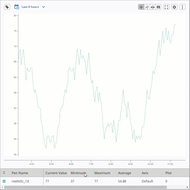
The Power Chart has a responsive design and a mobile-optimized display that is different than the standard display. It has a mobile breakpoint of 750px to fit on mobile devices. The mobile breakpoint is configurable on the responsiveDesignWidth property. The image below shows how the Power Chart renders on a smaller device. The image below shows how the Power Chart renders on a smaller device.
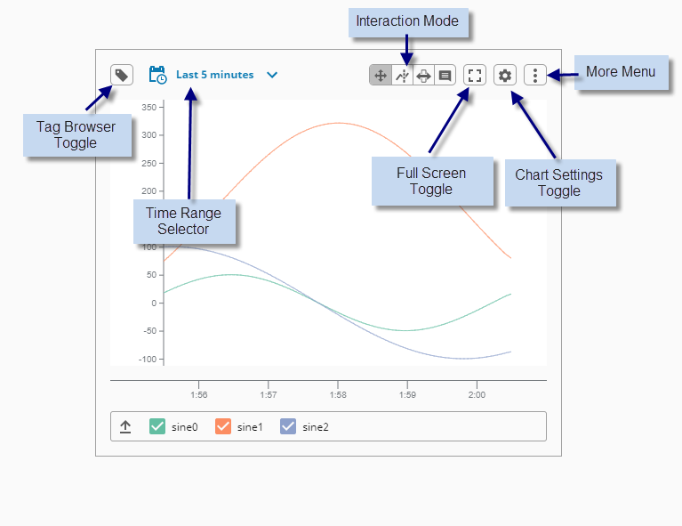
Component Anatomy
Aside from the chart trending area, the component features Browse Tags, Pen Control, and Chart Settings panels that provide additional functionality. The diagram below identifies these areas on a standard device.
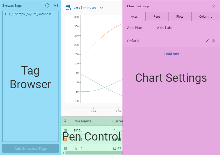
The Browse Tags panel allows you to browse for any available historical data, and add it to the chart. It is similar to the Designer's Tag Browser, but this tree reports any records that are accessible from the Tag Historian system, including tables provided by the DB Table Historian Provider. There are two ways to add tags to the chart's display:
- Select any nodes (entries with the Tag icon), and click Add Selected Tags, which will add a pen to the chart that represents the node that was selected.
- Drag selected nodes onto the chart. You can select multiple items by using Ctrl-click and you'll see a prompt indicating how many tags are selected.
If there's more than one plot in the chart configuration, you will be prompted to choose the plot to add the pen to.
Pen Control
This table shows each pen that's currently on the component, offers aggregates based on the chart's current range, and provides quick actions like hiding the pen and changing its color.
New in 8.1.13
The Pen Data display now supports numeric locale formatting. Numeric values are automatically formatted based on the Session locale and the axes.dataFormat property.
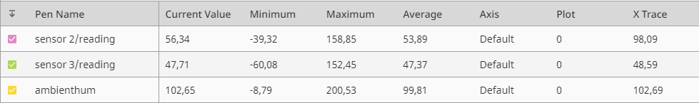
Chart Settings
This panel allows users to add new objects to the chart, such as axes and plots.
User Interaction
| Interaction | Icon | Description |
|---|
| Browse Tags |  | Toggles the Tag Browser panel. |
| Date Range Selector |  | Allows you to set the range on the chart. There are two modes:
- Realtime: Shows the most recent chart data based on the given timeframe. Useful in cases where you want to display records from now to some amount of time in the past.
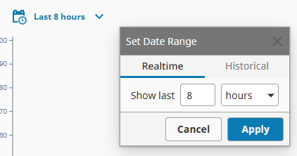 - Historical: Allows you to pick at start datetime and end datetime using a popup calendar.
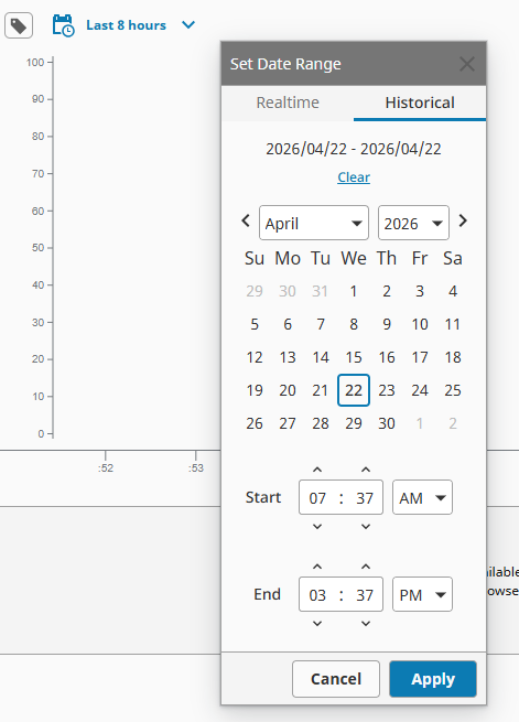
When the chart is in Historical mode, an additional time axis appears. On this axis, you can narrow down what the chart is showing you to specific points of interest by clicking and dragging the mouse along the axis. 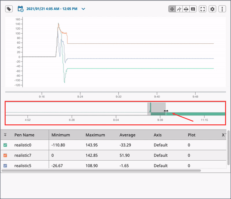
|
| Pan and Zoom |  | In this mode you can drag or swipe to pan forward and backward in time. On desktop device, clicking and dragging will pan across the chart. The mouse wheel will zoom. On mobile/touchscreen device, tapping and dragging will pan. The "pinch" and "spread" gestures will zoom. |
| Zoom reset |  | To reset the zoom to default, click the zoom reset icon. |
| X Trace |  | Tap to place a vertical line, which shows an interpolated value for each pen on the plot. To clear the X Trace values, select Clear X Trace from the More Menu. 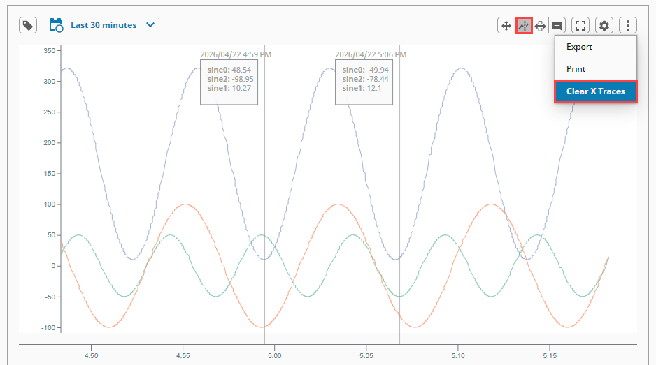 New in 8.1.13 The X Trace display now supports numeric locale formatting. Numeric values are automatically formatted based on the Session locale and the xTrace.infoBox.dataFormat property.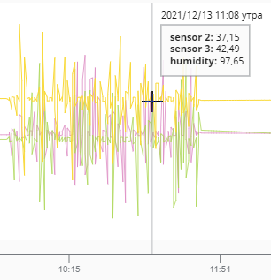 |
| Range Brush |  | Allows you to select a range of data on the chart. While a brush is active, the Pen Control Table will show aggregate summaries for the pens over the selected range. Multiple brushes will create multiple aggregation summaries.
Individual selections can be removed by clicking the trashcan icon in the Pen Control Table, or by selecting Clear Range Brushes on the More Menu.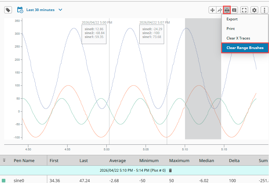 |
| Annotate |  | Click near a trend, line, or data point and you'll have the opportunity to add an annotation. The annotation is stored with the Tag Historian system, on the sqlth_annotations table. Annotations can edited by clicking the Edit  icon and deleted by clicking the Delete icon and deleted by clicking the Delete  icon, which appear when hovering over the annotation. icon, which appear when hovering over the annotation. 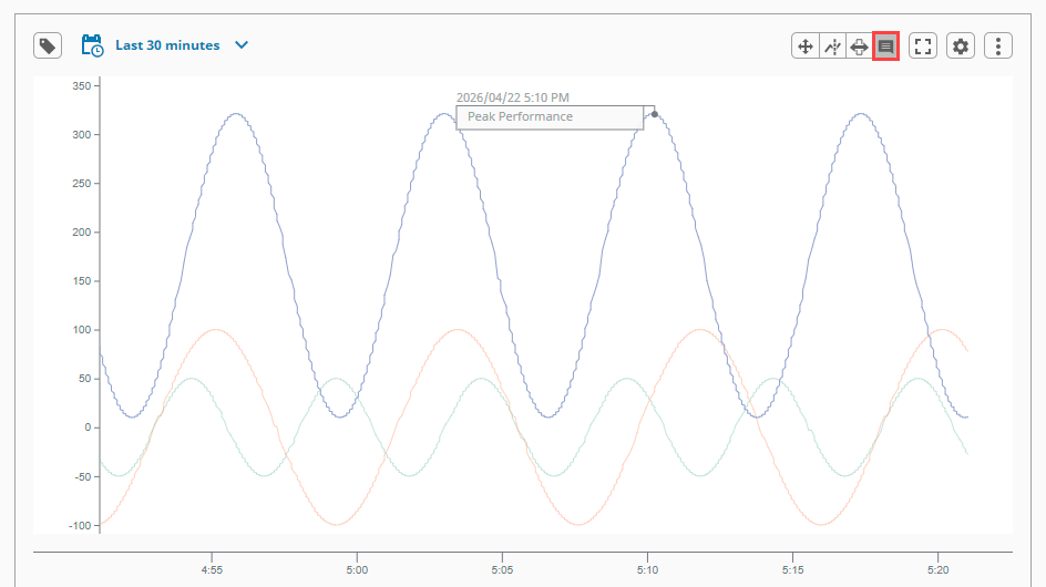 |
| Full Screen |  | Puts the chart into full screen mode. |
| Settings |  | Opens the Chart settings panel, allowing users to modify various aspects of the chart from the Session. There are four tabs: Axes, Pens, Plots, and Columns. Click to see the settings options. |
| More Menu |  | Provides additional contextual options, depending on the current state of the chart. The button to open the More Menu only appears if there is at least one pen on the chart. Click to see the More Menu options. |
Settings
| Tab | Description |
|---|
| Axes | You can add or delete Axes here, or click the Edit icon to edit an existing axis. The options are the same on the Add Axis and Edit Axes screens. |
| Pens | You can add or delete pens here or click the Edit icon to edit an existing pen. The options are the same on the Add Pen and Edit Pen screens. |
| Plots | You can add or delete plots here or click the Edit icon to edit an existing plot. The options are the same on the Add Plot and Edit Plot screens. |
| Columns | The Columns Chart Settings tab has options for datapoints to display on the Pen Control Panel and datapoints to display on the Range Brush Table. |
| Option | Description |
|---|
| Export | Takes the datapoints visible on the various plots, and exports them to a CSV. |
| Print | Opens print dialog box so user can print the chart. |
| Clear X Traces | Clears all X Traces on the chart. Only appears when there are X Traces on the chart. |
| Clear Range Brushes | Clears all range brushes on the chart. Only appears when there are brush selections on the chart. |
Properties
Most Properties have binding options. For more information on Bindings, see Types of Bindings in Perspective.
This section only documents the Props Category of properties. The other Categories are described on the Perspective Component Properties page.
| Name | Description | Property Type |
|---|
| config | Configuration for the data feeding the chart.
- penNamePathDepth: This value will set the depth of the tag path to include in the pen name. Using the Sample Quick Start project as an example, the realistic0 tag has a parent folder of realistic and a grandparent folder of sample-tags. The pen name in the Power Chart will display differently based on the value:
1: realistic03: sample_tags/realistic/realistic1
You can also add new tags with path depth values that differ from existing tags if needed for your project. Value is numeric. - tagBrowserStartPath: A path to a nested Tag History provider structure from which browsing will start. The path is expected to contain key-value pairs separated by
:/ characters. Value is string.Example:
histprov:Sample_DB:/drv:My_Gateway:My_Provider:/tag:Folder/New_Folder. - histprov: The name of the Tag Historian Provider.
- drv: The historian driver, which is typically a combination of a Gateway name and Tag Provider name separated by a colon. Example:
gateway:tagProvider - tag: A path to a node that has children. Typically should lead to either a folder or the root node of a UDT instance. If omitted, then the path will lead to the root of the drv.
While providing a path to this property, the tag component can be omitted, which will set the starting path for the Tag Browser panel to the root of a particular driver. For example, histprov:Sample_DB:/drv:My_Gateway:My_Provider:/.
- mode: The type of query that is being made against the data source. Options are realtime or historical. Value is string.
- refreshRate: Duration (in milliseconds) that data will be queried for updated results. (realtime mode only). Value is numeric.
- pointCount: Number of data points returned for the selected time range. Note: Changing the pointCount property's value to -1 will retrieve pen data points as it is stored in the database. In other words, this is the same as setting a Tag History binding's Query Mode to AsStored. While querying data with this mode, multiple value changes at the same timestamp will result in multiple rows, one row for each unique value. Value is numeric.
- startDate: Start date for a historical data query (historical mode only). Value is string.
- endDate: End date for a historical data query (historical mode only). Value is string.
- dateFormat: The date format displayed when in historical mode using a MomentJS date string (historical mode only). Value is string.
- timeFormat: The time format displayed when in historical mode using using a MomentJS time string (historical mode only). Value is string.
- rangeSelectorPen: The pen that will drive the data display of the range selector (historical mode only). Value is string
- unitOfTime: Time unit used for a realtime data query (realtime mode only). Value is numeric.
- measureOfTime: Time measurement used for a realtime data query. Options are seconds, minutes, hours, days, weeks, months, or years (realtime mode only). Value is string.
- rangeStartDate: Start date for the modified chart data range that the user has selected, either with the range brush or by panning/zooming. Read-only. Value is date.
- rangeEndDate: End date for the modified chart data range that the user has selected either with the range brush or by panning/zooming. Read-only. Value is date.
- responsiveDesignWidth: A number (in pixels) that will be used as the switch over width to the responsive design for the chart so it fits better on mobile devices. The mobile breakpoint is 750px, and is configurable. Value is numeric.
- visibility: Settings to show/hide elements within the component interface.
- showTagBrowser: Flag representing the visible state of the Tag Browser. Toggling this property will show or hide the Tag Browser. Value is boolean.
- showDateRangeSelector: Flag representing the visible state of the Date Range Selector. Toggling this property will show or hide the Date Range Selector. Value is boolean.
- showPenControlDisplay: Flag representing the visible state of the Pen Control display. Toggling this property will show or hide the Pen Control display. Value is boolean.
- buttons: Settings to show/hide the buttons used in the interface. Click to see more buttons properties.
- export: Settings to control the format of data exported from the chart via the More button's Export option.
- dateFormat: The date format of the exported data. See https://numeraljs.com for formats. Value is string.
- timeFormat: The time format of the exported data. See https://momentjs.com for formats. Value is string
| object |
| interaction | Configuration for the presentation of, and interaction with, chart data.mode: Current user interaction mode of the chart. Options are panAndZoom, xTrace, rangeBrush, or annotation. Value is string. Click to see more mode properties.fullscreen: Flag representing the full screen presentation mode of the chart. Value is boolean.chartZoomLevel: New in 8.1.11 Read-only value that corresponds to the current zoom level on the chart. External changes to this value will not update the level of zoom displayed on the chart. Value is numeric.rangeZoomLevel: New in 8.1.11 Read-only value that corresponds to the current zoom level on the range brush when the chart is in Historical Mode. External changes to this value will not update the level of zoom displayed on the chart. Value is numeric. | object |
| axes | Collection of predefined axes against which the data visualizations can be drawn.
- name: The name of the axis. Value is string.
- position: The side of the plot upon which the axis should be drawn. Options are left or right. Value is string.
- width: The width of the axis. Value is numeric.
- color: The color of the Y axis vertical bar.
- dataFormat: A numeral.js data format for displaying the data displayed in the pen control portion of the chart for this axis. See https://numeraljs.com for formats. Value is string.
- range: Configuration for the upper and lower limits of the axis.
- auto: If true, the minimum and maximum displaying values for the axis will be auto calculated.
Changed in 8.1.16 Auto range Y axes are now constrained to the upper/lower limits of the pen data bound to said axis. Value is boolean. - min: Minimum range value. If no value is provided, a minimum value will be calculated from the data bound to this axis. Value is numeric.
- max: Maximum range value. If no value is provided, a maximum value will be calculated from the data bound to this axis. Value is numeric.
- label: The label configuration for the Y axis.
- text: The text of the Y axis label. Value is string.
- offset: Offset the Y axis label from its default position. This enables you to fine tune the label location, which may be necessary depending on the scale and how much room the tick labels take up. Value may be positive or negative. Default is 0. Value is numeric.
- font: Font configuration for the Y axis label. Font size and color options for the font.
- style: Style for the Y axis label. Full menu of style options is available. You can also specify a style class.
- tick: Tick configuration. Click to see tick properties.
- grid:
New in 8.1.16 Configuration for gridlines to display on this axis. - visible: Visible state of the gridlines. Gridlines are shown only for axes that connect directly to the chart. Any satellite axes will display their tick configurations instead of gridlines. Value is boolean.
- color: Color of the gridlines.
- opacity: Opacity of the gridlines. Value is numeric.
- dashArray: Dashed appearance of the gridlines. Value is numeric.
- style: Style for the gridlines. Full menu of style options is available. You can also specify a style class.
- style: Style for the display. Full menu of style options is available. You can also specify a style class.
| array |
| pens | Visual representation of each active item.
- name: Name of the pen. Value is string.
- visible: Whether or not the pen is visible on the chart. Value is boolean.
- enabled: Availability of the pen on the chart and pen configuration panel. Value is boolean.
- selectable: Flag to allow the pen to be responsive to user selection. Value is boolean.
- axis: Name of an axis in the axes array to plot against. If left blank, a default axis will be created based on data values. Value is string.
- plot: The plot to which this pen is bound. Value is numeric.
- display: Configuration that drives the display of the pen. Click to see display properties.
- data:
- source: Source or tag path of the data behind the pen.
Changed in 8.1.14 Non-historical tag paths are converted to a historical format (e.g. histprov:default:/tag:_Simulator_/Ramp/Ramp0). Any updates to the pen via the UI will write the converted path back to this property. This keeps all of the data.source properties in a historical format while still allowing an initial non-historical tag path to add pen data to the chart display. Conversion is only supported for tags that have history enabled through the Tag Editor. Value is string. - aggregateMode: Mode to use to group the data. Value is string.
- default (MinMax): Returns both the minimum and maximum values in each interval.
- Average: The mean of the values in each interval.
- MinMax: Returns the minimum and maximum values.
- LastValue: The last recorded value in the interval.
- SimpleAverage: Arithmetic mean, no weighting.
- Sum: Total of all values in the interval.
- Minimum: Lowest value in the interval.
- Maximum: Highest value in the interval.
- DurationOn: Total time the tag was in the On state.
- DurationOff: Total time the tag was in the Off state.
- CountOn: Number of On state transitions or samples.
- CountOff: Number of Off state transitions or samples.
- Count: Number of samples in the interval.
- Range: Difference between maximum and minimum values.
- Variance: Statistical variance of the values.
- StdDev: Standard deviation of the values.
- PctGood: Percentage of samples considered good quality.
- PctBad: Percentage of samples considered bad quality.
| array |
| plots | A plot represents a row containing one or more pens.
- relativeWeight: Ratio between all plots. Value is numeric.
- color: Background color of the plot.
- markers: An array of markers that can be added to the plot to better visualize the data being displayed.
- type: Type of marker to add to the plot. Options are line or band. Value is string.
- axis: Name of the axis against which the marker should be drawn. This must be specified for the marker to be drawn. Value is string.
- value: Value where the line marker should be drawn. Value is numeric.
- display: Configuration for the display of the marker. Click to see display properties.
- style: Style for the individual plot. Full menu of style options is available for text, background, margin and padding, border, shape and miscellaneous. You can also specify a style class
| array |
| dataColumns | Configuration for the data columns that can be shown in tabular displays throughout the chart.
- penControl: Configuration for the data columns that can display for pens.
- currentValue: Show the current value column for the pen based on the time range. Value is boolean.
- minimum: Show the minimum column for the pen based on the time range. Value is boolean.
- maximum: Show the maximum column for the pen based on the time range. Value is boolean.
- average: Show the average column for the pen based on the time range. Value is boolean.
- axis: Show the axis column for the pen. Value is boolean.
- plot: Show the plot column for the pen. Value is boolean.
- xTrace: Show the xTrace column for the pen based on the time range. Value is boolean.
- rangeSelection: Configuration for the data columns that can display for the range brush.
- first: Show the first column for the pen based on the time range. Value is boolean.
- last: Show the last column for the pen based on the time range. Value is boolean.
- average: Show the average column for the pen based on the time range. Value is boolean.
- minimum: Show the minimum column for the pen based on the time range. Value is boolean.
- maximum: Show the maximum column for the pen based on the time range. Value is boolean.
- median: Show the median column for the pen based on the time range. Value is boolean.
- delta: Show the delta column for the pen based on the time range. Value is boolean.
- sum: Show the median column for the pen based on the time range. Value is boolean.
- ucl: Show the UCL column for the pen based on the time range. Value is boolean.
- lcl: Show the LCL column for the pen based on the time range. Value is boolean.
- standardDeviation: Show the standardDeviation column for the pen based on the time range. Value is boolean.
| object |
| title | Configuration for the title of the chart.
- visible: Whether or not the title is visible. Value is boolean.
- text: The text for the title. Value is string.
- font: Title font configuration. Font size and color options for the font.
- style: Style for the display. Full menu of style options is available. You can also specify a style class.
| object |
| timeAxis | Configuration for the time axis (X axis) of the chart.
- visible: Whether or not the time axis is visible. Value is boolean.
- tickCount: The number of ticks on the axis.
New in 8.1.22 Setting the tickCount to 0 will automatically scale the chart's X Axis based on the zoom level, panning, and scrolling. Value is numeric. - height: The height of the time axis. Value is numeric.
- color: The color of the axis.
- tick: Tick configuration. Click to see tick properties.
- grid:
New in 8.1.16 Configuration for gridlines to display on this axis. - visible: Visible state of the gridlines. Gridlines are shown only for axes that connect directly to the chart. Any satellite axes will display their tick configurations instead of gridlines. Value is boolean.
- color: Color of the gridlines.
- opacity: Opacity of the gridlines. Value is numeric.
- dashArray: Dashed appearance of the gridlines. Value is numeric.
- style: Style for the gridlines. Full menu of style options is available. You can also specify a style class.
- style: Sets a style for this timeAxis. Full menu of style options is available for text, background, margin and padding, border, shape and miscellaneous. You can also specify a style class.
| object |
| legend | Configuration for the display of the legend for the chart.
- visible: Whether or not the legend is visible. Value is boolean.
| object |
| style | Sets a style for this chart. Full menu of style options is available for text, background, margin and padding, border, shape and miscellaneous. You can also specify a style class. | object |
| Name | Description | Property Type |
|---|
| showTagBrowserButton | Flag representing the visible state of the Open Tag Browser and Close Tag Browser buttons. | value: boolean |
| showPanZoomButton | Flag representing the visible state of the Pan/Zoom toggle button. | value: boolean |
| showXTraceButton | Flag representing the visible state of the X Trace toggle button. | value: boolean |
| showRangeBrushButton | Flag representing the visible state of the Range Brush toggle button. | value: boolean |
| showAnnotationButton | Flag representing the visible state of the Annotation toggle button. | value: boolean |
| showFullscreenButton | Flag representing the visible state of the Fullscreen toggle button. | value: boolean |
| showSettingsButton | Flag representing the visible state of the Settings toggle button. | value: boolean |
| showMoreButton | Flag representing the visible state of the Show More toggle button. | value: boolean |
interaction.mode Properties
| Name | Description | Property Type |
|---|
| panAndZoom | Configuration settings for the chart in panAndZoom mode.
- freeRange:
New in 8.1.18 When enabled, this setting allows panning and zooming to dictate the time range used for the chart display. Value is boolean.
| object |
| xTrace | Configuration settings for the chart in xTrace mode.
- values: An array of read-only timestamp values representing the visible x-trace positions.
- infoBox: Configuration to build the box portion of the x-trace display.
- visible: Whether or not the box is visible. Value is boolean.
- showTime: Whether or not the time value above the box is visible. Value is boolean.
- width: The width of the box. Value is numeric.
- dataFormat: A numeral.js data format for displaying the data for this axis. See https://numeraljs.com for formats.
New in 8.1.2 As of Ignition 8.1.2, setting the dataFormat property to an empty string will result in no formatting being applied to the value. Useful in cases where a binding is returning the data in a preformatted state. Value is string. - dateFormat: The date format displayed when in historical mode using a MomentJS date string (https://momentjs.com). Value is string.
- timeFormat: The time format displayed when in historical mode using using a MomentJS time string (https://momentjs.com). Value is string.
- stroke: A configuration object describing the properties that will be applied to the stroke of the box. Click to see stroke properties.
- fill: The fill configuration. Click to see fill properties.
- style: Style for the box. Full menu of style options is available. You can also specify a style class.
- line: Configuration to build the vertical line portion of the x-trace display.
- visible: Whether or not the line is visible. Value is boolean.
- color: The color to apply to the line stroke, if applicable.
- width: The width to apply to the line stroke, if applicable. Value is numeric.
- opacity: The opacity to apply to the line stroke, if applicable. Value is numeric.
- dashArray: The spacing to apply between dashes of the line stroke, if applicable. Value is numeric.
- style: Style for the box. Full menu of style options is available. You can also specify a style class.
| object |
| rangeBrush | Configuration settings for the chart in rangeBrush mode.
- values: An array of config objects to build each range brush.
- start: The start timestamp position. Value is string.
- end: The end timestamp position. Value is string.
- active: Configuration to build the active range brush display.
- color: The color of the active range brush.
- opacity: The opacity of the active range brush. Value is numeric.
- style: Style settings for the active range brush. Full menu of style options is available. You can also specify a style class.
- inactive: Configuration to build the inactive range brush displays.
- color: The color of the inactive range brush.
- opacity: The opacity of the inactive range brush. Value is numeric.
- style: Style settings for the inactive range brush. Full menu of style options is available. You can also specify a style class.
| object |
| annotation | Configuration settings for the chart in annotation mode.
- infoBox: Configuration to build the box portion of the annotation display.
- visible: Whether or not the box is visible. Value is boolean.
- showTime: Whether or not the time value above the box is visible. Value is boolean.
- width: The width of the box. Value is numeric.
- dateFormat: The date format displayed when in historical mode using a MomentJS date string (https://momentjs.com). Value is string.
- timeFormat: The time format displayed when in historical mode using using a MomentJS time string (https://momentjs.com). Value is string.
- stroke: A configuration object describing the properties that will be applied to the stroke of the box. Click to see stroke properties.
- fill: The fill configuration. Click to see fill properties.
- font:
New in 8.1.17 A configuration object describing the properties that will be applied to the font. Click to see font properties. - style: Style for the box. Full menu of style options is available. You can also specify a style class.
- line: Configuration to build the connecting line portion of the annotation display.
- visible Whether or not the line is visible. Value is boolean.
- color: The color to apply to the line stroke, if applicable.
- width: The width to apply to the line stroke, if applicable. Value is numeric.
- opacity: The opacity to apply to the line stroke, if applicable. Value is numeric.
- dashArray: The spacing to apply between dashes of the line stroke, if applicable. Value is numeric.
- style: Style for the box. Full menu of style options is available. You can also specify a style class.
- dot: Configuration to build the dot portion of the annotation display.
- visible: Whether or not the dot portion is visible. Value is boolean.
- color: The color to apply to the dot.
- radius: The radius of the dot. Value is numeric.
- opacity: The opacity of the dot. Value is numeric.
- style: The style settings for the dot. Full menu of style options is available. You can also specify a style class.
| object |
infoBox.stroke Properties
Both interaction.mode.xTrace and interaction.mode.annotation have the following infoBox.stroke properties.
| Name | Description | Property Type |
|---|
| color | The color to apply to the line stroke, if applicable. | color |
| width | The width to apply to the line stroke, if applicable. | value: numeric |
| opacity | The opacity to apply to the line stroke, if applicable. | value: numeric |
| dashArray | The spacing to apply between dashes of the line stroke, if applicable. | value: numeric |
infoBox.fill Properties
Both interaction.mode.xTrace and interaction.mode.annotation have the following infoBox.fill properties.
| Name | Description | Property Type |
|---|
| color | The color to apply to the trend fill, if applicable. | color |
| opacity | The opacity to apply to the trend fill, if applicable. | value: numeric |
interaction.mode.annotation.infoBox.font Properties
| Name | Description | Property Type |
|---|
| color | The text color of the annotation label and datetime text. | color |
| size | The font size of the annotation label and datetime text. | value: numeric |
| style | Custom CSS styles to apply to the annotation text. Any style that applies to an SVG line element can be used. See also style options. | object |
axes.tick Properties
| Name | Description | Property Type |
|---|
| color | The color of the ticks. | color |
| count | New in 8.1.11 Number of ticks to display on the Y axis. Default value is Auto. When the tick count is Auto, Y axis ticks will be added/removed based on the height of the chart, and the tick spacing is adjusted around whole numbers. | value: numeric or string |
| label | Tick label configuration.
- font: Label font configuration. Font size and color options for the font.
- format:
New in 8.1.11 Sets the numeric format for the tick label. The value must be a valid D3 Format value. Default value is Auto. When the tick label format is Auto, the D3 format ~f is used. This creates a fixed point that will trim any insignificant trailing zeroes. Value is string. - style: Style for the tick label. Full menu of style options is available. You can also specify a style class.
| object |
| style | Style for the tick. Full menu of style options is available. You can also specify a style class. | object |
pens.display Properties
Each of the following four display properties have the same set of styles properties.
| Name | Description | Property Type |
|---|
| type | The type of chart to be built. Options are line, area, bar, or scatter. | value: string |
| interpolation | Type of curve that should be used to draw the line portion of the chart. Options are: curveBasis, curveBasisOpen,curveCardinal, curveCardinalOpen, curveCatmullRom, curveCatmullRomOpen, curveLinear, curveMonotoneX, curveMonotoneY, curveNatural, curveStep, curveStepAfter, or curveStepBefore.
More information on the interpolation methods above can be found in D3's documentation. | value: string |
| breakLine | If true, the line will be broken on either side of bad/missing data values. If false, bad/missing data values are removed and the adjoining points are connected. | value: boolean |
| styles | Settings for the display when it is normal, highlighted, selected, or muted.
- normal: An object providing style configuration for the “normal” state (no user interaction) of a column, or data entry, in a trend. Any color values specified here will override values set in the colorScheme or colors properties.
- highlighted: An object providing style configuration for the “highlighted” state (mouse hover) of a column, or data entry, in a trend. Any color values specified here will override values set in the colorScheme or colors properties. The highlighted property uses the same configuration properties as the 'normal' property above.
- selected: An object providing style configuration for the “selected” state (mouse click) of a column, or data entry, in a trend. Any color values specified here will override values set in the colorScheme or colors properties.
- muted: An object providing style configuration for the “muted” state (non selected) of a column, or data entry, in a trend. Any color values specified here will override values set in the colorScheme or colors properties.
| object |
pens.display.styles Properties
| Name | Description | Property Type |
|---|
| stroke | A configuration object describing the properties that will be applied to the stroke of the trend type being displayed (if applicable). The line , and area trend types will have these styles applied to them.
- color: The color to apply to the line stroke, if applicable.
- dashArray: The spacing to apply between dashes of the line stroke, if applicable. Value is numeric.
- opacity: The opacity to apply to the line stroke, if applicable. Value is numeric.
- width: The width to apply to the line stroke, if applicable. Value is numeric.
| object |
| fill | The fill configuration.
- color: The color to apply to the trend fill, if applicable.
- opacity: The opacity to apply to the trend fill, if applicable. Value is numeric.
| object |
plots.markers.display Properties
| Name | Description | Property Type |
|---|
| color | Color of the marker. | color |
| width | Width of the line. | value: numeric |
| opacity | Opacity of the marker | value: numeric |
| dashArray | Dashed appearance of the marker. | value: numeric |
| label | Configuration for the label of the marker.
- text: Text for the label. Value is string.
- position: The position of the label relative to the line. Options are right or left. Value is string.
- font: Label font configuration. Font size and color options for the font.
- style: Style for the label. Full menu of style options is available. You can also specify a style class.
| object |
| style | Style for the display. Full menu of style options is available. You can also specify a style class. | object |
timeAxis.tick Properties
| Name | Description | Property Type |
|---|
| color | The color of the ticks. | color |
| label | Tick label configuration.
- angled: Whether or not the tick labels are angled. Value is boolean.
- format: Date/time format displayed by each tick using a MomentJS data string (https://momentjs.com). Value is string.
- font: Label font configuration. Font size and color options for the font.
- style: Style for the tick label. Full menu of style options is available. You can also specify a style class.
| object |
| style | Style for the tick. Full menu of style options is available. You can also specify a style class. | object |
Component Events
The Perspective Event Types Reference page describes all the possible component event types for Perspective components. Not all component events support each Perspective component. The Component Events and Actions page shows how to configure events and actions on a Perspective component. Component scripting is handled separately and can be accessed from the Component menubar or by right clicking on the component.
Example
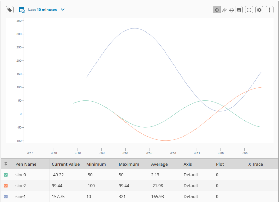
For this example, we will be configuring history on three tags and adding them to the Power Chart. These tags are available from the Gateway Quick Start project, and the Historian will be the Sample_SQLite_Database.
-
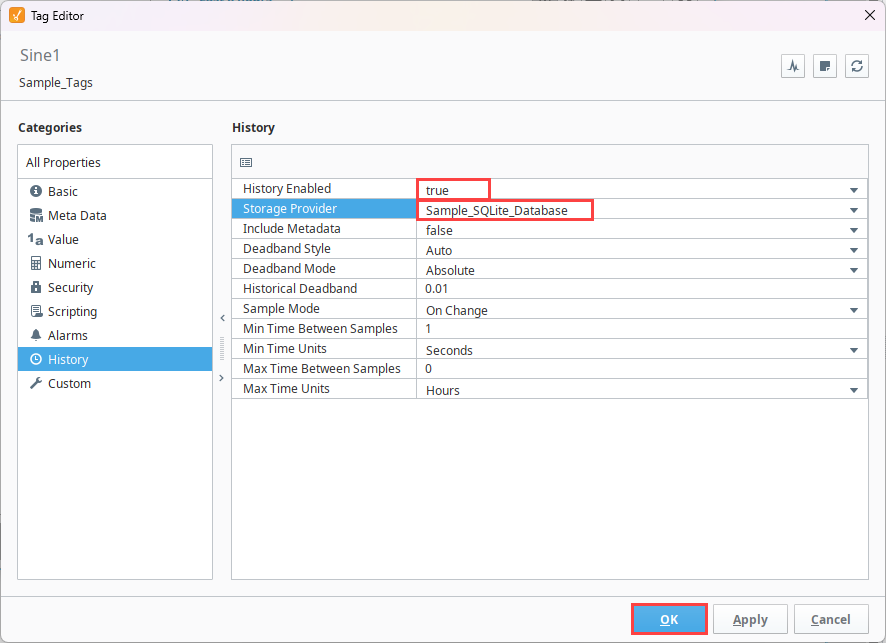
Double-click the Sine0 tag from the Tag Browser to open the Tag Editor.
-
Access the History tab to set History Enabled to true and select Sample_SQLite_Database for the Storage Provider.
-
Select OK.
-
Repeat these steps for the Sine1 and Sine2 tags.
-
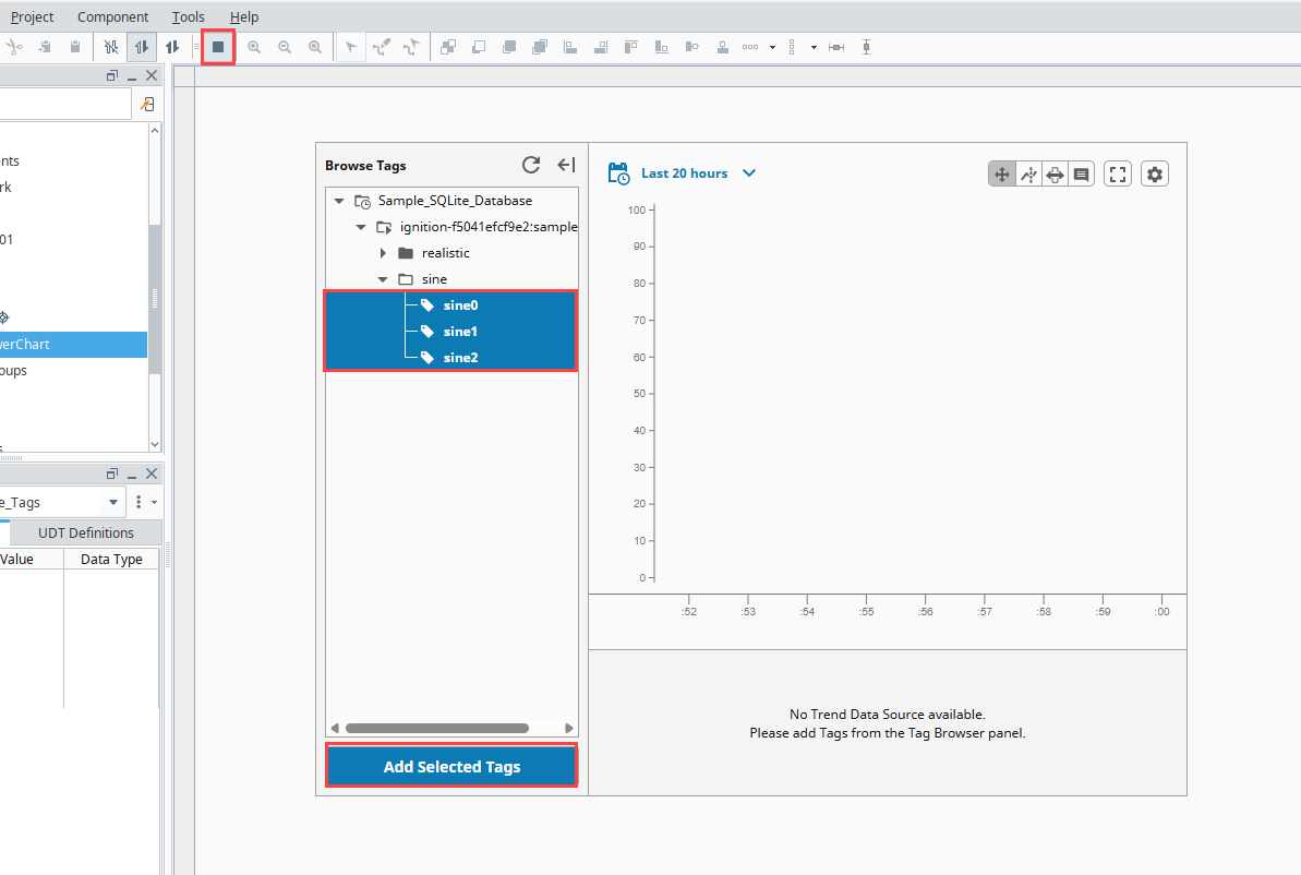
Drag and drop a Power Chart onto a view.
-
Place your Designer in Preview Mode.
-
Expand the Browse Tags panel.
-
Expand the Historian Provider dropdown until the Sine tags are displayed.
-
Select the Sine0, Sine1, and Sine2 tags (using Crtl + click) and click Add Selected Tags.
The Sine0, Sine1, and Sine2 tag data is now displayed on the Power Chart trend area. You can adjust the Date Range settings, pen controls, and chart settings from here to view the data as desired.