Perspective - Dropdown

Component Palette Icon:
Description
The Dropdown component is a great way to display a list of choices in a limited amount of space. The current selection is shown, and the choices are presented when the user clicks on the dropdown button. There is also the capability to search for an element by typing the name of that element in the dropdown field. If the element is present, it will appear as you are typing and you can select it. If the element doesn't exist, you can define text to display that the text is not found by configuring the noResultsText property.
The choices that are displayed in the Dropdown depend on what Elements are defined in the options property of the Property Editor. The placeholder property defines what text is shown before any of the choices are selected. For example, you can have the word 'Select...' to inform the user to select any of the Elements from the dropdown list.
There is also a multiSelect property which allows the user to select multiple elements from the dropdown. Selected elements can be deleted by clicking the 'x' icon.
The Dropdown component has two pre-configured variants:
- Single Selection: Default layout that displays a list of choices of which the user can select one.
- Multi-Selection: Layout with a list of choices of which the user can select more than one.
Properties
Most Properties have binding options. For more information on Bindings, see Types of Bindings in Perspective. This section only documents the Props Category of properties. The other Categories are described on the Perspective Component Properties page.
| Name | Description | Property Type |
|---|---|---|
| value | The result of current selections (input) after any processing. | variable, based on which item in props.options property is selected. |
| options | An array of objects for each dropdown option.
| array |
| multiSelect | Enable multiple selected values. Default is false. | value: boolean |
| placeholder | Settings for the text displayed when value is empty. Click to see the placeholder properties. | object |
| enabled | If set to false, component is disabled. Field will not focus and dropdown will not be interactive.Note: If the component is disabled, scripts can still run on the component. For example, if you add a script action to the onClick event, the script will fire when the user clicks on the Dropdown. | value: boolean |
| search | Enter text to start search.
| object |
| showClearIcon | Whether to display a button that the user can use to clear the selection. Default is false. | value: boolean |
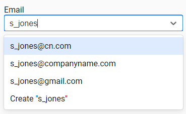
| allowCustomOptions | Whether a user may enter a custom value to be submitted. Default is false. While set to True, typing a value that doesn't match one of the existing options from the session will provide the user with a "Create" option. Selecting the Create option will set props.value to the new option. Creating a custom option in this way does not change the value of props.options. The custom option is simply a means to allow the user to type a custom value into the component. | value: boolean |
| textAlign | New in 8.1.19 Aligns the value(s) and/or placeholder text displayed within the dropdown. Valid values are left, center, and right. textAlign within the dropdown modal itself may be overridden or set separately using props.dropdownOptionStyle.textAlign. | value: string |
| minMenuHeight | New in 8.1.29 Minimum height of the dropdown menu. If the minimum height is not available under the component, and space is available above the component, the dropdown will flip to display options above the component. Default value is 150. | value: numeric |
| maxMenuHeight | New in 8.1.29 Maximum height of the dropdown menu before it becomes scrollable. Default value is 350. | value: numeric |
| style | Sets a style for this component. Full menu of style options is available for text, background, margin and padding, border, shape and miscellaneous. You can also specify a style class. | object |
| dropdownOptionStyle | Sets a style for the dropdown options. Full menu of style options is available for text, background, margin and padding, border, shape and miscellaneous. You can also specify a style class. | object |
placeholder Properties
| Name | Description | Property Type |
|---|---|---|
| text | Prompt text to display when no options are selected. | value: string |
| color | Color of placeholder text. Can be chosen from color wheel, chosen from color palette, or entered as RGB or HSL value. See Color Selector. | color |
| icon | Settings for an icon used as a placeholder.
| object |
Component Events
The Perspective Event Types Reference page describes all the possible component event types for Perspective components. Not all component events support each Perspective component. The Component Events and Actions page shows how to configure events and actions on a Perspective component. Component scripting is handled separately and can be accessed from the Component menubar or by right clicking on the component.
Examples
Example 1

| Property | Value |
|---|---|
| props.options.0.value | [default]_Dairy_/Bldg25/valve1 |
| props.options.0.label | Valve 1 |
| props.options.1.value | [default]_Dairy_/Bldg25/valve2 |
| props.options.1.label | Valve 2 |
| props.options.2.value | [default]_Dairy_/Bldg25/valve3 |
| props.options.2.label | Valve 3 |
| props.options.3.value | [default]_Dairy_/Bldg25/valve4 |
| props.options.3.label | Valve 4 |
| props.placeholder.text | Select a Valve... |
| props.placeholder.color | #0000AC |
| props.placeholder.icon.path | material/grade |
| props.placeholder.icon.color | #008000 |
| props.style.borderStyle | solid |
| props.style.color | #0000D9 |
| props.style.fontFamily | garamound |
| props.style.fontSize | 16px |
| props.style.fontWeight | bold |
| props.style.borderWidth | 2px |
| props.style.borderColor | #008000 |
| props.style.borderRadius | 8px |
| props.dropdownOptionStyle.color | #008000 |
| props.dropdownOptionStyle.fontSize | 14px |
| props.dropdownOptionStyle.fontWeight | bold |
| props.dropdownOptionStyle.textAlign | right |
Example 2
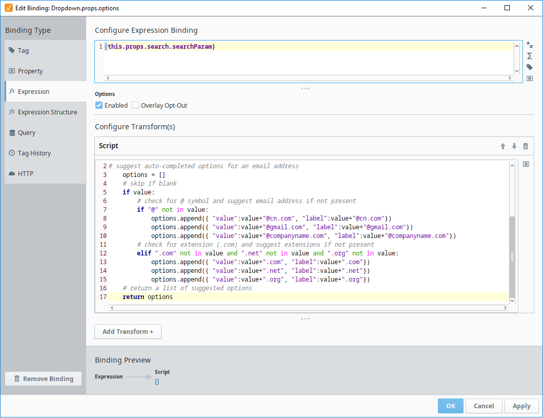
In this example, we have a dropdown list with an expression binding on the options property. There is also a label on the view with the word "Email" as its text.
A default email address of j_smith@companyname.com is set as the starting value for the component.

As the user starts entering characters for an email address, the dropdown list provides typeahead options of the entered text plus three possible email options, @'cn.com', '@companyname.com', or '@gmail.com'.
| Property | Value |
|---|---|
| value | j_smith@companyname.com |
| options | (Bound to an expression. See example below.) |
| props.search.enabled | true |
# suggest auto-completed options for an email address
options = []
# skip if blank
if value:
    # check for @ symbol and suggest email address if not present
    if "@" not in value:
        options.append({ "value":value+"@cn.com", "label":value+"@cn.com"})
        options.append({ "value":value+"@gmail.com", "label":value+"@gmail.com"})
        options.append({ "value":value+"@companyname.com", "label":value+"@companyname.com"})
    # check for extension (.com) and suggest extensions if not present
    elif ".com" not in value and ".net" not in value and ".org" not in value:
        options.append({ "value":value+".com", "label":value+".com"})
        options.append({ "value":value+".net", "label":value+".net"})
        options.append({ "value":value+".org", "label":value+".org"})
# return a list of suggested options
return options