Perspective - DateTime Picker
Component Palette Icon:
Description
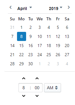
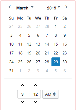
The DateTime Picker component uses the calendar to select the date and time. You can choose the "pickerType" to set both date and time, or just date. Configure the date and time format in the Property Editor using the formattedValue property. To use the DateTime Picker, select the month, date, and time on the component.
The DateTime Picker component has two pre-configured variants:
- Date and Time - Enables users can select a date and time on a calendar.
- Date - Enables users can select a date on a calendar.
User Interface
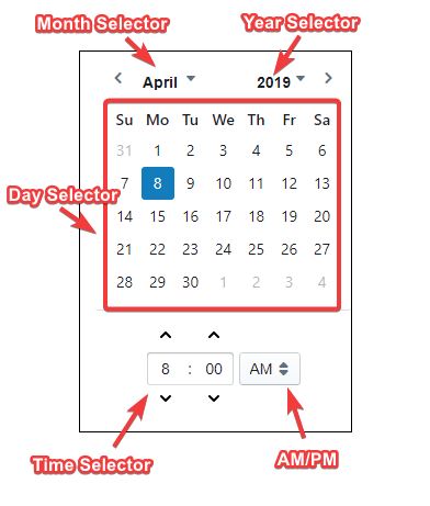
| Interaction | Description |
|---|---|
| AM/PM | Allows users to toggle between AM or PM. |
| Day Selector | Allows users to choose a specific day. |
| Month Selector | Allows users to choose a specific month. |
| Time Selector | Allows users to choose a specific time. |
| Year Selector | Allows users to choose a specific year. |
Properties
Most Properties have binding options. For more information on Bindings, see Types of Bindings in Perspective. This section only documents the Props Category of properties. The other Categories are described on the Perspective Component Properties page.
| Name | Description | Property Type |
|---|---|---|
| value | Current date/time as a Date object or timestamp in milliseconds. | value: dropdown |
| formattedValue | Date and time in configured format. | value: string |
| pickerType | Whether to display and enable picker for date only or for both date and time. | value: string |
| minDate | Minimum date/time as a Date object or timestamp in milliseconds. If null, the minimum date is 10 years in the past from today. | value: string |
| maxDate | Maximum date/time as a Date object or timestamp in milliseconds. If null, the minimum date is 10 years in the future from today. | value: string |
| format | Template for formatting date display - must be valid moment.js format, e.g., 'MM/DD/YYYY h:mm a'. | value: string |
| locale | Code for localization of language and formatting. Use the dropdown to select language. | value: string |
| enabled | 'False' will disable any interaction with the calendar.Note: If the component is disabled, scripts can still run on the component. For example, if you add a script action to the onClick event, the script will fire when the user clicks on the DateTime Picker. | value: boolean |
| style | Sets a style for this component. Full menu of style options is available for text, background, margin and padding, border, shape and miscellaneous. You can also specify a style class. | object |
Component Events
The Perspective Event Types Reference page describes all the possible component event types for Perspective components. Not all component events support each Perspective component. The Component Events and Actions page shows how to configure events and actions on a Perspective component. Component scripting is handled separately and can be accessed from the Component menubar or by right clicking on the component.
Example
| Property | Value | Style Category |
|---|---|---|
| props.format | MM/DD/YY hh:mm:ss a | N/A |
| props.style.borderStyle | solid | border |
| props.style.borderWidth | 1px | border |
| props.style.borderColor | #D90000 | border |