Perspective - Signature Pad
Component Palette Icon:
Description
The Signature Pad component enables users to draw a signature and submit it. Submitting a signature triggers a component event, enabling Ignition to do something with the signature.
Properties
Most Properties have binding options. For more information on Bindings, see Types of Bindings in Perspective. This section only documents the Props Category of properties. The other Categories are described on the Perspective Component Properties page.
| Name | Description | Property Type |
|---|---|---|
| enabled | Enables the canvas, clear button, and submit button. When enabled, component scripting functions for clearSignature and submitSignature are also enabled. | value: boolean |
| pad | Settings for the pad.
| value: object |
| actionBar | Settings for the actionBar.
| value: object |
| status | Settings for the status of the component.
| object |
| style | Sets a style for this component. Full menu of style options is available for text, background, margin and padding, border, shape and miscellaneous. You can also specify a style class. | object |
Scripting
See the Perspective - Signature Pad Scripting page for the full list of scripting functions available for this component.
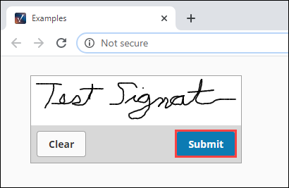
Examples
Example 1

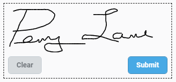
In this example we set a few properties to customize the look of the Signature Pad. The buttons are on the left. The blue background is set with the prop.canvas.clearColor property, which enables the color to show up in our project but not get saved as part of the signature. Lastly, we put two Label components above and below the Signature Pad with signing instructions.
| Property | Value |
|---|---|
| props.enabled | true |
| props.canvas.clearColor | #DAF9FF |
| props.actionBar.position | left |
| props.actionBar.submitButton.text | Submit |
| props.actionBar.submitButton.enabled | true |
| props.actionBar.submitButton.primary | true |
| props.actionBar.submitButton.style.fontFamily | Merriweather |
| props.actionBar.clearButton.text | Clear |
| props.actionBar.clearButton.enabled | true |
| props.actionBar.clearButton.primary | true |
| props.actionBar.clearButton.style.fontFamily | Merriweather |
| props.style.borderStyle | dashed |
| props.style.borderwidth | 1pt |
Example 2
The following example downloads the signature image when a user clicks the Submit button on the component.
To set this up, do the following:
-
Drag a Signature component onto a Perspective view. Make sure it's a view that has a URL.
-
Right-click on the component and select Configure Events.
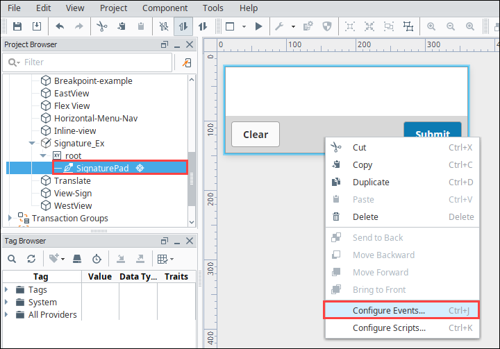
-
Select the OnSignatureSubmitted event.
-
Click the Add icon and select Script.
-
In the Configure Script Action box, add the following script:
#Downloads a signature file.

image = event.signatureFile.getBytes()
system.perspective.download("Signature.PNG", image)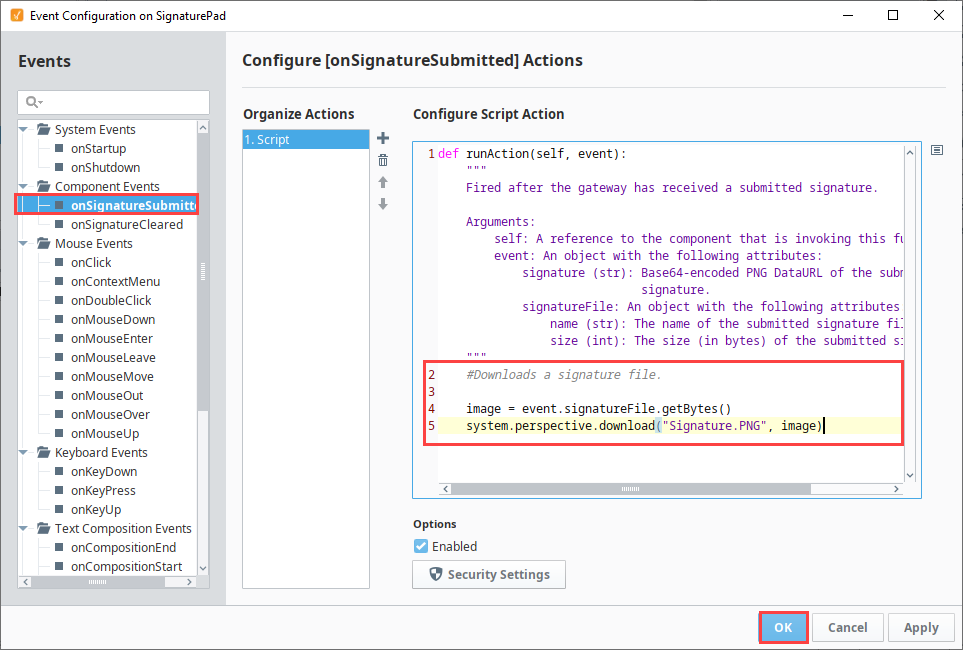
-
Click OK to save the script.
-
Save your project.
-
Open a Perspective Session with the view that has the Signature Pad component.
-
Sign the component and click Submit.
-
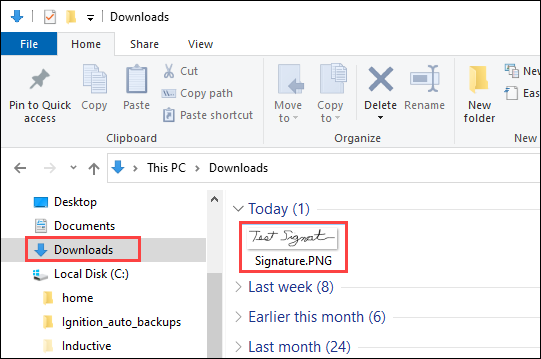
An image file is saved to your computer. In this example, we're running Ignition on Windows. The file Signature.PNG appears in our Downloads folder: