Report - Table
The Report Table displays data in a structured, repetitious format which gives reporting users the ability to flexibly layout and organize tabular data in a variety of ways. The Reporting engine automatically creates new pages to fit all data within the table's boundaries while applying formatting preferences such as font, size, layout, and alignment. Combine this feature with powerful data manipulation and layout tools, you get an object that forms the basis of your reports.

Report Design Component Palette Icon:
Table Properties
In the Property Inspector, use the Configure Table and Properties tabs to configure your table.
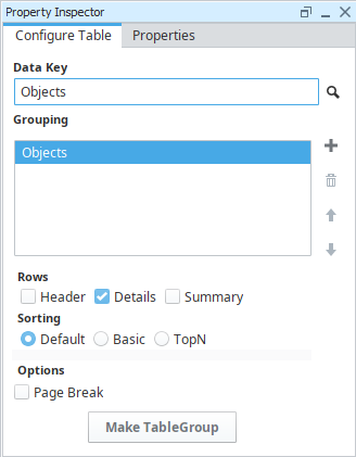
Configure Table Tab
| Name | Description |
|---|---|
| Data Key | Unique identifier or placeholder that points to your data. Typically a data source is used for this property. |
| Grouping | Allows you to group the data by columns in the datasource. Will always at least group by the entire datasource. |
| Rows | Rows in a table. There are three types:
|
| Sorting | Orders data in the table. Sorting occurs after the data has already been retrieved in the data source. There are three options:
|
| Page Break | Creates a page break between each grouping. |
| Make Table Group | Turns the Table into a Table Group, where you can add 'child' and 'peer' tables. |
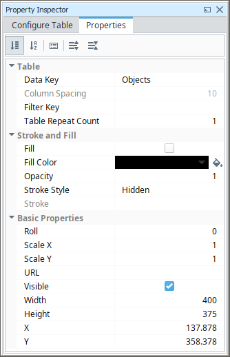
Properties Tab
| Name | Description |
|---|---|
| Data Key | Data Key associated with the table. Should be the data key of the data source that contains rows such as a query and should match the Data Key of the Configure Table Tab. |
| Table Repeat Count | Renamed the "Column Count" property to "Table Repeat Count". This is the number of times the table will repeat horizontally on a page before paginating. Set your table width to be the width of a single repeat, i.e., a Table Repeat Count of 3 means the width of the table should be 1/3 of the page width. |
| Column Spacing | The space between table columns. |
| Filter Key | A key or expression used to prune the underlying data source's rows down. If not blank, only rows for which this key expression evaluates to true will be included. |
| Starting Page Break | If true, the table will always start on a new page if part of a table group. |
| Fill | If true, the shape will fill its space with color. |
| Fill Color | If Fill is selected, the color that will fill the shape. |
| Opacity | How opaque the fill color is, between 0 and 1. |
| Stroke Style | What style of stroke or border to use: Hidden, Shape Outline, Border, or Double. To learn more about stroke styles, refer to Stroke and Fill Properties. |
| Stroke | Details for the chosen stroke. Each Stroke has its own properties depending on the Stroke Style chosen. |
| Roll | Number of degrees this shape is rotated clockwise. |
| Scale X | Amount to scale the width of this shape. 1 is scale to 100%. |
| Scale Y | Amount to scale the height of this shape. 1 is scale to 100%. |
| URL | New in 8.1.19 A link to attach to this reporting component. Will be a clickable hyperlink if the report is exported as a PDF. You can use the values below to link to internal pages.
|
| Visible | If true, the shape will be visible. |
| Width | Width of this shape in pixels. |
| Height | Height of this shape in pixels. |
| X | Horizontal distance in pixels between the left edge of this shape and the left edge of the page. |
| Y | Vertical distance in pixels between the upper edge of this shape and the top edge of the page. |
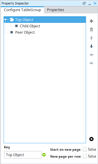
Configure TableGroup Properties
Table Groups are a collection of multiple tables represented by a single component. Examples of their use can be found on the Table Groups page.

| Name | Description |
|---|---|
 Add Child/Peer Table Add Child/Peer Table | Adds a new table to the group. Allows for the creation of a Child or Peer table.
|
 Delete Table Delete Table | Removes the selected table from the group. |
 Move Up Move Up | Moves the selected table up in the hierarchy. Tables are always presented in a Top-to-Bottom order, so your initial table should always be at the top. |
 Move Down Move Down | Moves the selected table down in the hierarchy. |
 Move Left Move Left | Moves the selected table left in the hierarchy, potentially changing the peer/child relationship with any tables listed above the selected table. |
 Move Right Move Right | Moves the selected table right in the hierarchy, potentially changing the peer/child relationship with any tables listed above the selected table. |
 Destroy Table Group Destroy Table Group | Removes the table group. Caution: This will delete any configurations on all tables below the top-most table. |
| Start on new page | Adds an explicit page break between the selected table and the prior peer table. |
| New page per row | Adds an explicit page break for each row of the selected table. |
| Key | The Key of the selected table. |
Row Properties
All Table Rows (Header, Details, and Summary) have the same properties, and all rows in the table use its own settings. You can click on each row to see the property values for that row. Here is a list of all the Table Row properties and their descriptions.
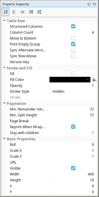
| Name | Description |
|---|---|
| Structured Columns | If true, this row will be organized into columns, otherwise, the row will allow free form design. |
| Column Count | If this row is structured, this is the number of columns in the row. |
| Move to Bottom | If true, this row will be moved to the bottom of the table. |
| Print Empty Group | If true, row will print even if it has no children. Only applicable for header or summary rows. |
| Sync Alternate Versions | If checked, the columns widths of this row will be synchronized with alternate row versions. |
| Sync Row Above | If checked, the column widths of this row and the row above it will be synchronized as long as they have the same number of fields. |
| Version Key | Data Key to drive which version of the table row to display. |
| Fill | If true, the shape will fill its space with color. |
| Fill Color | If Fill is selected, the color that will fill the shape. |
| Opacity | How opaque the fill color is, between 0 and 1. |
| Stroke Style | What style of stroke or border to use: Hidden, Shape Outline, Border, or Double. To learn more about stroke styles, refer to Stroke and Fill Properties. |
| Stroke | Details for the chosen stroke.. Each Stroke has its own properties depending on the Stroke Style chosen. |
| Min. Remainder Height | Minimum distance in points between the bottom of the row that will split onto a new page. The default value of 72 points is equivalent to 1 inch. Note: This and Min. Split Height are how the table determines when to add another row on to a page, or split the row to a new page. If using rows with a large height (such as those that contain another component, like a chart) you may find that the row is "split" horizontally across multiple pages. Setting this and Min. Split Height to a larger number will help prevent these splits. |
| Min. Split Height | Minimum distance in points between the top of the row that will split onto a new page. The default value of 72 points is equivalent to 1 inch. Typically set to the same number as Min. Remainder Height. See the information box on the Min. Remainder Height property above. |
| Page Break | Data Key or expressions used to determine whether row should force a page break. |
| Reprint When Wrapped | If true, this row will be reprinted on a new page when its children cross a page boundary. |
| Stay with Children | The number of children this row must be accompanied by, in the case where some children run off the bottom of a page. |
| Roll | Number of degrees this shape is rotated clockwise. |
| Scale X | Amount to scale the width of this shape. 1 is scale to 100%. |
| Scale Y | Amount to scale the height of this shape. 1 is scale to 100%. |
| URL | New in 8.1.19 A link to attach to this reporting component. Will be a clickable hyperlink if the report is exported as a PDF. You can use the values below to link to internal pages.
|
| Visible | If true, the shape will be visible. |
| Width | Width of this shape in pixels. |
| Height | Height of this shape in pixels. |
| X | Horizontal distance in pixels between the left edge of this shape and the left edge of the page. |
| Y | Vertical distance in pixels between the upper edge of this shape and the top edge of the page. |
Cell Properties
The cells on the Table are simply Text Shape components embedded directly in a row. They can be multi-selected, with shift or alt, to change the properties of multiple cells at once. For more information, see the Text Shape page here in the Appendix.
Reserved Column Names
Besides the built-in keys for the Reporting Module's Table component, there are several reserved names that should not be used as keys for column headers. These keys are broken down into categories in the following table:
| Key Type | Key |
|---|---|
| Heritage/Top Level | Running |
| Heritage/Top Level | Remaining |
| Heritage/Top Level | Up |
| Aggregate | total |
| Aggregate | average |
| Aggregate | count |
| Aggregate | countDeep |
| Aggregate | max |
| Aggregate | min |
Examples
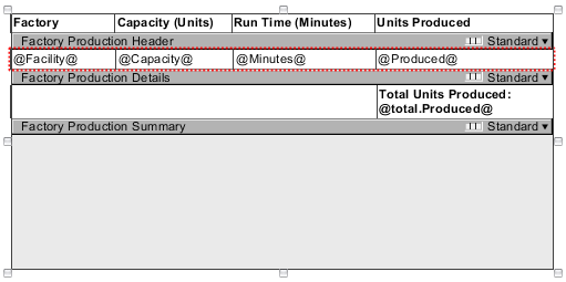
The Table component has a lot of functions and features. Examples of how you can use these functions and features are included in each of the sections below.