Report - Simple Table
With the Simple Table, you can very quickly add a table inside a report. The Simple Table is a grid-like table structure that dynamically creates new rows and columns for rows returned by the Data Keys on the component. To learn more about the Simple Table, refer to the CrossTab and Simple Tables page.
When creating an XLS file of a report that contains a Simple Table, the content in the Simple Table will be added as an editable overlay. To create an XLS file that places the data directly into cells on the spreadsheet, use a Table component instead.

Report Design Component Palette Icon:
Properties
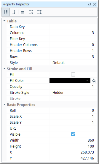
Table Properties
| Property | Description |
|---|---|
| Data Key | The data key associated with this Tabular component. Should be the data key of a data source that contains rows, such as a query. |
| Columns | Number of columns. |
| Filter Key | A key or expression used to prune the underlying data source's rows down. If not blank, only rows for which this key expression evaluates to true will be included. |
| Header Columns | Number of Header Columns. |
| Header Rows | Number of Header Rows. |
| Rows | Number of Rows. |
| Style | Give the CrossTab or Simple Table a pre-configured style.
The Style section below shows several examples of some of the style templates you can choose from. |
| Fill | If true, the shape will fill its space with color. |
| Fill Color | If Fill is selected, the color that will fill the shape. |
| Opacity | How opaque the fill color is, between 0 and 1. |
| Stroke Style | What style of stroke or border to use: Hidden, Shape Outline, Border, or Double. To learn more about stroke styles, refer to Stroke and Fill Properties. |
| Stroke | Details for the chosen stroke. Each Stroke has its own properties depending on the Stroke Style chosen. |
| Roll | Number of degrees this shape is rotated clockwise. |
| Scale X | Amount to scale the width of this shape. 1 is scale to 100%. |
| Scale Y | Amount to scale the height of this shape. 1 is scale to 100%. |
| URL | New in 8.1.19 A link to attach to this reporting component. Will be a clickable hyperlink if the report is exported as a PDF. You can use the values below to link to internal pages.
|
| Visible | If true, the shape will be visible. |
| Width | Width of this shape in pixels. |
| Height | Height of this shape in pixels. |
| X | Horizontal distance in pixels between the left edge of this shape to the left edge of the page. |
| Y | Vertical distance in pixels between the upper edge of this shape to the top edge of the page. |
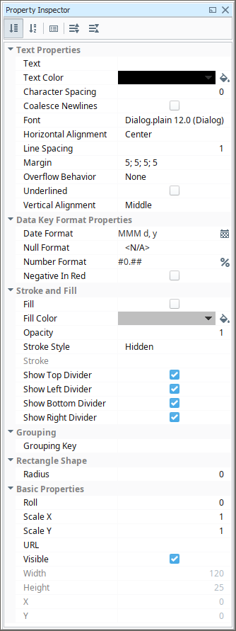
Cell Properties
| Property | Description |
|---|---|
| Text | Text to display in the shape. |
| Text Color | Color of the text. |
| Character Spacing | Amount of extra spacing to add between characters.Negative spacing makes characters closer together. |
| Coalesce Newlines | If true, consecutive line breaks will be merged into one. |
| Font | Font to use for the text. |
| Horizontal Alignment | Horizontal Alignment for text: Left; Right; Center; Full. |
| Line Spacing | Spacing between lines of text. 1 is single spacing, 2 is double spacing, etc. |
| Margin | Margin between texts and bounds of shape in pixels. Format is top: left: bottom; right. |
| Overflow Behavior | How text that overflows the bounds of the shape should be handled.
Changed in 8.1.19 The Grow row option has been removed, and the default value is now None. |
| Underlined | If true, use underlined text. |
| Vertical Alignment | Vertical alignment for text: Top; Middle; Bottom. |
| Date Format | Formats to use for dates in this shape. |
| Null Format | Formats to use for null values in this shape. |
| Number Format | Formats to use for numbers in this shape. |
| Negative in Red | If true, show negative numbers in red. |
| Fill | If true, the shape will fill its space with color. |
| Fill Color | If Fill is selected, the color that will fill the shape. |
| Opacity | How opaque the fill color is, between 0 and 1. |
| Stroke Style | What style of stroke or border to use: Hidden, Shape Outline, Border, or Double. To learn more about stroke styles, refer to Stroke and Fill Properties. |
| Stroke | Details for the chosen stroke. Each Stroke has its own properties depending on the Stroke Style chosen. |
| Show Top Divider | New in 8.1.12 If true, show top divider. |
| Show Left Divider | New in 8.1.12 If true, show left divider. |
| Show Bottom Divider | New in 8.1.12 If true, show bottom divider. |
| Show Right Divider | New in 8.1.12 If true, show right divider. |
| Grouping | Grouping Key will add a row or column for each Grouping the key generates. |
| Radius | Amount to radius the corners of this shape. |
| Roll | Number of degrees this shape is rotated clockwise. |
| Scale X | Amount to scale the width of this shape. 1 is scale to 100%. |
| Scale Y | Amount to scale the height of this shape. 1 is scale to 100%. |
| URL | New in 8.1.19 A link to attach to this reporting component. Will be a clickable hyperlink if the report is exported as a PDF. You can use the values below to link to internal pages.
|
| Visible | If true, the shape will be visible. |
| Width | Width of this shape in pixels. Changed in 8.1.12 This property is read-only. |
| Height | Height of this shape in pixels. Changed in 8.1.12 This property is read-only. |
| X | Horizontal distance in pixels between the left edge of this shape and the left edge of the page. Changed in 8.1.12 This property is read-only. |
| Y | Vertical distance in pixels between the upper edge of this shape and the top edge of the page. Changed in 8.1.12 This property is read-only. |
Reserved Column Names
Besides the built-in keys for the Reporting Module's Table component, there are several reserved names that should not be used as keys for column headers. These keys are broken down into categories in the following table:
| Key Type | Key |
|---|---|
| Heritage/Top Level | Running |
| Heritage/Top Level | Remaining |
| Heritage/Top Level | Up |
| Aggregate | total |
| Aggregate | average |
| Aggregate | count |
| Aggregate | countDeep |
| Aggregate | max |
| Aggregate | min |
Example
This Simple Table shows the total number of downtime events and downtime minutes, as well as the average number of downtime minutes for each piece of equipment. The included Equipment Downtime Dataset was used for this Simple Table example.
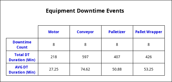
Equipment, Duration_minutes
"Motor", 52
"Conveyor", 154
"Palletizer", 58
"Pallet Wrapper", 251
"Motor", 33
"Conveyor", 94
"Palletizer", 10
"Pallet Wrapper", 25
"Motor", 23
"Conveyor", 60
"Palletizer", 32
"Pallet Wrapper", 25
"Motor", 12
"Conveyor", 33
"Palletizer", 8
"Pallet Wrapper", 25
"Motor", 24
"Conveyor", 124
"Palletizer", 75
"Pallet Wrapper", 25
"Motor", 43
"Conveyor", 51
"Palletizer", 120
"Pallet Wrapper", 25
"Motor", 13
"Conveyor", 36
"Palletizer",39
"Pallet Wrapper", 25
"Motor", 18
"Conveyor", 45
"Palletizer", 65
"Pallet Wrapper", 25
The Simple Table uses the Show Calculation property in the Key Browser and several of the Built-in Keys: 'count', 'total', and 'average.' Other properties were modified to make the column headers and row headers stand out. Double click on the cell to change the property values for that cell. The property values for this example are shown in the property list below.
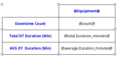
| Property | Value |
|---|---|
| Style | Default |
| Columns | 1 |
| Header Columns | 1 |
| Rows | 3 |
| Column Header | Equipment |
| Header in Row 1 | Downtime Count |
| Header in Row 2 | Total DT Duration (Min) |
| Header in Row 3 | AVG DT Duration (Min) |
| Header Rows Color | 0000D9, Bold |
| Header Column Color | 0000D9, Bold |